

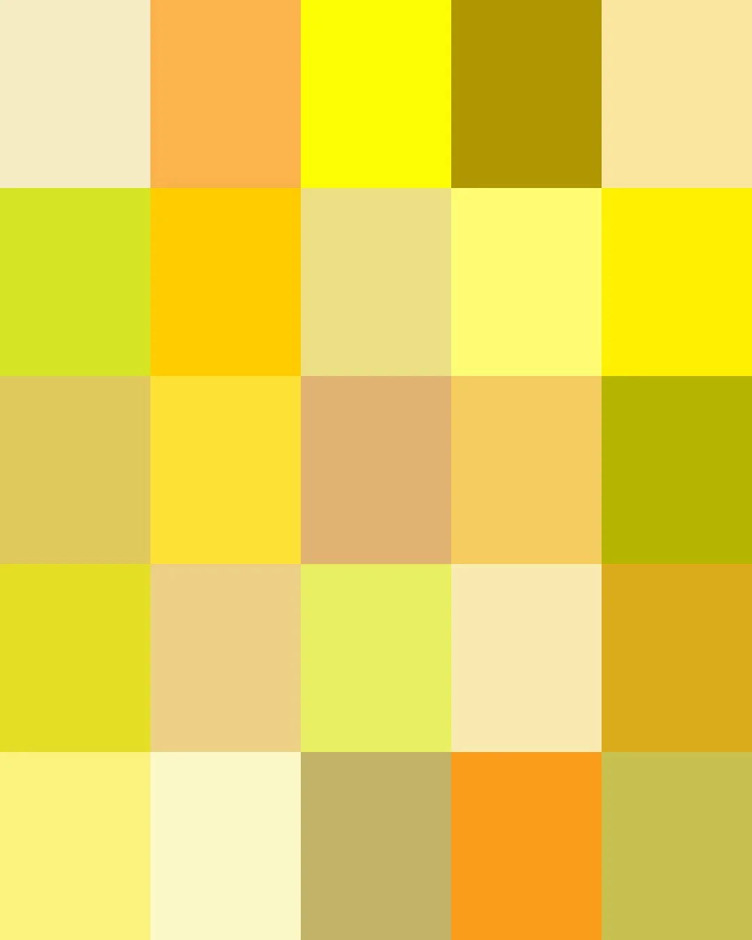
From ancient Egypt, where orpiment, a toxic arsenic mineral, gilded tomb walls with a shimmering gold-yellow, to Mughal India's Indian yellow, pressed from the urine of mango-fed cattle and prized by European painters for its intense luminance and deep gold hue, yellow has long been a color of alchemy and intrigue.
Synthetic pigments eventually freed yellow from these elaborate and sometimes toxic origins, making it an everyday color. Today's yellows range from buttery creams, sunlit lemons, and honeyed golds to the deep tones of mustard and ochre.
Here are the stories about some of our Yellows. Clicking on a Color will take you to our Spoonflower shop where you can order it on 60+ types of Fabric, Wallpaper, and Home Décor Products.
Or, save your favorites to your Pinterest boards for later.
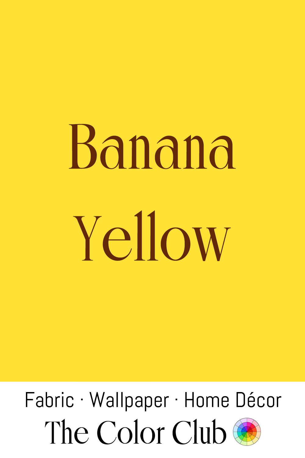
/ BANANA YELLOW / bright, warm and fruity sunny.
Bananas exist in a surprising range of colors, from green and yellow to red, purple, and even nearly black varieties found around the world. The Banana most people recognize today is the Cavendish variety, which became the world's dominant export Banana in the 1950s. Its familiar golden-yellow peel is one of the best-known sights in everyday life.
Andy Warhol transformed Banana Yellow into a Pop Art icon with his peelable Banana illustration for the cover of The Velvet Underground & Nico in 1967. The simple, vivid image stands among the defining artworks of the era, permanently linking this energetic yellow with contemporary art, music, and visual culture.
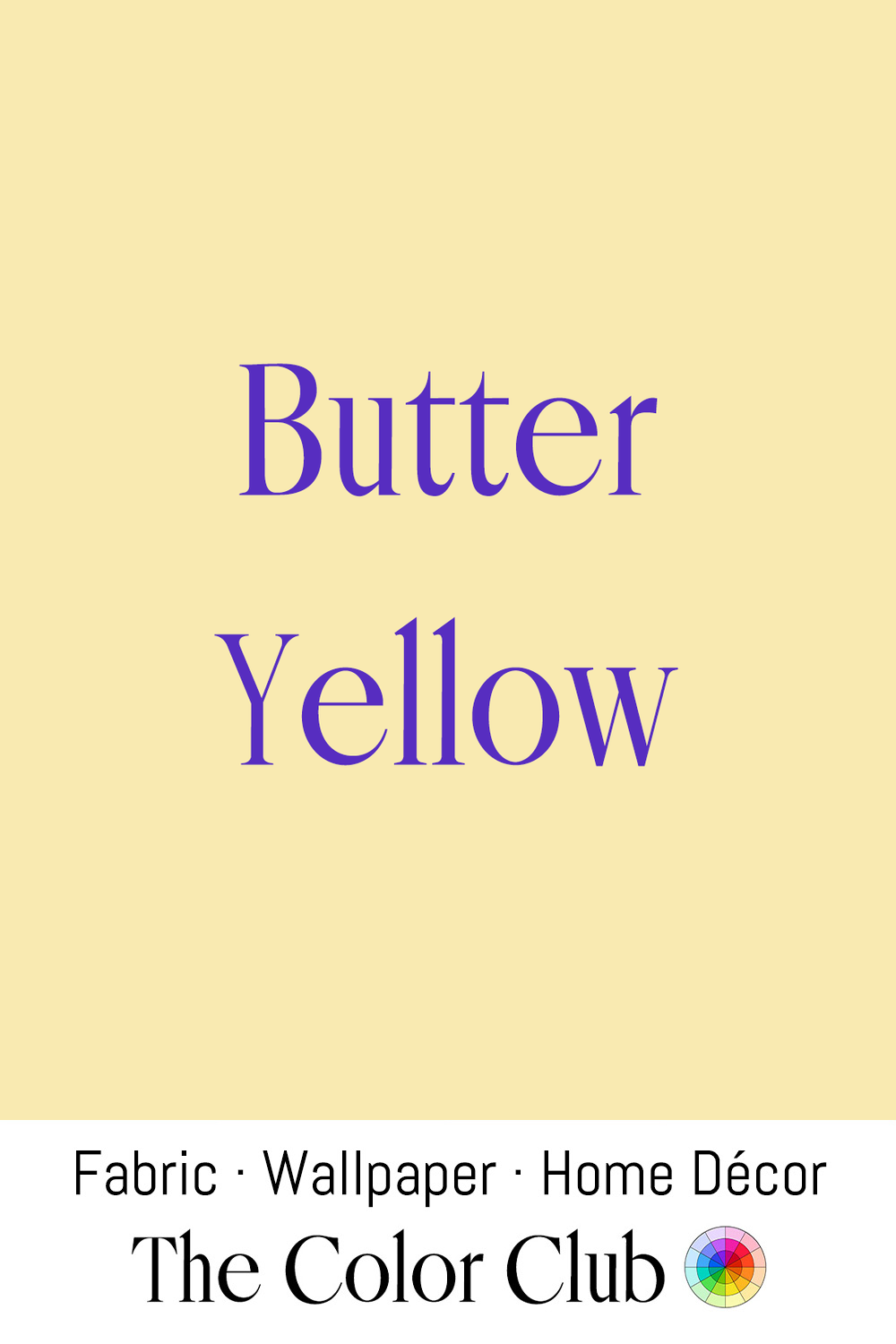
/ BUTTER YELLOW / pale, warm, soft and creamy.
Churned and valued since antiquity, Butter takes its natural pale-gold color from the season and the diet of the cows producing the milk. In the 1930s, American feed-sack manufacturers printed cotton sacks in similar creamy yellows, and during the Depression many households repurposed the fabric into quilts, making the shade part of everyday textile history.
In 2024 and 2025, Butter Yellow returned to the runway, appearing in collections from Jacquemus, Loewe, and Louis Vuitton. Its appeal lies in its balance between freshness and nostalgia, bringing warmth to fashion, interiors, and textiles.
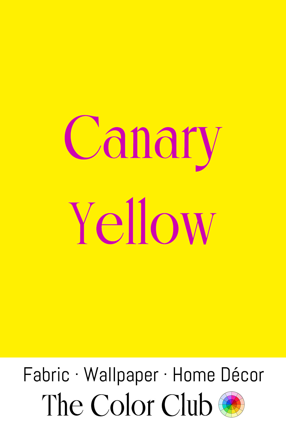
/ CANARY YELLOW / chirpy bright, highly saturated and energetic.
Canaries were selectively bred in captivity from the 17th century for their vivid yellow plumage and song. Their name became a color term, and jewelers later applied it to exceptionally intense yellow stones, known as “canary diamonds.”
The most famous example is the Tiffany Yellow Diamond, a 287.42-carat canary-yellow rough acquired by Tiffany & Co. in 1878 and cut under the supervision of gemologist George Frederick Kunz to 128.54 carats. Mounted since 1995 in Jean Schlumberger's Bird on a Rock setting, it has kept Canary Yellow associated with rarity, optimism, and high design.
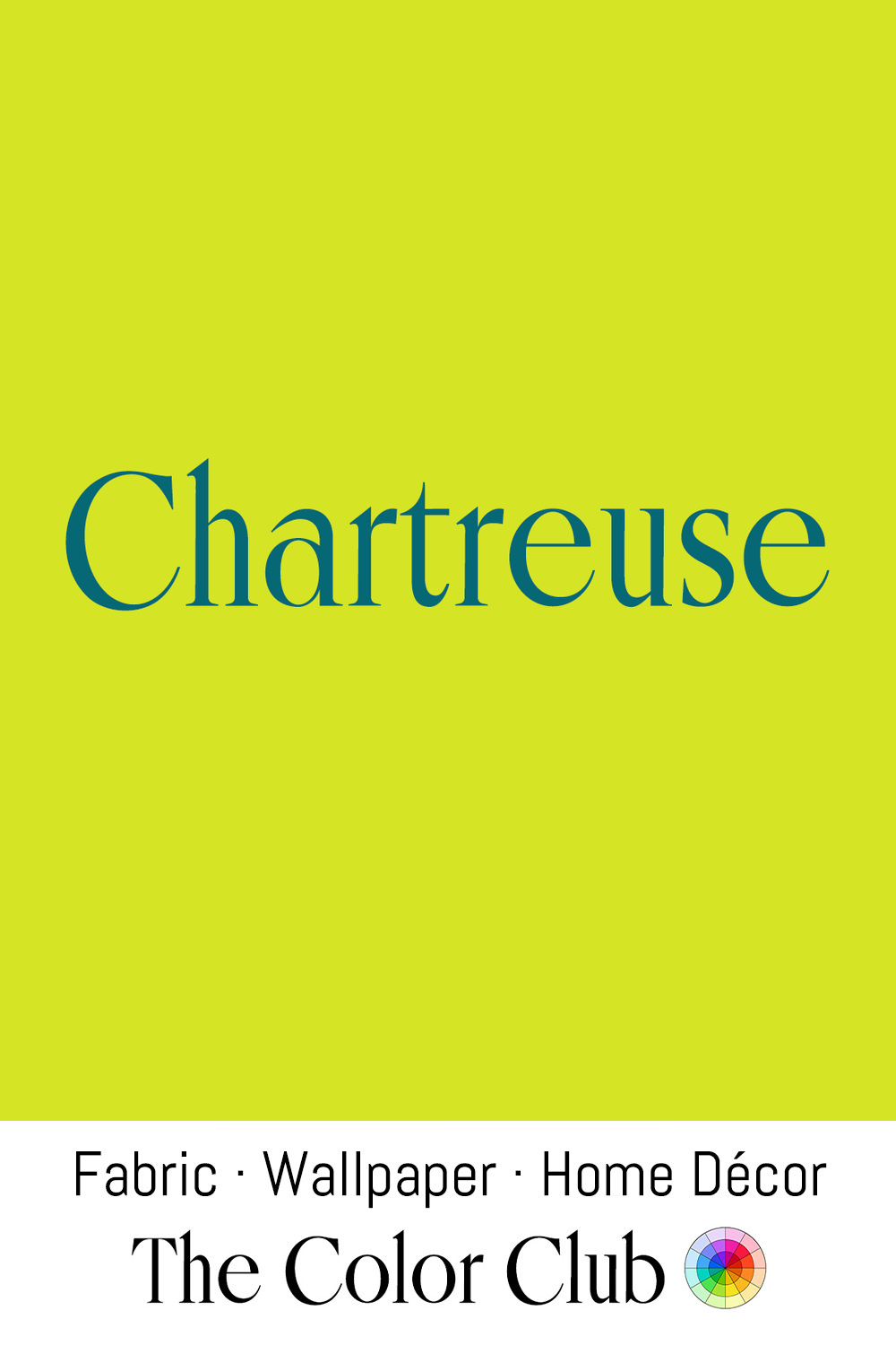
/ CHARTREUSE / bright, acidic yellow-green.
Carthusian monks at the Grande Chartreuse monastery finalized the secret herbal recipe for their French liqueur in 1737, and the color still carries its name. The original green Chartreuse derives its vivid hue from chlorophyll in the herbs, while the lighter Yellow Chartreuse, introduced later, takes its warmer tone from saffron.
During the 1950s and 1960s, Chartreuse became a defining shade of mid-century design, appearing on laminate countertops, textiles, and ceramics, including dinnerware glazed in Chartreuse from 1951 to 1959. Its intense yellow-green character reflected the era’s fascination with new synthetic pigments and bold palettes that brought a sense of energy and modernity into everyday interiors.
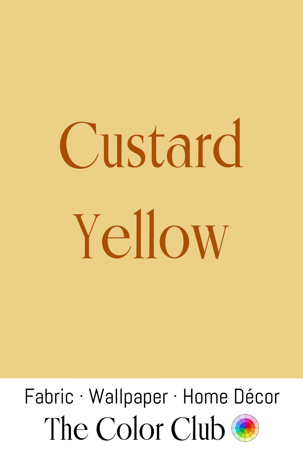
/ CUSTARD YELLOW / gently warm, golden, pale and creamy.
English chemist Alfred Bird invented eggless Custard powder in Birmingham in 1837 after his wife, who was allergic to eggs, needed an alternative to the traditional recipe. His blend of cornflour, flavoring, and coloring gave it a familiar pale yellow appearance, and it became a household staple that permanently linked the shade with comfort and nostalgia.
This soft, cheerful yellow remains closely associated with British domestic design, from vintage kitchens and seaside interiors to mid-century-inspired spaces. Its gentle warmth brings a sense of familiarity and optimism, recalling tearooms, coastal cottages, and the relaxed palettes of postwar homes.
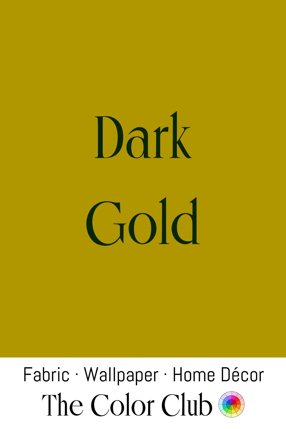
/ DARK GOLD / distinguished, richly saturated antique.
Across civilizations, Gold has symbolized power, wealth, and permanence, from the gold funerary mask of Egyptian pharaoh Tutankhamun to the gilded domes, religious objects, and royal interiors of later empires. Its enduring value comes from its rarity and resistance to tarnishing, making it a material associated with prestige.
This deeper, aged gold tone became a defining element of Art Deco design in the 1920s and 1930s, appearing in metalwork, lighting, and sculpture such as Paul Manship's gold-leafed Prometheus at New York's Rockefeller Center, unveiled in 1934. The same rich gold continues to represent old-world luxury, from architectural details to goldwork embroidery, a centuries-old textile tradition using metallic threads for ceremonial and decorative garments.
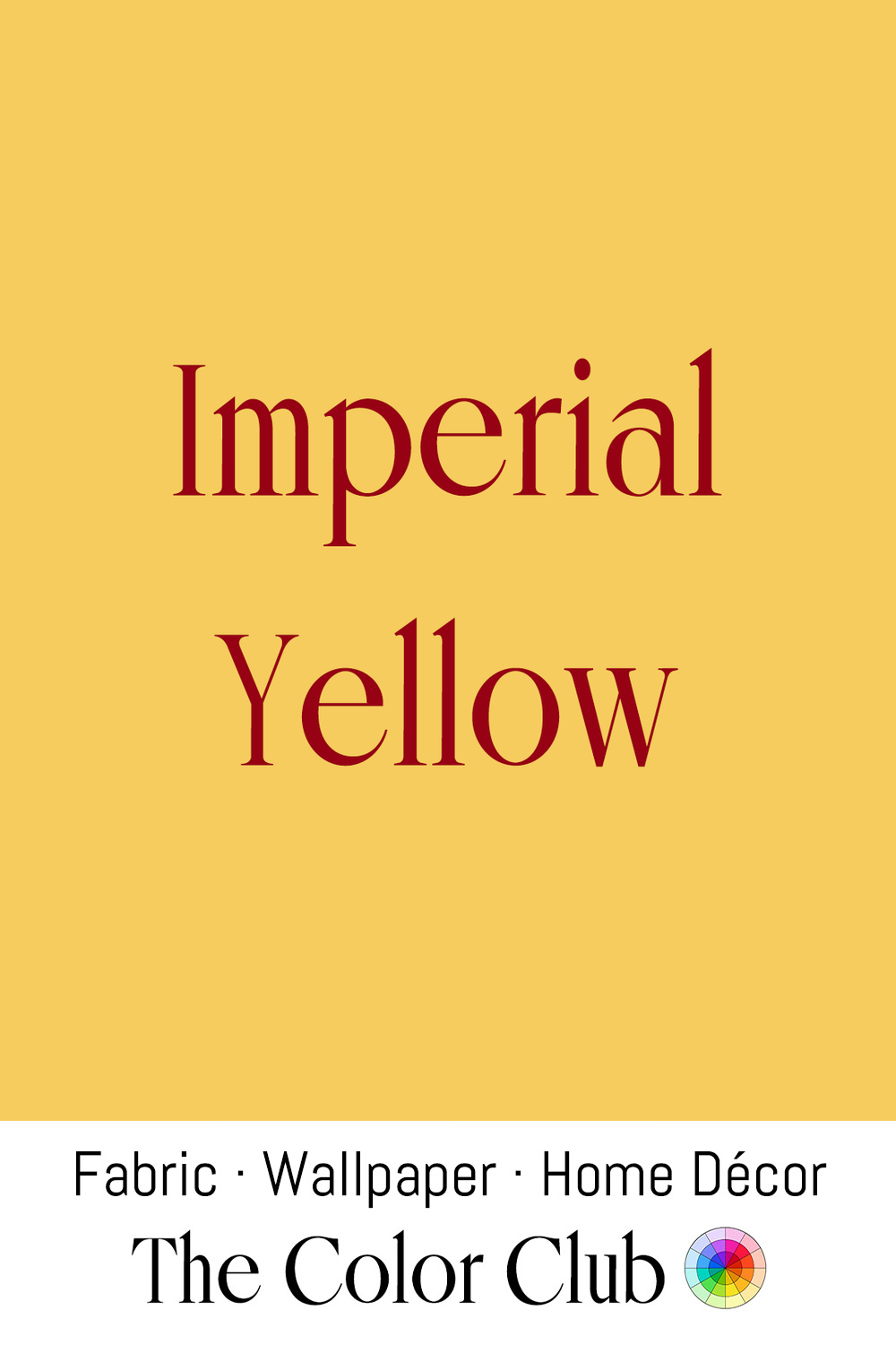
/ IMPERIAL YELLOW / luxuriously rich, warm and golden royal.
In China, bright yellow became associated with imperial authority during the Tang dynasty, when the color was linked to the throne. By the Qing dynasty (1644–1912), minghuang, or “bright yellow,” was reserved for the emperor and empress, appearing on dragon robes and the glazed roof tiles of imperial buildings.
In Beijing, the Forbidden City’s thousands of yellow roofs still define the palace complex. In 2015, Chinese couturier Guo Pei brought this imperial color to the global stage when her Imperial Yellow cape appeared at the Met Gala, held under the theme China: Through the Looking Glass.
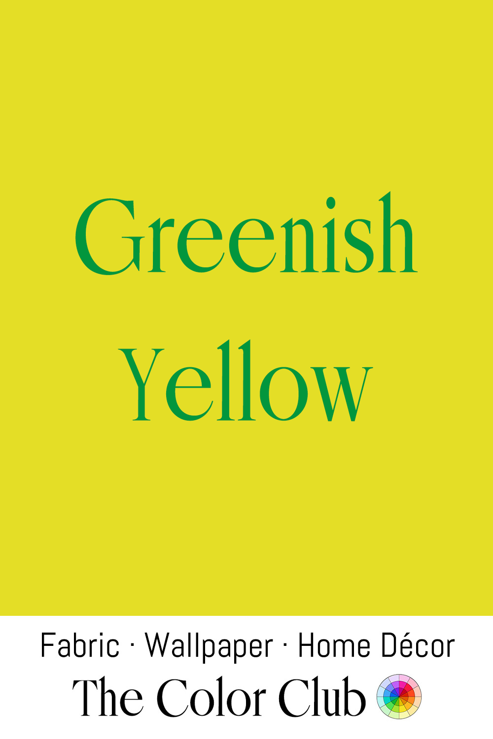
/ GREENISH YELLOW / vividly bright and sharply acidic.
This high-visibility yellow-green sits near the part of the spectrum the human eye detects most easily in daylight. That trait led to its adoption in safety applications worldwide, including vests, helmets, and emergency vehicle markings from the mid-20th century onward.
In the finale of Alexander McQueen’s Spring/Summer 1999 show, two industrial robots sprayed acid green and black paint onto a model’s white dress, a moment that fused craft and technology. The shade continues to appear in streetwear, sportswear, and graphic design for its futuristic, high-impact quality.
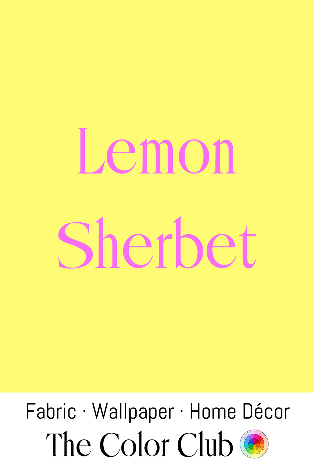
/ LEMON SHERBET / light, bright, zesty yellow with a citrusy flair.
Sherbet was originally a chilled, sweetened fruit-juice beverage served at Ottoman court ceremonies. The term traces back through Turkish şerbet and Persian sharbat to the Arabic word for “a drink.” European traders carried Sherbet westward in the 16th and 17th centuries, and Italians eventually froze it into sorbet.
The pale citrus yellow of Lemon Sherbet became closely linked with confectionery, packaging, and nostalgic food branding, particularly in Britain, where Lemon Sherbet sweets remain a familiar childhood treat. Today, this cheerful yellow continues to evoke freshness, playfulness, and retro-inspired design.
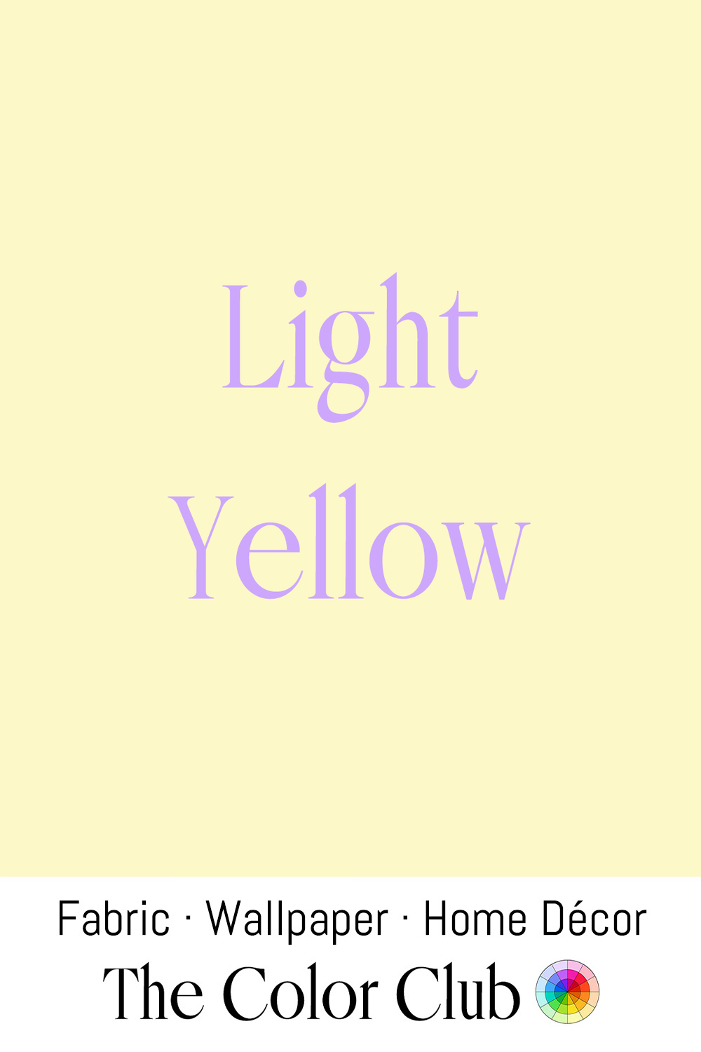
/ LIGHT YELLOW / pale, gentle, warm.
In the late 19th and early 20th centuries, babies were dressed in Light Yellow alongside pink, blue and white, before the modern division of pink for girls and blue for boys became firmly established.
Softer yellows have also long been useful in children's rooms because they provide lightness and warmth without any gendered associations.
The gender-neutral nursery is not a new invention, but it has recently become popular as parents move away from traditional color coding and toward more flexible, individual approaches to children's interiors.
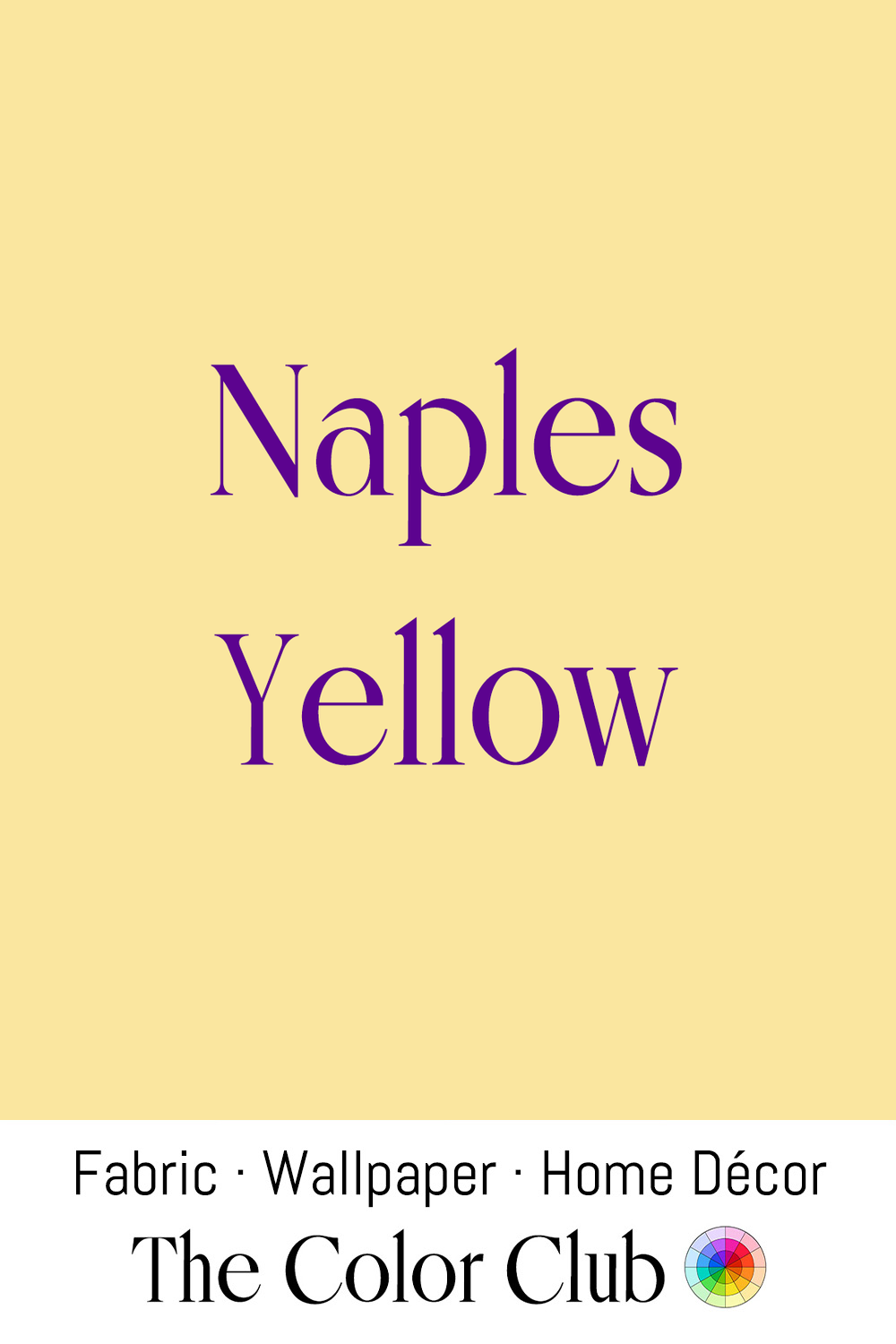
/ NAPLES YELLOW / warm, muted, soft golden hue.
Lead antimonate yellow, the pigment behind Naples Yellow, appeared in Egyptian and Mesopotamian glazed tiles and glass more than 3,000 years ago, making it one of the oldest synthetic colors known. It acquired its Italian name in the late 17th century, when writers wrongly linked its warm golden tone to the volcanic landscape around Naples.
Prized for its opacity and for luminous skin tones and highlights, Naples Yellow became a favorite of painters, Manet among them. The original lead-antimony formula has largely been replaced for safety reasons, and today's Naples Yellow is usually a blend of safer ingredients that recreates its historic warmth.
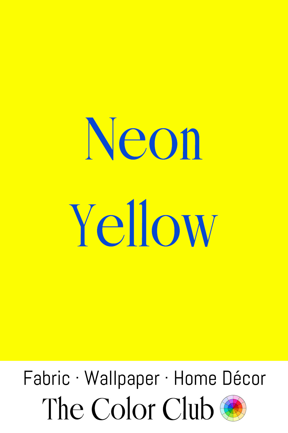
/ NEON YELLOW / electric and high-visibility.
High-visibility properties made Neon Yellow the standard for safety workwear and emergency signage from the 1960s, a use later written into regulations in many countries. Artists including Andy Warhol and Peter Max used it deliberately in the 1960s and '70s as an emblem of synthetic, mass-produced modernity, a shade born of industrial chemistry.
The color became closely associated with the technology, energy, and optimism of the late 20th century, appearing in 1980s fashion, sportswear, and graphic design, and Gianni Versace embraced fluorescent yellows in bold runway collections of the late 1980s and early 1990s. Today, Neon Yellow is found in streetwear, performance clothing, and contemporary interiors as an accent chosen for contrast, movement, and instant visual impact.
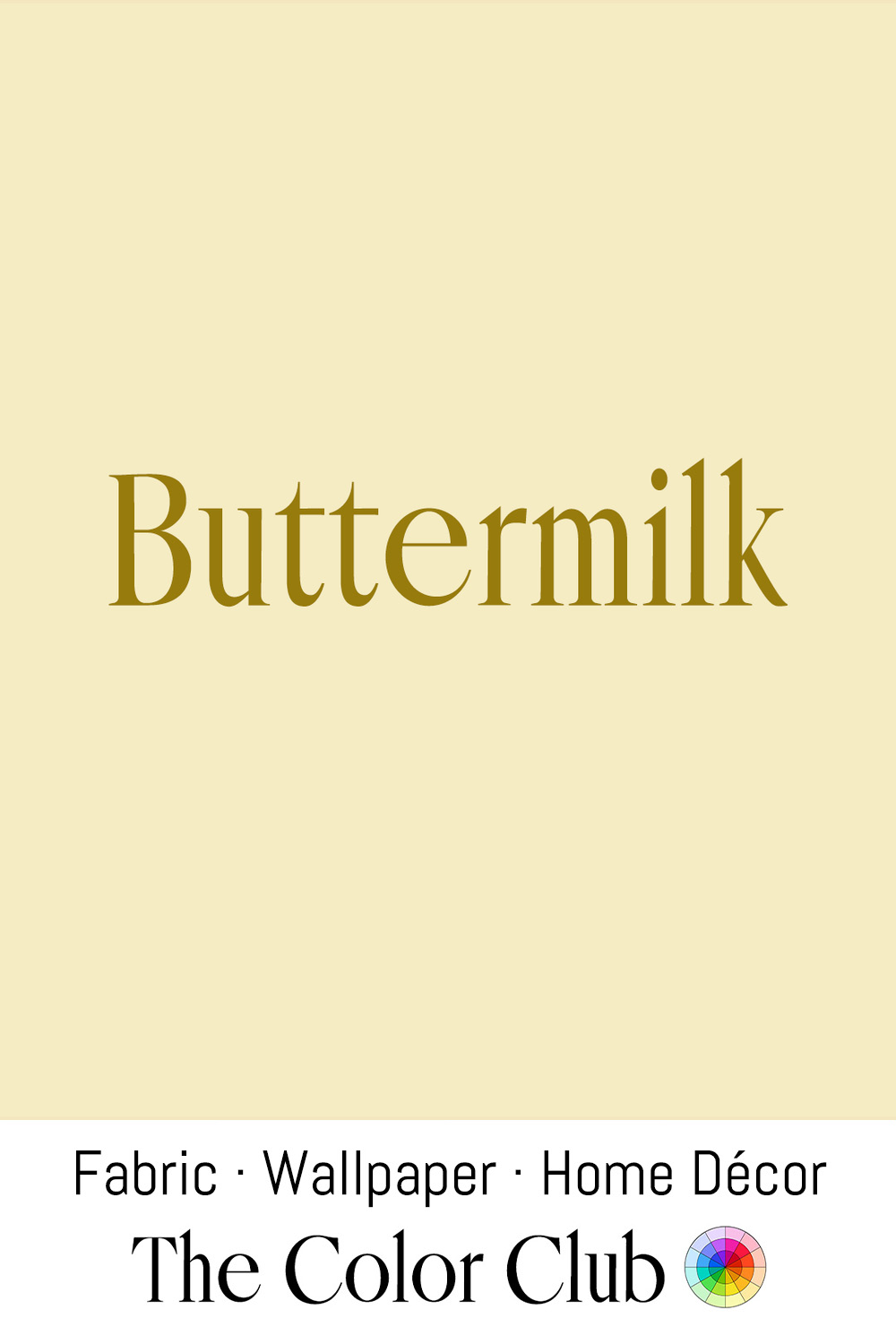
/ BUTTERMILK / deliciously pale, creamy springtime pastel.
From the 16th to the 18th century, linen from across northern Europe was sent to the bleaching fields around Haarlem, where it was soaked in lye, soured for days in buttermilk, and spread on the grass to whiten in the sun. In the late 1800s, a maker in Cwm, near St. Dogmaels in Pembrokeshire, stitched a bedcover with one side of rich cream cotton sateen, now documented as the Buttermilk Welsh Wholecloth Quilt.
In the early 1980s, Scottish designer Bill Gibb made a Buttermilk Silk Dress, now held by Aberdeen Art Gallery & Museums, for the Silk Council. Today this tone serves as a background foundation: it photographs softly in daylight and reads as nostalgic, sitting quietly behind everything else in a room.
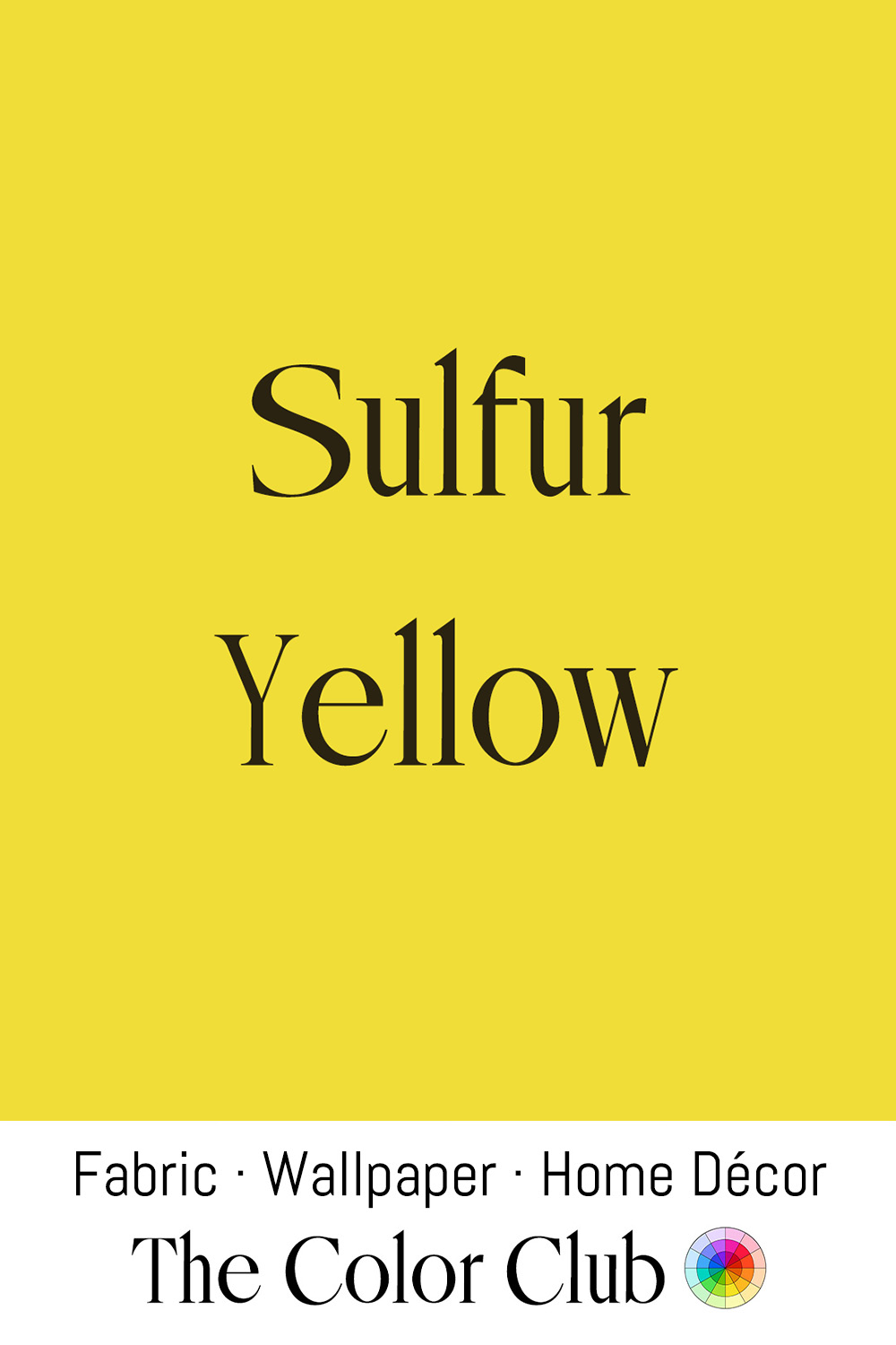
/ SULFUR YELLOW / golden warm and softly saturated.
Elemental Sulfur has long been associated in alchemy and folklore with volcanic fire and brimstone. In its common powdered form, natural Sulfur is a warm, muted yellow. In 1814, Werner's Nomenclature of Colours, the guide Charles Darwin later carried on the Beagle, listed Sulphur Yellow with the yellow parts of a large dragonfly and snapdragon blooms.
Mexican architect Luis Barragán came out of retirement to design Casa Gilardi in Mexico City, completed in 1977 as his last project. Its corridor, lit through narrow yellow-painted windows, bathes the passage in a golden haze on the way to the indoor pool, using color as pure atmosphere.
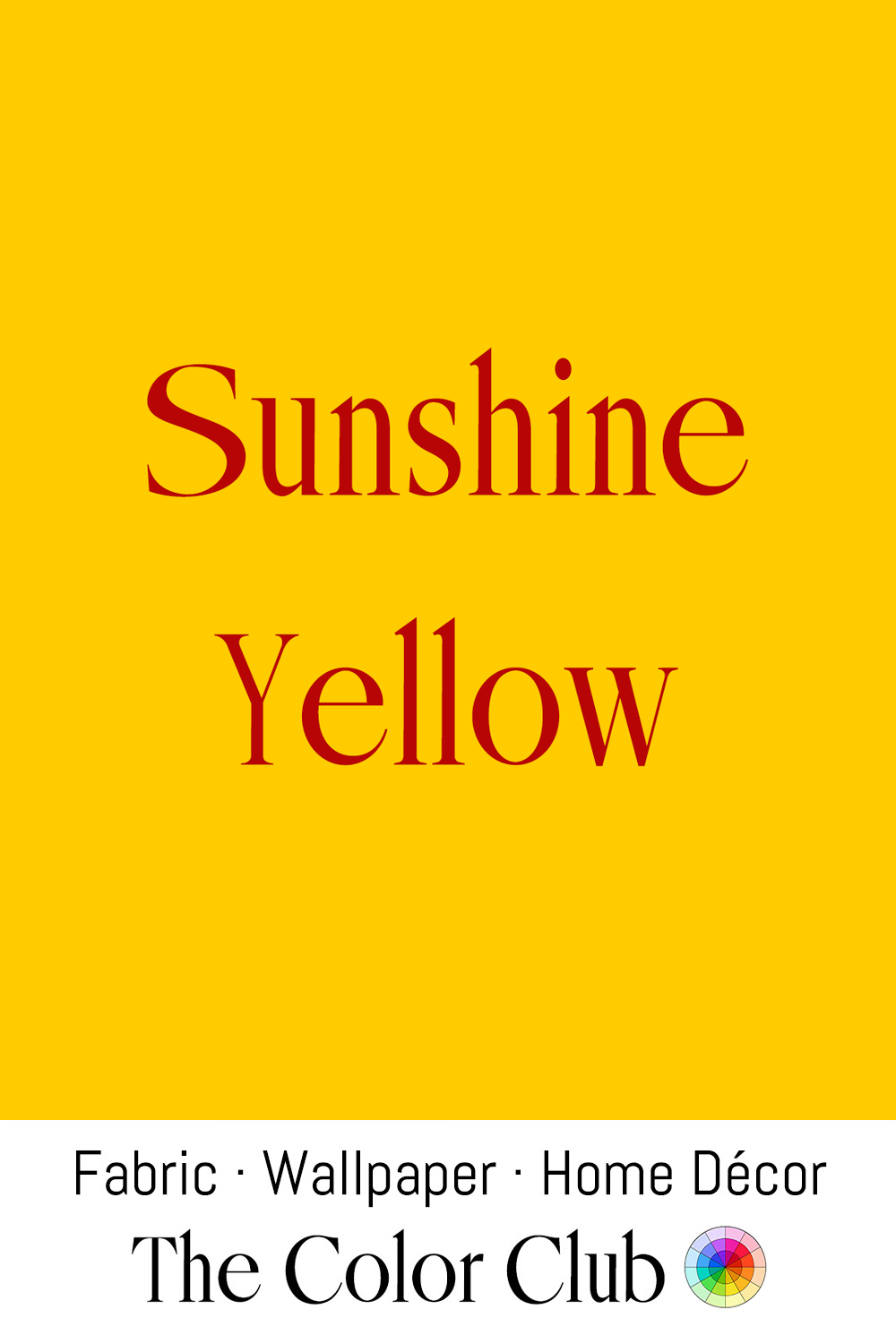
/ SUNSHINE YELLOW / bright, warm, bold.
Vincent van Gogh made this intense yellow central to some of his most celebrated works, painted from 1888, after his move to Arles. He relied on newly available chrome yellow pigments to capture the light of the south of France, producing some of the most recognizable uses of yellow in modern art.
India Mahdavi returns to rich, saturated yellows throughout her work: bright accents in the colorful rooms of Hôtel Thoumieux in Paris, yellow dining chairs at the Silver House above the Domaine du Muy sculpture park in Provence, and Sunshine Yellow satin sofas and armchairs in the Lili Boulanger room at Rome's Villa Medici.
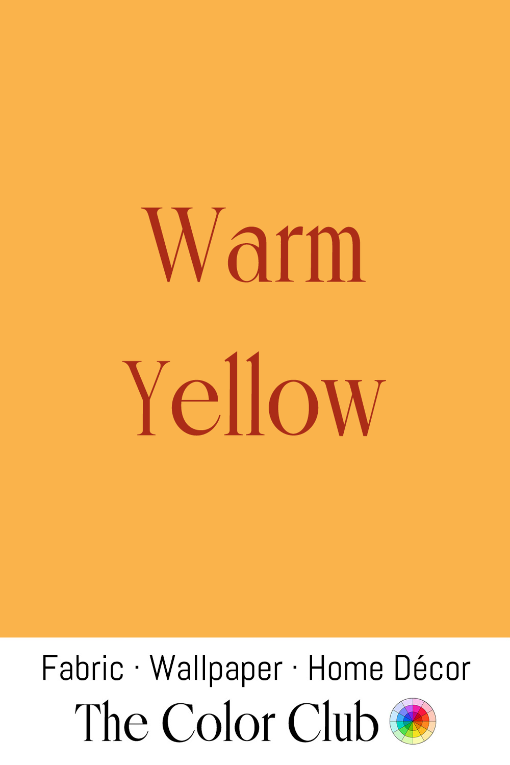
/ WARM YELLOW / golden rich sunlit glow.
Ripening wheat and harvest fields have long linked golden yellows with abundance and the changing light of the natural world. Between 1890 and 1891, Claude Monet painted some 25 canvases of the grainstacks near his home in Giverny, recording how the shifting warmth of daylight transformed them from morning to dusk and from summer into winter.
Since then, bright yellow has remained strongly associated with warmth, optimism, and energy. Its immediate visual impact has made it a recurring choice in branding, graphics, and product design for creating a sense of visibility, movement, and joy.
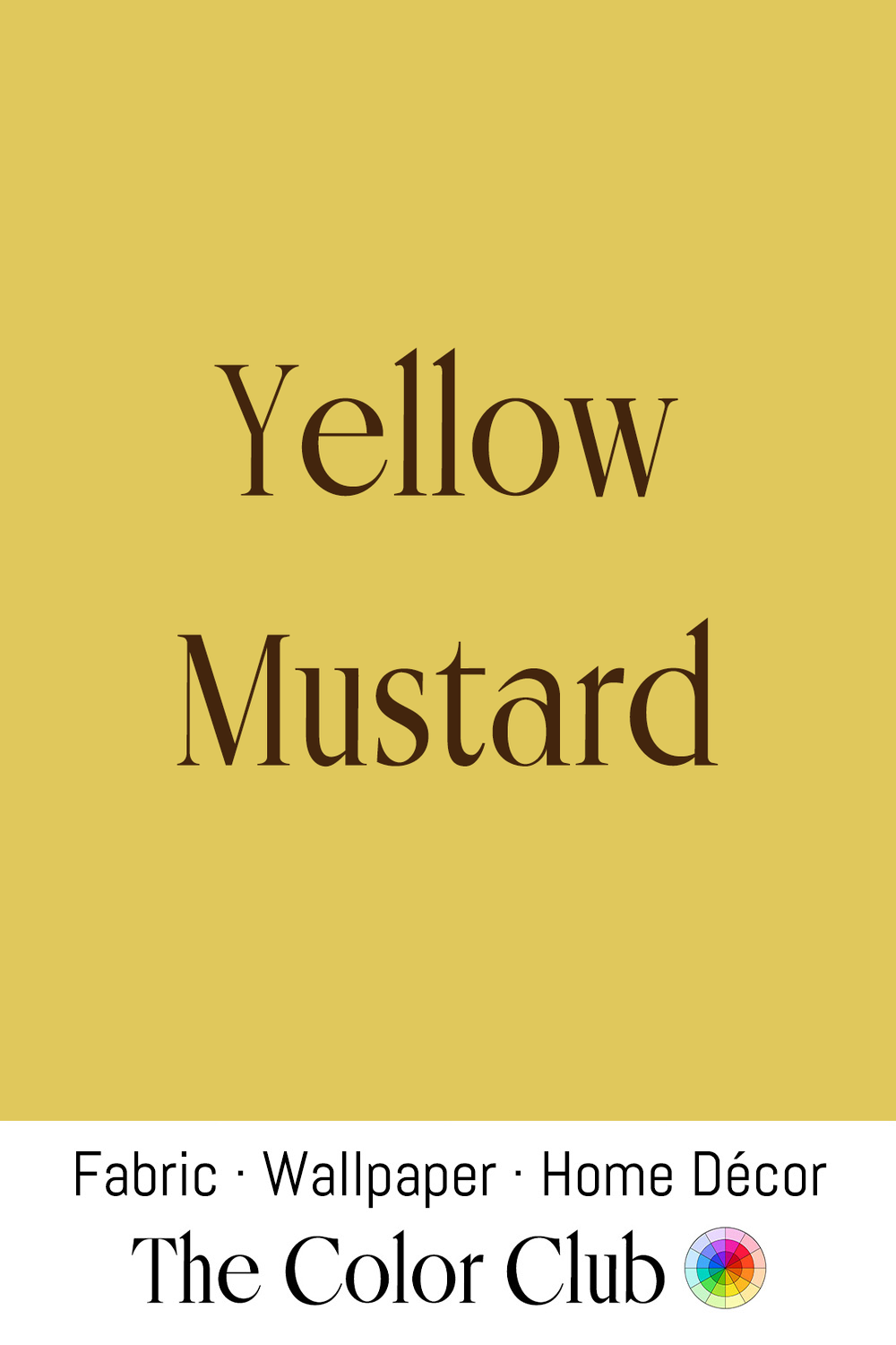
/ YELLOW MUSTARD / bright, warm, with a slightly acidic tinge.
Ancient Romans combined crushed Mustard seeds with vinegar to make one of the earliest known prepared mustards. The vivid yellow of modern Mustard comes from turmeric, added to intensify its now familiar golden shade.
During the 1960s and 1970s, when designers embraced earthy, saturated palettes, Yellow Mustard spread through fashion and interiors, from Emilio Pucci’s bold prints to 1970s knitwear and suede, velvet seating, ceramic tableware, and kitchen appliances. It has returned periodically in contemporary design, valued for its warmth, personality, and vintage-inspired richness.