

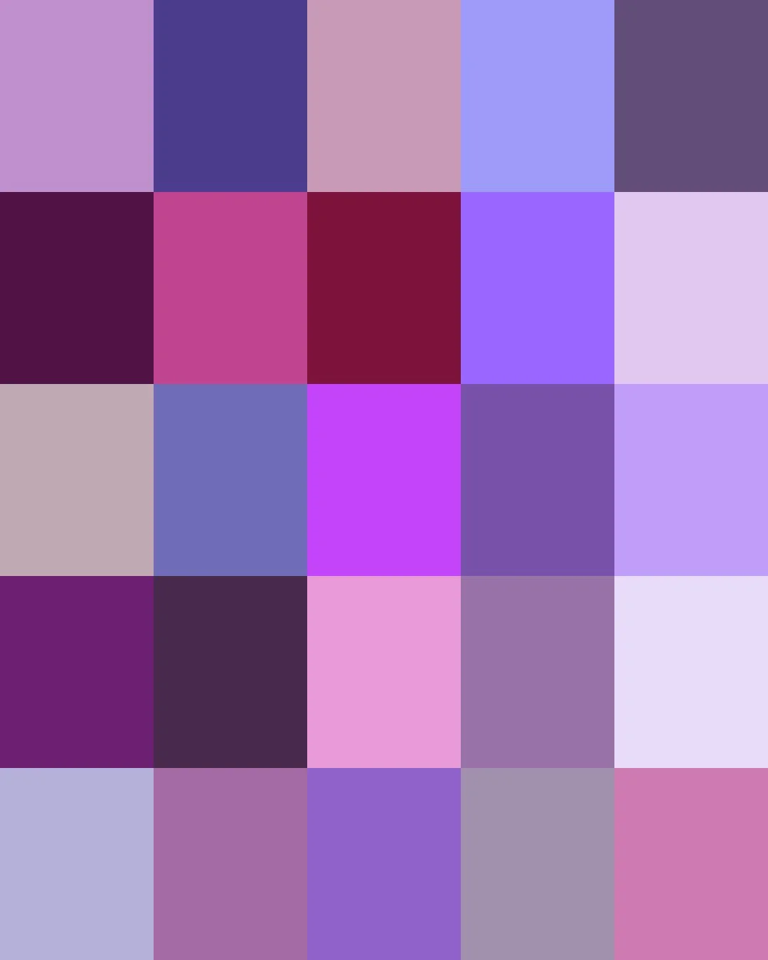
From ancient Phoenicia, where thousands of crushed murex sea snails yielded a single ounce of Tyrian purple, a dye so costly that only emperors and other elites could afford it, to England in 1856, when eighteen-year-old chemist William Perkin accidentally discovered mauveine, purple went from one of the rarest and most expensive colors of the ancient world to one of the easiest to produce.
Today's purples range from faint lilacs and lavenders, dusty mauves, and violet brights to the deep tones of plum and aubergine.
Here are the stories about some of our Purples. Clicking on a Color will take you to our Spoonflower shop where you can order it on 60+ types of Fabric, Wallpaper, and Home Décor Products.
Or, save your favorites to your Pinterest boards for later.
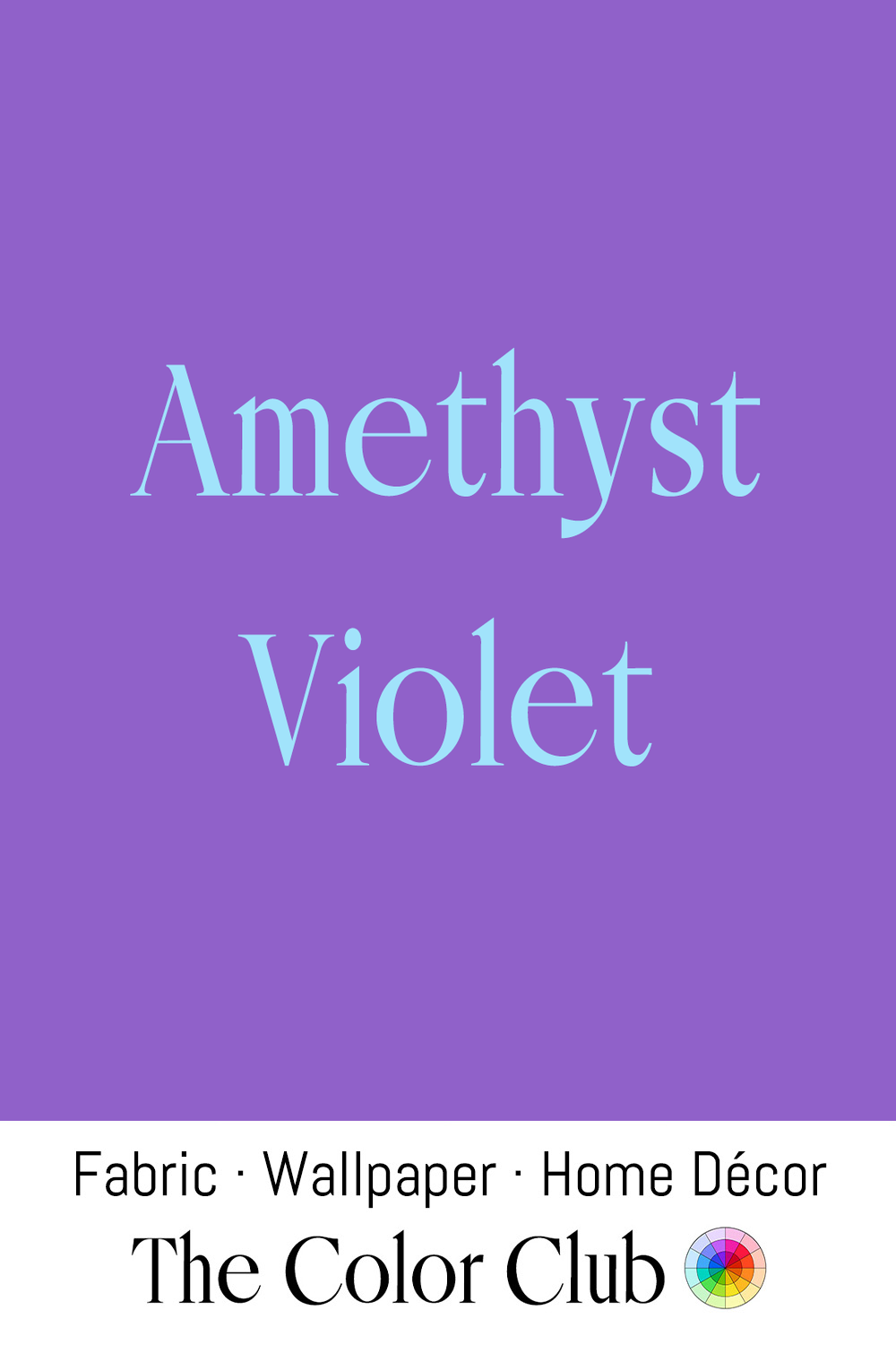
/ AMETHYST VIOLET / rich, saturated, cool jewel purple.
For most of history, Amethyst ranked among the five cardinal gems, valued alongside diamond, ruby, sapphire, and emerald, for the color of kings. Queen Charlotte of England owned a celebrated Amethyst bracelet in the second half of the eighteenth century, but the gem's fortunes collapsed almost overnight once massive deposits were discovered in Brazil in the 1800s, permanently crashing its price and turning what had been an imperial rarity into one of the most widely available gemstones on the market.
The rich purple is popular in quilting fabric and wall coverings, as a jewel-tone option for accent walls, and it remains a recurring choice for velvet upholstery on statement chairs and sofas.
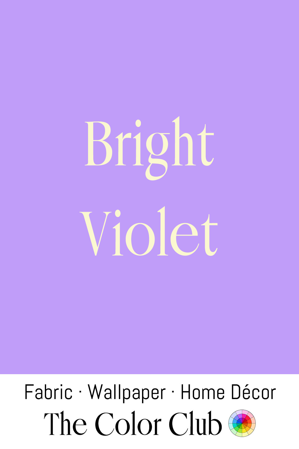
/ BRIGHT VIOLET / bold, saturated and very vivid purple.
Many spiritual traditions link violet to higher consciousness. In the modern Western chakra system, it is the color of Sahasrara, at the crown of the head, associated with transcendence and connection to the divine. In the early 1930s, American mystic Guy Ballard introduced the “violet flame,” an energy believed capable of clearing negativity, and went on to found the “I AM” Activity, one of the first major Ascended Master movements in the United States.
Today, Bright Violet turns up in wellness centers and yoga studios as a deliberate design choice for meditation-focused spaces, drawing on its association with Sahasrara and inner reflection.
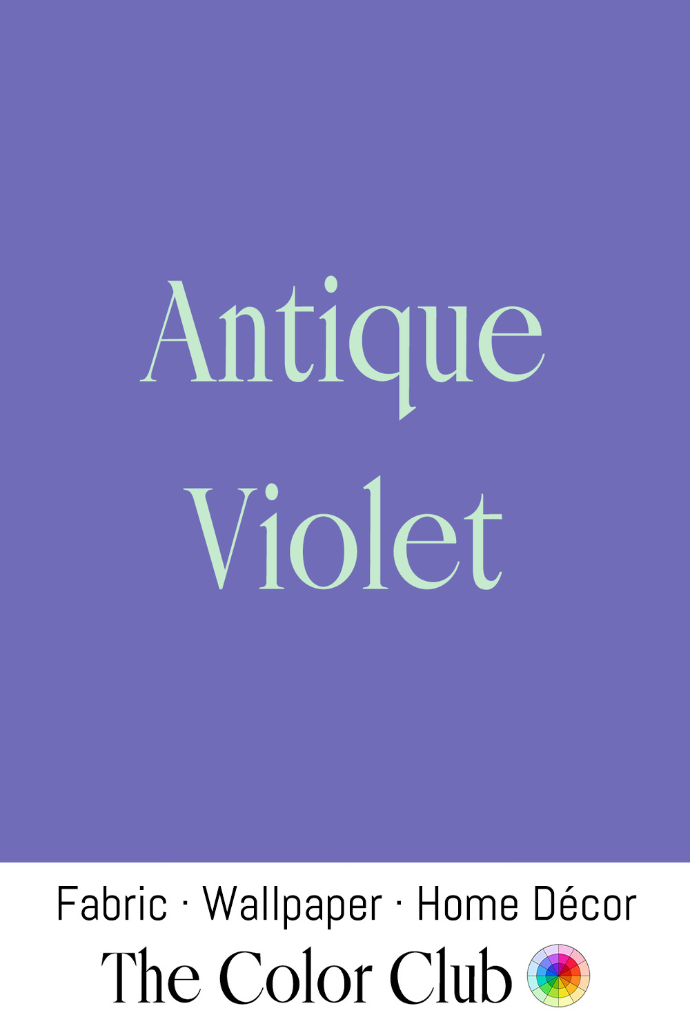
/ ANTIQUE VIOLET / muted, soft, dusty blue-purple.
Purple was historically among the most expensive dyes available, so faded, muted purples often resulted from garments and textiles that had simply aged and lightened over decades of wear and washing.
The same historic purple has become a signature of vintage and antique-inspired interior design, found in reproduction wallpaper and upholstery meant to evoke an old, inherited room.
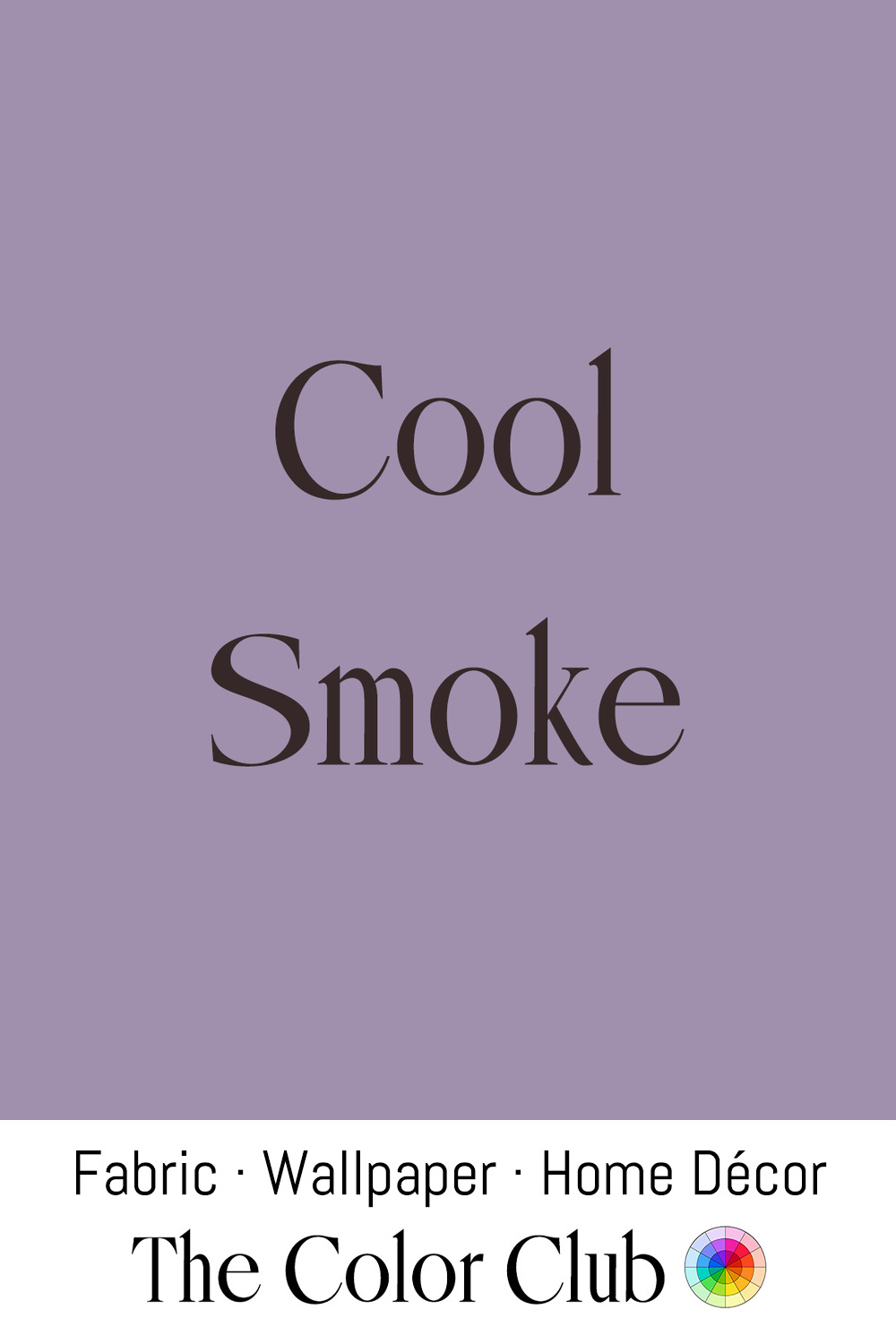
/ COOL SMOKE / dusky, hazy blue-violet-gray.
James McNeill Whistler painted “Variations in Violet and Green” in 1871, one of his London river scenes built around a cool violet palette. Whistler’s Thames nocturnes captured London’s industrial fog and coal Smoke as an aesthetic subject in its own right, turning the murky, violet-tinged air over the water into some of the era’s most influential atmospheric paintings.
The same dusty, smoke-toned violet has become a favorite of contemporary interior palettes, valued for reading as sophisticated and lived-in.
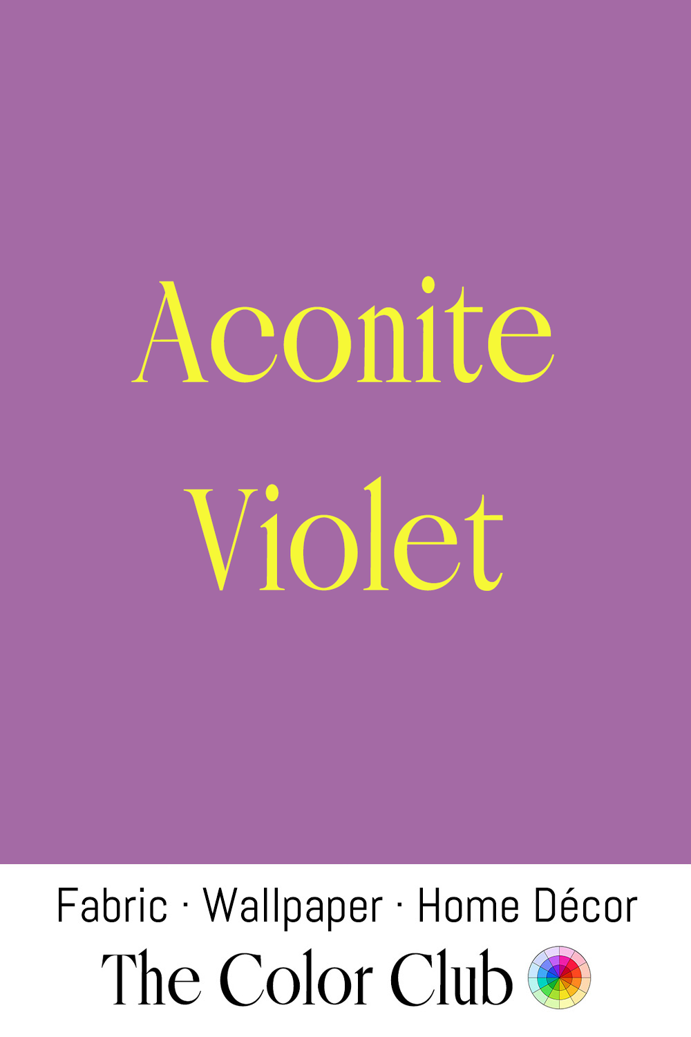
/ ACONITE VIOLET / cool, muted, floral purple.
Aconite, or monkshood, is a purple-flowered plant so toxic that ancient Greek and Roman writers described it being used to poison arrow tips and to execute prisoners, earning it the folk name 'wolfsbane' for its use against predators.
Despite its deadly reputation, Aconite's deep purple blooms have long been a favorite of cottage garden design.
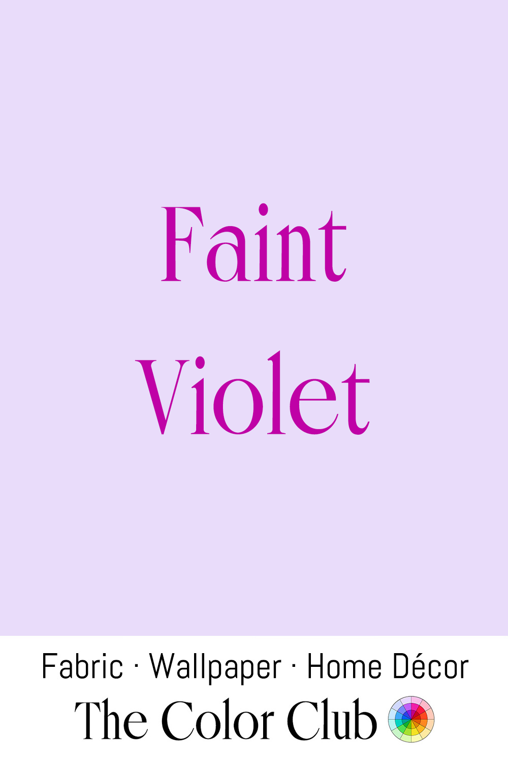
/ FAINT VIOLET / ethereal, soft and pale yet vivid purple.
Between 1818 and 1824, window glass shipped from England to Boston contained too much manganese oxide, and once installed in Beacon Hill townhouses, it slowly turned pale violet in the sun. What began as a manufacturing flaw became a status symbol, and the few original panes still in place draw visitors today.
This gentle, almost-white violet has become a favorite in romantic wedding palettes, valued for introducing a delicate whisper of purple. Bridal designers who offer gowns in lavender and violet tones aim at brides who want a colored dress with a softer, more traditional silhouette.
The shade also remains a staple of nursery design, often paired with grays and warm whites for a gender-neutral look. In quilting, Faint Violet appears among florals and blenders within spring-themed projects.
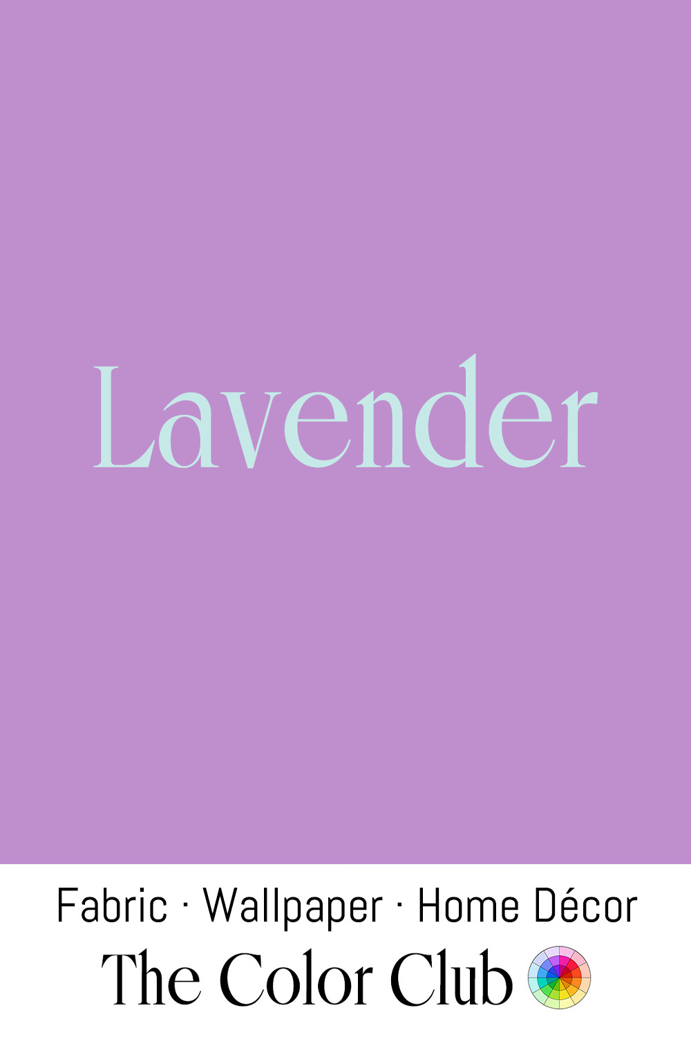
/ LAVENDER / soft and lyrical springtime purple.
Since ancient Rome, where it was prized for scenting bathwater, Lavender has been cultivated in the Mediterranean, and in the 19th century it became a defining crop of Provence, France, where vast purple fields still draw visitors every summer during the harvest season.
That association with Provence has made Lavender a signature color of French country and cottage-style interior design worldwide. The plant itself remains central to modern aromatherapy and perfumery, valued for a calming fragrance long claimed to aid sleep and relaxation. Lavender is also a classic choice for spring weddings and bridesmaid dresses.
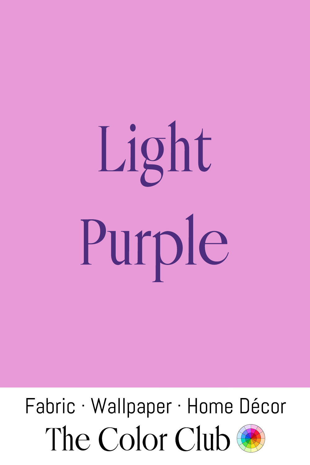
/ LIGHT PURPLE / bright, fresh, Easter spring pastel.
In his 1597 Herball, English botanist John Gerard renamed the purple passeflower the Pasque flower, noting that it opens around Easter time. Its petals were traditionally used to dye the season's eggs.
Pastels joined the holiday through its link with spring, and Light Purple remains one of its classic shades, seen in festive décor, Sunday best and table linens.
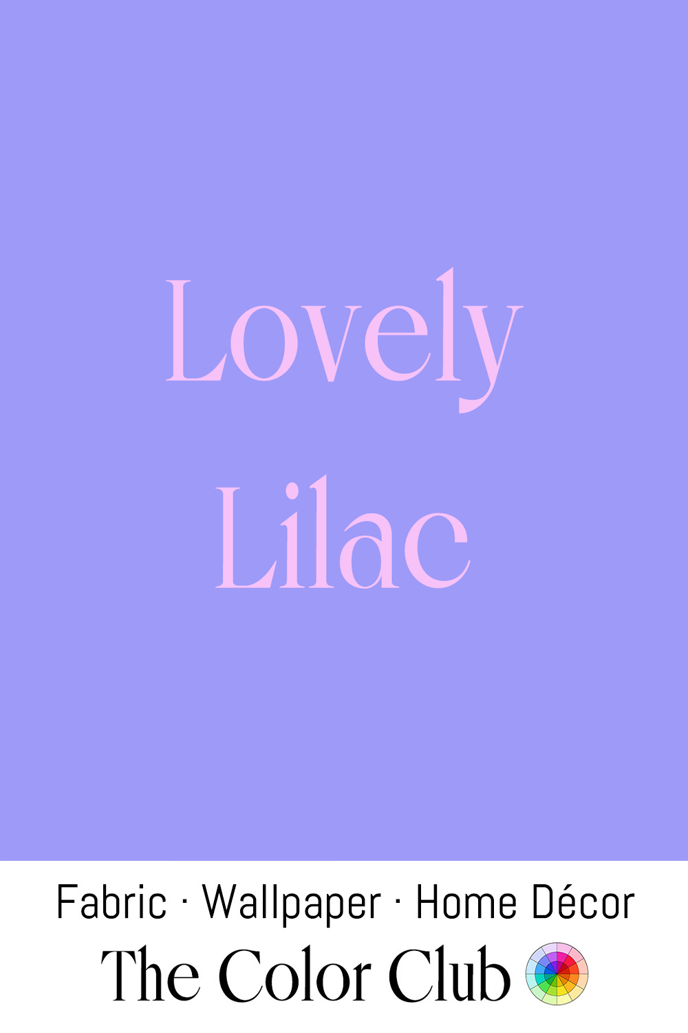
/ LOVELY LILAC / cool-toned, richly-saturated blue-violet.
Chemists first synthesized a cobalt-based purple pigment in 1859, and it quickly became a favorite of the Impressionists, who used it to capture shadows and light. Claude Monet relied on it for the Water Lilies he painted at Giverny, where he designed a garden around a lily pond crossed by a Japanese bridge hung with Lilac-hued wisteria, and in 1915 built a vast studio to create the series on a monumental scale.
Princess Diana wore a Lilac Versace skirt suit on June 17, 1997, for her anti-landmines speech at the Red Cross headquarters in Washington, D.C.
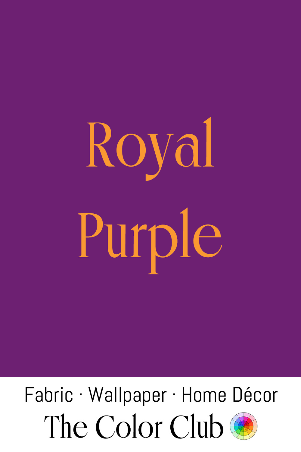
/ ROYAL PURPLE / deep, rich, formal - heritage revival.
Queen Elizabeth I's sumptuary laws, in force through the Elizabethan era from 1558 to 1603, restricted purple clothing to the immediate royal family alone. That exclusivity carried directly into British royal ceremony: King Charles III wore a purple silk velvet Robe of Estate at his 2023 coronation, the same robe his grandfather King George VI wore in 1937, conserved for the occasion by Ede and Ravenscroft, London tailors operating since 1689.
That imperial association extends into graduation regalia, luxury branding, and formal design today, still the standard shorthand whenever a project wants to signal authority and prestige.
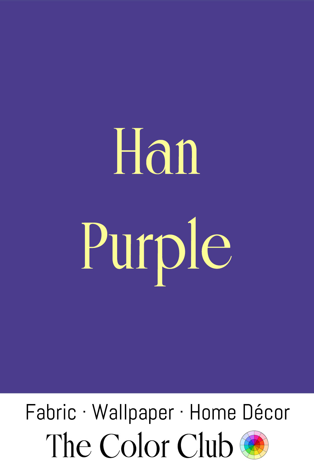
/ HAN PURPLE / cool and dark with a blue undertone.
Chemically barium copper silicate, Han Purple is one of the earliest synthetic pigments ever made, produced in China from at least the 8th century BCE. Traces survive on Emperor Qin Shi Huang’s Terracotta Army, made around 210 BCE and unearthed near Xi’an in 1974.
Han Purple later fell out of use and was identified again only in 1992.
In 2006, physicists at Stanford, Los Alamos and the University of Tokyo reported in the journal Nature that Han Purple, chilled near absolute zero in a powerful magnetic field, behaves as if it had lost a dimension, a discovery that brought the ancient color into modern quantum research.
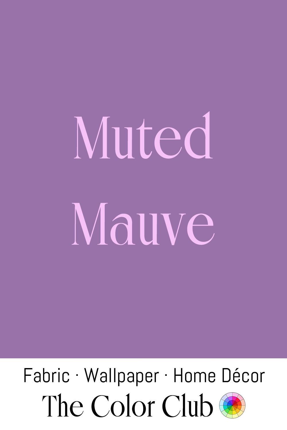
/ MUTED MAUVE / soft, grayish pink-purple - faded vintage.
Mauve was such a fashion sensation in Victorian society that Punch magazine coined the term 'mauve measles' to mock its sudden ubiquity. This soft, grayish purple-pink remains a favorite neutral in contemporary interiors, adding warmth to gray schemes.
Carry the same shade across our 60+ fabric and wallpaper types, with matching bedding and curtains. Eco-printed in the USA — free shipping worldwide.
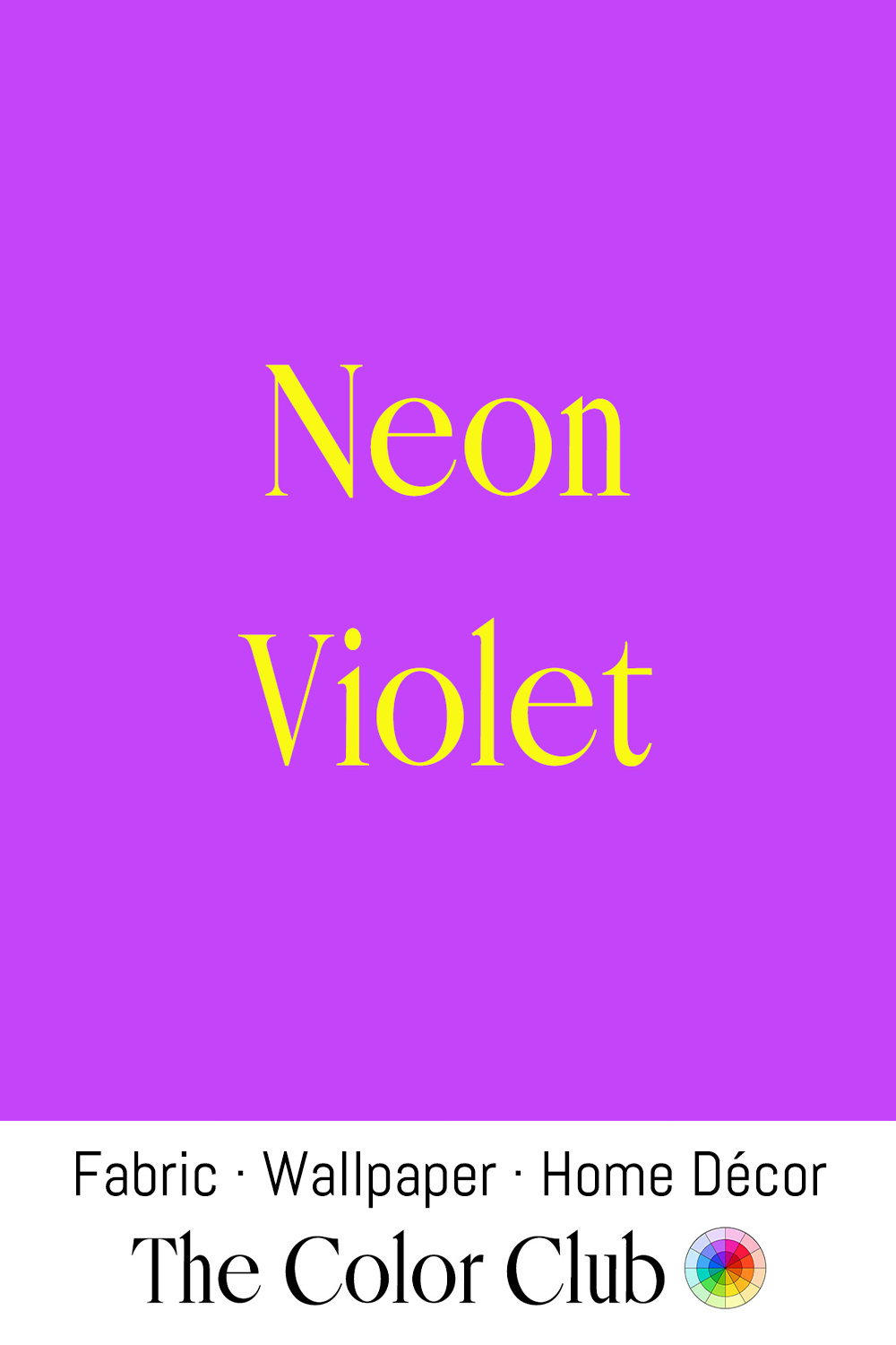
/ NEON VIOLET / 1980s hot pinkish retro.
Brothers Bob and Joe Switzer of Berkeley, California began experimenting in the 1930s with compounds that glowed under black light, eventually mixing their discoveries with shellac to create the first fluorescent paints. The U.S. military adopted them during World War II, helping pilots make night landings on aircraft carriers. In 1946 the Switzers founded Day-Glo Color Corp.
From the late 1980s onward, neon violet became a defining tone of rave culture, its glow under UV blacklight a natural fit for clubs and warehouse events across the UK and Europe. That association has carried the energy of electronic music into fashion and graphic design ever since.
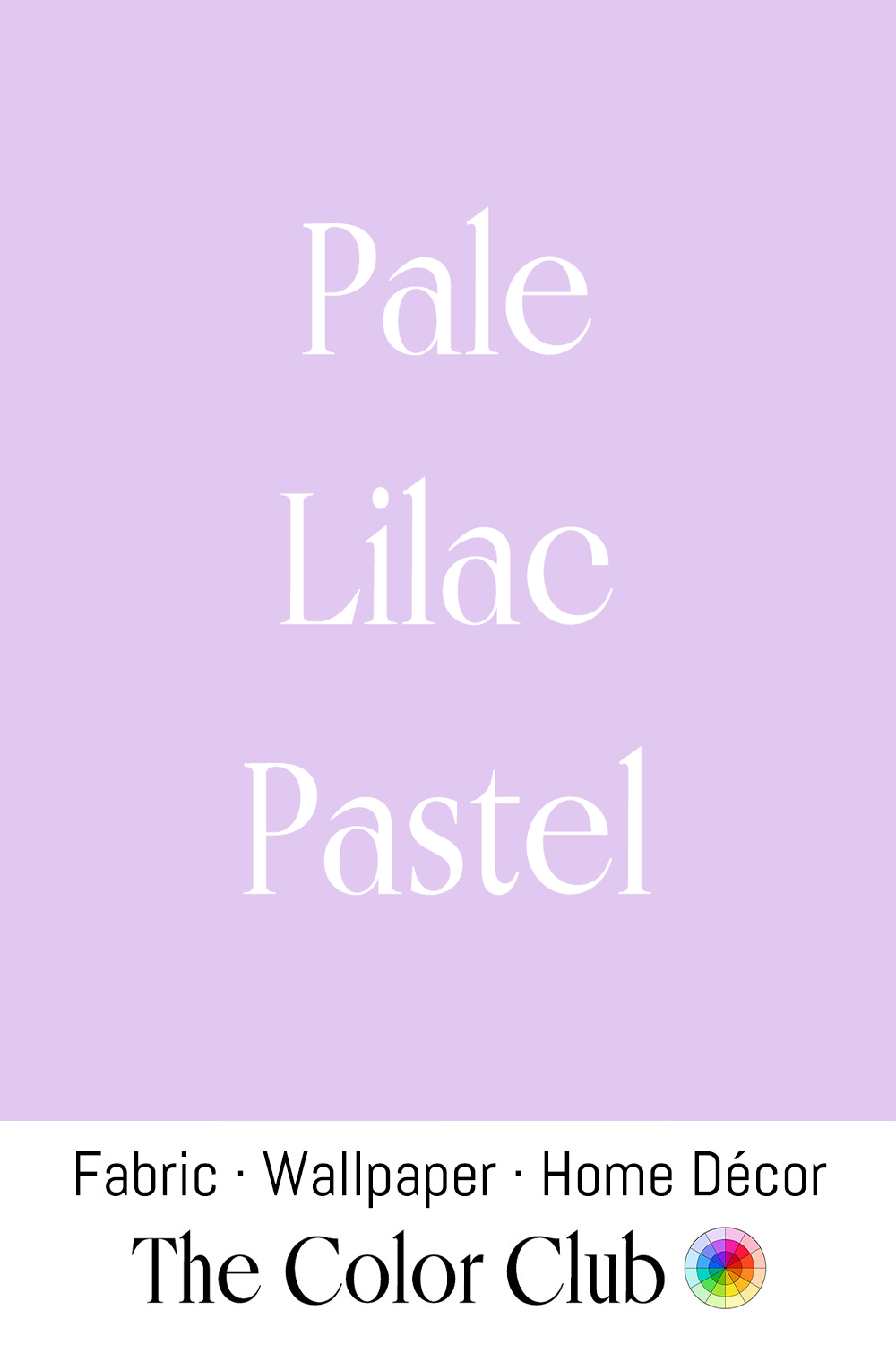
/ PALE LILAC PASTEL / delicate pinkish lavender with a powdery touch.
Sweet peas became the best-loved bloom of the late Victorian and Edwardian eras after Scottish gardener Henry Eckford bred them into a wide range of colors, Pale Lilacs among them. In 1900, an exhibition at London's Crystal Palace marked two hundred years since their arrival in Britain.
This soft, balanced purple has become a popular choice in modern gender-neutral nursery and children's design, valued precisely because it sits between pink and blue.
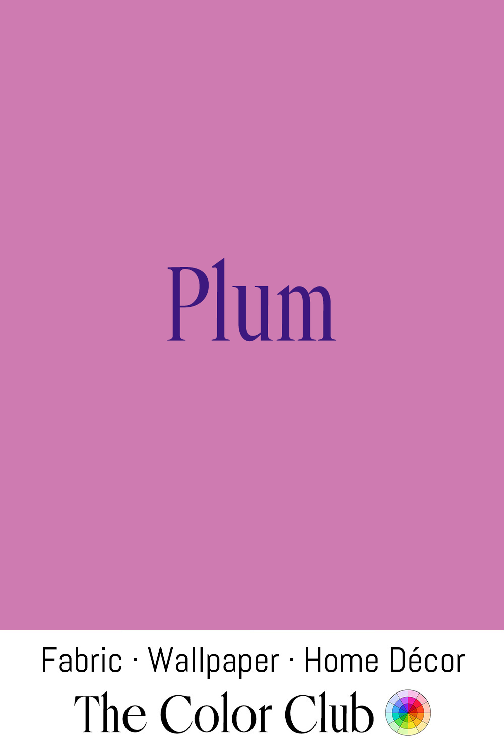
/ PLUM/ rich, fruity juicy, reddish purple.
Roman general Pompey the Great is credited with introducing cultivated Plum trees to Rome around 65 BCE, and by 77 CE the naturalist Pliny the Elder wrote of "an enormous crowd of plums" in his Natural History. The fruit's deep purple-red skin gave English speakers a color name for this tone well before synthetic purple dyes existed.
In traditional Amish quiltmaking, Plum has long been a favored jewel tone, chosen alongside burgundy, emerald green, and navy blue as a solid fabric set against dark backgrounds in the craft's classic geometric patterns.
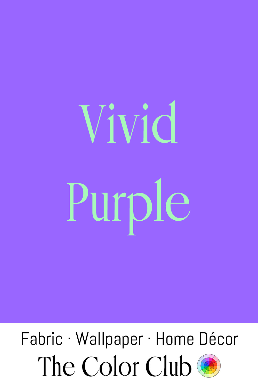
/ VIVID PURPLE / extremely bold and richly saturated.
German chemist August Wilhelm von Hofmann patented a family of intensely saturated blue-to-violet synthetic dyes in 1863, produced by substituting alkyl groups into the dye rosaniline. Valued for their brightness, Hofmann's purples became popular in Victorian textiles and inks.
The color has become a favorite of maximalist fashion and branding design in recent years, prized for a boldness that instantly reads as modern and electric.