

White Color Stories
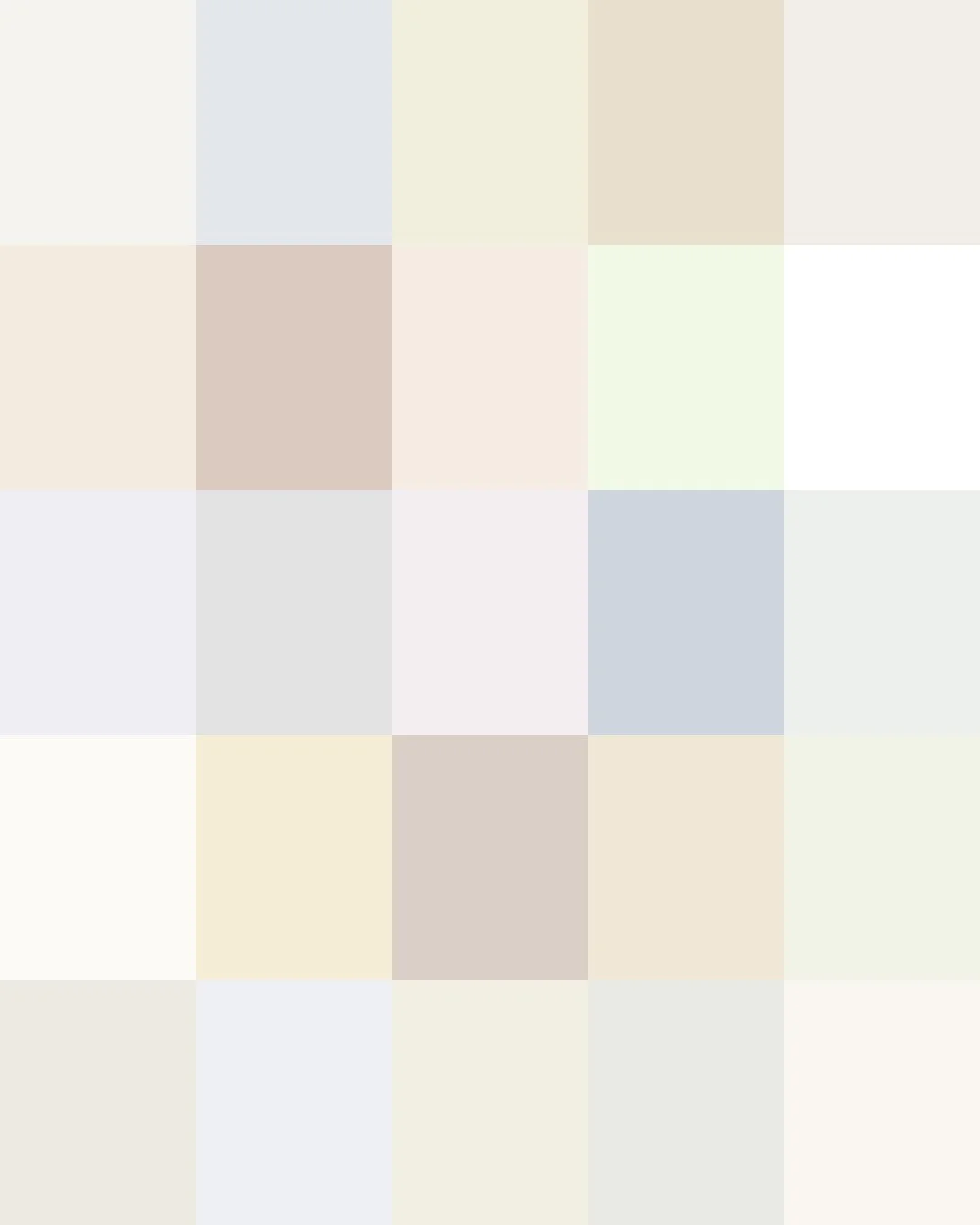
From ancient India, where the white-clad Jain monks and nuns adopted simple white robes as a mark of purity and renunciation, to Elizabeth I's Tudor court, where ceruse, a lead-based white powder, became the mark of aristocratic beauty despite slowly poisoning its wearers, white has carried both sanctity and vanity through time.
The invention of safe, brilliant white titanium white in the early twentieth century replaced lead-based pigments in paints and cosmetics. Today's whites range from warm ivories and chalky bone, soft linens, and cool porcelains to the crisp tones of paper and snow.
Here are the stories about some of those Whites in our Collections.
We print all of them on demand for you.
Clicking on a Color will take you to our Spoonflower shop where you can order it on 60+ types of Fabric, Wallpaper, and Home Décor Products.
Or, save your favorites to your Pinterest boards for later.
TIP: Order swatches first to check how light colors print on your chosen material’s undertone.
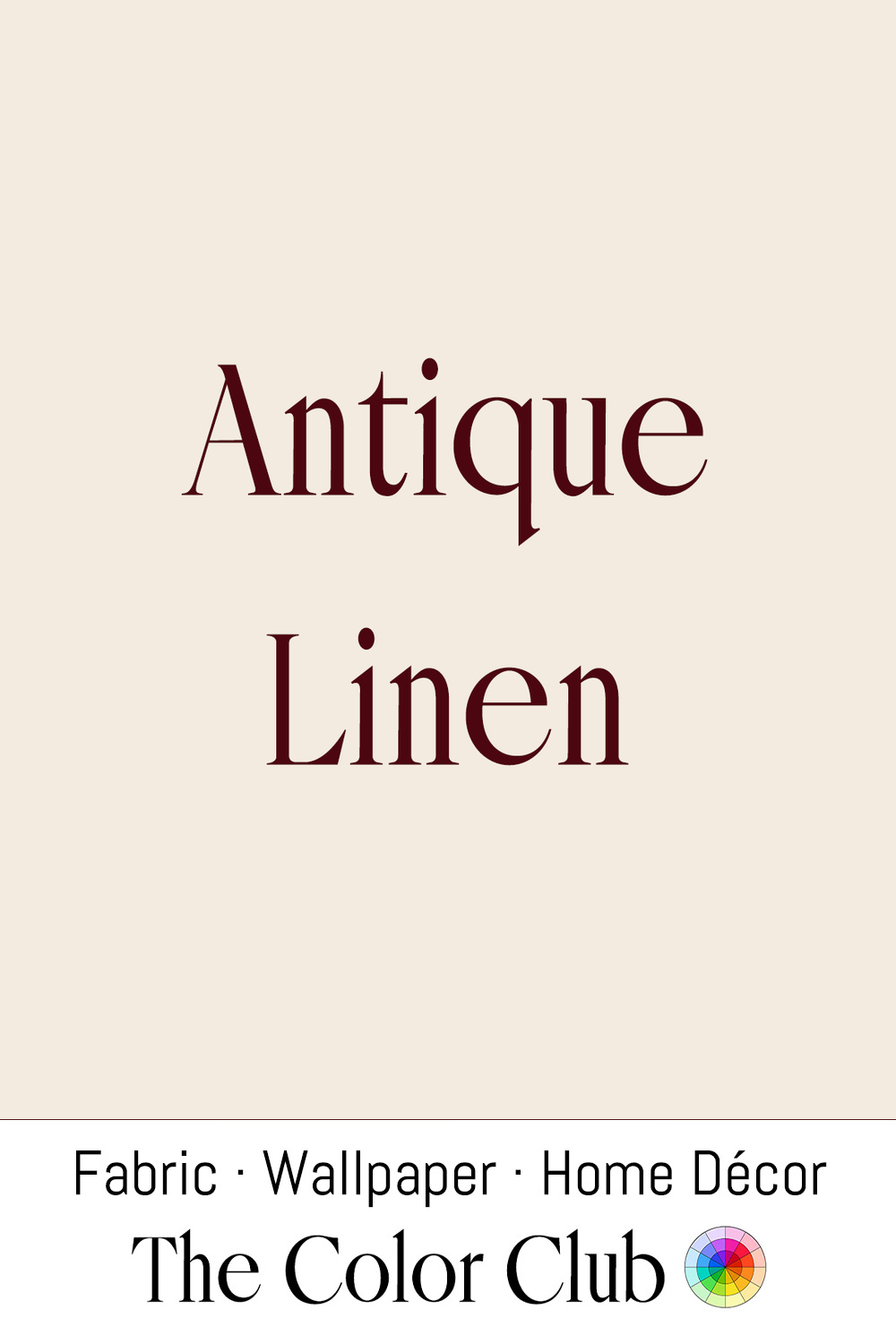
/ ANTIQUE LINEN / warm, mellow, ivory-white with the soft tone of aged flax.
Flax, the plant fiber linen is woven from, has been used by humans for an extraordinarily long time — spun, dyed, and knotted flax fibers recovered from Dzudzuana Cave in the Republic of Georgia date back roughly 30,000 to 34,000 years, making flax one of the oldest fibers ever put to use, long before woven linen cloth itself appears in the archaeological record. Naturally undyed linen begins as a soft ivory and gradually deepens with age, washing, and exposure to light, developing the warm tone associated with antique household linens.
Today, Antique Linen remains a cornerstone of natural-material interiors, particularly in the Belgian and Scandinavian traditions. Designers such as Ilse Crawford frequently work with similarly aged linen tones to create spaces that feel understated, tactile, and lived-in, celebrating the beauty of natural fibers left in their imperfect, honest state.
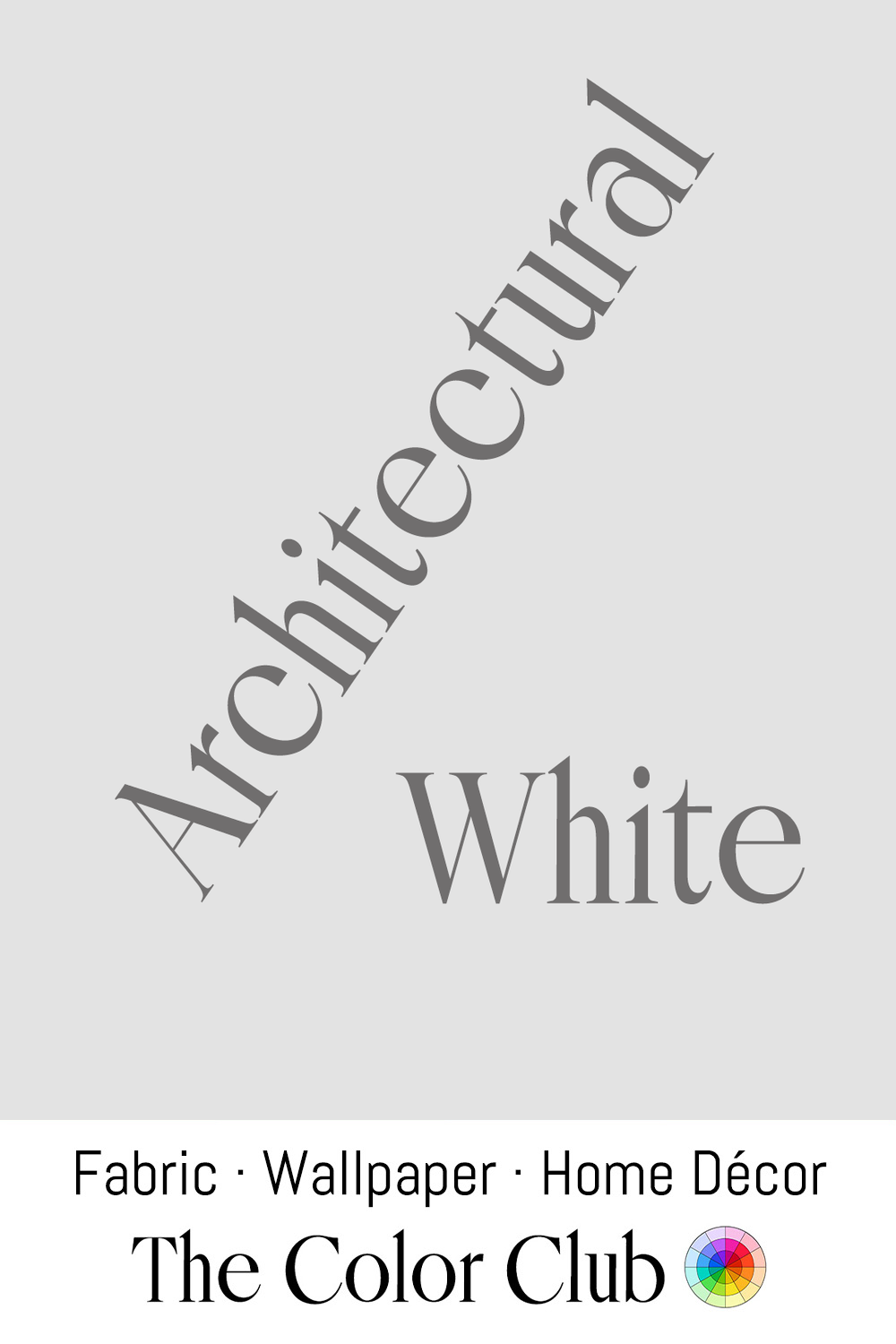
/ ARCHITECTURAL WHITE / crisp and minimal, perfectly neutral.
Swiss-French architect Le Corbusier championed plain white walls as a foundational element of modernist architecture in the 1920s, arguing in his 1925 essay collection that whitewashing a home was a moral act of clarity and honesty, stripping away ornament to reveal pure form.
That modernist ideal shaped 20th-century architecture worldwide, and this neutral white remains the default backdrop of contemporary galleries, minimalist homes, and architectural photography, still valued for the same clarity Le Corbusier championed a century ago.
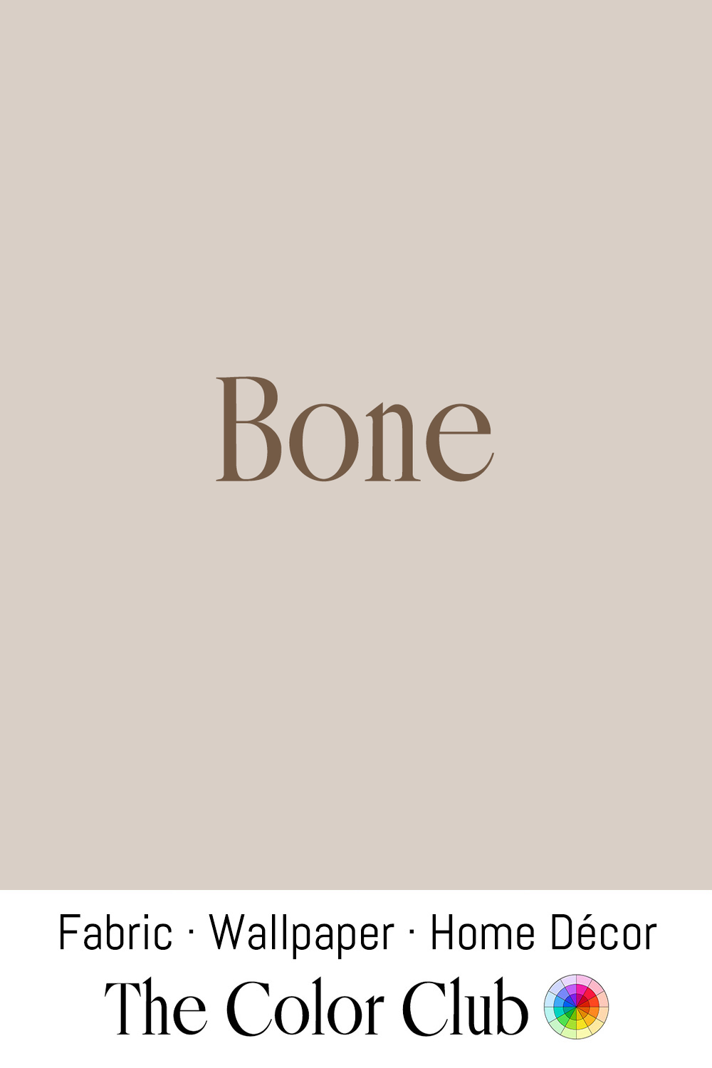
/ BONE / soft, warm, organic and muted beige.
The color takes its name directly from the pale, weathered tone of bleached animal bone left out in the sun for years, a natural process that has long made bone and ivory reference points for describing a particular soft, muted off-white.
Bone became a defining neutral of late-20th-century minimalism, replacing stark white with warmer, more natural palettes. Designers working in the wabi-sabi tradition, such as Axel Vervoordt, favor lime plaster in this same range of muted, weathered neutrals, pairing it with linen and stone to build quietly layered interiors around natural materials and subtle tonal variation. The same understated shade remains a favorite among ceramicists, where bone-colored clays and glazes provide a calm, textural backdrop that lets form speak for itself.
/ CANNOLI CREAM / soft milky white - pale warm neutral.
Cannoli originated in Sicily, likely during Arab rule of the island between the 9th and 11th centuries, with the fried pastry shell and sweetened ricotta filling evolving into the dessert now closely associated with Sicilian and Italian-American baking traditions.
This warm, creamy white has become a defining neutral in Mediterranean-inspired interiors, where it echoes the tones of limestone, lime plaster, and sunlit stucco found across southern Italy. In contemporary design, architects such as Vincent Van Duysen frequently work with similarly warm off-whites, pairing them with natural oak, travertine, and linen to create interiors that feel understated, tactile, and quietly luxurious.
/ CHALK WHITE / soft, warm finish with a subtle beige undertone.
Chalk takes its name from the natural limestone formed from the accumulated remains of microscopic marine organisms over millions of years. Used since antiquity as a writing material, building substance, and pigment, chalk's pale warm white became one of the earliest references for describing soft, natural whites. Ground chalk was also historically used as a base in artists' grounds and gesso, creating the smooth pale surfaces beneath painted works.
For centuries, chalk-based distemper, a simple wash of ground chalk, water, and glue size, was the standard interior finish across European homes, prized for its soft, breathable, matte texture, right up until oil-based paints became widely affordable in the 19th century. In contemporary interiors, Chalk White appears in limewash walls, plaster finishes, ceramics, and natural textiles, where its warm undertone creates spaces with a quiet, handcrafted feel. Its softness makes it especially suited to rooms built around stone, wood, linen, and other organic materials.
/ COTTON BLOOM / soft and warm natural white.
Cotton has been cultivated and spun into cloth for thousands of years, with archaeological evidence from the Indus Valley civilization showing cotton textile production more than 5,000 years ago. The plant’s soft white boll gave the fiber its name and created one of the most familiar natural whites in the textile world.
Cotton Bloom reflects the enduring influence of natural fibers in fashion and interiors. From the white cotton garments to the continued use of unbleached and natural cotton in contemporary textile design, this soft white represents comfort, simplicity, and the beauty of everyday materials. Unlike synthetic whites, it retains a warmth that feels relaxed, familiar, and timeless.
/ ZERO PIGMENT WHITE / pure and unprinted natural substrate tone.
Zero Pigment White refers to a surface left in its original state, allowing the material’s own undertone, texture, and natural variation to define the color.
This approach has deep roots in textile and craft traditions, where undyed fibers have always revealed the character of the material itself. Natural canvas, linen, silk, and woven fabrics each produce their own interpretation of white, shaped by the fiber, weave, and finish. In contemporary interiors, this raw, unprinted white is valued for creating spaces where material authenticity and texture become part of the design.
It is also used in projects that pair white with colored elements in the same material: stark white sheets paired with a colored duvet and pillows, or a multi-colored quilt where white is one of the many colors.
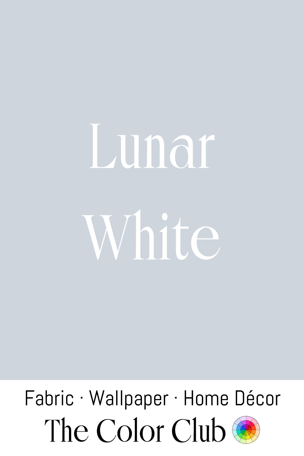
/ LUNAR WHITE / cool, pale, blue-gray with a soft, almost silvery sheen.
The Moon’s surface is actually a dark gray, reflecting only about 12 percent of the sunlight that reaches it. Against the darkness of space, it appears luminous to the human eye, creating the association between moonlight and a pale, silvery white that has influenced artists and designers for centuries.
This cool, restrained white has become a favorite in contemporary minimalist interiors, where it creates calm, contemplative spaces. Lunar White is also popular in bedrooms and bedding, where its cool undertone creates a restful, atmospheric setting across sheets, duvets, and layered textiles. The color brings the quiet feeling of evening light into the room.
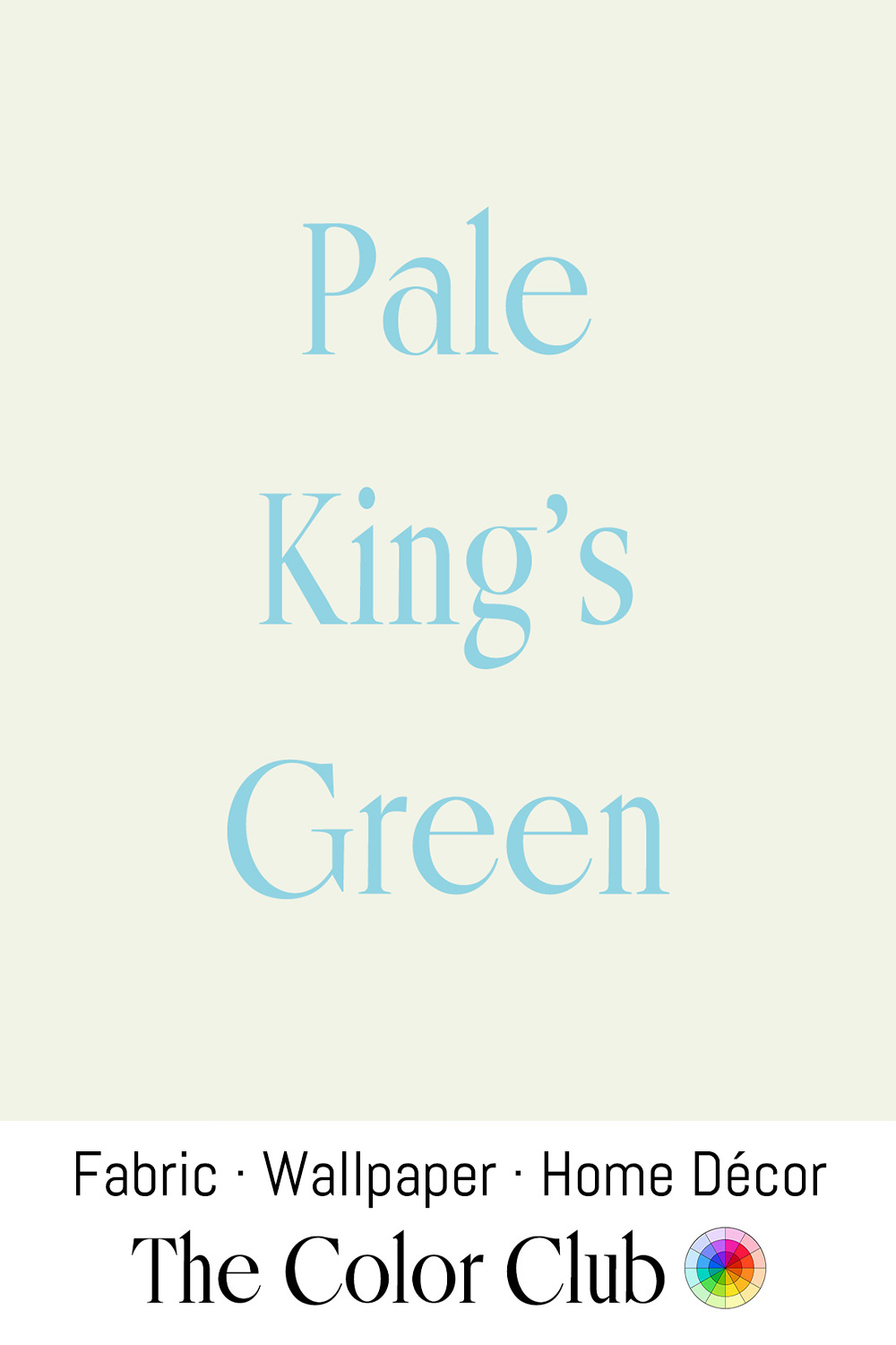
/ PALE KING'S GREEN/ very light delicate pale Yellow-Green
Pale, watery yellow-greens like this one trace back to a real 19th- and early 20th-century color trend known as eau de nil — French for "water of the Nile" — inspired by the pale, sediment-tinted green of the river itself. The shade became closely associated with Egypt-obsessed European design from the late 1800s onward, and reached its height of popularity in the Art Deco 1930s, prized for its understated, slightly dusty elegance.
This soft, pale yellow-green has remained a favorite in heritage interiors ever since, used on walls, ceilings, and architectural detailing to bring a quiet, historic calm to a room. Its muted undertone pairs naturally with ivory, calico, and warm neutrals, and it's still a recurring choice in Georgian- and Art Deco–inspired palettes today, valued for the same soft, restrained elegance that made it popular a century ago.
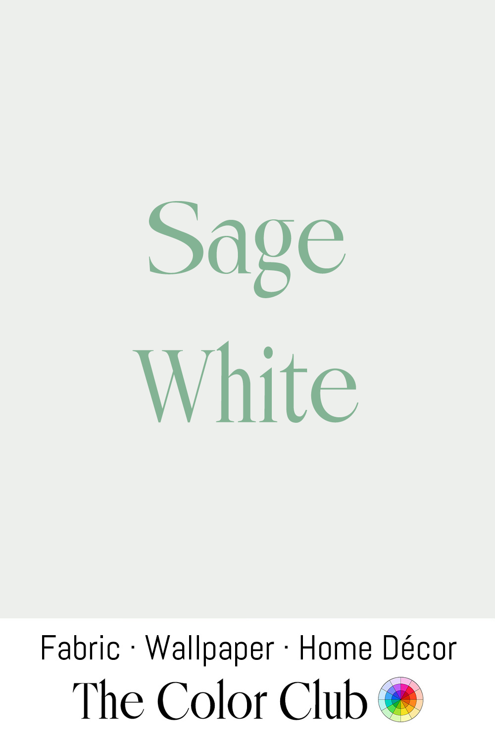
/ SAGE WHITE / very pale, grayish-green, soft and herbal.
This pale tint takes its subtle green cast from sage, the Mediterranean herb whose silvery gray-green leaves have been valued in gardens, medicine, and cooking since antiquity. Reduced to its lightest expression, Sage White carries only a delicate trace of that botanical color.
This gentle green-white appears throughout contemporary interiors as a calming neutral for walls, cabinetry, and textiles. Designers use similar shades in biophilic and Scandinavian-inspired spaces, pairing them with oak, stone, and natural fibers to create rooms with a quiet connection to the landscape.
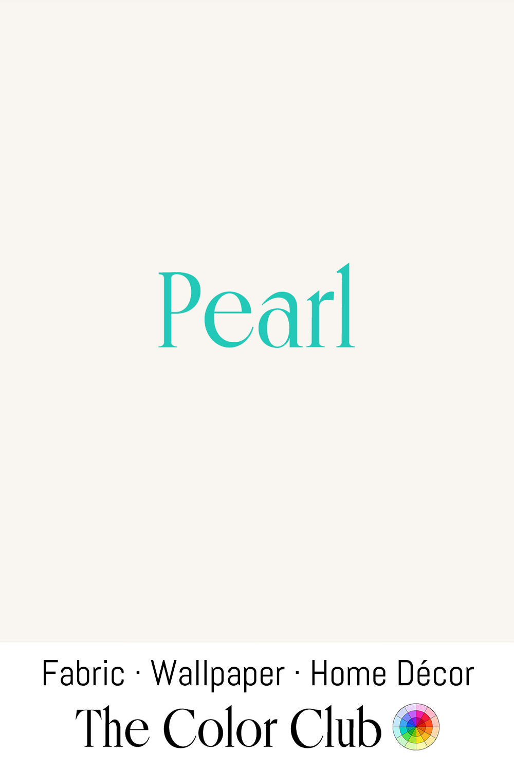
/ PEARL / soft, warm white with a delicate creamy undertone.
In bridal fashion, Pearl is a standard named fabric colorway, distinct from both ivory and stark white. Bridal houses describe it as a creamy off-white with warm, often light-gold undertones, one shade richer than plain ivory. It's a common choice across satin, mikado, crepe, and lace, valued for pairing well with a wide range of skin tones without the coolness of true white.
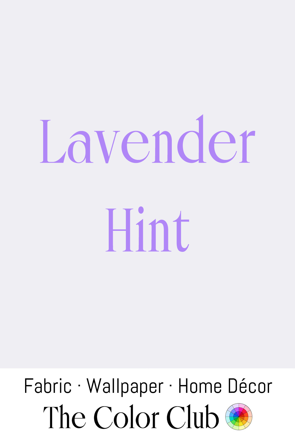
/ LAVENDER HINT / cool white with a faint whisper of violet.
True whites are rarely perfectly neutral. Paint and textile manufacturers have long used subtle violet or blue undertones to balance the warmth that white pigments can develop over time, especially under artificial lighting. This barely perceptible tint gives Lavender Hint its cool, refined character.
This delicate lavender-white appears in contemporary interiors where designers use cool undertones to create fresh, calm spaces. Similar shades are often applied to walls, trim, and ceilings, bringing a subtle sense of airiness that works particularly well with marble, brushed metals, pale woods, and minimalist furnishings.
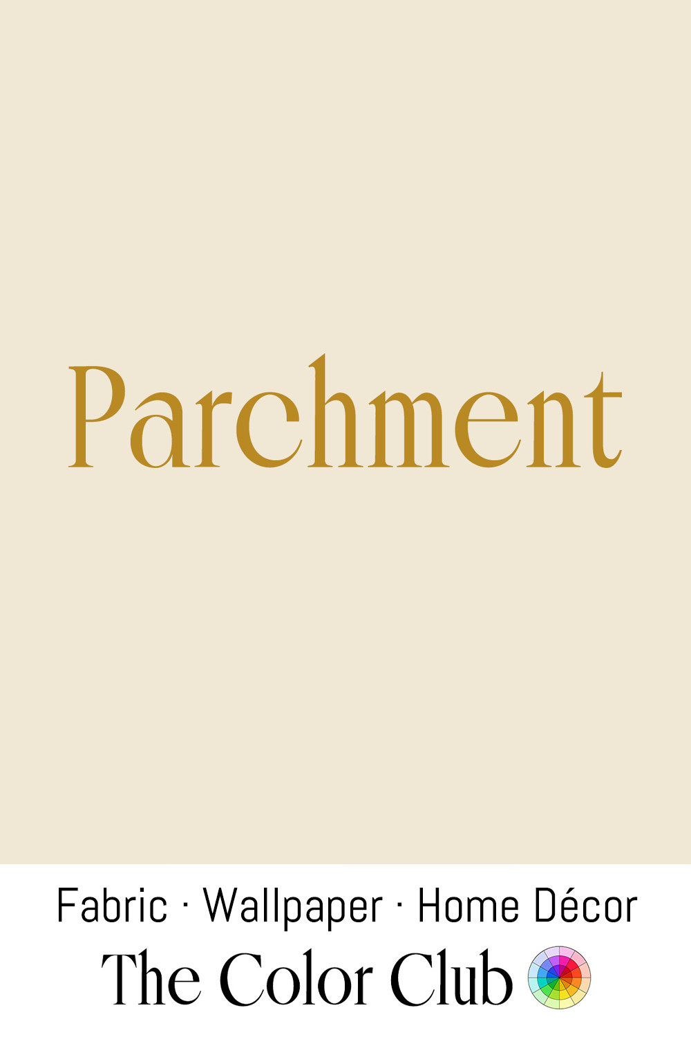
/ PARCHMENT / warm, soft and aged papery ivory.
Parchment, made from treated animal skin, was the dominant writing surface across Europe and the Middle East for more than a thousand years before paper became widely available. Its distinctive warm ivory tone developed through the scraping, stretching, and aging process used to prepare the hide, creating a surface associated with manuscripts, records, and historical documents.
This aged ivory remains closely connected to craft traditions including bookbinding, archival design, and handmade stationery. In interiors, similar parchment tones appear in heritage-inspired spaces, where warm walls, papers, and textiles create a sense of history and permanence.
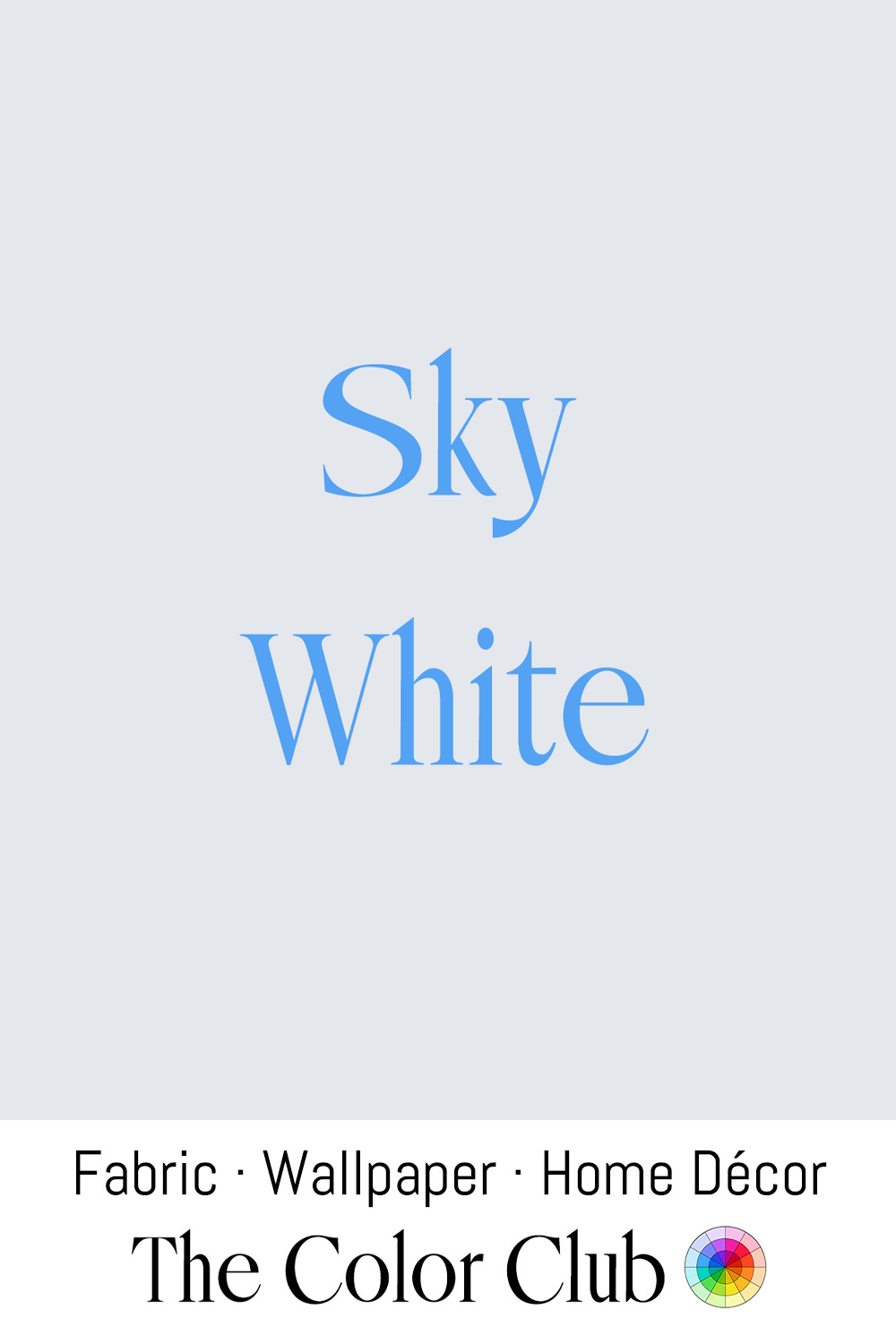
/ SKY WHITE / very pale, airy and cool with a faintly blue veil.
The sky itself is never truly white; its pale appearance near the horizon comes from Rayleigh scattering, which softens the deeper blue overhead into a lighter haze where sunlight passes through more atmosphere.
This delicate blue-white has become a thoughtful choice in contemporary interiors, especially on ceilings and upper walls where designers use it to create a sense of height and openness. By echoing the color of a clear sky, Sky White brings a feeling of spaciousness and natural light into interior spaces.
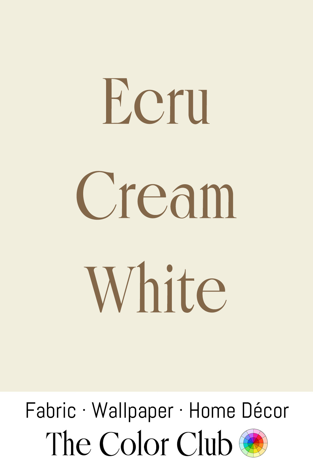
/ ECRU CREAM WHITE / pale, warm beige, natural and unbleached.
Ecru comes directly from the French word écru, meaning “raw” or “unbleached.” The term originally described the natural color of silk, linen, and cotton straight from the loom, before bleaching or dyeing altered the fiber’s original tone.
This warm, unprocessed shade remains closely connected to textile craft traditions, especially handwoven linen, natural cotton, and traditional weaving practices where the beauty of the raw fiber is preserved. In contemporary interiors, Ecru Cream White is central to minimalist and Japandi-inspired spaces, where designers use natural fabrics, woven textures, wood, and ceramics to create calm environments built around simplicity and material honesty.
/ TITANIUM WHITE / modern, crisp and weightless.
In 1909, Norwegian chemist Peder Farup, working with industrialist Gustav Jebsen, patented a process for producing titanium dioxide as a pigment. By the late 1920s, titanium white had overtaken lead white as the dominant white pigment in paint manufacturing worldwide, offering exceptional opacity, brightness, and stability.
Titanium White remains the standard white pigment across contemporary design, appearing in artists' paints, architecture, cosmetics, and everyday products such as toothpaste. Its pure, high-covering character defined the modern idea of white: clean, precise, and engineered for consistency across countless applications.