

Pink Color Stories
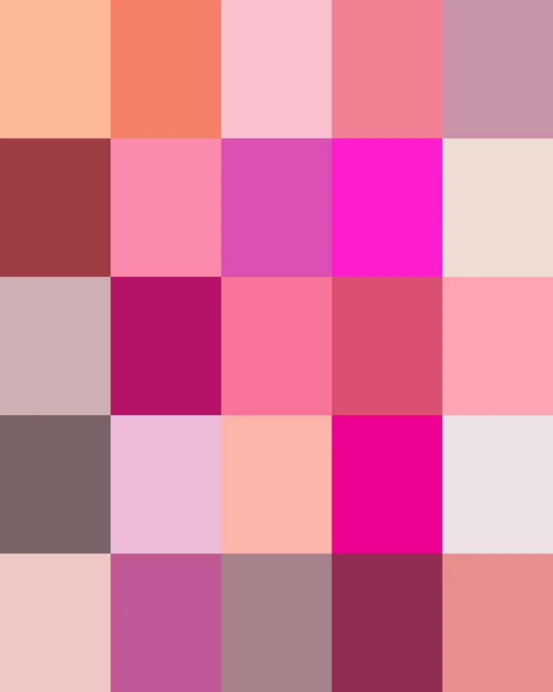
From the court of eighteenth-century France, where Madame de Pompadour lent her name to a soft rose hue favored on Sèvres porcelain, to 1950s America, where blush-pink bathrooms and kitchens became a symbol of postwar optimism, pink has moved from aristocratic refinement to everyday cheer. Today's pinks range from faint blush and dusty mauve, bubblegum brights, and rosy neutrals to the deep tones of magenta and fuchsia.
Here are the stories about some of those Pinks in our Collections.
We print all of them on demand for you.
Clicking on a Color will take you to our Spoonflower shop where you can order it on 60+ types of Fabric, Wallpaper, and Home Décor Products.
Or, save your favorites to your Pinterest boards for later.
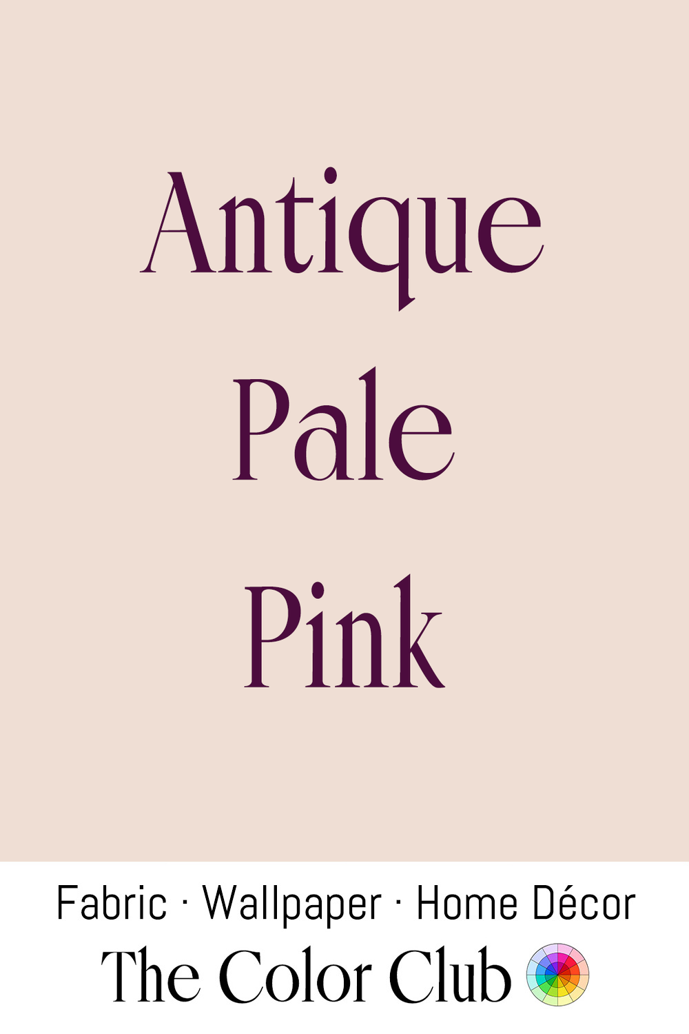
/ ANTIQUE PALE PINK / very light dusty pink, faded and powdery.
Pale pinks like this one were historically achieved by heavily diluting madder or cochineal dyes, both expensive imports, which made soft, uneven pastel pinks a byproduct of dyers stretching costly red dyestuffs as far as they would go.
That same soft, faded pink has become a mainstay of antique-inspired and 'grandmillennial' interior design, often paired with aged brass and chintz florals to evoke inherited, old-money interiors.
Natural dyeing with madder root remains a living craft today: fiber artists exhaust the same dye bath through several sequential dips, watching it fade from deep red down to exactly this soft, dusty pink and coral, a technique still taught in natural-dye workshops as a way to get a whole gradient of antique-looking tones from a single root.
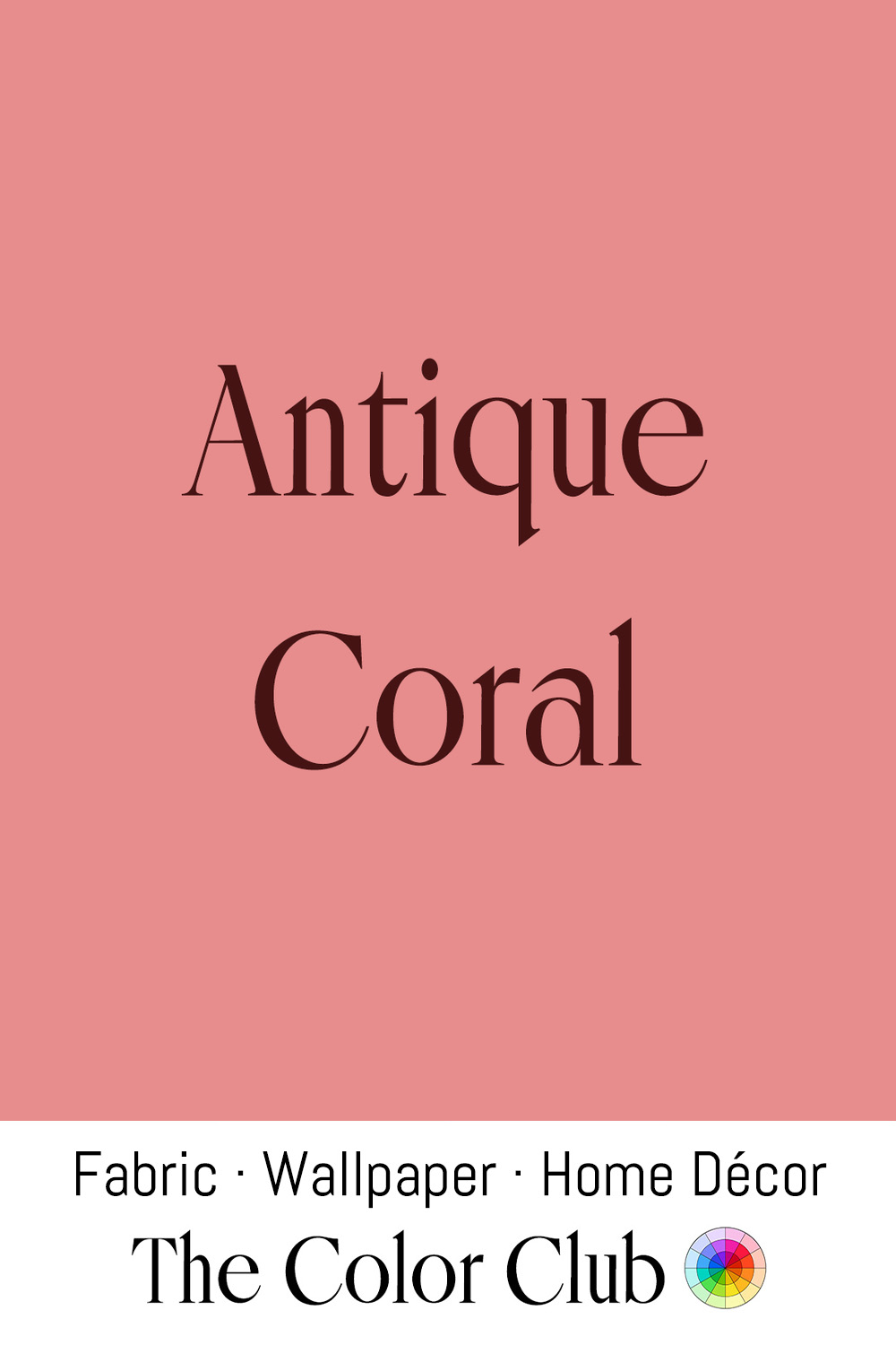
/ ANTIQUE CORAL / muted, warm pink with a soft, dusty quality.
Precious red coral, harvested from the Mediterranean since antiquity and carried across the ancient world for use in amulets, beads, and ornament, naturally softens from its vivid original color toward this same muted, dusty cast with age, wear, and prolonged light exposure, a material Pliny the Elder recorded the Romans believed protected children from harm.
Renaissance painters including Piero della Francesca and Andrea Mantegna depicted the infant Christ wearing a coral pendant in works such as the Madonna di Senigallia and the Madonna della Vittoria (1496), the same devotional custom that saw coral teething rings genuinely soothe infants' sore gums while doubling as a protective charm.
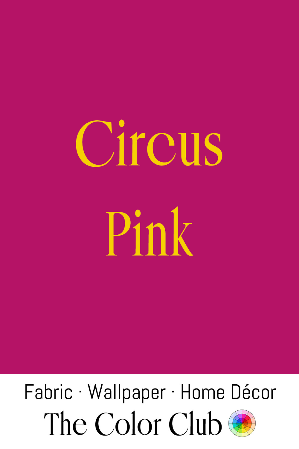
/ CIRCUS PINK / highly saturated fuchsia with a bold, theatrical intensity.
Bright pinks and reds were painted onto wagons, tents, and costumes, specifically because they needed to catch attention from a distance and read clearly under gaslight and later electric light.
The color also became central to 19th-century circus advertising. Printers like the Strobridge Lithographing Company of Cincinnati built an entire industry around oversized, color-lithographed posters bursting with saturated inks, chosen specifically because they could be read from a distance. Strobridge reportedly went to unusual lengths to keep its bright reds and pinks from fading into a dull brown, since a poster that lost its punch lost its whole purpose.
By the 1870s, printing these posters was one of the largest line items in a circus's entire budget, proof of how central bold, attention-grabbing color was to the whole enterprise.
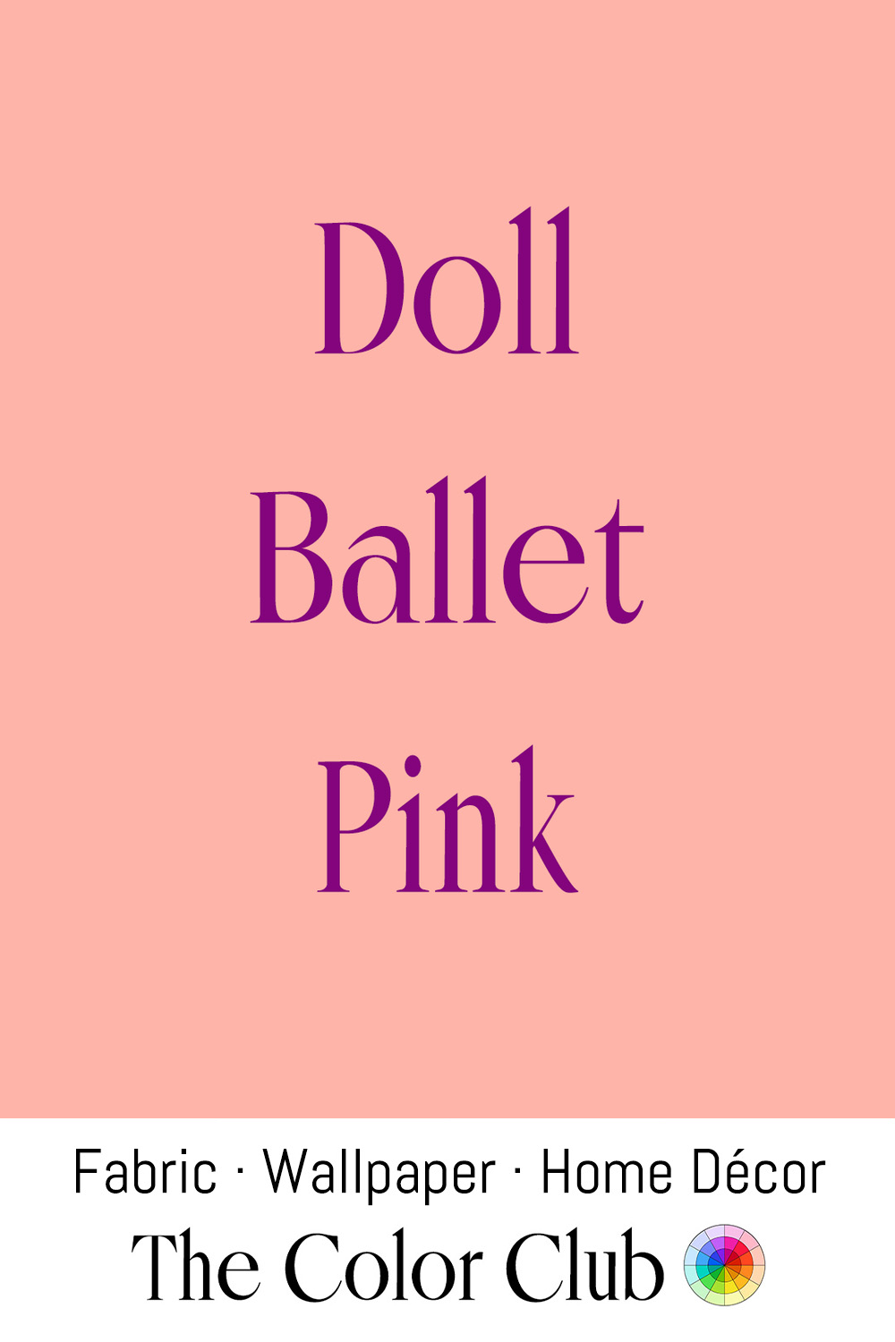
/ DOLL BALLET PINK / soft warm blush, pretty girly.
Classical ballet shoes have been made in this pale pink satin since at least the 19th century, chosen originally to visually elongate a dancer's leg line on stage, a convention formalized as ballet training became standardized across Russian and French schools.
The tone became inseparable from femininity and delicacy in 20th-century fashion, and remains a recurring choice in bridal, occasion, and children's wear whenever a designer wants softness without moving into a stronger, more saturated pink.
Freed of London, founded in 1929 by cobbler Frederick Freed and his wife Dora in a Covent Garden basement, has made pointe shoes in this shade of pink ever since. The company still supplies the Royal Ballet and New York City Ballet in that same pink today.
See also Ballet Bronze and Ballet Brown
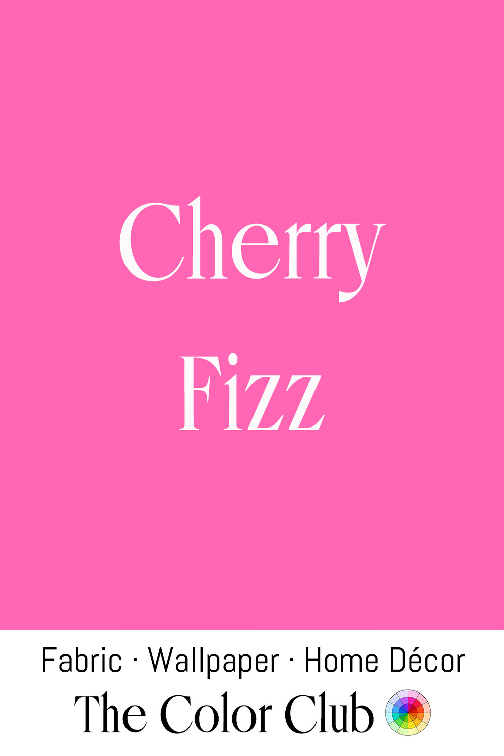
/ CHERRY FIZZ / lively and vivid hot pink candy color.
American soda fountains of the 1870s through 1920s served phosphates, tart drinks made with acid phosphate, soda water, and fruit syrup, and the Wild Cherry Phosphate was consistently the most popular flavor on the menu during that golden era of drugstore counters.
That same fizzy hot pink has also become a genuine interior design statement in recent years: Trend forecasters at WGSN have tracked a real search surge for "hot pink chair", while Pinterest named "cherry coded," an aesthetic built around bright cherry motifs in fashion, wallpaper, and home accessories.
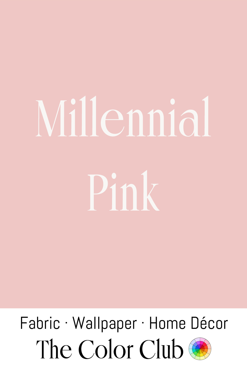
/ MILLENNIAL PINK / light, warm, softly diffused peachy hue.
Journalist Véronique Hyland coined the term in a 2016 New York Magazine article, identifying this desaturated blush as the defining color of its cultural moment across fashion, interiors, and tech products simultaneously.
Instagram's visual culture accelerated its spread, since the tone photographed unusually well in natural light and became the default backdrop of an entire mid-2010s aesthetic era.
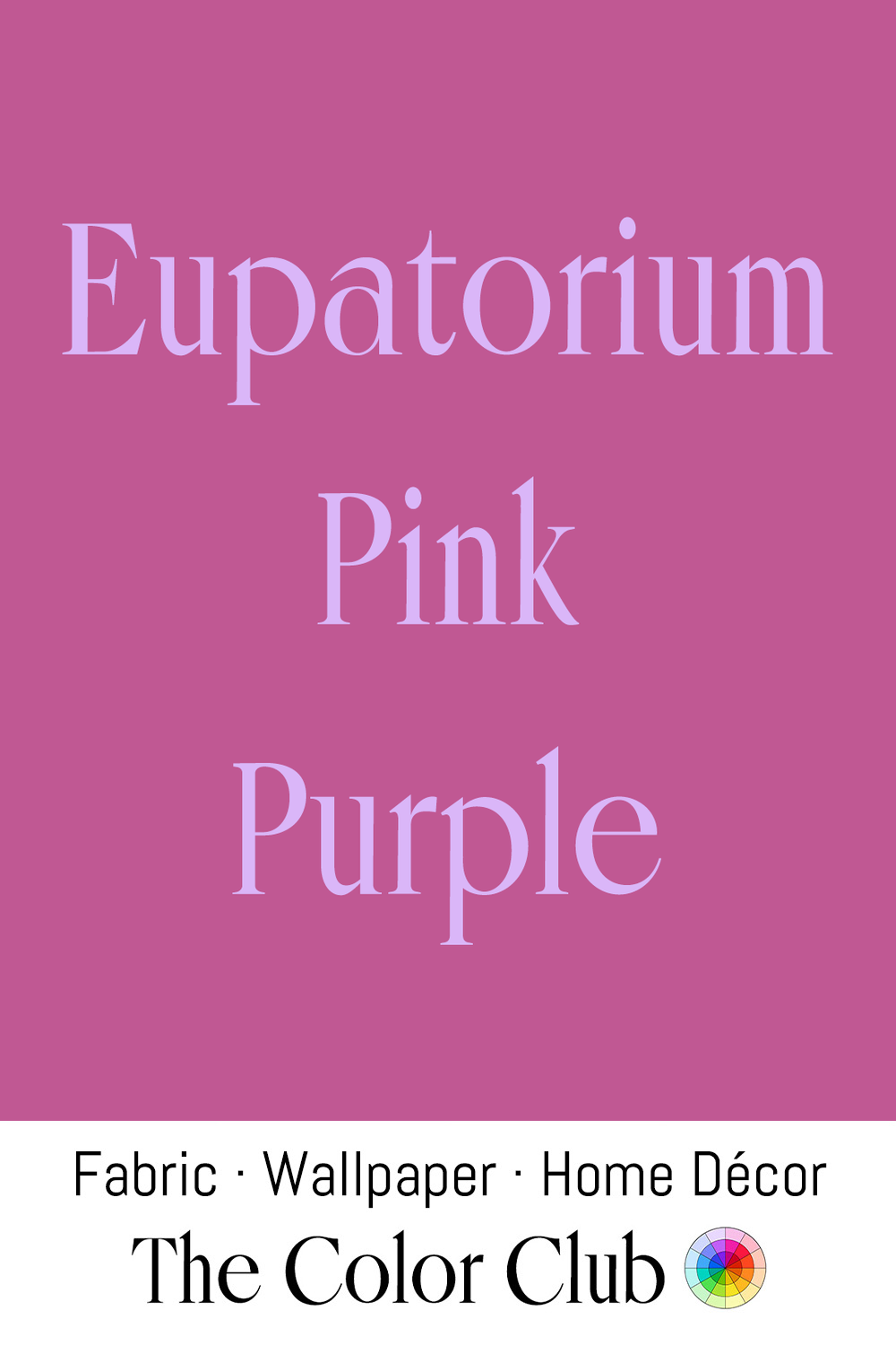
/ EUPATORIUM PINK PURPLE / rich floral mid-tone.
The name comes from Eupatorium, a genus of flowering plants including Joe-Pye weed and boneset, long used in Native American and early American folk medicine for treating fevers and as a general tonic.
This muted, botanical pink-purple has become a familiar shade in native plant and cottage garden-inspired textile and wallpaper design, chosen specifically to evoke wildflower meadows.
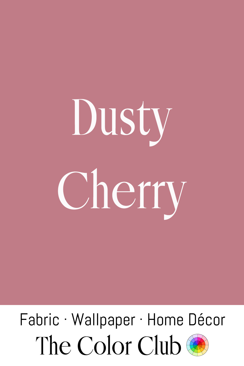
/ DUSTY CHERRY / muted, dusty, greyed-down pink.
A color that has lost its brightness the way old fabric, dried fruit or petals do. Regency-era daytime fashion favored pale, muted pastels — including pink — over the bolder colors reserved for evening wear, a marker of taste rather than mere preference. Natural dyes of the period, used before synthetic dyes existed, faded further with wear and washing, softening garments toward exactly this kind of worn, dusty tone.
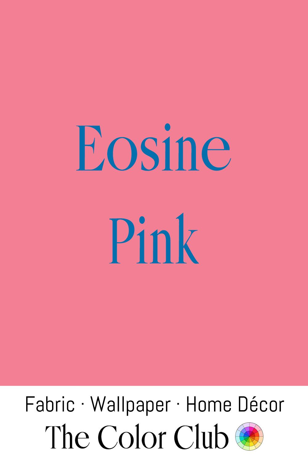
/ EOSINE PINK / bright, warm, and vividly chemical.
Eosin, first synthesized in 1873 by German chemist Heinrich Caro, was among the earliest fluorescent synthetic dyes, prized for a brightness that natural pink dyestuffs like madder or cochineal simply could not achieve; the name comes from Eos, the Greek goddess of dawn.
Coincidentally sharing that same name, Hungarian ceramicist Vilmos Zsolnay developed an entirely separate "eosin" glaze in 1893 at his family's Zsolnay factory in Pécs — an iridescent, metallic luster finish (unrelated chemically to Caro's dye, but named after the same dawn goddess for its similar rosy glow) that shifts color depending on the angle of light. The technique became a hallmark of Art Nouveau ceramics and architectural tilework across Hungary, decorating building façades and museum collections, and Zsolnay still hand-produces eosin-glazed pottery today using the same closely guarded formula.
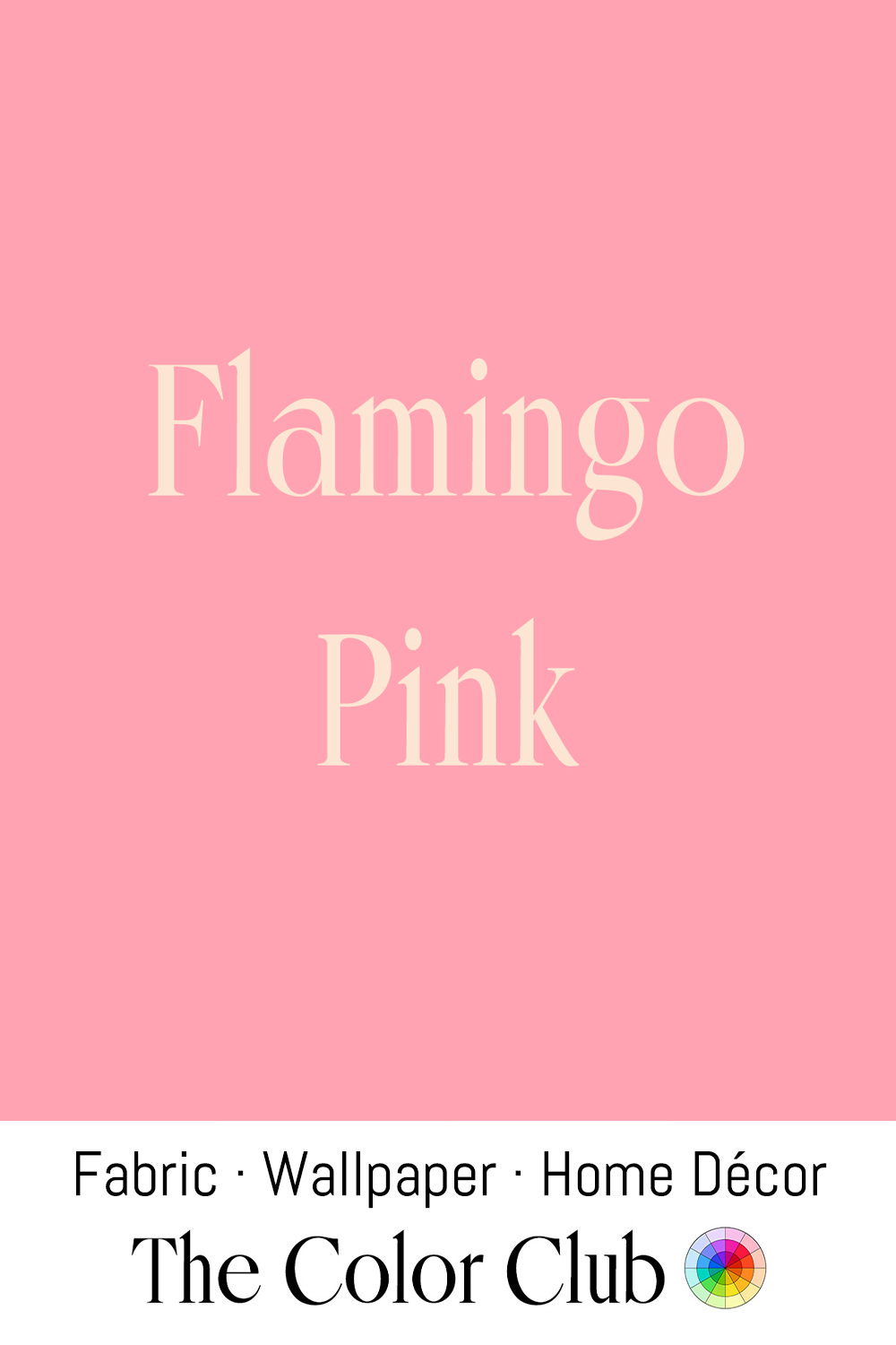
/ FLAMINGO PINK / bold and tropical vivid flush.
Flamingos owe their pink color to carotenoid pigments in the algae and crustaceans they eat, a diet-dependent color so distinctive that captive flamingos will fade to white without the right feed; Miami's Art Deco architects embraced exactly this shade in the 1930s, painting hotel facades and neon signage in flamingo pink to match the city's namesake bird.
That same tropical pink remains inseparable from Miami and mid-century Florida resort style today, still used on hotel exteriors and vintage-inspired interiors to signal warm-weather glamour.
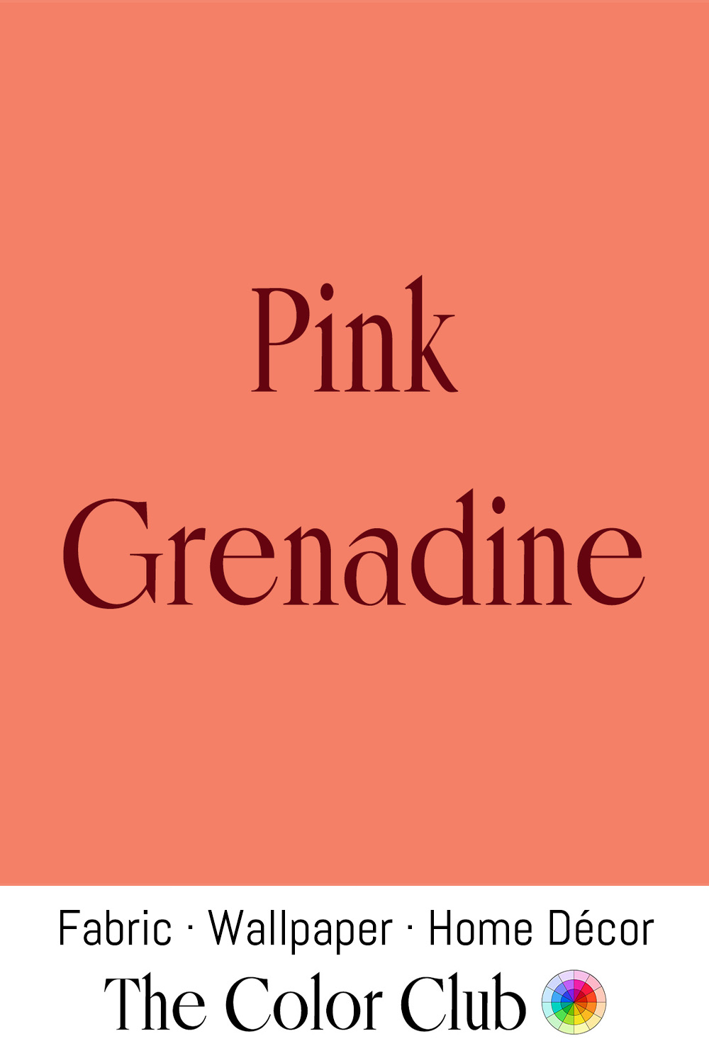
/ PINK GRENADINE / warm and fully saturated orange-coral.
Grenadine takes its name from the French word for pomegranate, the fruit whose juice gives the syrup its color, and it became a staple of French confectionery and the cocktail bars that followed through the 19th century.
Henri Matisse worked repeatedly in this warm coral-pink register during his Fauvist period, and mid-century American fashion later adopted the same tone as a signature resort-wear color, carried especially by Lilly Pulitzer from the 1960s onward.
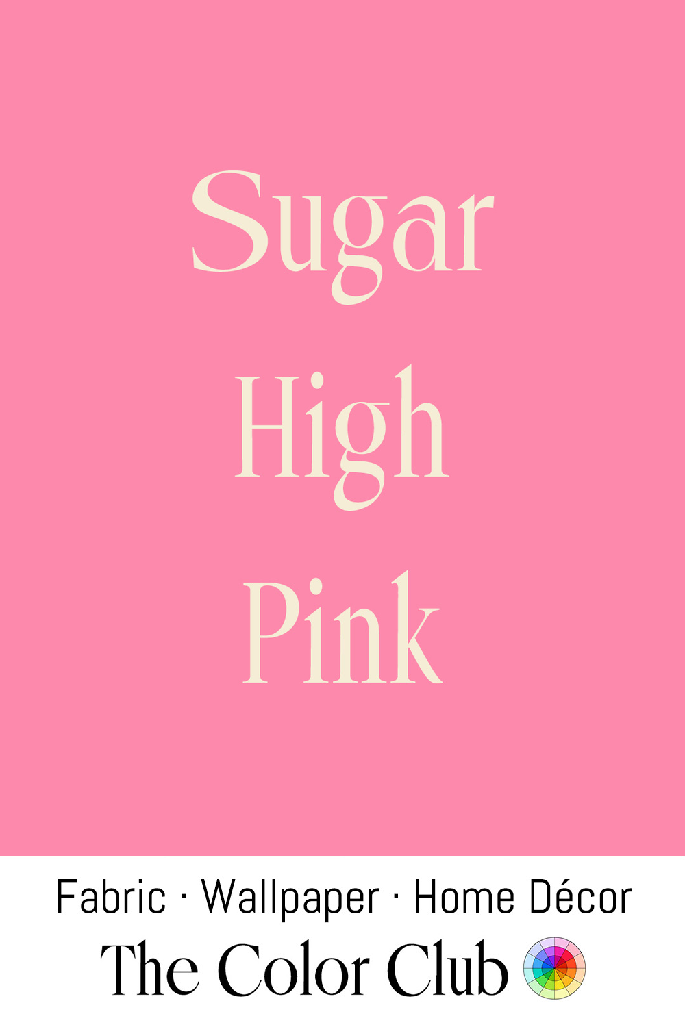
/ SUGAR HIGH PINK / brightly sweet and candy crushed.
That saturated candy pink that drove the "Barbiecore" fashion and interior trend of 2022–2023. It began in March 2022, when Valentino's creative director Pierpaolo Piccioli sent an entire Fall/Winter runway collection down in monochrome hot pink at Paris Fashion Week. The color, and the trend's name, trace back to Mattel's Barbie doll, created by Ruth Handler in 1959 and known for decades for her pink packaging and wardrobe.
Momentum built further ahead of the 2023 "Barbie" film starring Margot Robbie, and the trend jumped fully into home décor: interior writers began styling rooms with frill-edged bed linens, tasseled lampshades, and full accent walls in this same saturated pink.
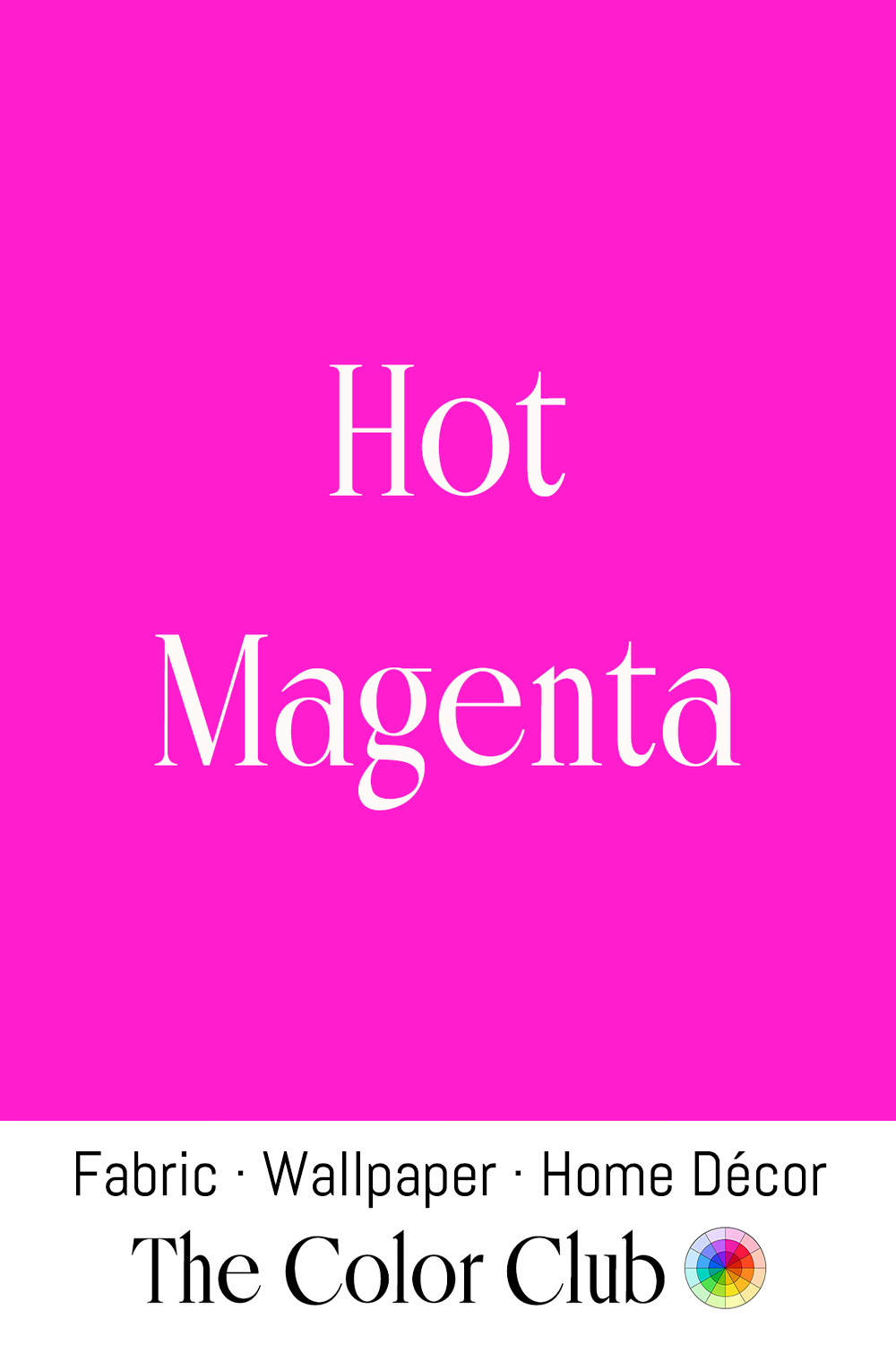
/ HOT MAGENTA / electric pink-purple with an intense, synthetic energy.
The color magenta takes its name from a bloody 1859 battle near the Italian town of Magenta, fought during the Second Italian War of Independence; a vivid new synthetic dye called fuchsine, discovered by French chemist François-Emmanuel Verguin that same year, was renamed magenta shortly afterward to commemorate the French and Sardinian victory.
This hotter, more electric version of the color has become a signature of maximalist 1980s and 2020s fashion revivals alike, prized in both eras for a boldness that natural dyes could never achieve.
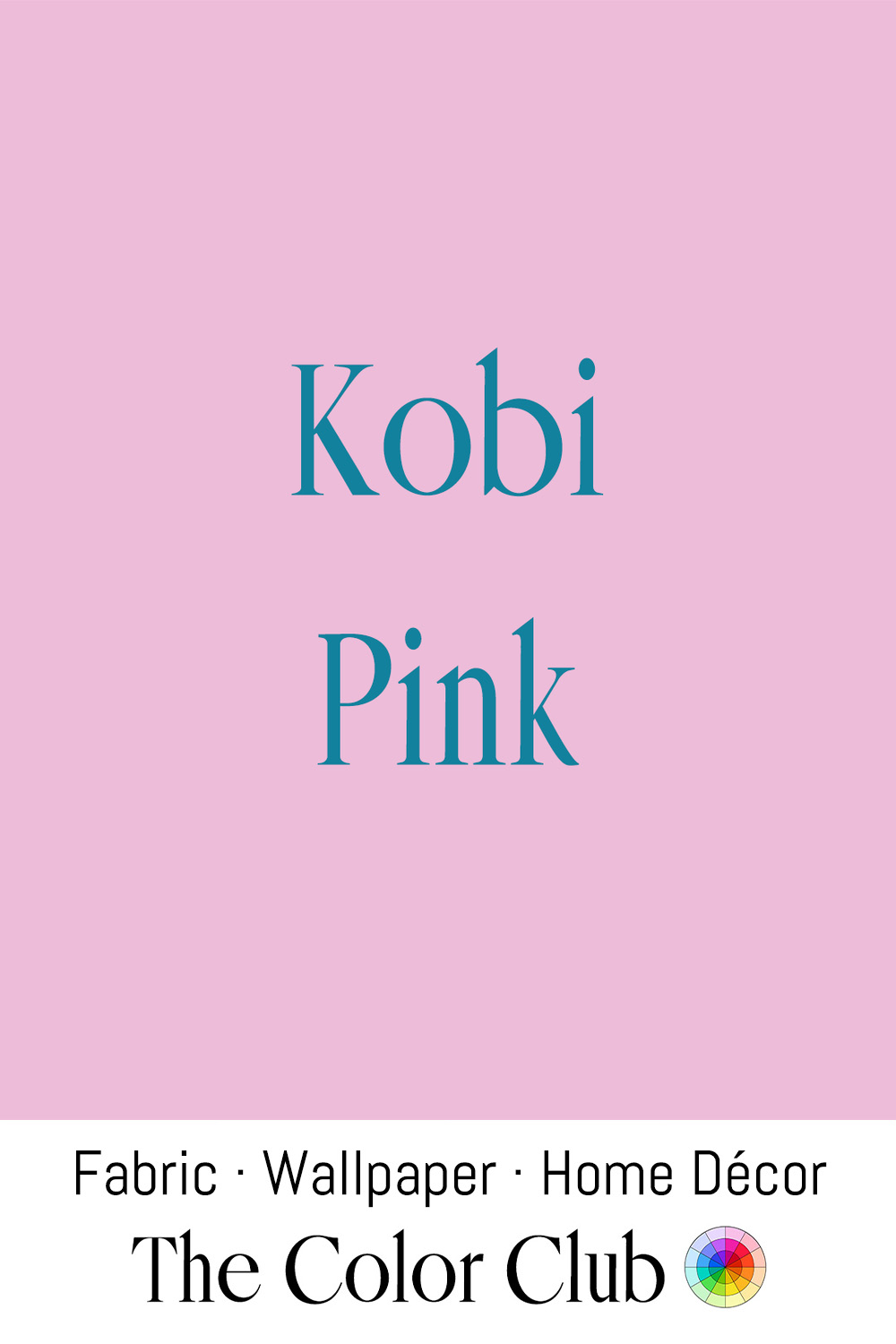
/ KOBI PINK / soft, light and cool with a violet undertone.
The name "Kobi" entered use in 2001 as part of the Xona Color List, a digital color reference still used by designers and developers to give screen colors a standardized identity.
In the physical world, "Kobi Pink" functions as a standardized trade name across several independent apparel and textile businesses: an Indian supplier sells it as a silk used for sarees and dress linings, a U.S. wholesaler lists it as a polyester faille for costumes and gowns, and a small couture bridal house in Kosovo has made at least one custom evening gown in the shade.
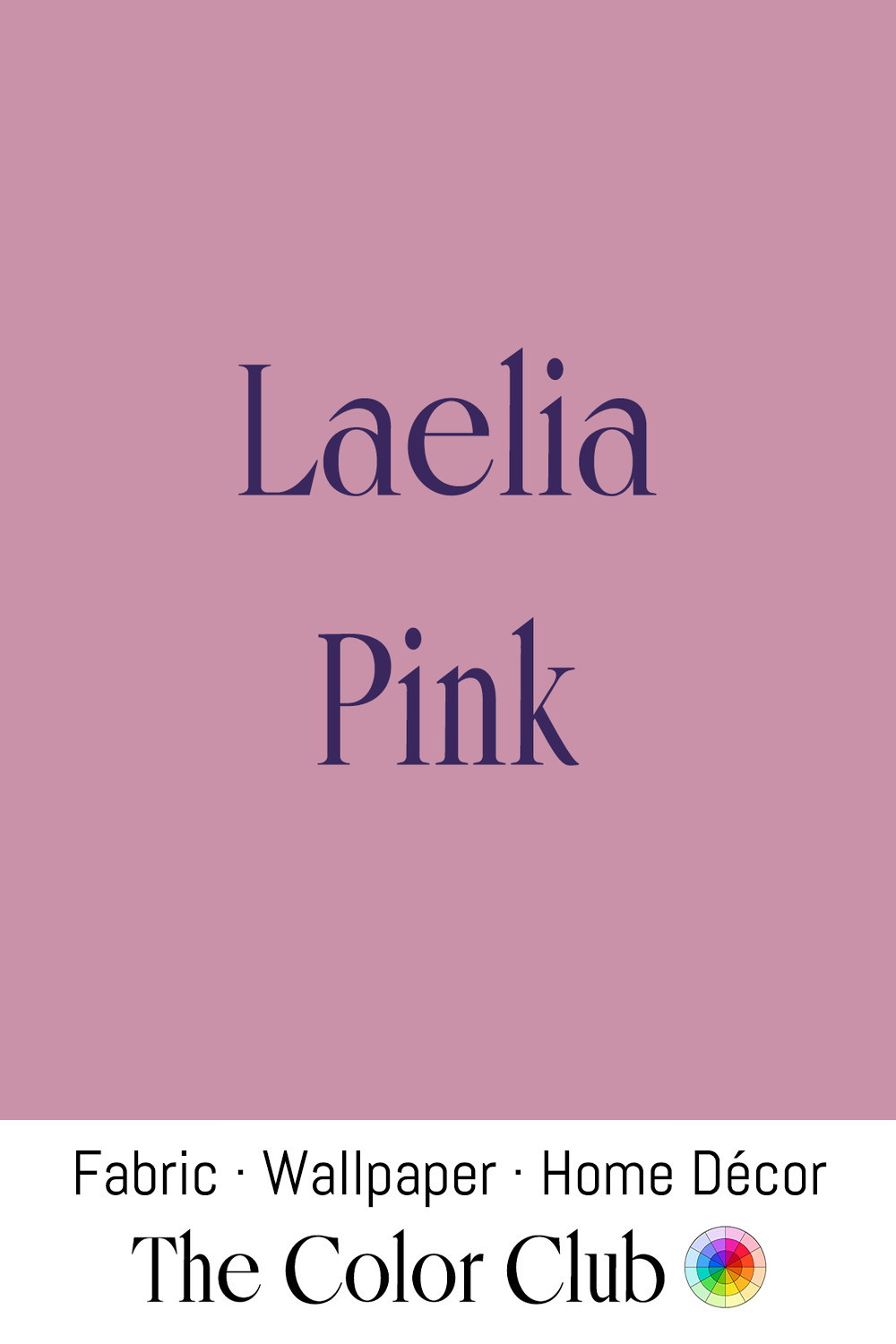
/ LAELIA PINK / soft, warm, muted and delicately dusty.
The name comes from Laelia, a genus of orchids native to Mexico and Central America, prized by 19th-century European plant collectors during the Victorian era's intense 'orchidelirium,' when wealthy collectors paid extraordinary sums for newly discovered tropical orchid species.
That same soft orchid pink has remained a favorite in botanical-print textile and wallpaper design, valued for evoking the delicacy of a real flower.
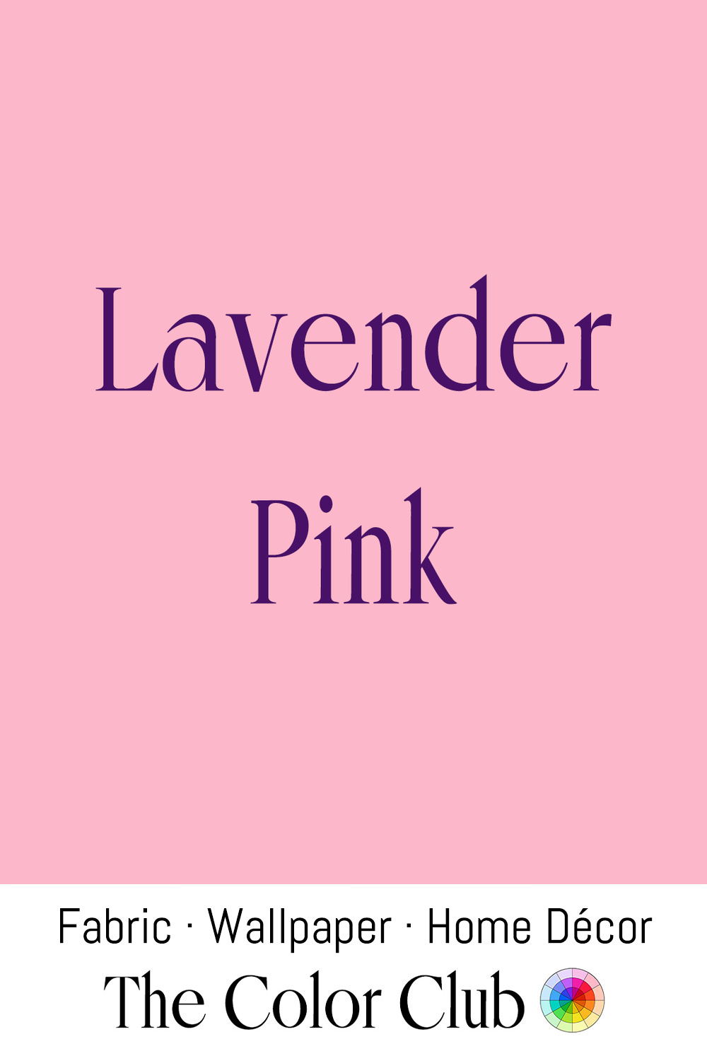
/ LAVENDER PINK / soft, warm, gentle floral.
Lavender has been cultivated since ancient Rome, prized for scenting bathwater, and by the 16th century the fields around Grasse, in the south of France, had become the heart of Europe's perfume industry, still the source of the essential oil in many fine fragrances today.
The pink-leaning side of the lavender family became a favorite of 1920s and '30s fashion, worn as a softer, more wearable alternative to true violet during the pastel-heavy interwar years, and it remains a common choice in nursery and vintage-inspired textile design.
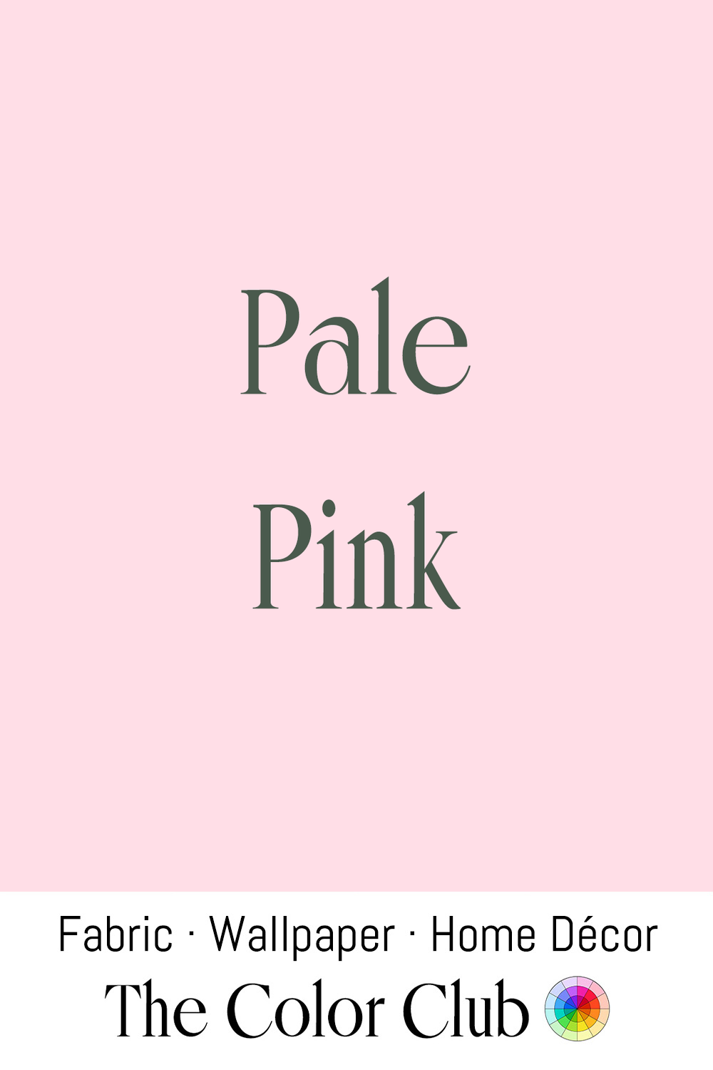
/ PALE PINK / soft and airy, delicate pastel.
Pale pink became the standard color for baby girls in the United States during the 1940s, when American retailers and manufacturers settled on pink for girls and blue for boys, a convention that shaped the Baby Boomer generation and has largely held ever since.
The assignment took decades to arrive at: a 1918 trade publication for infant retailers had actually advised the opposite, that "pink, being a more decided and stronger color, is more suitable for the boy, while blue... is prettier for the girl," and a 1927 Time magazine survey of major department stores found several, including Filene's in Boston and Marshall Field in Chicago, still dressing boys in pink at the time.
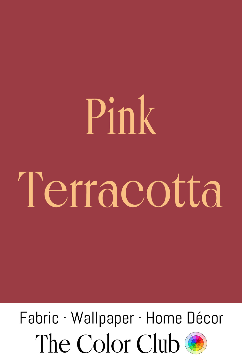
/ PINK TERRACOTTA / warm, sunbaked and earthy rosy brown.
Terracotta, meaning 'baked earth' in Italian, has been fired into pottery, roof tiles, and sculpture since antiquity, its warm reddish-brown color coming from the iron oxide naturally present in the clay.
This pinker, softer variant has become a favorite of the 2020s terracotta revival in interior design, often paired with warm pinks and dusty roses alongside the more traditional orange-brown terracotta tones.
In 1876, Maharaja Sawai Ram Singh II ordered every building in Jaipur's old walled city repainted this terracotta pink to welcome Britain's Prince of Wales, later King Edward VII, since pink symbolized hospitality in the region. His queen loved the result so much that in 1877 the Maharaja passed a law requiring all future buildings in the old city to be painted the same shade, naming it the “Pink City.”
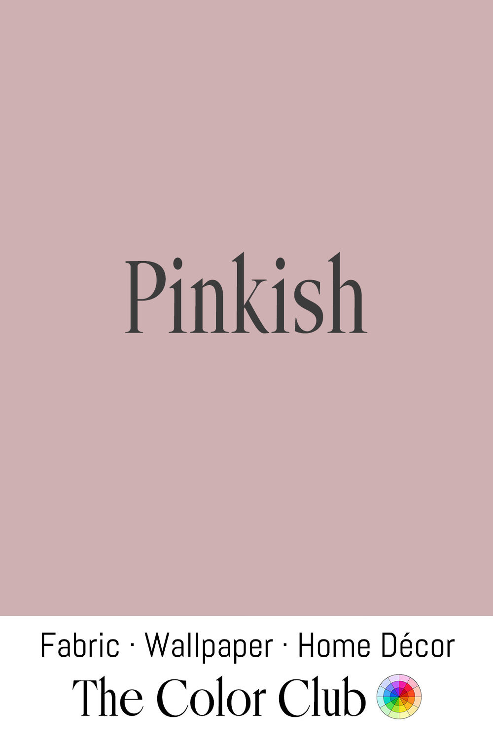
/ PINKISH / soft and ambiguous, grayish, barely-there pink.
This ambiguous, barely-pink neutral has become a favorite of minimalist interior design, valued precisely for how it shifts depending on the light and the colors placed beside it, reading sometimes as pink and sometimes as plain gray or beige.
Designers have long prized colors with that same instability. Belgian designer Axel Vervoordt has built a decades-long career on exactly this kind of light-sensitive neutral, rooted in his “Wabi” philosophy of deliberate simplicity; his 2020 collaboration with Kim Kardashian on her Calabasas home, unveiled in Architectural Digest, became one of the most widely covered examples of this approach, with walls left in muted, shifting neutrals rather than any single, namable color.
/ POWDER PINK / very pale, soft, delicate and chalky.
The name references cosmetic face powder, a beauty product with roots stretching back to ancient Egypt and Rome, though the pale pink powders familiar today became widely available only once industrial cosmetics manufacturing scaled up in the early 20th century.
This gentle, chalky pink has become a mainstay of nursery and bathroom design, favored as a softer, more sophisticated alternative to brighter 'baby pink' whenever a designer wants pale pink without reading as overtly childlike.
/ RASPBERRY RIPPLE / bold, saturated pink-red with a bright, fruity intensity.
The "ripple" technique, streaking flavored syrup through vanilla ice cream, was developed in the United States in the 1930s once factory machinery could marble fruit paste into ice cream without fully blending it, and raspberry quickly became the most popular flavor to ripple.
The combination became especially beloved in Britain, where raspberry ripple turned into a defining seaside treat of the 1950s and '60s ice cream van era, its bright pink swirl through white vanilla still evoking British summer nostalgia strongly enough that Jo Malone London built an entire fragrance around it in recent years.
/ ROSE BRIGHT / lush, floral, pink-purple.
Roses have been cultivated for over 5,000 years, but modern rose breeding traces largely to Empress Joséphine Bonaparte, who assembled an enormous collection of rose varieties at Château de Malmaison in the early 1800s, commissioning botanical illustrator Pierre-Joseph Redouté to document them and effectively founding the systematic rose cultivation still practiced today.
Bred by David Austin in 1988, the rose cultivar 'Charles Rennie Mackintosh' was named in partnership with the Charles Rennie Mackintosh Society and the City of Glasgow, honoring the Scottish architect and designer (1868–1928), whose work — including the Glasgow School of Art and the Willow Tearooms — frequently featured stylized roses. The rose itself is a cross between Austin's 'Chaucer' and 'Mary Rose,' bred to produce an old-fashioned, quartered bloom in an unusual lilac-pink shade that deepens toward lilac in cool weather and softens toward pink in warmth.
/ ROUGE PINK / intensely vivid red cast with a bright, cosmetic warmth.
Rouge, French for "red," has been used to color cheeks since ancient Egypt, where it was made by blending fat with red ochre. This vivid rouge tone remains a defining shade in cosmetics today, and the word itself is still the standard French and English cosmetics-industry term for blush.
The doll industry adopted the same cosmetic logic directly: French bisque doll makers like Jumeau and Bru, working through the late 19th century, hand-painted a rouged blush onto each unglazed porcelain face, applied in thin layers and re-fired in the kiln after each one to fix the color permanently into the bisque.
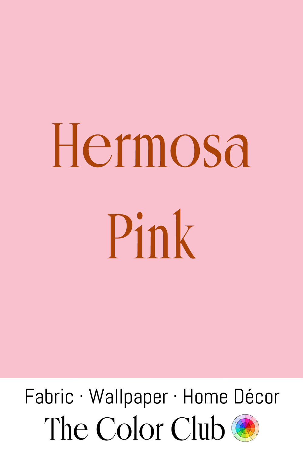
/ HERMOSA PINK / gentle, romantic rose-red blush.
The name likely traces to the Hermosa rose, a China rose cultivar introduced to Europe in 1840 and prized for its reliable, repeat-blooming soft pink flowers, which quickly made it one of the most widely planted roses of the 19th century.
The soft rose-pink has remained a staple of romantic, cottage-garden interior and fashion design, still associated with old garden roses whenever designers reach for a heirloom pink.
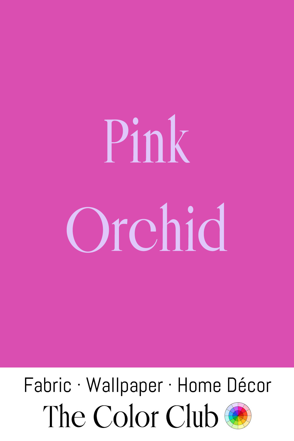
/ PINK ORCHID / vivid floral with a warm purple undertone.
The Victorian craze for collecting tropical orchids, dubbed "orchidelirium," saw the tropical species command extraordinary prices among European collectors.
This bold, saturated pink-purple remains a hallmark of maximalist botanical print design, where large-scale exotic florals in intense, high-saturation color gives a wall or fabric an immersive, enveloping presence.