

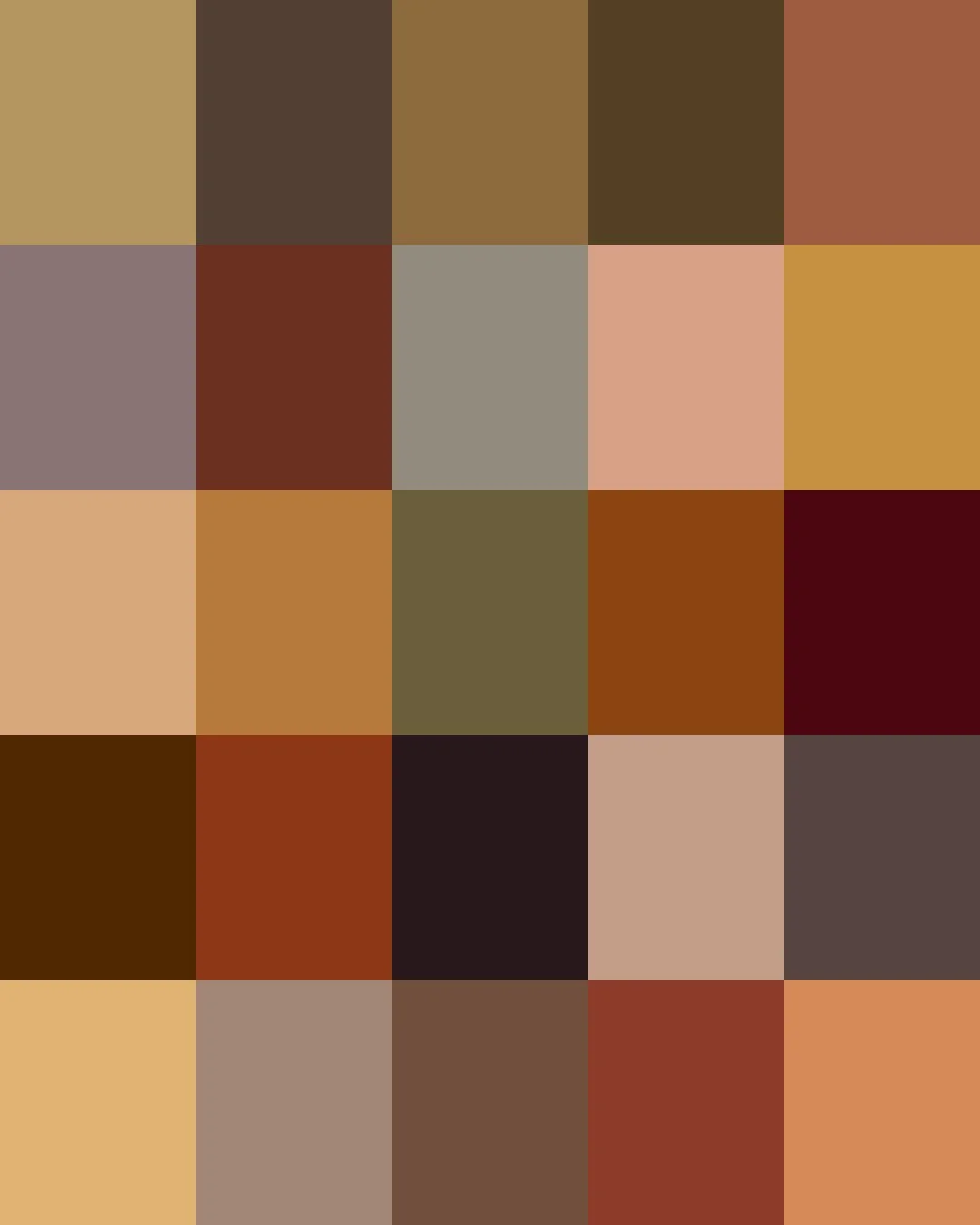
From prehistoric cave walls at Lascaux, painted with raw umber dug straight from the earth, to Victorian-era mummy brown ground from the wrappings of Egyptian mummies, brown is humanity's most literal color.
Modern pigments have expanded brown beyond the earth and the archive. Today's browns range from soft taupes and warm beiges, and weathered wood tones to the deep tones of rich chocolate, espresso, and chestnut.
Here are the stories about some of our Browns. Clicking on a Color will take you to our Spoonflower shop where you can order it on 60+ types of Fabric, Wallpaper, and Home Décor Products.
Or, save your favorites to your Pinterest boards for later.
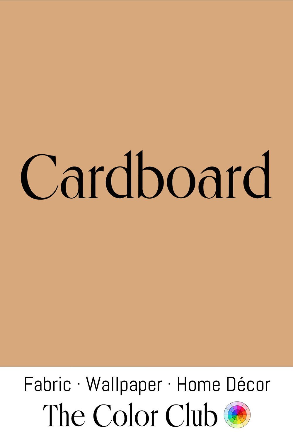
/ CARDBOARD / light, warm tan with a creamy orange undertone.
In 1871, Albert L. Jones of New York patented corrugated board to wrap bottles and glass lantern chimneys. The distinctive tan of Cardboard results from lignin, which remains in the raw, unbleached board and darkens as the wood pulp is cooked.
Corrugated boxes began replacing wooden crates in the 1890s, and industrial production turned Cardboard into one of the most universally encountered surfaces of modern life. Its ubiquity in shipping and retail gave it a strong functional identity through the 20th century, one that designers began to exploit deliberately from the 1960s onward, using uncoated kraft stock as a signal of honesty, simplicity, and environmental consciousness.
The tone now carries a well-established visual shorthand for sustainability and craft across packaging and branding.
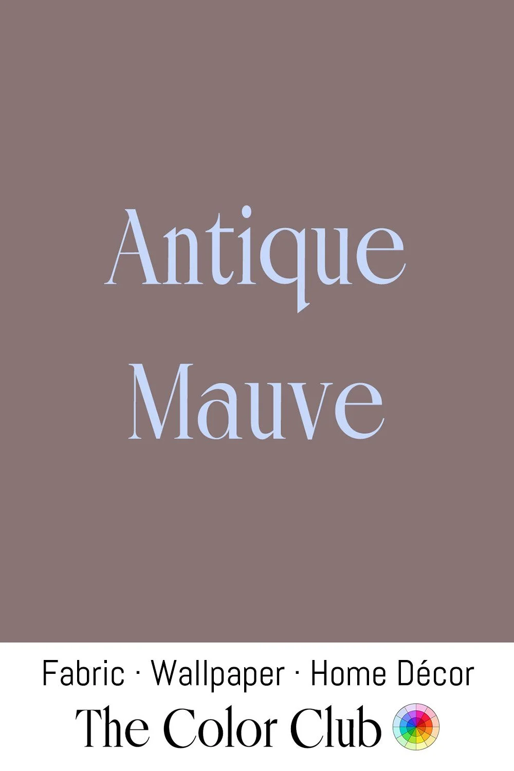
/ ANTIQUE MAUVE / softly faded and warm grayish brown
Artificial dyes transformed Victorian fashion, introducing vivid colors that had previously been difficult to achieve. However, some of these early synthetic dyes were light-sensitive and faded rapidly with exposure. Mauveine, the first commercially successful synthetic purple dye, was prized for its brilliant hue, but its color could deteriorate in light.
Bridgwater’s Blake Museum holds a rare two-piece silk dress dyed with mauveine around 1860. The museum knows of only one comparable surviving outfit: a silk skirt and blouse dating to 1862–1863 in London’s Science Museum, where the effects of fading can be seen.
Warm brown-gray tones belonged to the broader earth-tone movement that swept design starting around 1970, when browns, rusts, and muted golds replaced the brighter colors of the previous decade in American homes, appearing on everything from kitchen appliances to upholstery to walls.
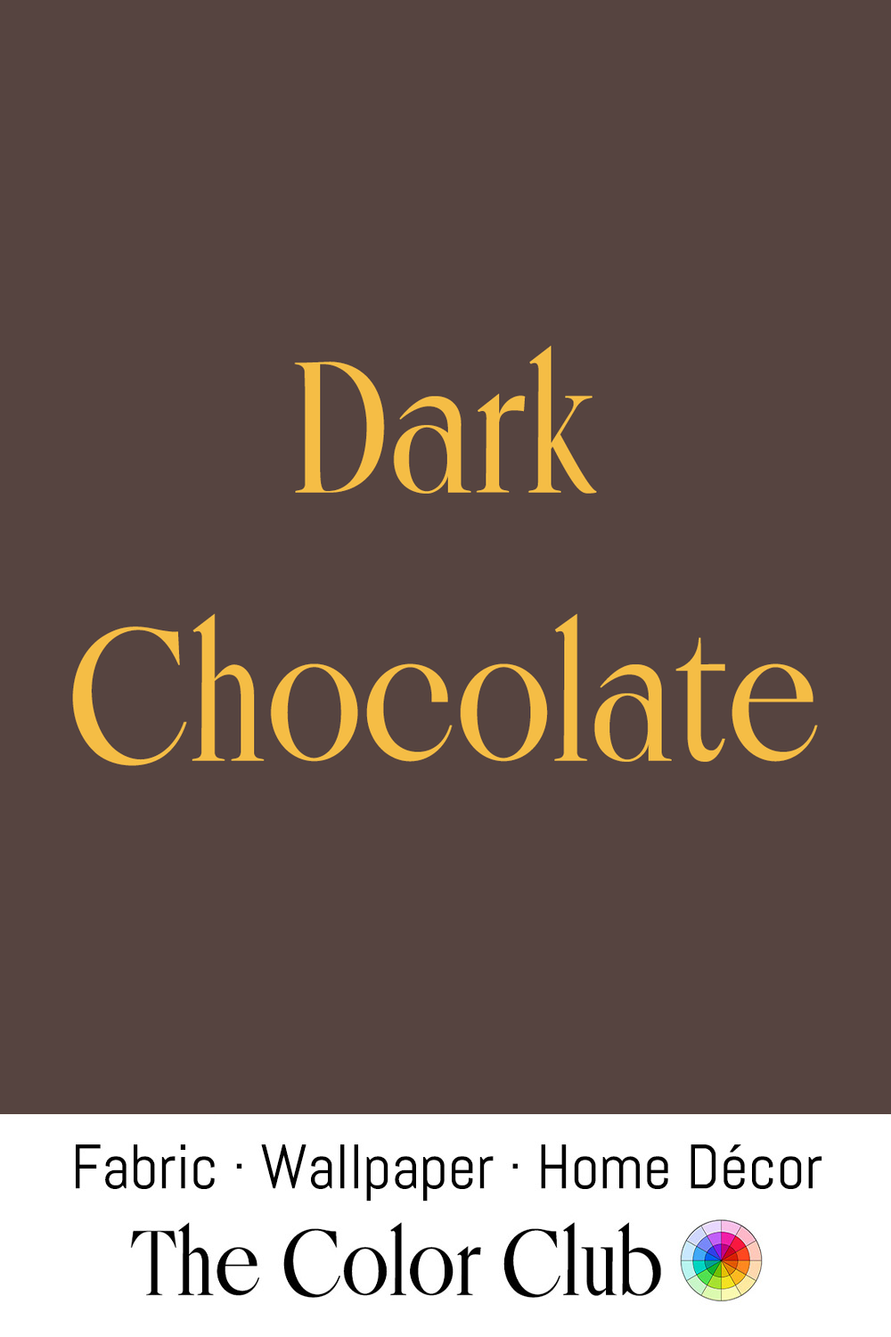
/ DARK CHOCOLATE / warm, dense, coffeehouse brown.
Cacao was domesticated over 5,000 years ago in what is now Ecuador before spreading into Mesoamerica, where the Maya and Aztec prepared it as a bitter drink, which the Aztecs called cacahuatl. Spanish conquistador Hernán Cortés encountered it at the Aztec court in 1519, and chocolate reached European nobility as a sweetened luxury drink over the following century.
In fashion, Chocolate brown has repeatedly signaled luxury. Tom Ford's 2004 collections for Gucci, the last of his era-defining run at the house, included dresses in rich brown stretch silk, and chocolate-brown velvet and leather have remained a recurring fixture of both runway collections and interior design in the years since.
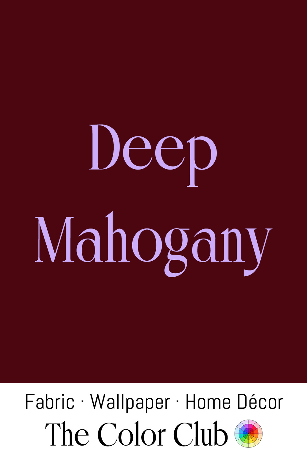
/ DEEP MAHOGANY / very dark, richly saturated, warm reddish brown.
European traders encountered Mahogany in Caribbean and Central American forests during the Age of Exploration, and by the 18th century, English cabinetmaker Thomas Chippendale worked with it extensively, helping usher in Britain's golden age of furniture making, though the wood's supply came at a devastating human cost: forests across Cuba, Jamaica, and Hispaniola were logged using enslaved labor to meet European demand.
Mahogany's deep, glowing tone carried into 20th-century design through the great Art Deco ocean liners: designer Pierre Patout created mahogany-framed, silk-velvet dining armchairs for the SS Normandie, which entered service in 1935, cementing Mahogany's association with streamlined luxury travel.
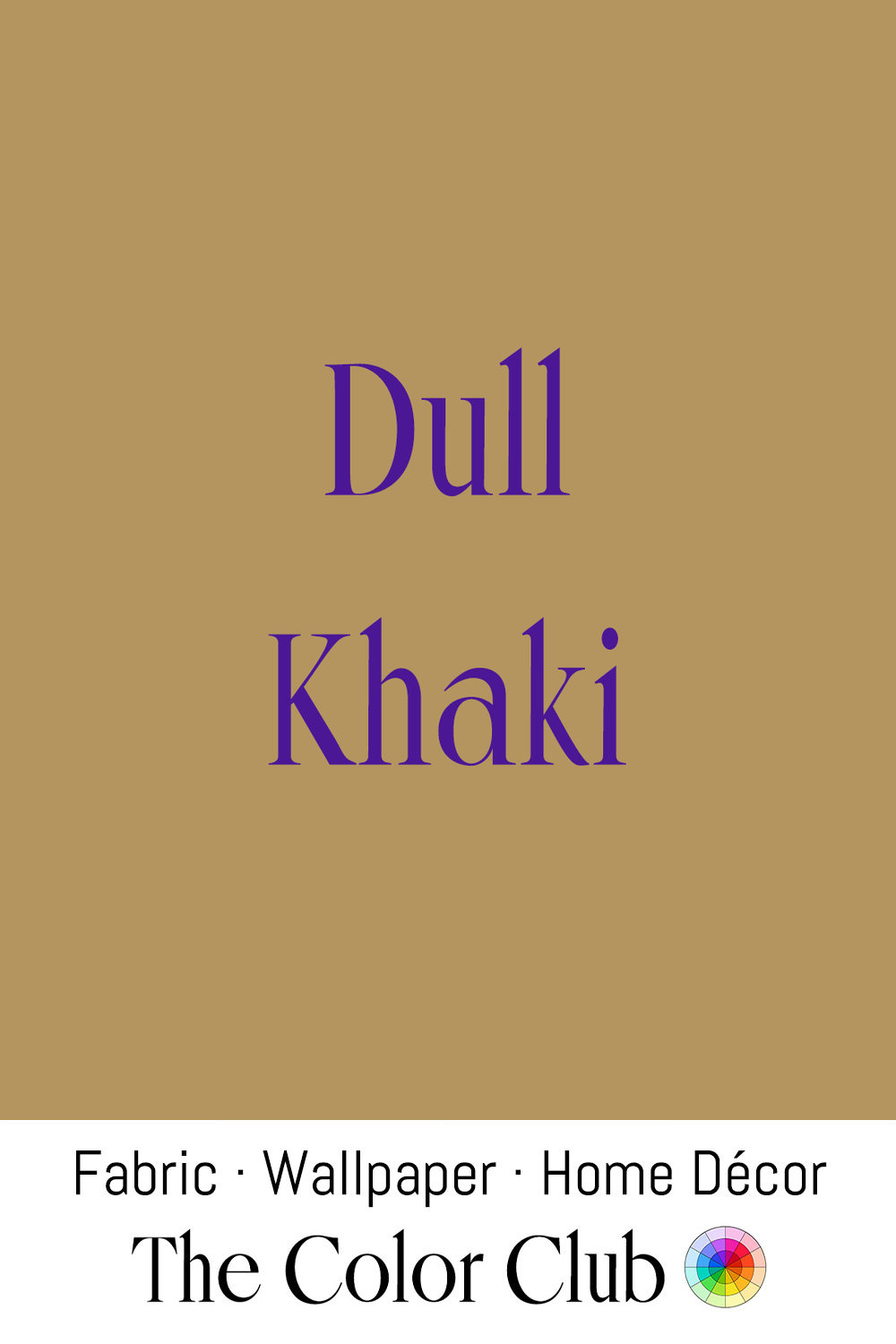
/ DULL KHAKI / softly sun-worn, muted golden-tan.
In Hindustani and Urdu, Khaki means dust-colored. In 1846, British officer Harry Lumsden raised his Corps of Guides at Peshawar, and the story goes that he dyed their white cotton with river mud to blend into the frontier landscape. A standardized Khaki dye was patented in England in 1884, and Khaki later dressed British troops in the Second Boer War, which began in 1899.
Khaki crossed fully into civilian fashion after the Second World War, when surplus military cotton trousers became cheap and plentiful. Princeton students soon began pairing Khaki chinos with blazers and oxford shirts, a look that spread through the Ivy League and was later worn by President John F. Kennedy, cementing Khaki as a fixture of American collegiate style through the 1960s.
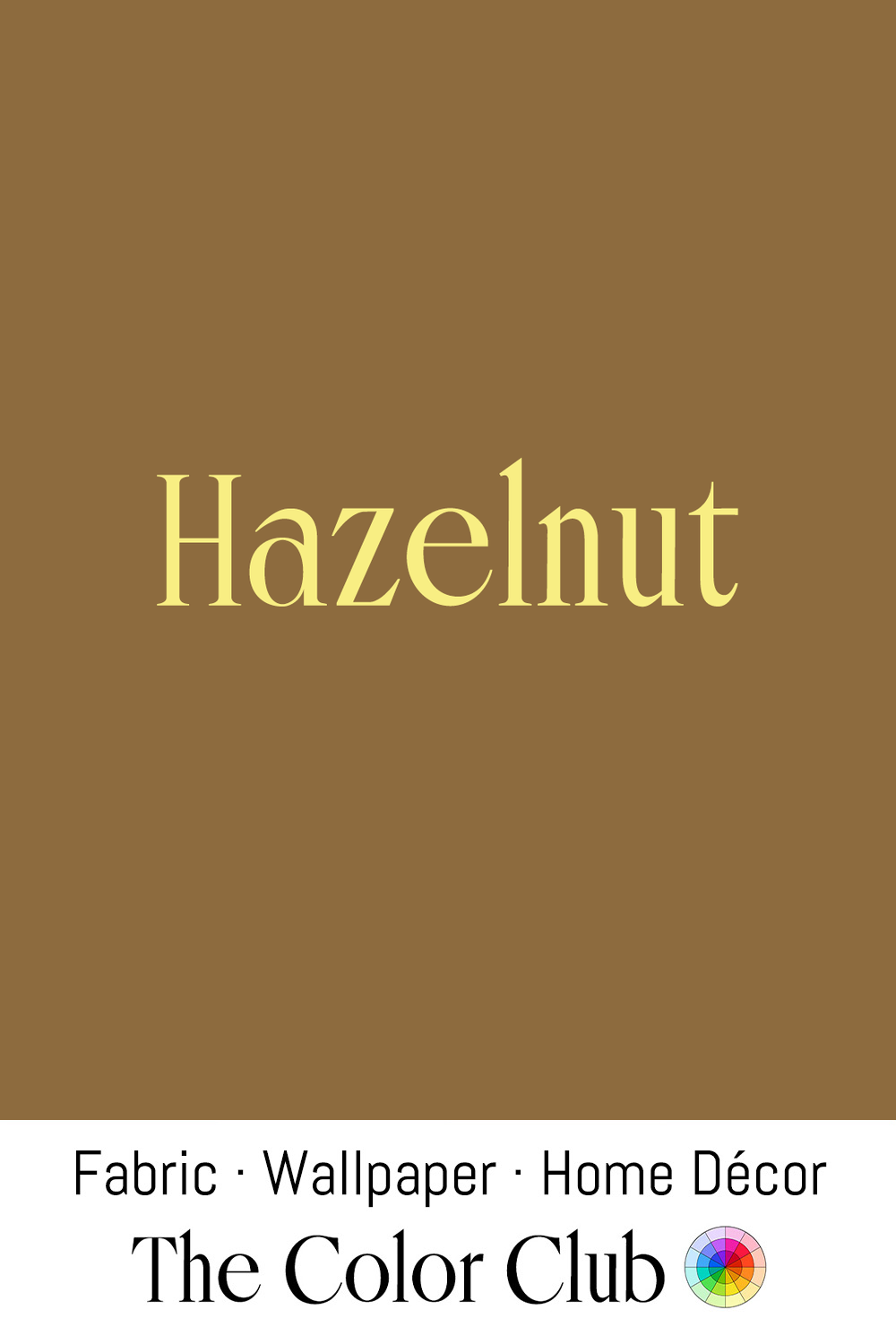
/ HAZELNUT / warm, rich brown, soft and toasty.
Pietro Ferrero, a pastry maker in Alba, in Italy's hazelnut-rich Piedmont region, created a sweet paste of hazelnuts, sugar, and scarce cocoa in 1946. His son Michele later refined it into a creamy spread, and in 1964, the first jar left the Ferrero factory under a new name: Nutella.
Warm, toasted browns became a fixture of 1970s interior palettes, appearing alongside avocado green and burnt orange in the earthy, nature-inspired color schemes that defined the decade's living rooms. The tone has since remained a staple of textile and leather goods design, valued for reading as warm and organic.
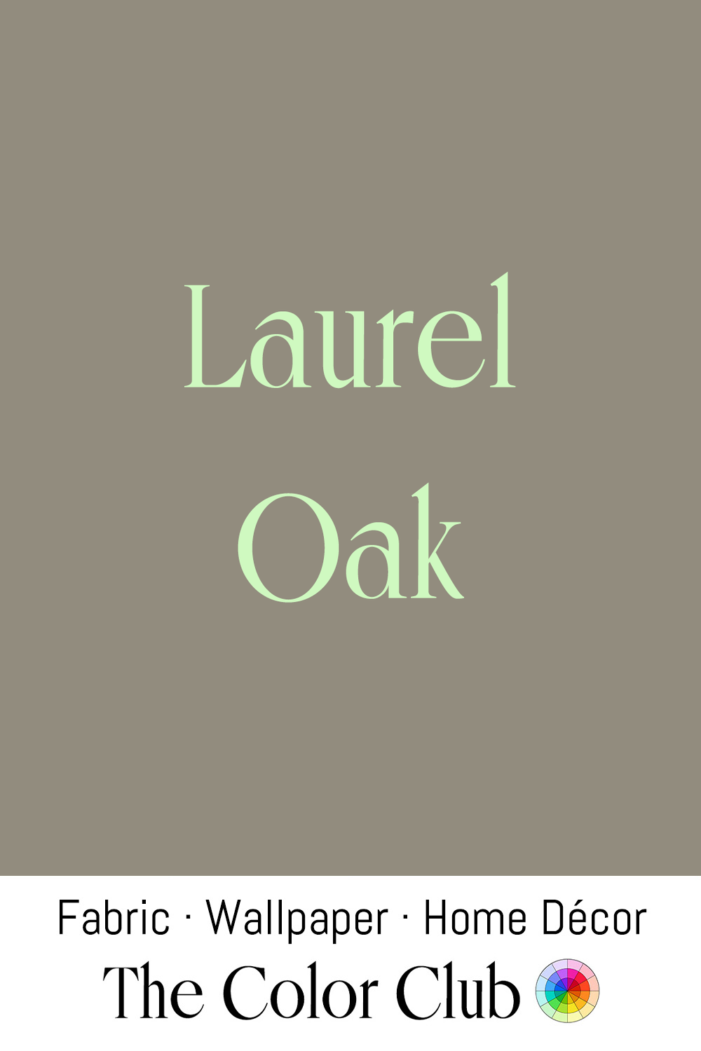
/ LAUREL OAK / soft, neutral grayish brown.
Native to the coastal plains of the southeastern United States, from Virginia down through Florida and west into Texas, Laurel Oak (Quercus laurifolia) is prized for its glossy, laurel-shaped leaves. Because it grows quickly enough to provide shade within a couple of decades, Laurel Oak became a favored ornamental street tree across southern towns and cities through the 20th century, planted along residential avenues for its dense oval canopy.
This grayish, warm-neutral brown sits squarely in the "greige" family that dominated interior design through the 2010s and early 2020s, used as a bridge between cool gray and warm beige on wall coverings and upholstery. By 2026, designers were turning toward warmer, more characterful mole-brown neutrals.
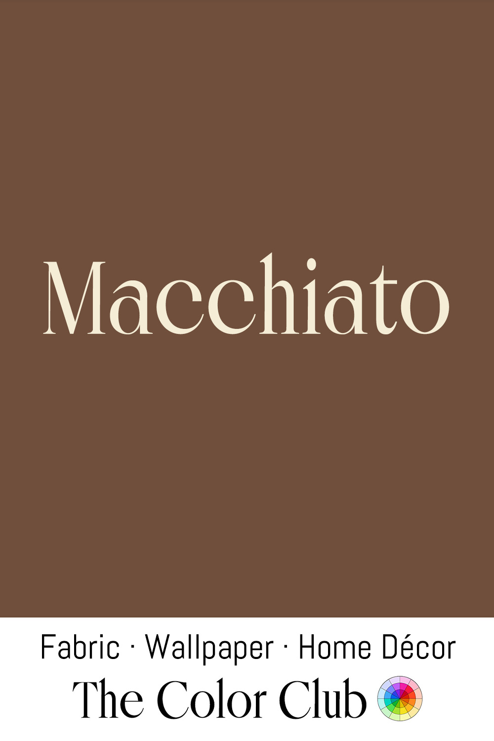
/ MACCHIATO / warm brown with a reddish undertone.
The word Macchiato means stained or marked in Italian: a barista drops a single measure of steamed milk into the espresso shot, and at that moment the liquid lifts to this even warm brown.
Milanese bar culture of the postwar decades made this the color of a working professional's mid-morning order, drunk standing, quickly, in two sips. Italian ceramic manufacturers of the 1960s produced small, thick-walled Macchiato cups in glazes deliberately matched to this tone, so the drink and its vessel read as one warm object on the zinc counter.
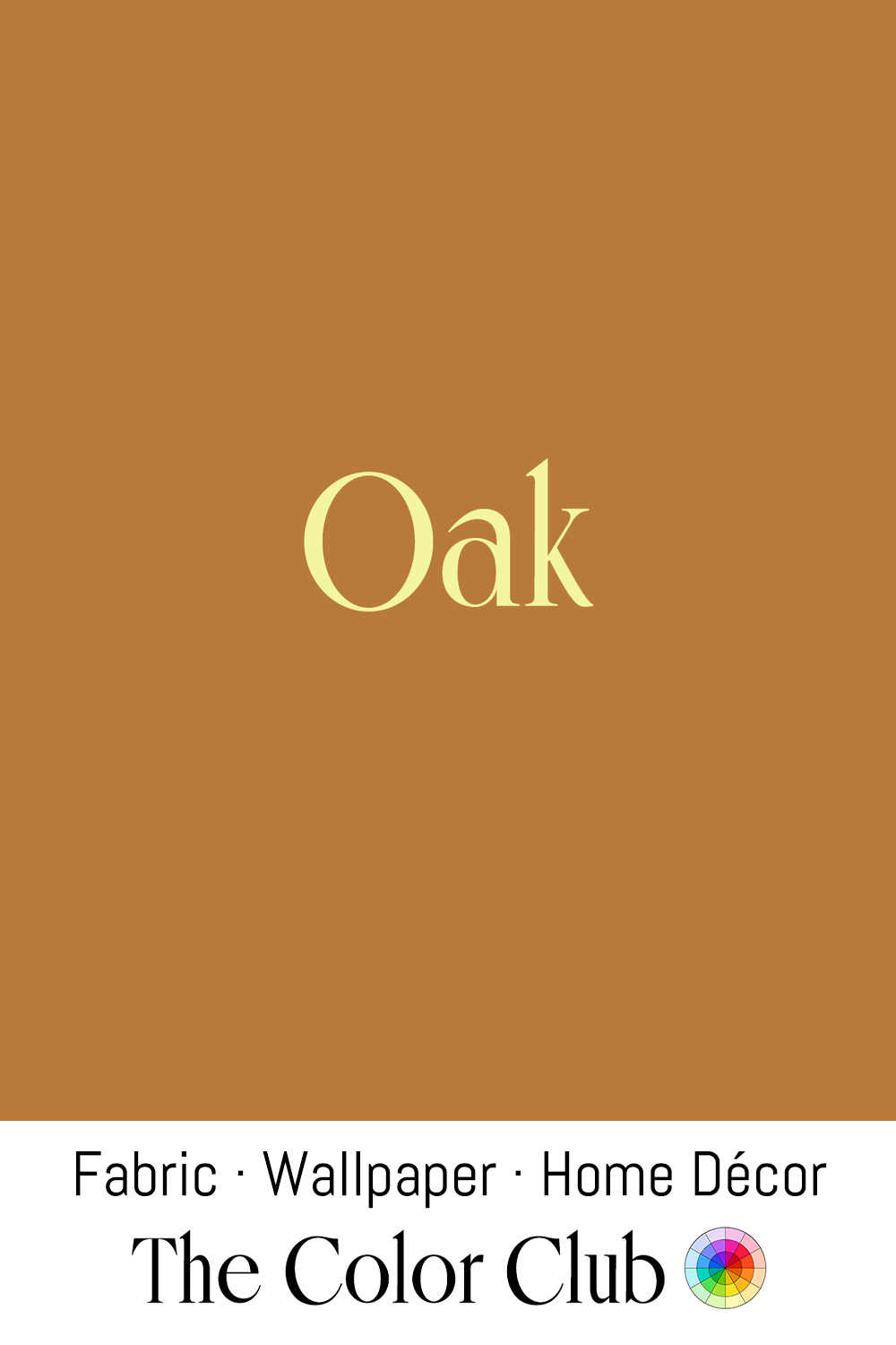
/ OAK / sun-warmed golden-brown.
Quercus robur, the English oak, has supplied timber for construction and shipbuilding since antiquity, so valued by the British Royal Navy that the phrase "Heart of Oak" became synonymous with the fleet, and it was the wood behind Henry VIII's warship the Mary Rose.
In 1900, American furniture maker Gustav Stickley began producing sturdy, quartersawn white oak furniture from his Craftsman Workshops in Syracuse, New York, launching the Mission style that came to define the American Arts and Crafts movement. His magazine The Craftsman spread the look nationwide, and oak's straight, honest grain remained the visual signature of the style through the 1910s.
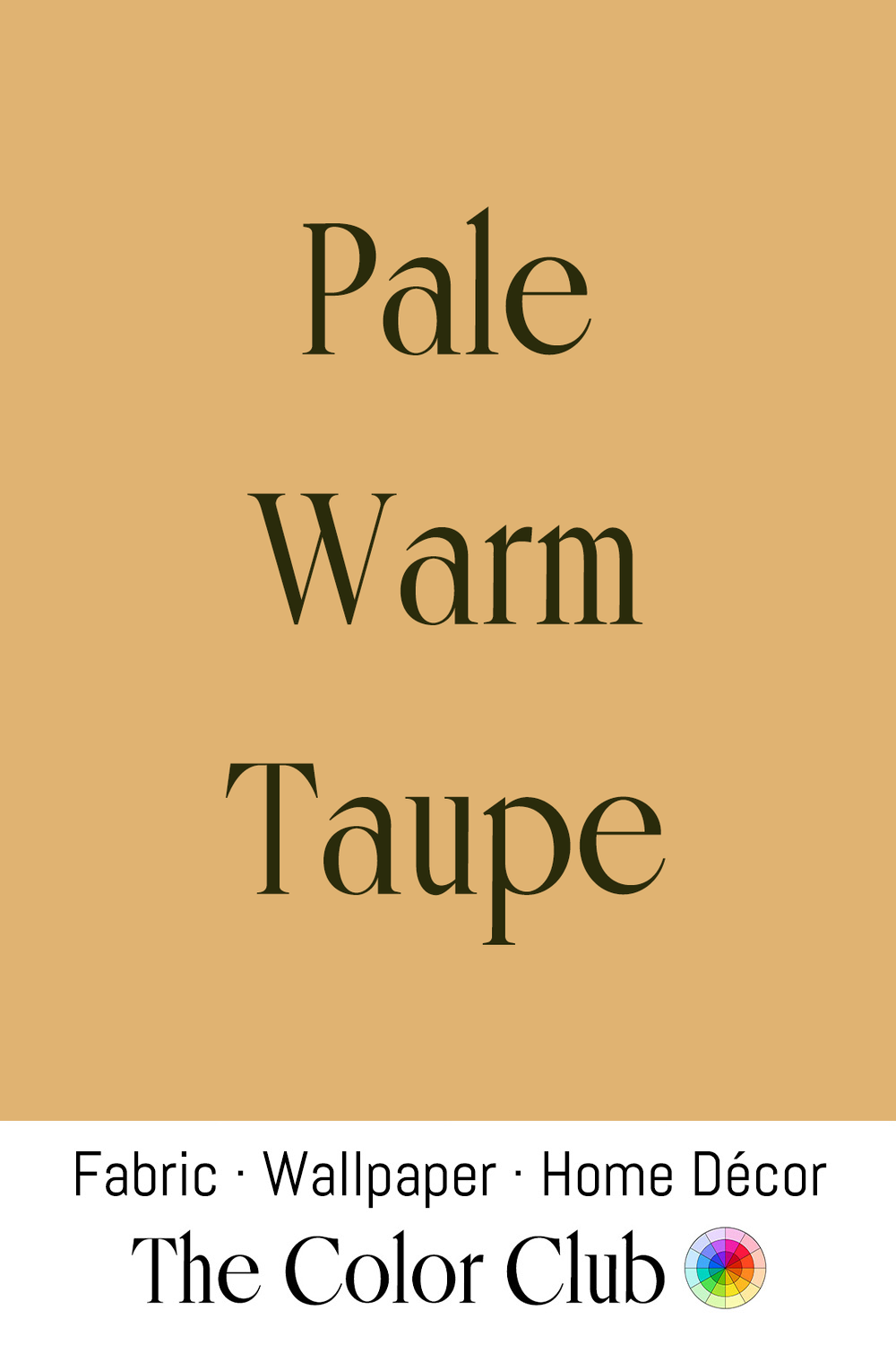
/ PALE WARM TAUPE / light, golden tan, soft and muted.
In French, a Taupe is a mole, and the color refers to the animal's velvety fur. The Oxford English Dictionary traces its first documented use as a color name in English to 1911, though American milliners were already describing it in print by 1906.
Fashion designer Coco Chanel embraced Taupe as part of her understated, luxurious palette of beiges in 1920s Paris. She likened the shades to the beauty of honey, sand and earth, pairing them with black and cream in her tailored suits. The color later became a mainstay of mid-century American interior design, valued as a warmer, richer alternative to plain beige in both upholstery and décor.
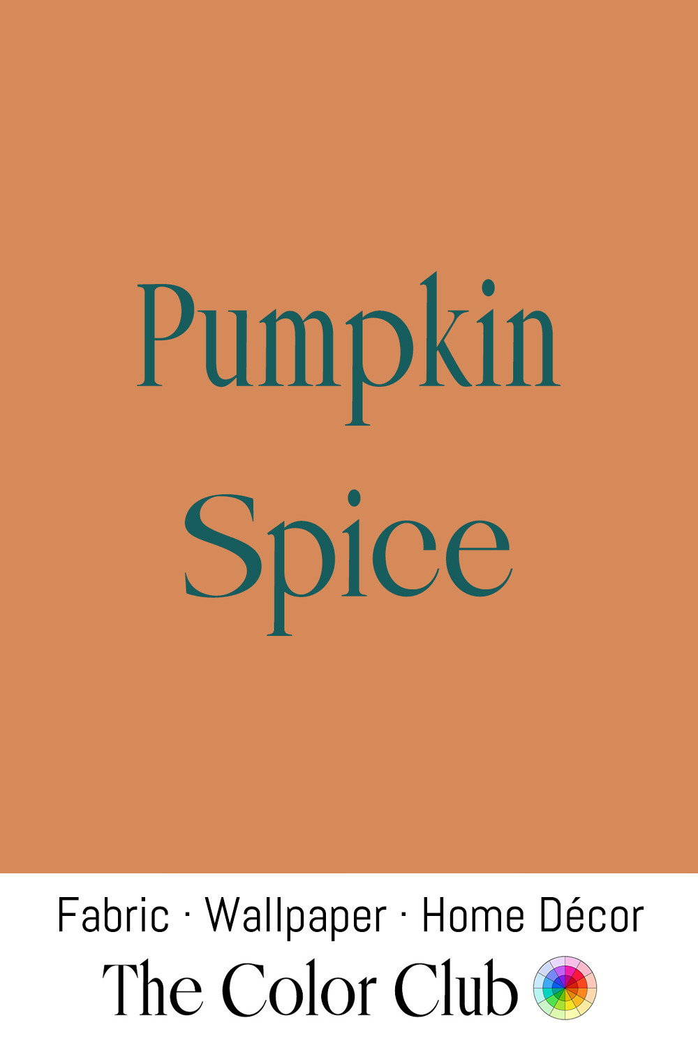
/ PUMPKIN SPICE / warming autumnal orange-brown.
In early 2003, a Starbucks team led by Peter Dukes developed the Pumpkin Spice Latte inside the company's Seattle "Liquid Lab," and it launched that fall as a limited test in 100 stores across Vancouver and Washington, D.C., quickly becoming the company's most popular seasonal drink.
The orange-brown tone predates the drink in fashion and interiors: designer Halston built much of his 1970s reputation on Ultrasuede shirtdresses in tobacco and apricot shades, while a similar warm rust-and-pumpkin palette filled American living rooms of the decade in shag carpets and upholstered furniture before returning to seasonal home décor trends every autumn.
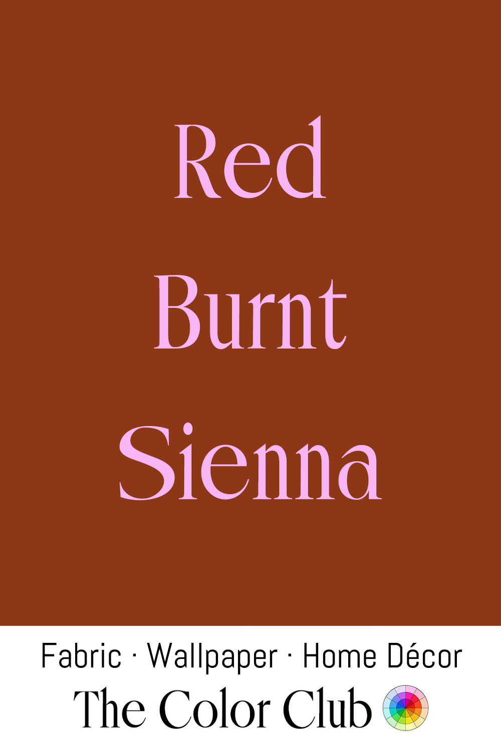
/ RED BURNT SIENNA / warm, earthy and deeply saturated.
The iron-oxide-rich earth pigment was mined near the Tuscan city Siena. Painters including Caravaggio and Rembrandt kept both raw and burnt Sienna in their palettes, and the English word Sienna was first recorded as a color name in 1760.
Sienna's iron chemistry lives on in rust dyeing, a textile craft in which fabric is soaked in vinegar and water, pressed against rusty metal objects, and left for a few days while the iron oxidizes directly onto the fibers. The technique yields a permanent, one-of-a-kind stain in this rust-red-brown range, and has become popular with fiber artists and hobbyists working in cotton and silk.
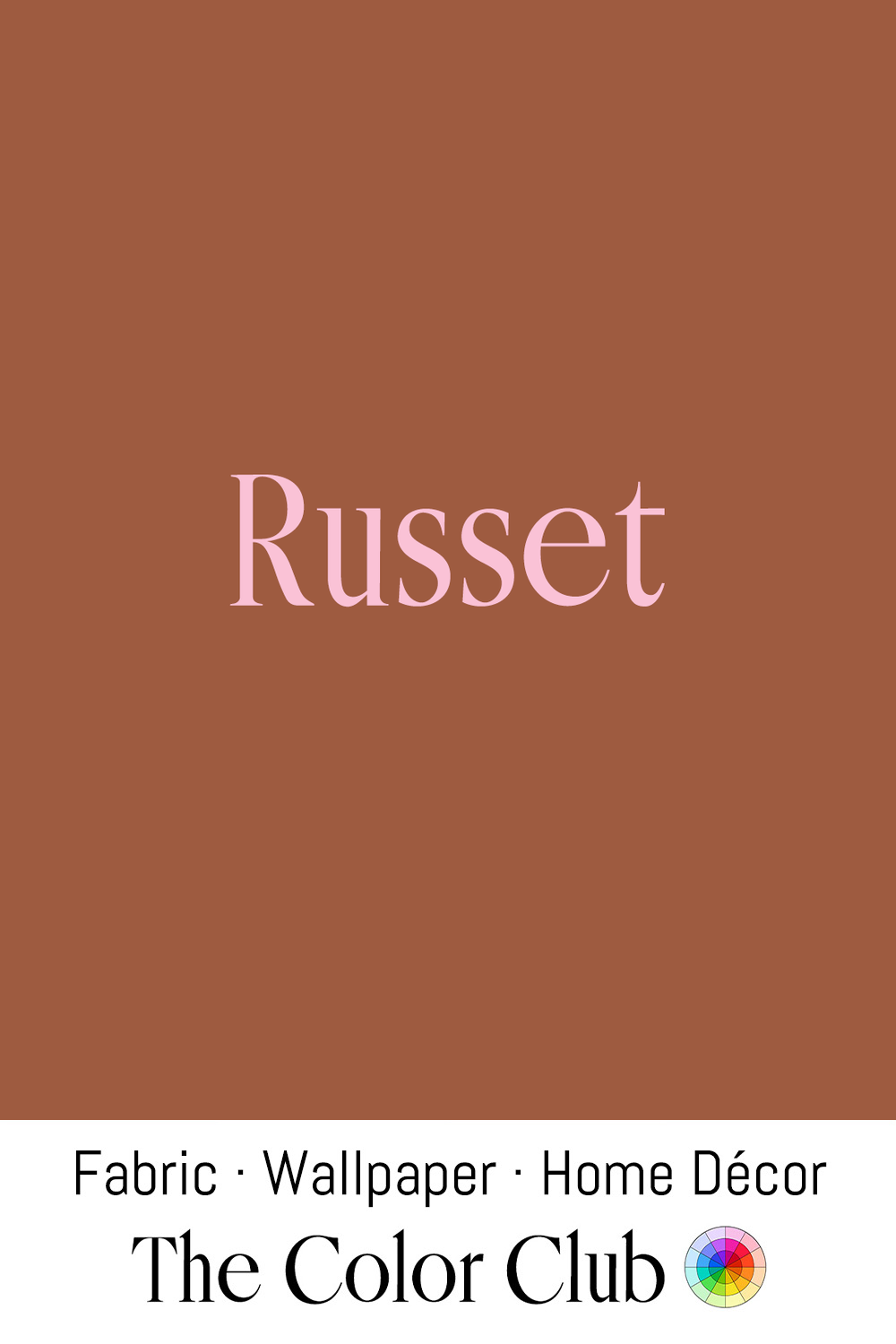
/ RUSSET / warm earthy weathered reddish brown.
Russet comes from the Latin russus, meaning red, and by the Middle Ages it named both a color and a coarse woolen cloth dyed with madder. England's sumptuary laws of 1363 restricted the poor to wearing only Russet or another cheap wool called blanket.
Russet shed its centuries-old association with poverty in the 20th century, becoming a staple of 1970s interior design, where it appeared on corduroy sofas, ceramics, and small appliances as part of the decade's broader turn toward organic, earth-toned palettes. It remains a recurring choice in fashion and interiors today, valued as a warm, autumnal neutral.
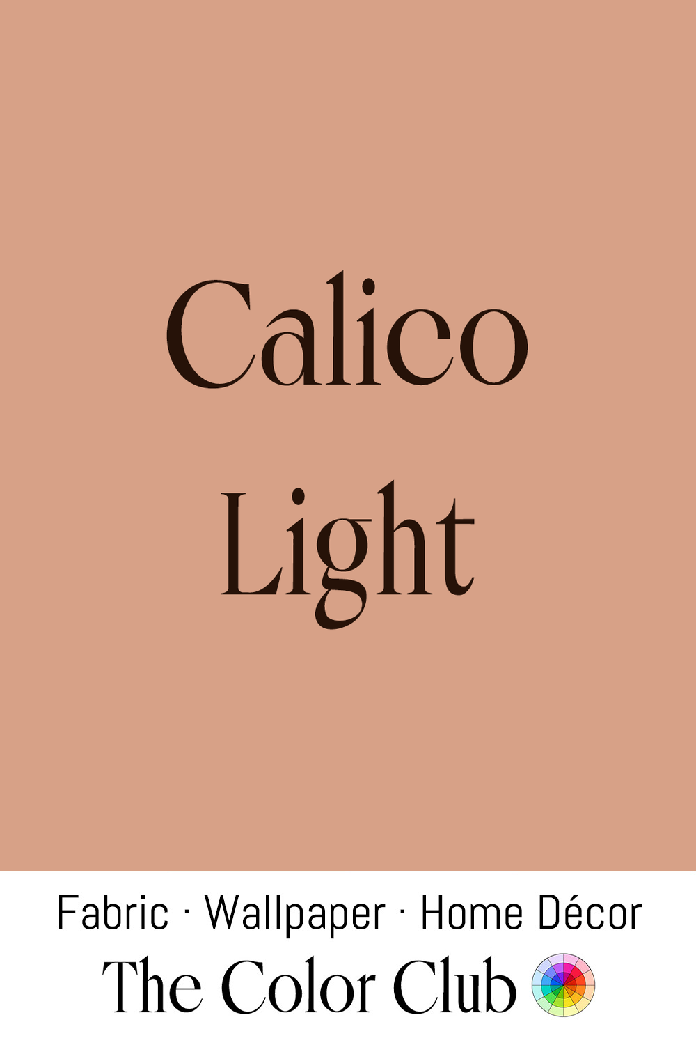
/ CALICO LIGHT / soft, warm and faded peachy-tan.
In Calicut, now Kozhikode, in the Indian state of Kerala, weavers had been producing plain-weave cotton cloth since at least the 11th century, and Calico is named after the port. Its printed cottons flooded into Europe in such volume that England banned them with the Calico Acts of 1700 and 1721 to protect its wool and linen trade, pushing manufacturers there to learn India's own block-printing and dyeing techniques.
By the 19th century, small-repeat Calico prints had become the fabric of choice for American pieced quilts, their tiny motifs and low cost letting quiltmakers cut them into hundreds of interlocking pieces. Made both overseas and in the new mills of New England, they traveled west with the country's expanding population.
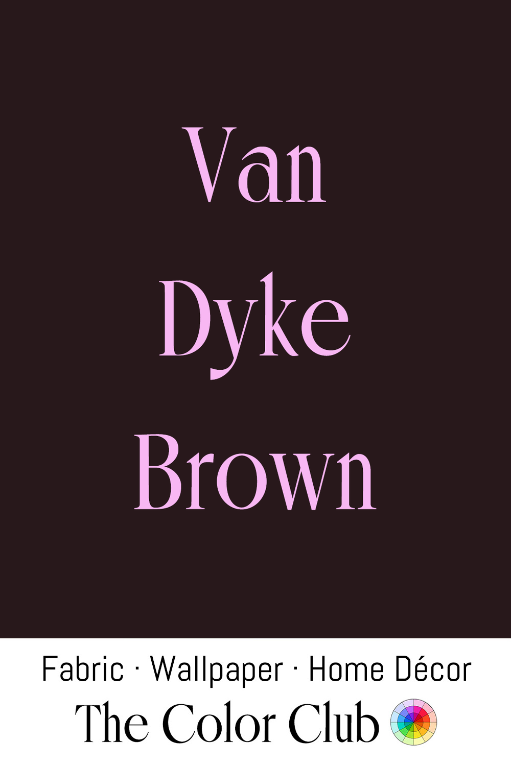
/ VAN DYKE BROWN / very dark, warm, dense and almost black.
Mined in Germany, the pigment has been in use since at least the 16th century. The Flemish painter Anthony Van Dyck used it constantly, mixing it with lead white for underpainting, working it into the folds of drapery, and combining it with vermilion and white to build warm shadows into flesh tones.
The name carried into photography in the late 19th century with the Van Dyke Brown printing process, developed from Sir John Herschel's 1842 iron-silver formulas, which produced warm, sepia-toned contact prints. Artists revived the technique in the 1960s and 70s for its handmade, painterly quality.
/ DADDY BROWN / deep, grounded, warming umber.
In Old English, brún was already a color term by around 1000 CE, and the pigment behind it is far older still: umber, an iron-and-manganese earth pigment, appears in cave paintings dating back more than 40,000 years.
Through the 20th century, the color's long association with humility and craft carried into uniform trades and workwear. In 1916, the delivery company that became UPS chose a deep brown for its vehicles and uniforms, matching the Pullman rail cars and hiding road dirt. In recent fashion cycles the color has reversed course entirely: as deep chocolate, toffee and caramel tones returned to clothing and home goods in the early 2020s, color consultant Eve Ashcraft, who helped develop Martha Stewart's original paint line, called brown "the comfort food of color."
/ BALLET BRONZE / warm and softly muted. / BALLET BROWN / dark, warm, and deeply muted.
Freed of London, founded in 1929 by cobbler Frederick Freed and his wife Dora in a Covent Garden basement, has made pointe shoes in a single traditional pink for generations, still supplying the Royal Ballet and New York City Ballet in that same shade today.
In the early 1970s, Dance Theatre of Harlem began customizing its dancers' tights, pointe shoes and ribbons in shades of brown to match their skin tones. In 2018, working with the London company Ballet Black, Freed introduced Ballet Brown and Ballet Bronze after more than a year of development, becoming the first British dancewear manufacturer to offer pointe shoes beyond that single traditional pink, giving dancers of color a shoe that matched their own skin tone.