

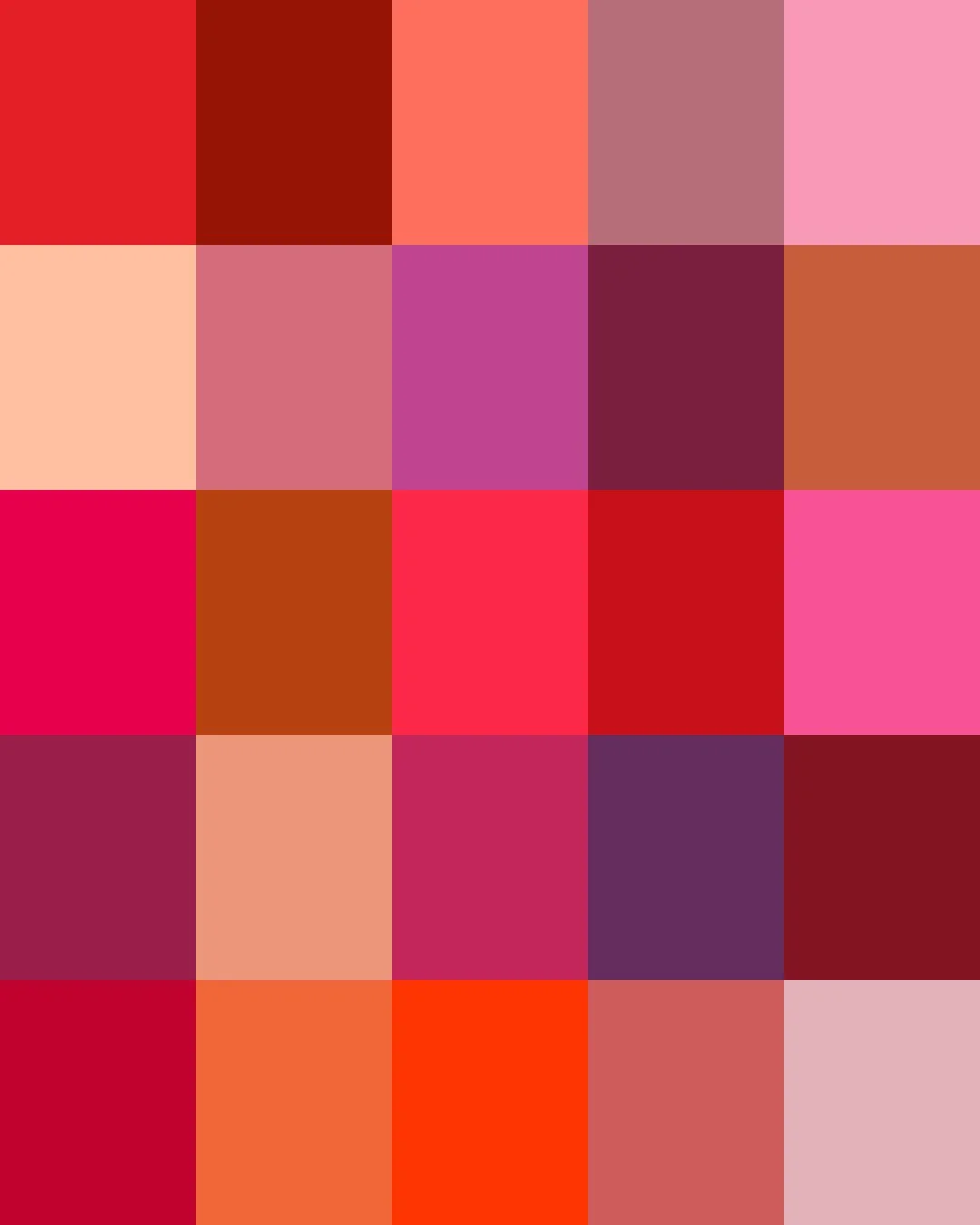
From ancient China, where ground cinnabar colored the lacquered thrones and ceremonial vessels of the imperial court, to Renaissance Europe's cochineal, a crimson dye pressed from Mexican insects and reserved for the robes of cardinals, red was the sign of prestige.
By the twentieth century, synthetic dyes had turned red into an everyday color, no longer reserved for the powerful. Today's reds range from soft blush pastels and cherry brights to the deep tones of wine and burnished rust.
Here are the stories about some of our Reds. Clicking on a Color will take you to our Spoonflower shop where you can order it on 60+ types of Fabric, Wallpaper, and Home Décor Products.
Or, save your favorites to your Pinterest boards for later.

/ CHRISTMAS RED / for all your ho-ho-holiday crafts.
German-born cartoonist Thomas Nast drew Santa Claus for Harper's Weekly every Christmas season from 1863 to 1886, shaping him into a distinctly American figure, plump and red-suited. Nast drew on his own childhood memory of Saint Nicholas Day in Germany, honoring a 4th-century bishop whose feast was traditionally celebrated on December 6th — a European gift-giving tradition centuries older than any American illustration.
From 1931, Haddon Sundblom's Christmas advertising for Coca-Cola fixed the image of the Christmas Red American Santa Claus around the world.
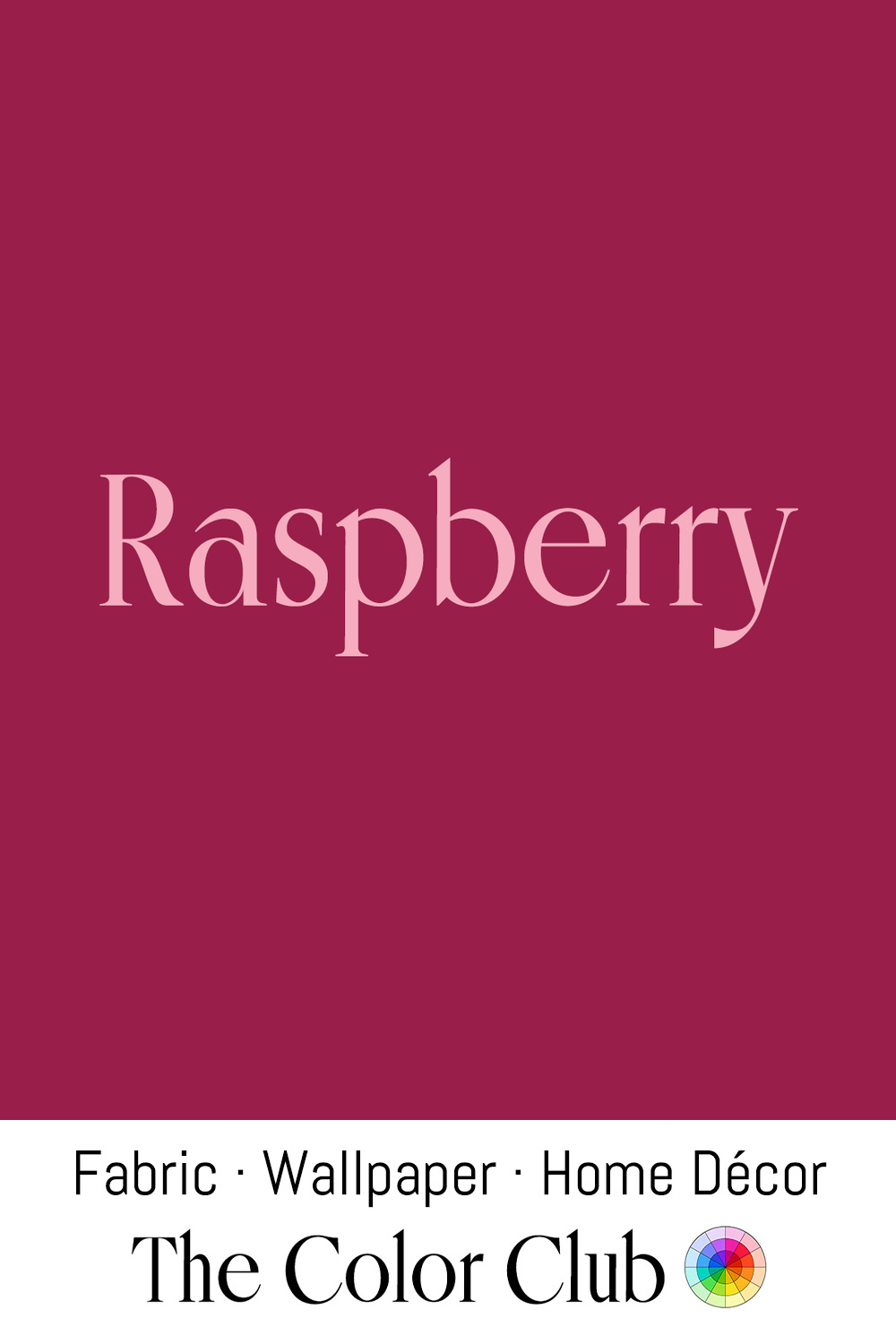
/ RASPBERRY / deep, dark, fruity pink-red.
One of the earliest documented uses of the name in fashion survives at London's Victoria and Albert Museum: a 1913 design titled simply "Raspberry," a deep pink-red skirt suit paired with a dark brown fur muff and stole, from a bound album of designs by Madame Elizabeth Handley-Seymour, one of London's leading court dressmakers of the era.
Seven decades later, Prince's 1985 single "Raspberry Beret" fixed the color's playful, slightly vintage connotation firmly into pop culture.
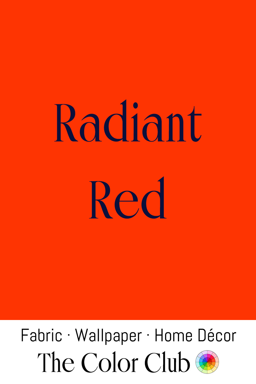
/ RADIANT RED / vividly saturated hot color of speed.
Red has been the national racing color of Italy for over a century. In July 1907, Felice Nazzaro drove a red Fiat to victory at the French Grand Prix in Dieppe, the first time French motoring had been beaten on its own soil, and rosso corsa has marked Italian racing cars ever since, the way France raced in blue and Britain in green.
When Enzo Ferrari founded his own marque decades later, he carried the color forward, and it remains the color most associated with Ferrari, Alfa Romeo, and Ducati today.
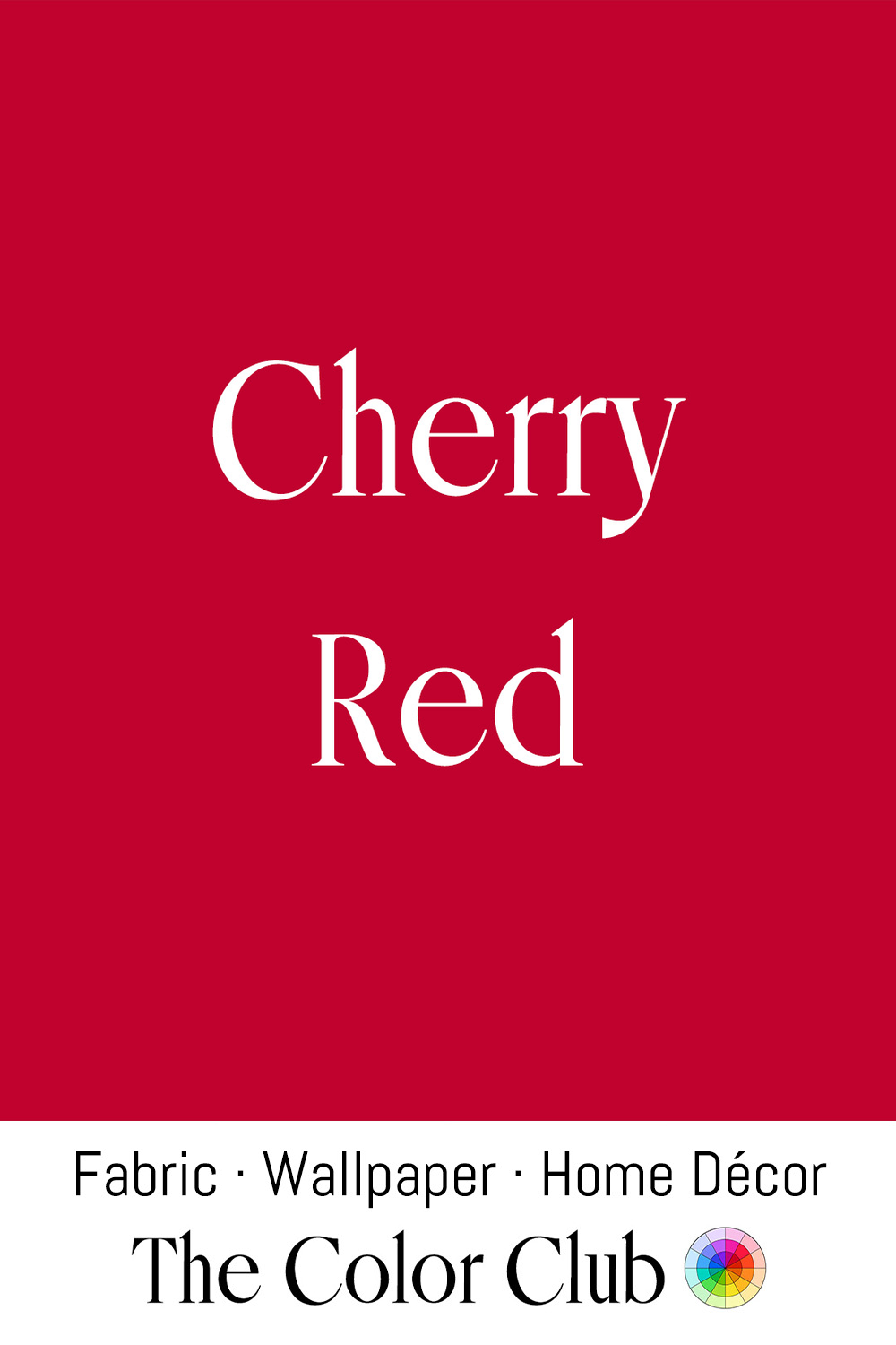
/ CHERRY RED / classic lipstick, party girl look.
Dorothy Draper, the influential American decorator, built her signature high-contrast, high-color schemes on the belief that "lovely, clear colors have a vital effect on our mental happiness," and in her Depression-era newspaper column she urged readers to take red and paint their front doors with it.
Draper's philosophy played out at scale in 1946, when she took on the largest hotel redecoration in American history at the time: a $4.2 million overhaul of The Greenbrier resort in West Virginia, which had spent the war as an army hospital. Her red wingback armchairs, set against the lobby's black-and-white checkerboard marble floor, became one of the defining images of the reopened hotel.
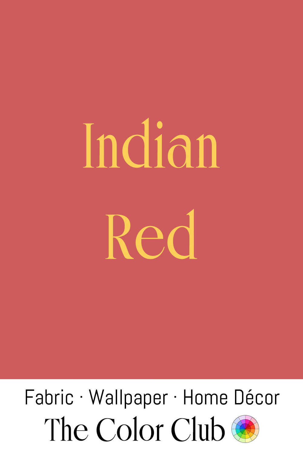
/ INDIAN RED / brick-warm and dusky.
A genuine historic pigment, an iron oxide, or hematite, originally mined on the Indian subcontinent and traded to European painters for centuries, valued for a warmth and permanence few other reds could match.
Rembrandt relied on it and pigments like it constantly, building the deep, glowing shadows and grounds of his paintings from layers of natural iron oxide earths rather than costlier alternatives, a technique modern conservators have confirmed through pigment analysis of his canvases. Its stability has kept paintings made with it looking remarkably unchanged centuries later, which kept it a staple on professional painters' palettes long after cheaper synthetic reds became available.
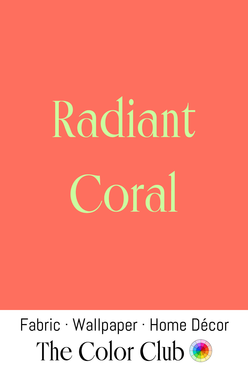
/ RADIANT CORAL / lush and luxurious pink-orange.
The Italian coastal town of Torre del Greco, near Naples, is the historical center of Coral harvesting, documented back to at least the 15th century. The jewelry industry there formally began in 1805, when the King of Naples granted a ten-year manufacturing monopoly to a Coral broker from Marseille, and the trade quickly earned the Coral its local nickname, "red gold."
Generations of Torre del Greco family workshops have carved Coral into necklaces, cameos, and beads ever since, supplying European courts and, later, global jewelry markets. The craft has been put forward as a candidate for UNESCO recognition, and the town's Museo del Corallo, opened in 1933 at the coral-working school founded in 1878, continues to celebrate centuries of this craftsmanship today.
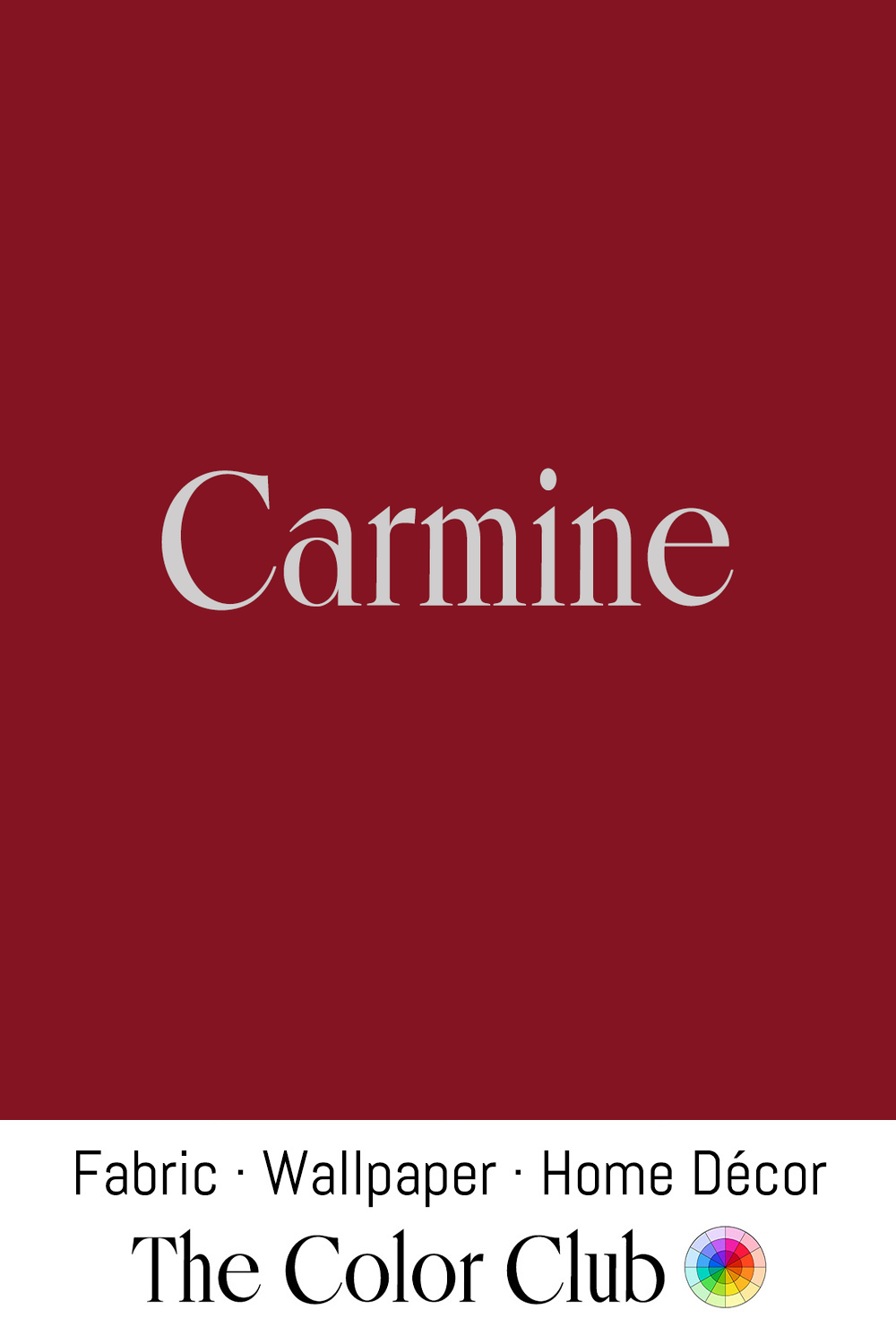
/ CARMINE / deep, dark red.
Carmine comes from cochineal, a tiny scale insect farmed by Mesoamerican peoples for over two thousand years, once used to dye the clothing and feathers of Aztec nobility. After the conquest of 1521, it became one of Spain's most valuable exports, and European royalty and the Catholic clergy adopted it too.
The same pigment still colors lipstick and blush today, listed on labels as "carmine" or "Natural Red 4." The FDA approved it for cosmetics in 1977, and it remains prized over synthetic reds for staying color-fast through heat, light, and hours of wear.

/ CINNABAR RED / earthy and warm with a strong orange undertone.
Cinnabar is mercury sulfide in its natural mineral form, used as a pigment since Neolithic times, when the people of Çatalhöyük, in present-day Turkey, painted their walls with it. It was also the dominant red in Chinese lacquerware, imperial seals, and ceremonial objects for thousands of years, its warmth carrying associations with luck, vitality, and imperial authority.
Chinese cinnabar lacquer, built up in dozens of layers and carved into intricate relief, reached its peak under the Ming and Qing dynasties. Despite the toxicity of its mercury, artists kept using it for its unmatched warmth and opacity until cadmium red arrived in the 20th century.
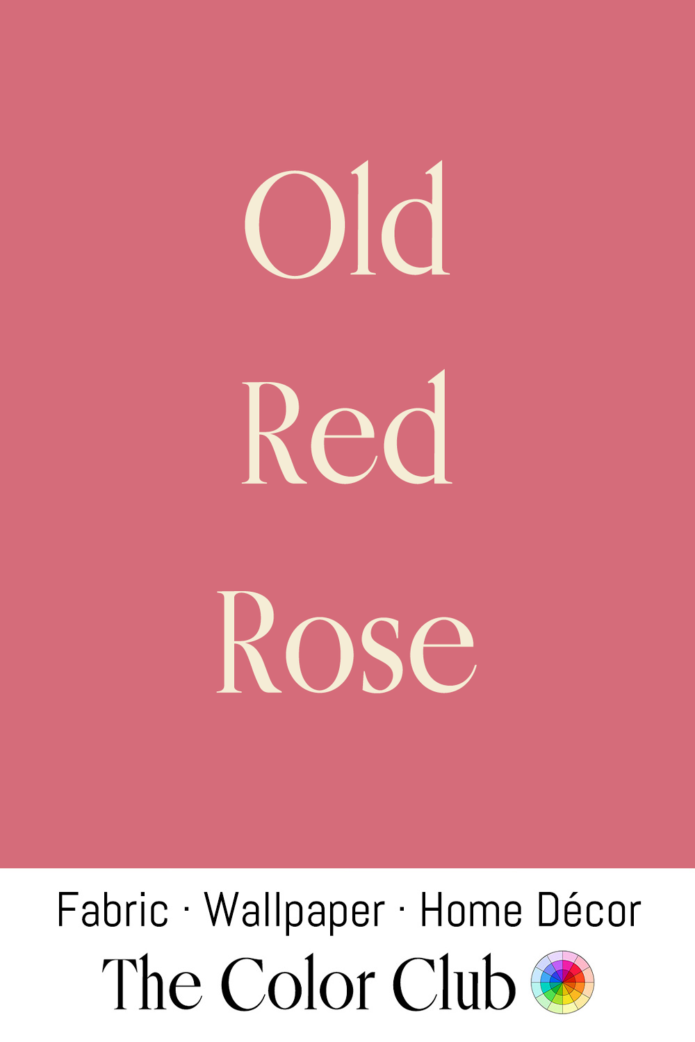
/ OLD RED ROSE / softened dusty ladylike antique patina.
Old rose was first recorded as a color name in 1892. Rose growers draw their line at 1867, when French breeder Jean-Baptiste Guillot introduced 'La France,' the first hybrid tea, and in 1966 the American Rose Society made it official: any class of rose that existed before that year counts as an old garden rose.
During his Rose Period, from 1904 to 1906, Pablo Picasso painted The Actor, now at the Metropolitan Museum of Art in New York, rehearsing in an Old Red Rose costume.
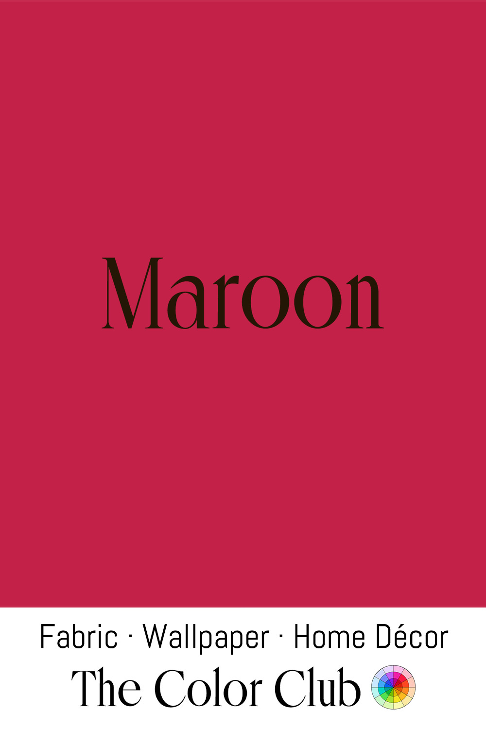
/ MAROON / classic bold, warm red.
The name derives from the French marron (chestnut) and was first recorded in English in 1789, though the connection to this particular vivid, pink-leaning red is a linguistic drift, not a direct color match.
The tone was historically achievable through madder root (Rubia tinctorum), one of the oldest dye plants in cultivation, used across ancient Egypt, Persia, and India to produce deep reds in wool and silk. Its institutional associations were cemented through the 19th century, when a red of this depth became a standard for school and university colors across Britain and the United States, chosen for its seriousness and visual authority.
Today, it remains one of the most widely used colors in sports identity and academic heraldry, carrying a consistent weight of tradition and establishment.
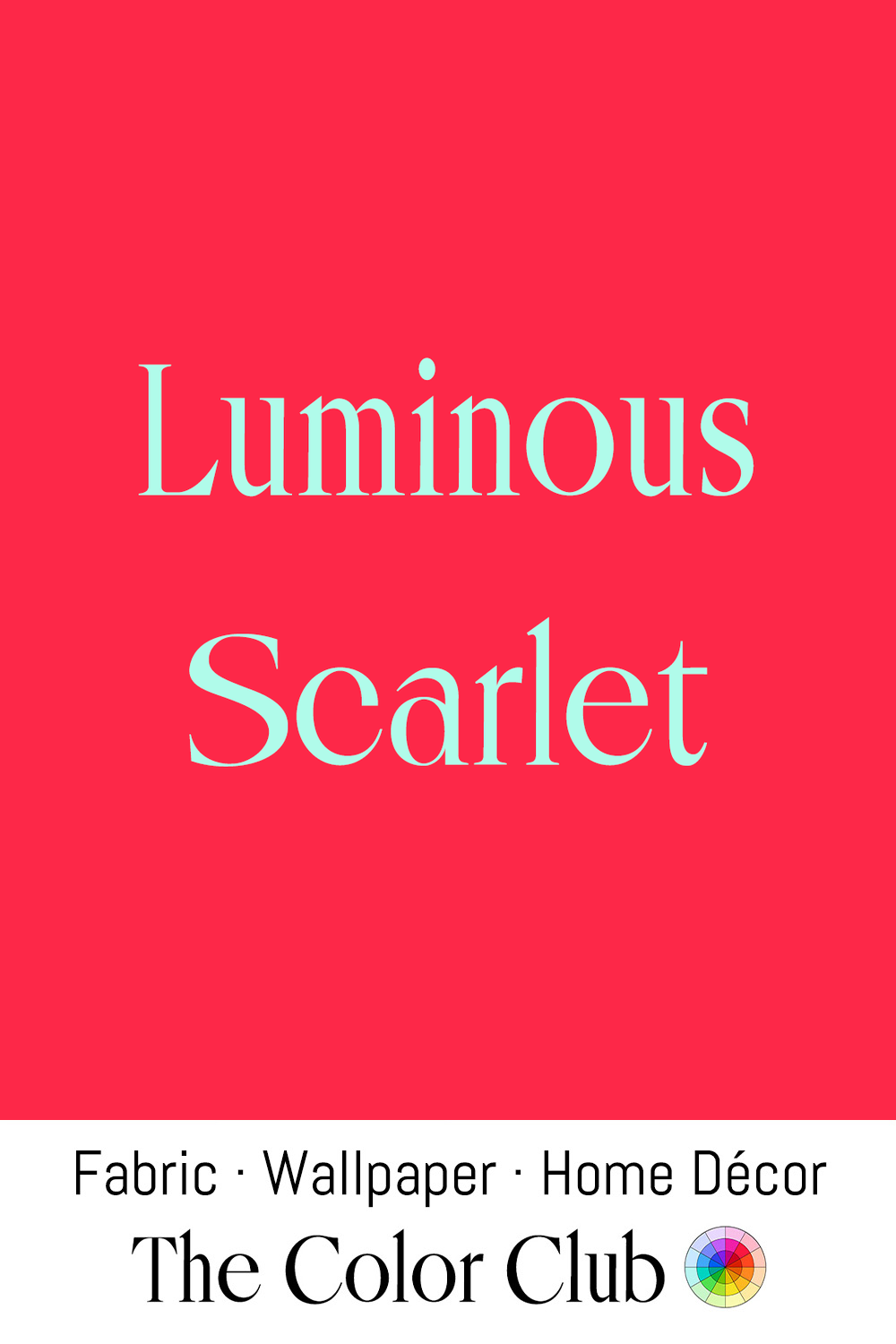
/ LUMINOUS SCARLET / intensely passionate vivid red-pink.
Luminous, jewel-toned reds have long been made from lac, extracted from the resin of the Kerria lacca insect native to India and Southeast Asia. Lac has colored silk and wool for more than two thousand years. The word "lake," still used today for a whole family of pigments, comes directly from "lac," carried into English by way of Arabic and Persian trade routes.
In 1969, Olivetti launched the Valentine, a portable typewriter designed by Ettore Sottsass with Perry King to be as ordinary an everyday tool as a pencil, in a glossy red close to Luminous Scarlet from its body to its carrying case. It became a pop design icon and was in the permanent collection of the Museum of Modern Art in New York by 1971.
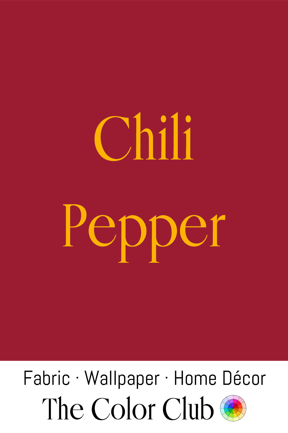
/ CHILI PEPPER / spicy deep red with a blue undertone.
The skin of the dried red Chili Pepper (Capsicum annuum) deepens from bright red to a darker, more complex tone in the drying process. The pigment responsible, capsanthin, is unique to the Capsicum genus, and was first isolated in crystalline form by Hungarian chemists László Zechmeister and László Cholnoky in 1927.
Red chili peppers became a signature print of Dolce & Gabbana, part of the label’s celebration of its sun-soaked Mediterranean heritage. In 2000, the house used them on a red minidress, and its spring/summer runway show that year was set against a food market of wooden crates brimming with peppers and fresh herbs. By the late 2010s, little chili peppers had spread across fashion as prints, earrings, anklets and mini bags.
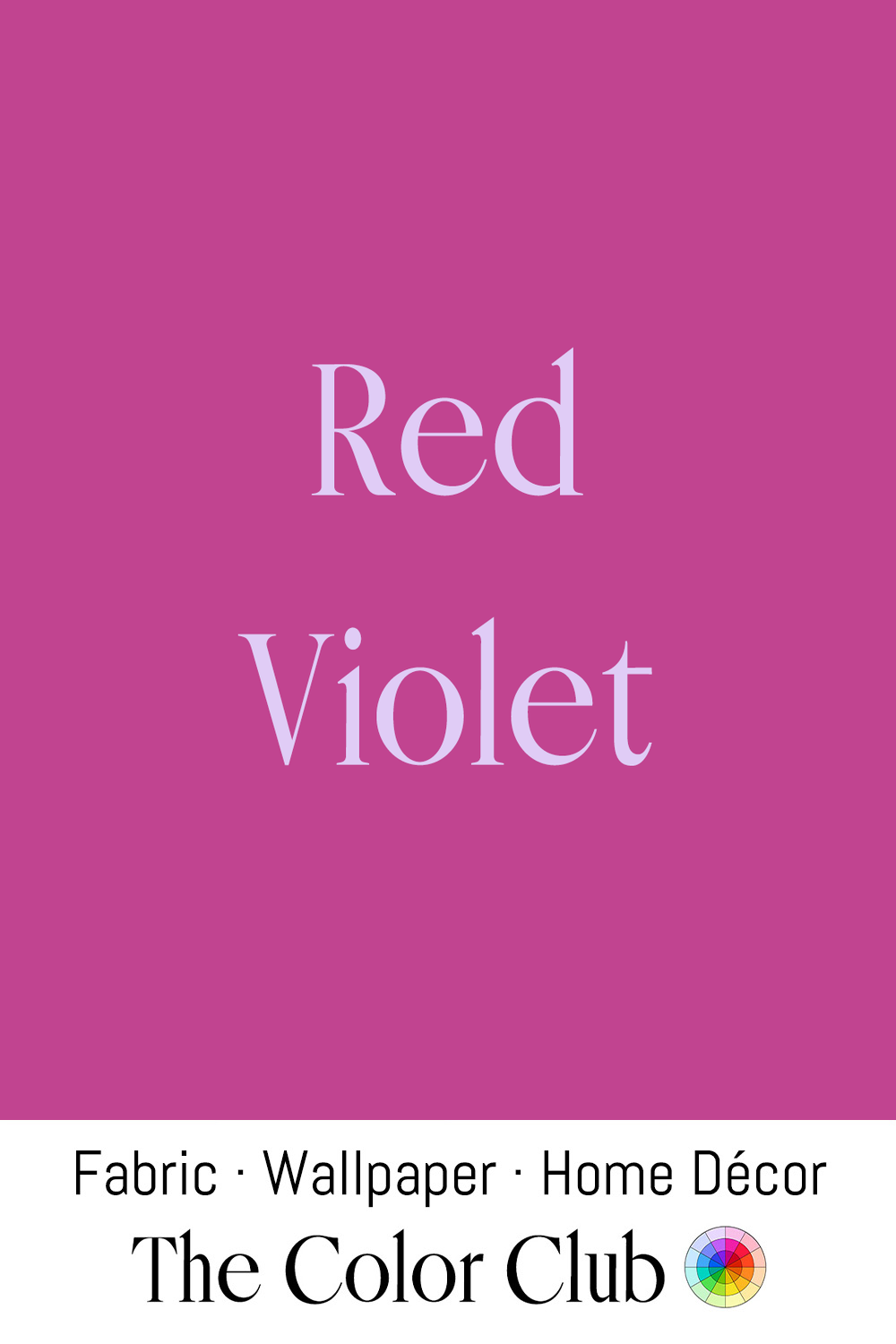
/ RED VIOLET / vivid, cool floral purple.
Red-violet is one of the in-between tones mapped by Moses Harris, an English engraver and entomologist who published The Natural System of Colours in 1766, one of the first color wheels to methodically name the hues sitting between a primary and a secondary color. Harris needed precise, repeatable color language to describe the insects he studied and illustrated, and his wheel placed red-violet among these tertiary tones, mixed from red and the purple that red and blue produce together.
His system, hand-painted and engraved well before synthetic dyes existed, became a foundational reference for later color theory, establishing the naming logic that still places red-violet where it sits today, as a definite, namable color of its own, bridging red and purple.

/ BEETROOT / intensely pigmented warm red-purple.
Betacyanin, a pigment compound, gives the root of Beta vulgaris its extraordinary staining intensity. The plant has been cultivated since antiquity across the Mediterranean, first for its leaves. The Romans used the root medicinally. In the 19th century its juice became a cheek and lip stain and a Victorian hair dye, valued for the depth of its purple-red despite its tendency to fade.
The pigment gained new commercial relevance in the 20th century as a natural food colorant, registered as E162, and became a key ingredient in the clean-label movement's push to replace synthetic reds in processed food from the 1990s onward.
/ MUTED PALE RED / soft, dusty, quiet and understated.
In the early 1700s, Venetian painter Rosalba Carriera helped establish pastel as a serious portrait medium, prized across Europe for its soft, powdery flesh tones. Her sitters included Louis XV of France and members of the Saxon and Austrian royal courts, and her velvety technique made her one of the most sought-after portraitists of her time.
Soft, faded shades later became a signature of British designer Laura Ashley, whose eponymous company built an entire aesthetic around Victorian- and Edwardian-inspired floral prints starting in the 1950s and 60s, dyed in muted, washed-out colors. By the 1970s and 80s, those prints had become a defining look of British homes and wardrobes, cemented further when Princess Diana was photographed wearing the brand before her 1981 wedding.

/ PERSIMMON / sun-kissed warm burnt orange-red.
In the Powhatan language of the Tidewater, later Virginia, the fruit was recorded as pasimenan, putchamin or pessamin, meaning "dry fruit." It was popular with the colonists at Jamestown, where archaeologists have recovered more than a hundred of its seeds. Captain John Smith described it in his 1612 account of Virginia, writing that an unripe one "will drive a man's mouth awrie with much torment," though ripe it was "as delicious as an apricock."
In interiors, Persimmon has had a recent resurgence, named one of the defining color trends of Spring 2025 by Better Homes & Gardens, with designers like Laurie DiGiacomo and Ellie Stein citing its warm, sun-kissed quality as an easy way to bring an inviting, cozy energy into a room.
/ RED MAHOGANY / warm, woody, reddish brown.
Mahogany overtook walnut as England's most fashionable furniture wood after 1721, when Parliament's Naval Stores Act removed import duties on colonial timber, flooding London workshops with wood from Jamaica, Cuba, and later Honduras. The decades that followed, sometimes called furniture's "Golden Age," produced the work of Thomas Chippendale and defined Georgian interiors.
And Mahogany is back: Homes & Gardens named it a defining trend of 2025, with designers like Sims Hilditch and Becky Shea folding its deep reddish tones back into contemporary rooms for warmth and contrast against lighter materials like marble or travertine.
/ TOMATO RED / fruity rich and orangey warm.
In 1544, Italian botanist Pietro Andrea Mattioli gave Europe its first written description of the tomato, a new fruit from the Americas. Ten years later he noted that some plants ripened to gold and others to red, and called the fruits pomi d'oro, "golden apples," the root of the Italian pomodoro.
Sicily, where Domenico Dolce was born, has inspired Dolce & Gabbana since its 1987 collection "La Sicilia." Its Spring 2019 runway sent out a dress printed with cans of tomatoes. Four years later, the TikTok aesthetic "Tomato Girl Summer" put a bright, orange-leaning tomato red everywhere, and interior designers carried it into homes.
/ SHOCKING PINK / vivid, saturated fuchsia with a violet edge.
Named and claimed by fashion designer Elsa Schiaparelli in 1937, the color Shocking Pink even had a perfume named after it. Inspired by a Cartier pink diamond belonging to her client Daisy Fellowes, a Singer sewing machine heiress and one of the era's leading style icons, Schiaparelli described the color as evoking the vivid hues of China and Peru rather than anything typically Western, "pure and undiluted."
The perfume's bottle, shaped like a woman's torso, was designed by Surrealist artist Leonor Fini. The color became inseparable from Schiaparelli's provocative, art-driven approach to fashion between the two World Wars.
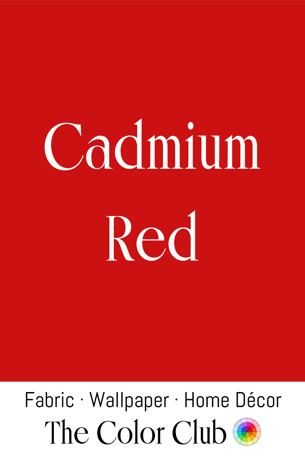
/ CADMIUM RED / pure, warm orangey.
Few color names refer as directly to their own chemistry as Cadmium Red. The element Cadmium was discovered by German chemist Friedrich Stromeyer in 1817, and Cadmium sulfoselenide pigments were developed industrially over the following decades, with Cadmium Red first sold commercially as an artists' pigment in the early 20th century. Painters valued it from the start for its opacity and lasting lightfastness.
Henri Matisse adopted it as a primary tool, using it in flat, unmodulated planes across his major works of the 1910s and 1920s to assert color as a structural force in its own right. Mark Rothko returned to it repeatedly in his large-scale color field paintings of the 1950s, where its saturated warmth became a vehicle for sustained emotional intensity.
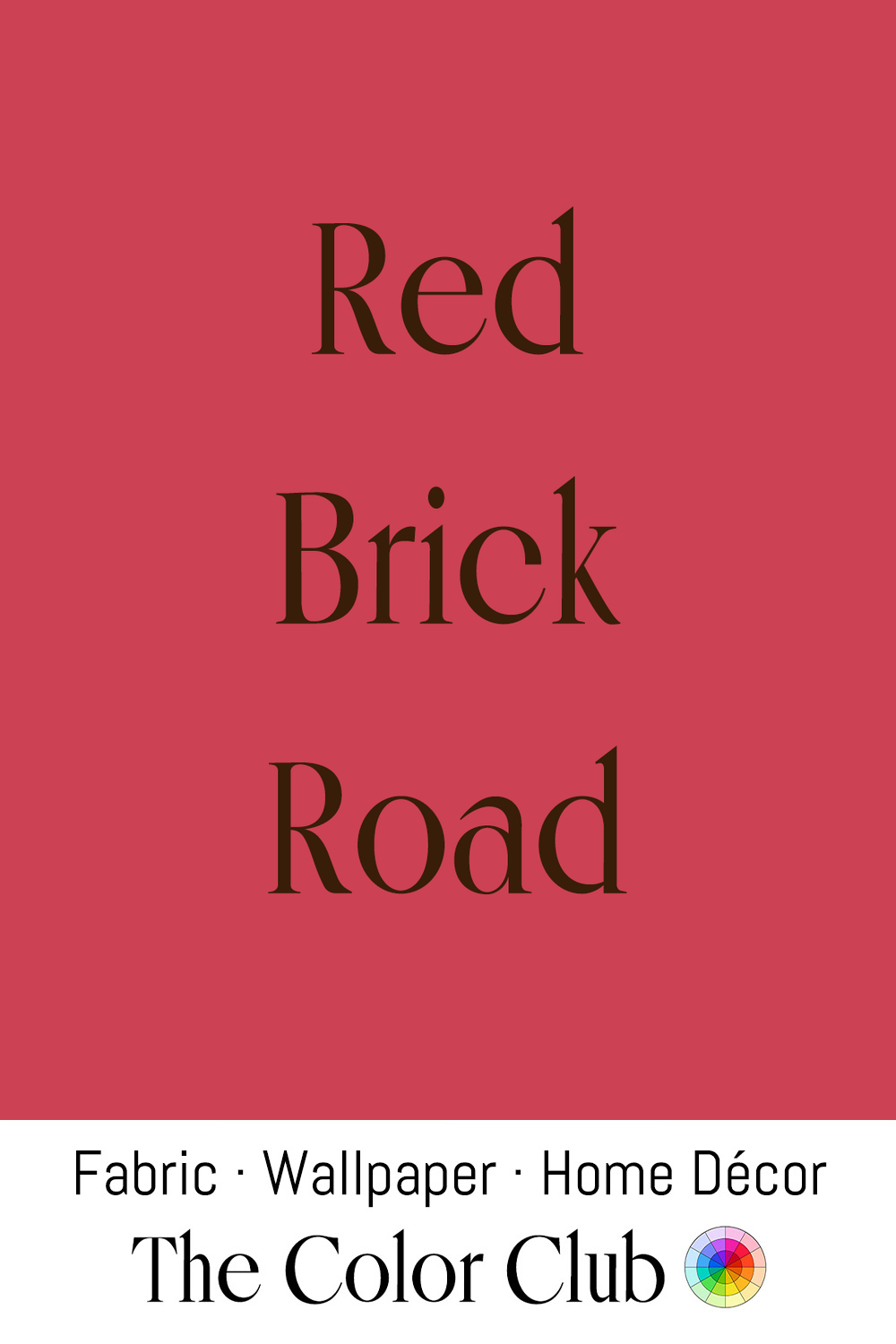
/ RED BRICK ROAD / warm and dusty.
After the Great Fire of 1666 destroyed roughly 13,000 wooden buildings, Red Brick became London's dominant building material. The Rebuilding Act that followed banned timber construction in the city outright. The taste for Red Brick specifically was reinforced by the court of Charles II, which favored a style popular in the Low Countries.
That style had deep roots on the continent. Stone was scarce across the North European Plain, so builders in the Low Countries and northern Germany had been firing clay for centuries — the Brick Gothic churches of the Hanseatic League, rising from the 1200s in cities like Lübeck and Gdańsk, still stand in a deep red.
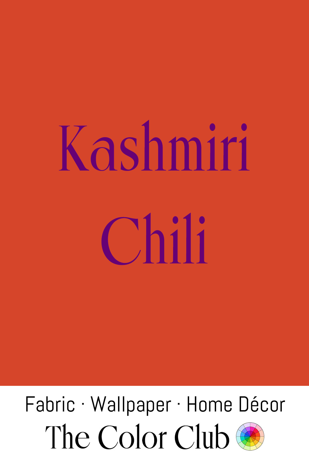
/ KASHMIRI CHILI / peppery brick red-orange.
In Kashmir, chilies have been cultivated over generations for their saturated color. Reds like it have long shown up in Kashmiri textiles, especially the deep-dyed wool of pashmina shawls and the madder-and-lac dyes used across South Asian textile traditions.
In interiors and fashion, it reads as a warm, earthy red, often paired with saffron, ochre, and deep browns in the kind of spice-market palette that's had steady staying power in autumn collections and layered rooms.
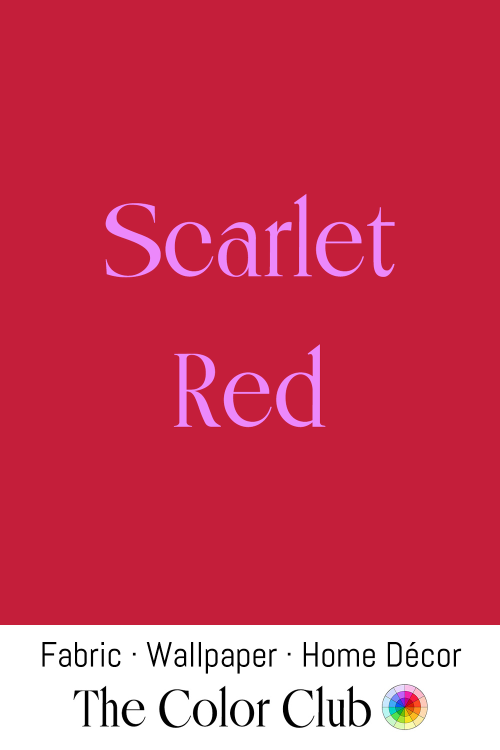
/ SCARLET RED / luxuriously bright, vivid and warm.
For centuries, the finest scarlet dye came from kermes, a tiny insect harvested from Mediterranean oak trees, so precious that scarlet cloth was reserved for royalty and, in the Catholic Church, for cardinals' robes.
In 1993, French shoe designer Christian Louboutin painted the sole of a prototype with his assistant's red nail polish, and the flash of red underfoot became his signature. In 2008 the red sole won trademark protection in the United States.
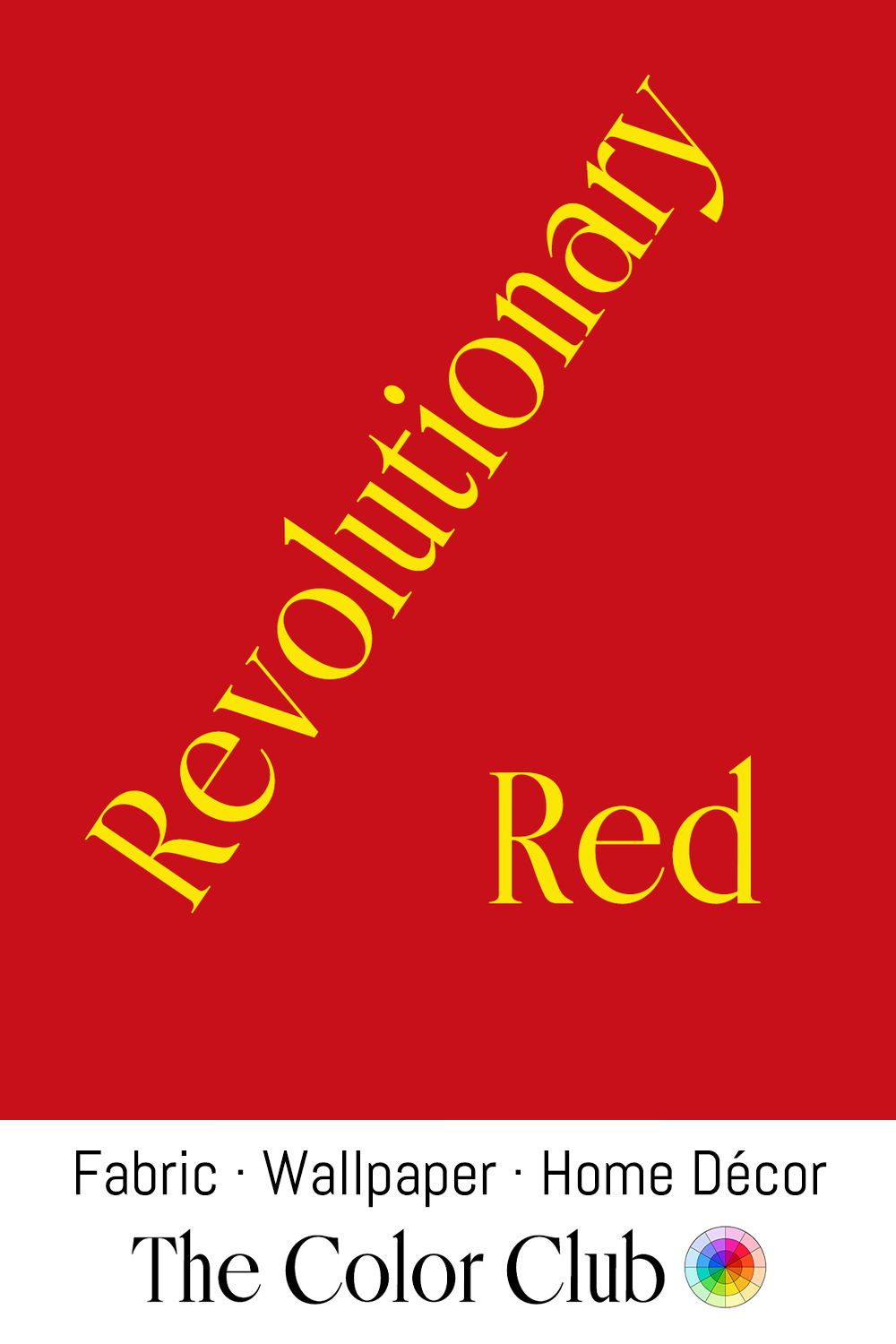
/ REVOLUTIONARY RED / bold passion and saturated protest.
Red's association with revolution dates to the French Revolution, when the bonnet rouge, a red Phrygian cap, became the badge of the Jacobins and sans-culottes, signaling their devotion to liberty.
On July 17, 1791, Paris mayor Jean-Sylvain Bailly raised the red flag of martial law, and the National Guard under the Marquis de Lafayette fired on republican petitioners at the Champ de Mars, a bloody episode that nonetheless cemented red's link to popular uprising.
Vivienne Westwood, in her 1970s and '80s punk designs (through the SEX and Seditionaries shops with Malcolm McLaren), used red alongside anarchist and Situationist imagery, consciously drawing on protest iconography.