

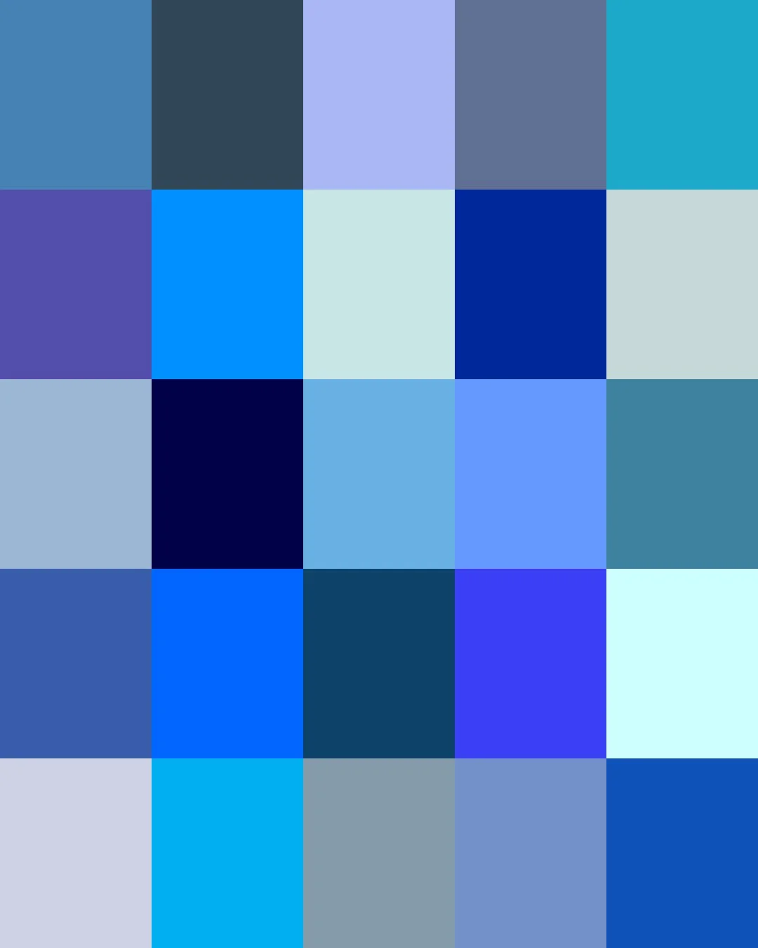
From ancient Egypt, where artisans fused copper and sand into a brilliant blue used to color the tombs of pharaohs, to renaissance Europe's ultramarine, ground from lapis lazuli and reserved for the robes of the Virgin Mary, blue was once a mark of luxury.
Modern synthetic dyes made blue affordable and part of everyone's wardrobe. Today’s blues range from faint coastal hues, nursery pastels, and worn denims to the deep tones of evening wear and night-sky ceilings.
Here are the stories about some of our Blues. Clicking on a Color will take you to our Spoonflower shop where you can order it on 60+ types of Fabric, Wallpaper, and Home Décor Products.
Or, save your favorites to your Pinterest boards for later.
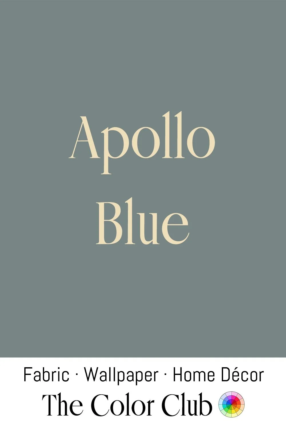
/ APOLLO BLUE / muted cool gray.
NASA's Apollo Command Module instrument panels were finished in a plain, muted gray, a practical choice that kept hundreds of switches, dials, and gauges legible without adding visual clutter to an already dense control layout. Mission Control's Houston operations room used a similarly restrained palette of gray-green wallpaper and two-tone green consoles throughout the Apollo missions.
That understated, utilitarian tone became inseparable from the visual identity of the space race, still evoking the quiet, focused atmosphere of a control room during humanity's most audacious missions.
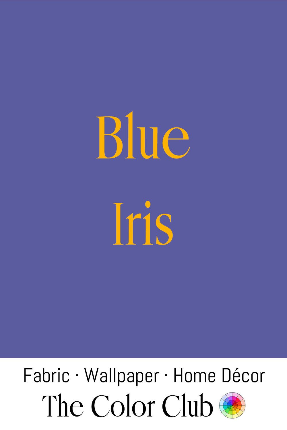
/ BLUE IRIS / violet-leaning, soft and muted floral.
Named for the Iris flower, the color traces back to Greek myth. Iris was the goddess of the rainbow and messenger of the gods. The flower carried her name for the range of colors found across its species, as recorded by Theophrastus in the 4th century BC.
In art, this specific blue-violet tone appears in Vincent van Gogh's Irises (1889), painted at the Saint-Paul-de-Mausole asylum in Saint-Rémy, where he studied the flowers growing in the garden with sustained attention to their precise color. After his death, the painting passed through several private collections before selling at auction in 1987 for $53.9 million, a world record at the time. It has hung at the J. Paul Getty Museum in Los Angeles since 1990.
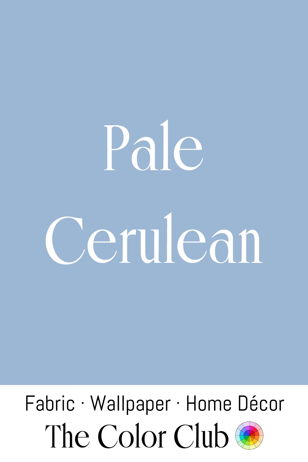
/ PALE CERULEAN / soft blue with a gentle gray and airy quality.
The word Cerulean derives from the Latin caeruleus, probably from caelum, meaning sky. Its first recorded use in English as a color name dates to 1590. The pigment Cerulean blue — cobalt stannate — was developed by the Swiss chemist Albrecht Höpfner in 1805 and commercially produced from 1860, when it became available to artists as a stable, lightfast sky blue.
Claude Monet was among the painters to use the manufactured pigment, mixing it with white for the swirls of steam and smoke in The Gare St-Lazare, one of twelve views of the Paris station he painted in 1877. The painting hangs today in the National Gallery, London.
/ FORGET-ME-NOT / soft, romantic, floral blue.
In a medieval German legend, a knight walking along a riverbank stooped to pick the small blue flowers for his beloved, but the weight of his armor pulled him under. As he was swept away, he threw her the bouquet and called out "Vergiss mein nicht" — forget me not.
The phrase spread across German-speaking Europe by the 15th century and crossed into English by the 1530s, attaching itself permanently to the flower's pale, unmistakable blue. Victorians later adopted the color as a token of remembrance, worn at partings and funerals.

/ INDIGO / dark, cool, saturated blue with a green undertone.
The dye comes from Indigofera tinctoria, a plant cultivated in India for over four thousand years. Its name derives from the Greek indikon, meaning simply "from India." For centuries, Arab and Venetian merchants carried it overland and across the Mediterranean to Europe in limited, costly quantities. That changed after Vasco da Gama opened a direct sea route in 1498, letting traders ship Indigo to Europe in bulk.
In the Americas, Indigo dyeing arose independently. In 2016, cotton fragments roughly 6,000 years old from Huaca Prieta, on Peru's northern coast, were found to contain indigotin, the same dye compound. It most likely came from a local Indigo plant.
/ LATE MIDNIGHT BLUE / cosmic deep and dark.
The first recorded use of the color name Midnight Blue was in 1810. Van Gogh used this depth of blue in Starry Night Over the Rhône and Café Terrace at Night (1888), among the first of his works to feature the night sky.
In fashion, the future King Edward VIII caused a stir in the 1920s by wearing Midnight Blue evening suits. The color photographed well, bringing out lapels, buttons and pockets in black-and-white press pictures. One of his evening suits is now part of the collection at the Metropolitan Museum of Art.
/ RAINCLOUD BLUE / pale gray, soft and overcast.
When sunlight passes through layers of cloud, the sky's blue softens into a muted gray. Similar tones have long appeared in landscape painting, where artists used diluted pigments to represent mist, distance, and changing weather.
James McNeill Whistler used a closely related blue-gray throughout his Nocturnes, a series of paintings begun in the 1870s that rendered London's Thames at dusk in hazy blues and grays. The critic John Ruskin accused Whistler of "flinging a pot of paint in the public's face." Whistler sued him for libel, in a trial that became a landmark argument for treating mood and atmosphere as serious subjects for art.
/ MAYA BLUE / vivid, clear cyan.
Developed by the ancient Maya during the first millennium CE, it is an unusual pigment: a hybrid of organic and inorganic ingredients, combining indigo dye extracted from the añil plant and palygorskite, a fibrous clay mineral, heated together to bond at a molecular level. The resulting color proved extraordinarily durable, resisting acids, alkalis, and centuries of jungle humidity, which is why it still survives vividly on murals at Bonampak and sculptures at Chichén Itzá.
The chemical structure of Maya Blue remained a mystery to Western science until the 1960s, when X-ray diffraction identified the clay and lab experiments showed how heating clay and dye together could make something so stable.
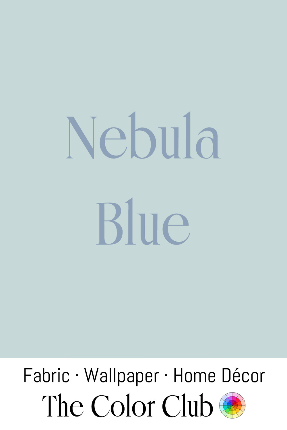
/ NEBULA BLUE / light cloudy grayish pastel.
William Herschel, the 18th-century astronomer who conducted some of the earliest telescopic surveys of nebulae, described what's now called the North America Nebula as a "faint milky nebulosity scattered over this space, in some places pretty bright."
In the same decades in Sweden, King Gustav III returned from France taken with Neoclassical style, which Swedish craftsmen adapted into their own restrained, chalky paint palette. Because Sweden's winters left rooms dark for months, furniture and paneling were finished in pale grays, whites, and this washed-out blue-gray to bounce what little daylight there was around a room. That soft, wintry tone became one of the defining colors of Gustavian style, and it's still widely copied in Scandinavian interiors today.

/ AIR FORCE BLUE / muted calm, cool and dusty.
The Royal Air Force adopted this shade for its uniforms in 1919. The story goes that the choice was more accident than design: Britain had a surplus of inexpensive sky-blue herringbone twill originally woven for the uniforms of Czarist Russian cavalrymen, an order left unfulfilled after the Russian Revolution.
When the United States Air Force became its own branch of the military in 1947, it took nearly three years of committee work before "air force blue" cloth was finally issued in 1950. The color has since been adopted, in close variants, by air forces across the Commonwealth, from Canada to Australia to New Zealand.

/ DENIM / rich, saturated blue of a new pair of jeans.
In Nîmes, France, weavers attempting to recreate a fustian cloth from Genoa, Italy, produced a sturdy twill called serge de Nîmes, from which the name Denim derives. Genoa’s French name, Gênes, is thought to be the source of the word “jeans.”
Traditional Denim is woven with indigo-dyed warp threads and undyed white weft threads, which is why the inside of a pair of jeans is so much paler than the outside.
Levi Strauss, a Bavarian immigrant who moved to San Francisco during the Gold Rush, popularized the fabric for work trousers in the 1870s. Synthetic indigo, developed by Adolf von Baeyer in the 1880s and brought to market in 1897, made the color affordable and consistent enough to clothe the world.
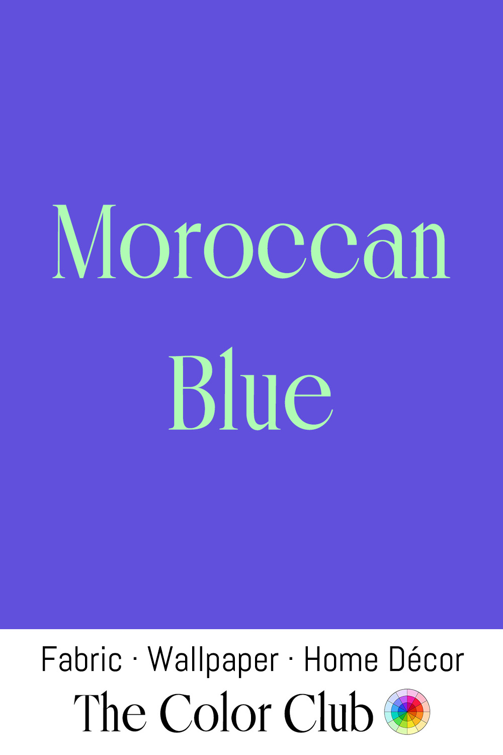
/ MOROCCAN BLUE / vivid, saturated indigo-violet.
The color is inspired by the painter Jacques Majorelle, who began a garden on the edge of Marrakech in 1923. From 1937, he drenched its studio walls, fountains, and pergolas in a saturated, electric blue drawn from the blue tiles of southern Morocco. The shade was so distinctly his that it eventually carried his name.
The garden fell into disrepair after Majorelle's death, until fashion designer Yves Saint Laurent and his partner Pierre Bergé bought and restored it in 1980. The color became closely associated with Saint Laurent's own work, and he carried the same electric blue into his collections.
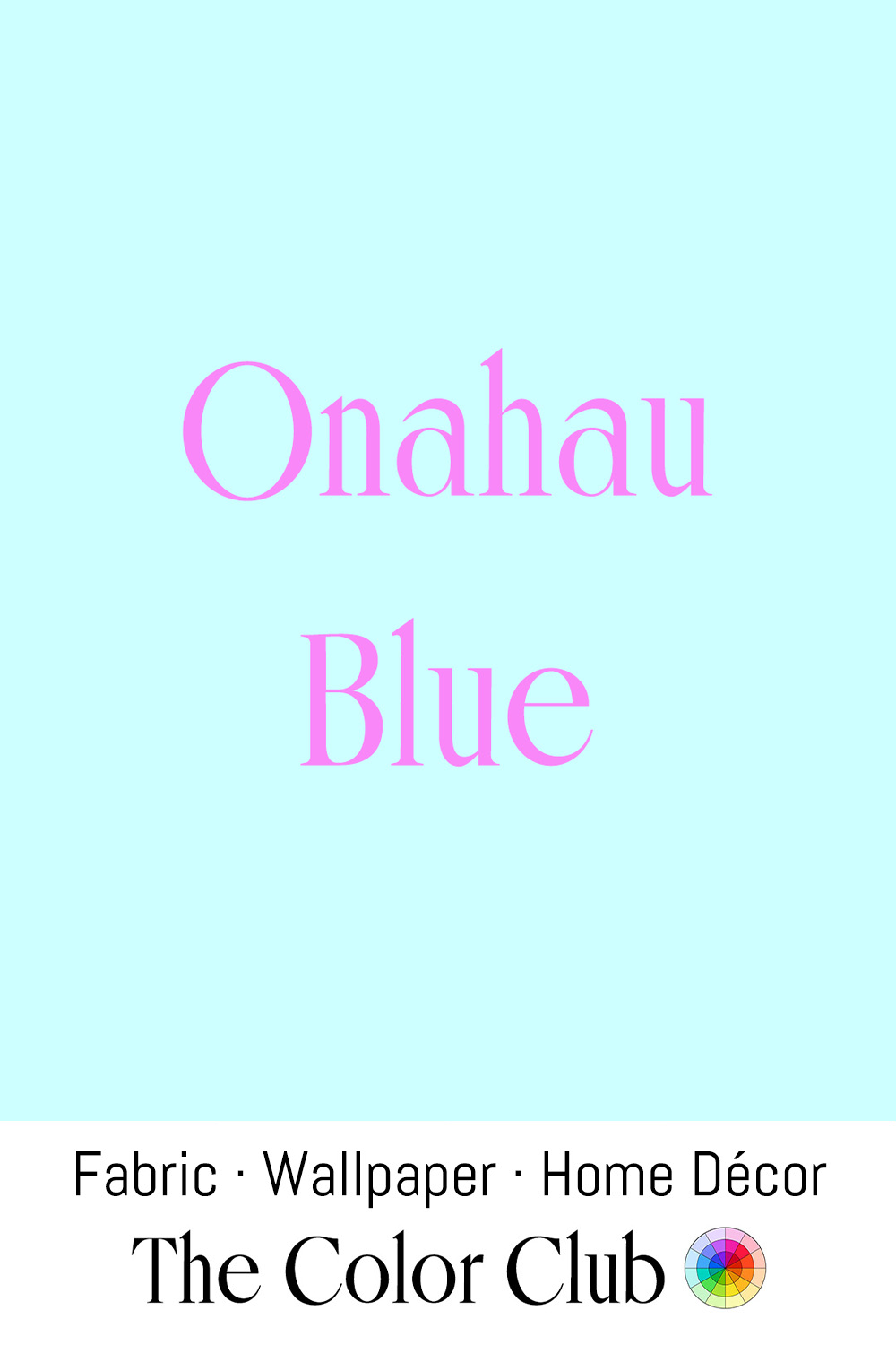
/ ONAHAU BLUE / tropical cool.
Evocative of Hawaii, the color is best understood as a mood: the pale, sun-lit hue of a calm tropical shoreline.
In 1960s Honolulu, clothier Reyn McCullough found the prints on island shirts too loud and borrowed a trick from local surfers, whose shirts had been bleached soft by the sun. He turned the fabric inside out, so each pattern showed through pale and muted. His reverse-print aloha shirt became the choice of Honolulu businessmen. In 1966 Hawaii made it official with Aloha Friday, a weekly day for wearing island shirts to the office.

/ TRANQUIL / calm and gentle grayish tint of teal.
Calming blue-greens have a long practical history. In 1914, American surgeon Harry Sherman replaced the white of an operating room at St. Luke's Hospital in San Francisco with green. He had found that the glare of an all-white room, combined with hours of staring at red blood, was straining surgeons' eyes and distorting their vision. His choice sat opposite red on the color wheel, letting the eye rest and reset. Hospitals worldwide gradually followed. Surgical scrubs today still come in blue-greens for that reason.
In Finland, the Loiske (Splash) wellness center at Ähtäri, completed in 2024 on a forested lakeshore, was designed with tranquility in mind. Its architects surrounded the pools with natural wood, stone and concrete, leaving the subtle blues and turquoise of the water to set the calm.
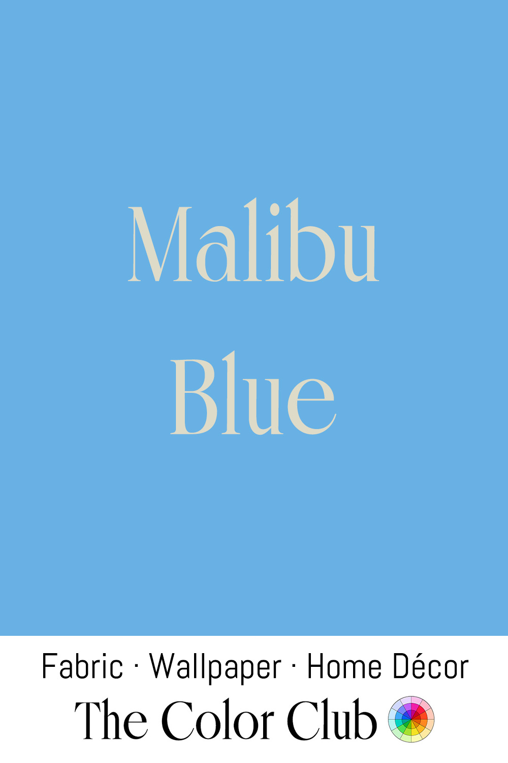
/ MALIBU BLUE / bright and clear.
The color is named for the stretch of Southern California coastline that has stood for beach culture and easy luxury since the mid-20th century.
Malibu's identity as a symbol of coastal leisure took hold after the Pacific Coast Highway opened in the 1920s and made the beaches newly accessible. Hollywood's decades-long fascination with the area as a retreat for stars cemented that identity.
Today, Malibu Blue carries the same associations, evoking clear skies, open water and sporty fashion.
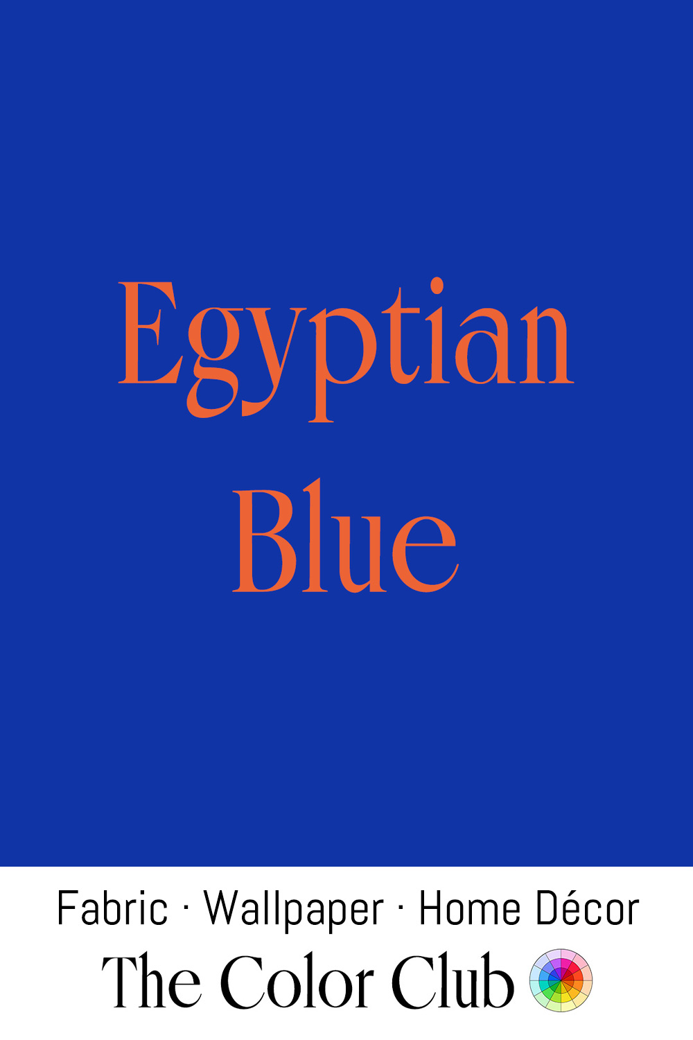
/ EGYPTIAN BLUE / historical medium-dark cobalt.
First produced around 3100 BCE, Egyptian Blue is widely considered the world's first synthetic pigment, made by heating together sand, copper, lime, and an alkali flux until they fused into calcium copper silicate. Egyptians used it to line tomb ceilings as a stand-in for the night sky and to color the skin of the god Amun.
It later spread through the Roman world as a cheaper alternative to costly, imported lapis lazuli. The pigment fell out of use after the fall of the Roman Empire, and its recipe was lost for centuries until its rediscovery in modern times.
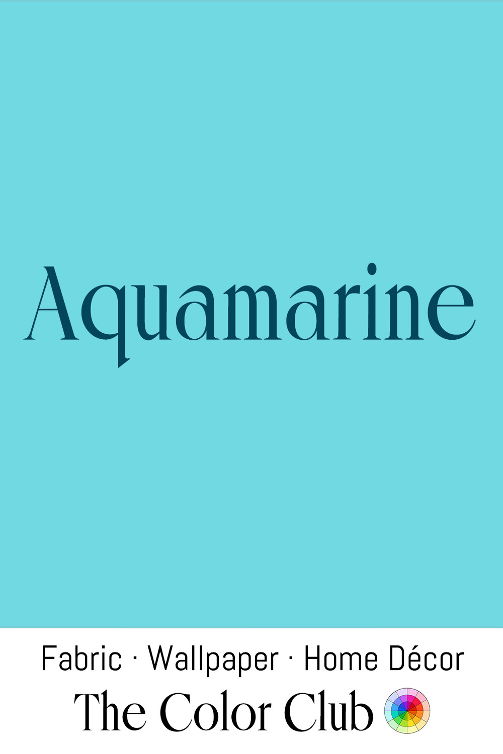
/ AQUAMARINE / cool, mineral blue-green.
Aqua marina, Latin for sea water, was first applied as a color name in English in 1598. The color's association with clarity and water is rooted in its name's own etymology, one of the more literal and direct connections between a color and its source.
It is also the name of the gemstone, a variety of beryl colored by trace amounts of iron. The gemstone's distinctive pale blue-green has been prized since antiquity. In maritime lore, Roman fishermen carried Aquamarine gemstones as protective talismans at sea. The stone was used extensively in jewelry throughout the ancient Mediterranean world.
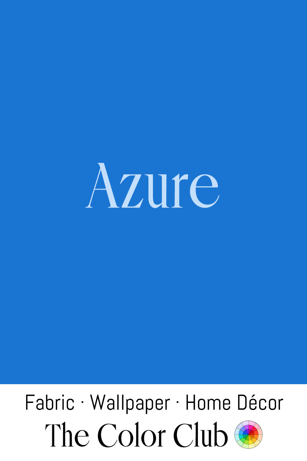
/ AZURE / richly saturated vivid blue with a cool clarity.
The word traces back to the Persian lazhward, the name of the region famous for lapis lazuli. Lazhward passed through Arabic and into Old French as azur.
In 1887, French writer Stéphen Liégeard used the word to title his travel book La Côte d'Azur, naming the Mediterranean coastline of southeast France after its vivid sea. He was inspired by his home region's own name, the Côte d'Or, in Burgundy. The name caught on quickly and has defined the coastline ever since, known in English as the French Riviera.
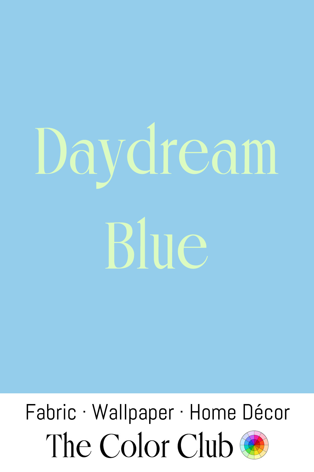
/ DAYDREAM BLUE / soft and sweet.
A pale blue found one of its grandest expressions on the ceiling of the Würzburg Residence in Germany, where Venetian painter Giovanni Battista Tiepolo spent 1752 and 1753 covering the world's largest ceiling fresco with airy, sky-filled scenes of the four continents. In March 1945, Allied bombing destroyed roughly 90 percent of Würzburg in a single night, yet Tiepolo's vast painted sky survived largely intact.
Blue has stood for loyalty for centuries. Against Women Unconstant, an English poem attributed to Chaucer, made blue the badge of a committed heart. By the 1630s, English speakers called an unwavering friend "true blue", and the Victorian rhyme asking a bride for "something blue", first recorded in 1871, carried the same wish for faithfulness into the wedding day.
/ GLACIAL ICE / misty, cool and airy winter blue.
In glaciers, snow compresses over centuries until air bubbles are forced out, and the dense ice absorbs red wavelengths, giving it a blue cast.
Edward Wilson, chief of scientific staff on Scott's Terra Nova expedition and its artist, recorded the pale blues of Antarctic ice in watercolors between 1910 and 1912, work that helped bring polar landscapes into public consciousness.
In Swedish Lapland, the Icehotel at Jukkasjärvi has been rebuilt every winter since 1989 from ice harvested from the Torne River. Artists from around the world design and carve its suites each season, and every spring the whole structure melts back into the river.
/ NAVY BLUE / nautical, coastal, celestial dark blue.
The Royal Navy adopted a deep blue for officers' uniforms in 1748, the first time it had any standardized dress at all. As the story goes, King George II so admired a riding habit of that color worn by the Duchess of Bedford that he asked the Navy's officers to be dressed to match it. The shade chosen that year was taken up by navies around the world, and by 1780 it was being called navy blue.
Ashore, navy became the color of everyday authority. London's new Metropolitan Police first patrolled in blue tailcoats in 1829, a uniform chosen to give the force a civilian look. Through the 20th century, navy became a staple of business suits, school uniforms and formal wear.
/ PALE PERIWINKLE / very light, soft, airy blue.
In his Confessions, philosopher Jean-Jacques Rousseau describes stumbling on a patch of Periwinkle flowers in 1764 while walking near Neuchâtel, Switzerland, and crying out with sudden joy — the sight instantly returned him to a walk he'd taken nearly thirty years earlier with Madame de Warens, his protector and lover, who was the first to make him aware of the flower.
The passage became one of the most quoted meditations on memory in French literature, and Periwinkle's pale blue has carried associations of nostalgia and old friendship ever since.
/ ROBIN'S EGG BLUE / cool teal with a green undertone.
Named after the American Robin's eggshell, the color was first recorded in English in 1873. Long before the name, round Robin's egg blue glass beads were the most common type traded at Jamestown, where English colonists bartered them with the Powhatan people in the early 1600s.
In 1845, Tiffany & Co. chose a Robin's egg blue for the cover of its Blue Book, the catalog of its jewelry, and the color went on to wrap Tiffany's famous boxes. The shade remains tied to its springtime association, evoking renewal and clear skies.
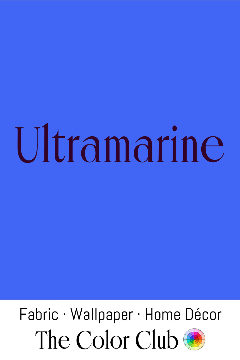
/ ULTRAMARINE / cool blue, vivid and deeply saturated.
From the 6th century onward, lapis lazuli mined at Sar-e-Sang in Afghanistan was shipped to Europe along trade routes, giving the pigment its Latin name, ultramarinus, or "beyond the sea." Ground lapis produced the most prized pigment in medieval and Renaissance painting, often reserved by patrons for the robes of Christ and the Virgin Mary as a mark of devotion and expense. At its peak, genuine Ultramarine cost more than gold by weight, and contracts between artists and patrons stipulated its use by name.
In 1826, French chemist Jean-Baptiste Guimet synthesized an affordable equivalent, which made the color widely available to artists and manufacturers for the first time. In 1828 it won him the 6,000-franc prize offered by France's Société d'Encouragement pour l'Industrie Nationale.
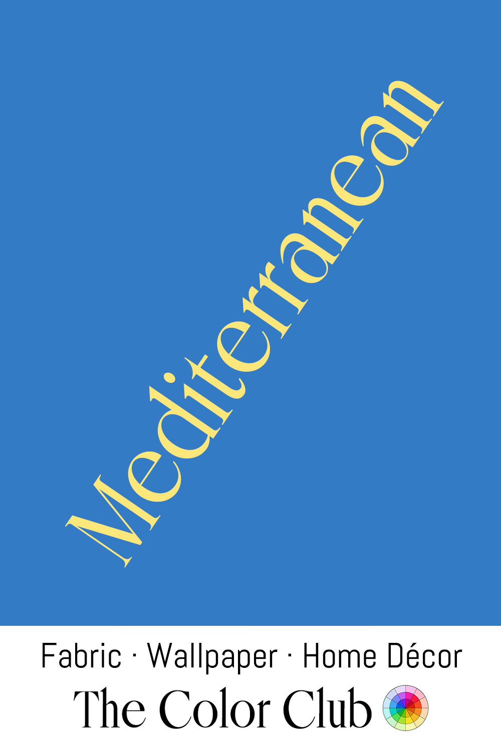
/ MEDITERRANEAN / medium saturated open sea.
In the summer of 1905, Henri Matisse invited fellow painter André Derain to the fishing village of Collioure on France's Mediterranean coast, where the two spent weeks painting the harbor in intense, pure colors straight out of the tube, including a saturated blue for sea and sky.
When their paintings were shown that autumn at the Salon d'Automne in Paris, the critic Louis Vauxcelles dismissed the painters as "wild beasts" (fauves), inadvertently naming the expressive movement, Fauvism.