

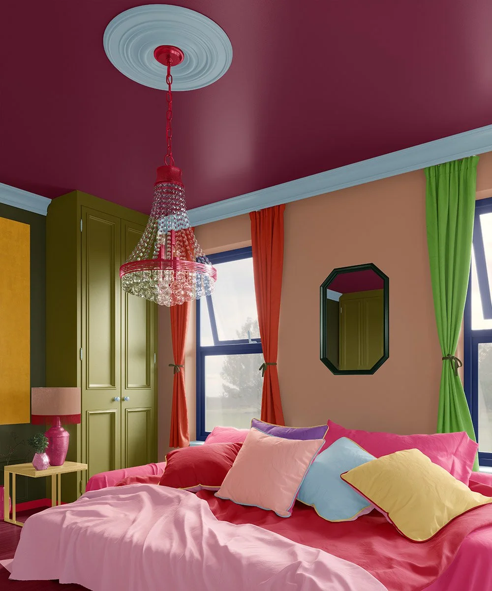
Look at this room.
Burgundy ceiling. Olive wardrobe. Walls the color of baked clay. Curtains in grass green on one window, blood orange on the next. Pillows in a riot of pastels. This is color confidence.
It works because every surface commits fully to its own color, letting the room's various textures and forms do their work and showcase their inherent qualities: the structured softness of fabrics, the modeling of furniture, the flat walls and ceilings that recede into the background, the pops of color across trims and moldings with details that otherwise go overlooked or drown in pattern.
All this was created purely from the joy and energy of solid color.
And this is the reason we built The Color Club around solid colors, and solid colors only.
Color drenching sounds like a very now idea (TikTok would have you believe it was invented in 2023), but the impulse is way old. Here we have put together a potted history of solid color interiors, along with some suggestions for how you can liven up your space – and happily live in it for longer than one season!
A short history of solid color
Long before “color drenching” was a phrase, solid color was simply the default. Pigment was expensive and pattern was labor: hand-blocked wallpaper, woven chintz, and painted murals all took specialist skill and money that most rooms, most of the time, didn't have. A flat, evenly mixed paint or distemper was the easier, cheaper, more available choice — which meant that for most of architectural history, a room's color came from a handful of solid fields, not a repeating motif.
Georgian and Regency drawing rooms in 18th-century Britain leaned on exactly this: strong, flat color on the walls, a different flat color on the joinery, set against gilt frames and mahogany furniture doing the decorative work.
Victorian drama, Japanese calm
The Victorians took the same solid-color logic toward drama: libraries and smoking rooms in deep bottle green paired with oxblood leather, cocooning after dark under gas or firelight. Traditional Japanese interiors arrived at something related from the opposite direction — a small number of restrained, unbroken tones across tatami, shoji, and timber, in service of calm, but built on the same principle: a considered palette of unbroken solids.
Artists and Designers
Modernism then gave solid color a real theoretical backbone. The Bauhaus formalized ideas around primary colors and their associations. Josef Albers built an entire body of work around nothing but solid squares of color set against each other, studying exactly how one hue affects the next. Piet Mondrian spent his career proving that flat, unmixed blocks of red, yellow, and blue could carry visual force, and when coupled with a title, such as “Broadway Boogie Woogie” (1942), also deliver narrative meaning.
And in 1931, the architect Le Corbusier turned the idea into an actual product: working with the Swiss wallpaper firm Salubra, he designed 43 solid, pattern-free colors organized into “color keyboards” — sliding cards that let a designer combine three to five flat colors at once for a room, assigning some to walls as a background and others to trim, doors, or built-ins as accents.
It's a direct ancestor of the palette in the bedroom above: several solid colors, chosen deliberately, working a room together.
Color drenched, not pattern-clashed
The 1960s saw an explosion of color, but since then, maximalism has meant not only more color, but more pattern: clashing florals, geometric wallpapers, an accent chair in one print and a rug in another, all coexisting on the theory that confidence means covering every surface in a different motif. It can look extraordinary in the right hands. It can also collapse into visual noise the moment one element is slightly wrong.
And while it may look fun on an Instagram post, it sure gets exhausting to look at and live in over time.
Solid color returns
Color drenching asks a different, in some ways harder question: what happens if you strip the pattern out and let solid color, one hue or several, chosen with real range, as in the room above, do the work instead? The answer is that texture and form get to matter again. A velvet throw pillow reads as velvet, rather than as one more surface fighting for attention against a print. A carved wardrobe panel or a ceiling medallion actually registers as form, instead of disappearing into a busy backdrop..
This is the whole premise we've built The Color Club around: a library of over 1,000 solid colors, researched and named with art historical rigor. Choosing a solid color from our library means never settling for “plain” but acting with a clear motivation: preference for a time period (Art Nouveau Peach), association with a location (Malibu Blue), beloved tradition (Christmas Red), mood (Raincloud Blue), persona (Daddy Brown), or radical gesture (Shocking Pink).
Your color story
A good solid color, chosen properly, carries the entire cultural history of its original pigment, the labor and trade that first brought it into the hands of explorers, royals, and artists, often at the high cost of its toxicity, and later, with the invention of synthetic substitutes, made available to the broadest public and designers who ran with it. A room built from several solids can therefore be read as a history book, as a personal diary, or as a novel in the making, by you, the author.
Creating your own color-drenched room
The bedroom above works because the palette was chosen with real range — a brash jewel-toned ceiling, a moody murky-green wardrobe, silent clay walls, and loud a green and an orange curtain doing deliberate work with and against each other.
You don't need every element at once to get the effect. You build it in layers:
● Start with the walls and ceilings. Our wallpapers run from renter-friendly Peel and Stick to fully committed Traditional and PVC-Free Type II wallcoverings, all available in any color in our library.
● Drench the bed in its own solid range. Combine your Duvet Cover, Sheet Set, Throw Blanket, and Pillows, all printed on the same fabric base, but with several related colors spread confidently across an entire bed, the way our room here does with its rose-red bedding and harmonized pastel pillows.
● Let the curtains carry a third color. Our Curtains, printed on Cypress Cotton Canvas or Linen Cotton Canvas, are exactly how a room gets several committed solids working together, the way this bedroom's green and orange panels do on either side of the bed. They don’t have to match the bed; they only need to hold their own.
● Add depth through texture. A Celosia Velvet® or Belgian Linen™ throw pillow holds solid colors differently depending on how light hits the pile or weave, which is how a color-drenched room, with many hues in it, never reads as flat.
All of it comes from the same 1,000+ color library, researched and described in our Color Stories on Instagram and here on our Blog — including deep dives into all ten of our base color collections: Red, Blue, Yellow, Green, Orange, Pink, Purple, Brown, White, and Black & Gray.
Before you embark on this big adventure, we advise ordering swatches first. It's a cheap and simple way to try out different hues on different surface materials, so you can see how a color prints against each material's natural undertone, and how your chosen colors sit next to each other.
Think dollhouse size before going full scale, and happy color drenching!