

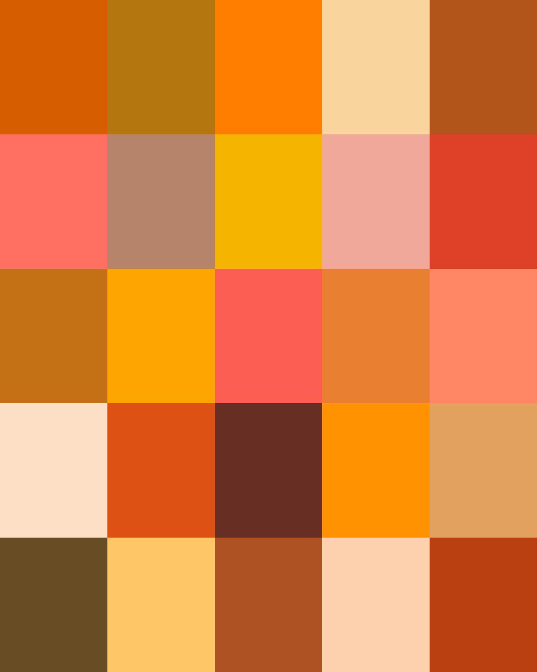
From ancient India, where the earliest Buddhist monks dyed their robes with turmeric, to seventeenth-century Holland, where the color became the emblem of the Royal House of Orange, orange has carried both spiritual and political weight.
Modern chemistry widened orange's range into brighter and bolder territory. Today's oranges range from soft apricot and peach, electric and citrus brights to the deep tones of pumpkin and rust.
Here are the stories about some of our Oranges. Clicking on a Color will take you to our Spoonflower shop where you can order it on 60+ types of Fabric, Wallpaper, and Home Décor Products.
Or, save your favorites to your Pinterest boards for later.
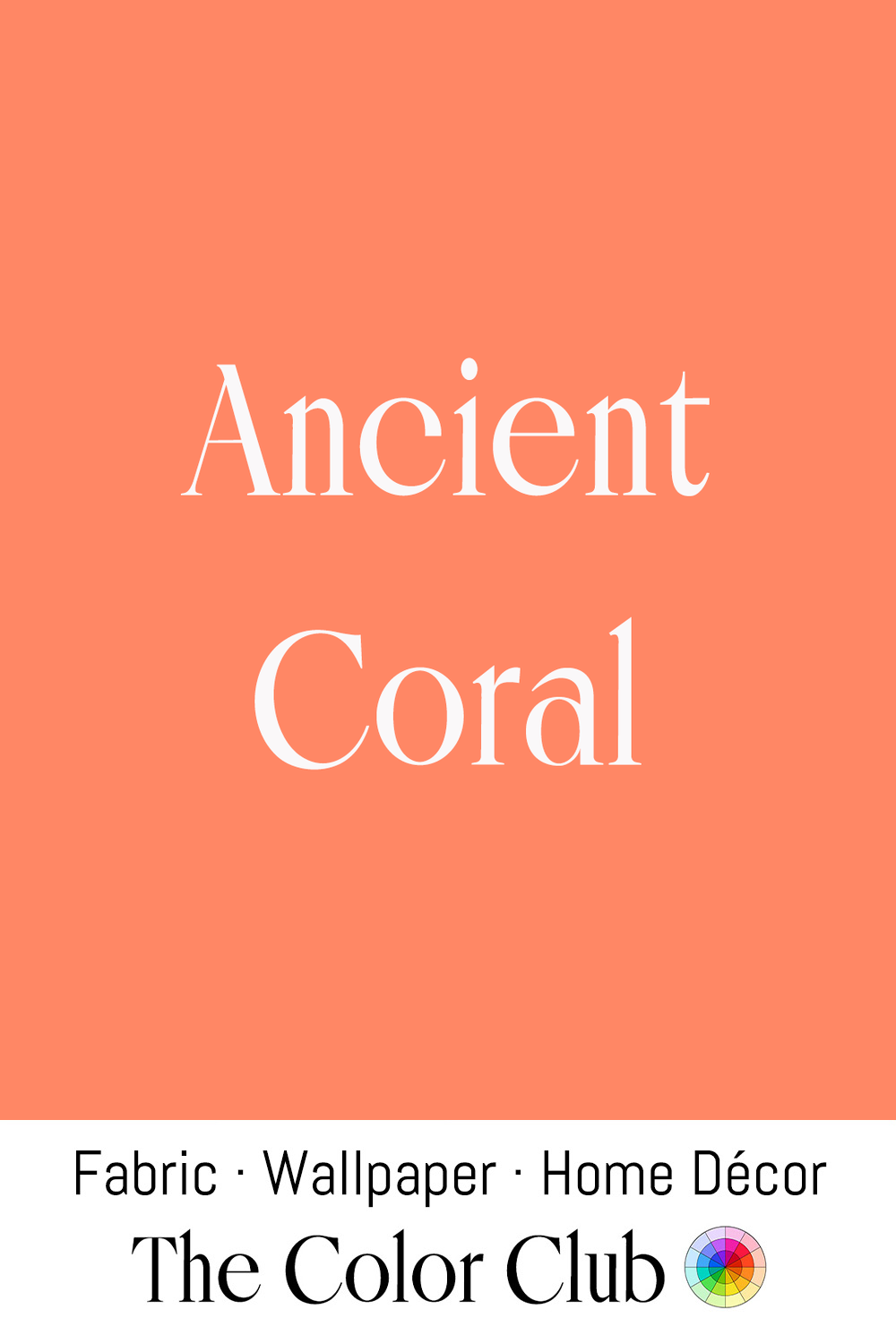
/ ANCIENT CORAL / warm, soft, fully saturated pinkish orange.
Since antiquity, Coral has been carved into jewelry and ornament, prized by ancient Mediterranean cultures including the Romans, who traded red Mediterranean Coral across the empire and believed it offered protection, particularly for children.
In Ovid's Metamorphoses, Perseus lays the head of Medusa on a bed of seaweed, which hardens at its touch into Coral, a myth for how the branches seemed supple underwater yet turned to stone in the air.
Today, this warm, saturated hue brings brightness and vitality to retro interiors.
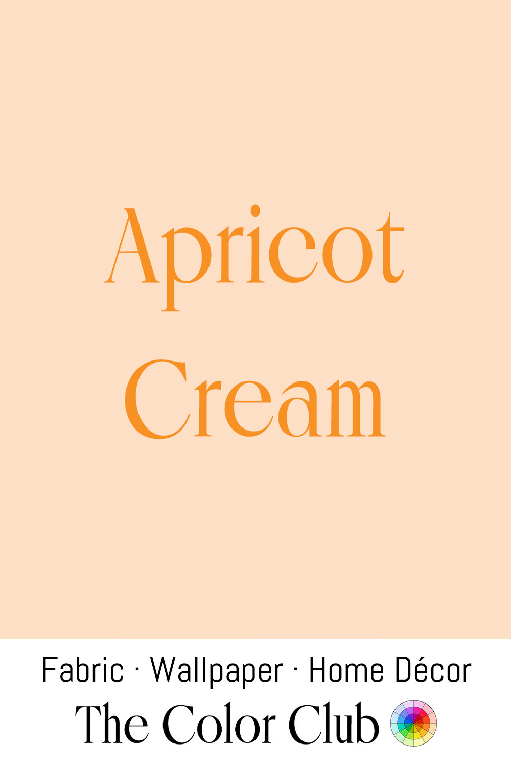
/ APRICOT CREAM / soft, pale, peachy-orange with a gentle, milky cast.
Peachy, apricot-toned bridesmaid dresses became a defining look of the mid-1970s, typically styled as tiered, ruffled gowns with wide-brimmed hats in the same shade.
Matching bridesmaid dresses have a much older, stranger origin: in popular lore, the custom goes back to ancient Rome, where the attendants dressed identically to the bride and groom so evil spirits couldn't identify who was actually getting married.
In 1840, Queen Victoria married in white and designed her twelve bridesmaids' dresses in white silk and tulle trimmed with roses, popularizing the all-white wedding. White was later reserved for the bride, and by the 1940s the colors had passed to the rest of the coordinated bridal party.
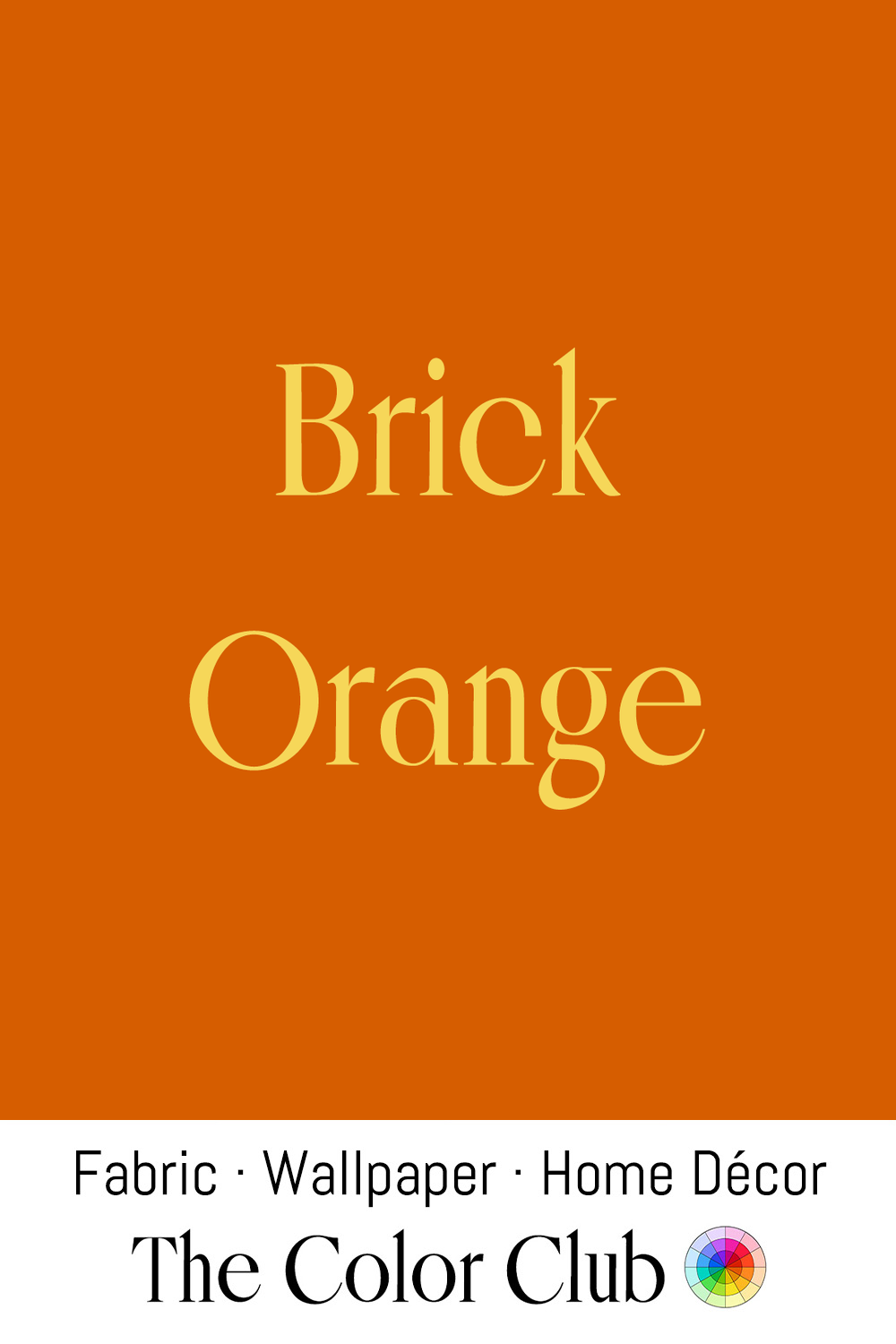
/ BRICK ORANGE / reddish with an earthy warmth.
Fired Brick has been a building material since at least 3500 BCE in Mesopotamia. The orange-red comes from iron oxide in the clay, brought out by the heat of the kiln.
Exposed Brick became a hallmark of SoHo's converted lofts in New York, former 19th-century factories and warehouses that artists began moving into starting in the 1960s and '70s. The same brick-red has remained a defining feature of industrial interior design, prized for the comfort it brings to otherwise minimalist spaces.
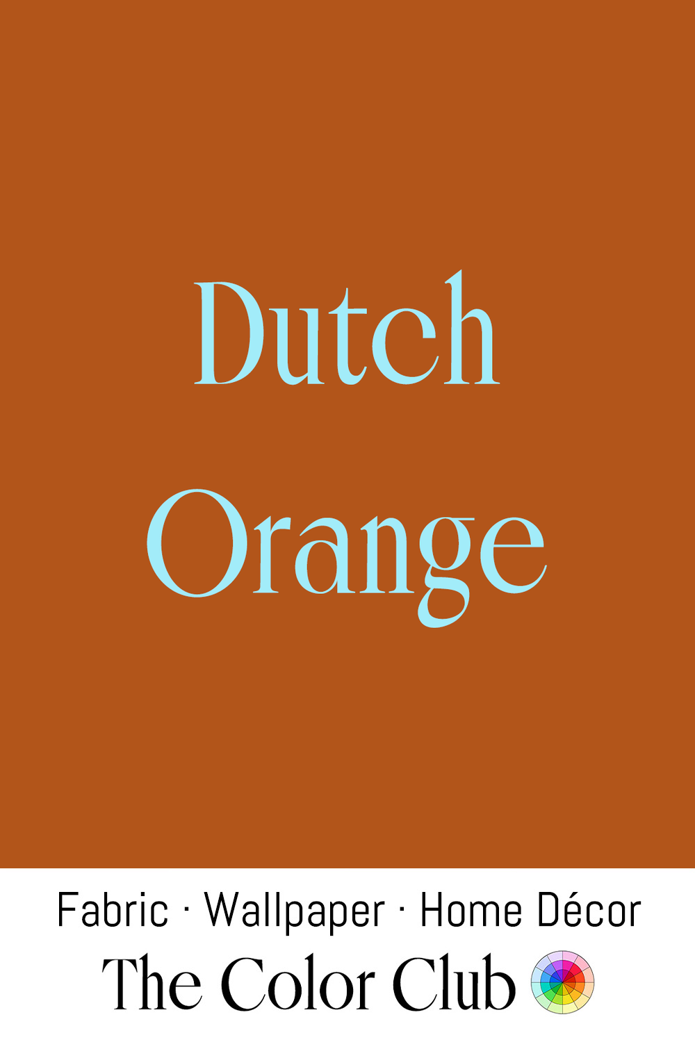
/ DUTCH ORANGE / deep, rusty, dense and earthy.
This deep, burnt-orange tone recalls the natural earth pigments prized by Dutch Golden Age painters in the 17th century, among them orange ochre, which Rembrandt used in The Rape of Ganymede, mined for its rich orange-red hue and ground for use in oil paint.
In the Luberon hills of Provence, the Gargas quarry still produces some 800 tons of ochre a year, in shades from yellow through orange to red, for artists' colors and cosmetics.
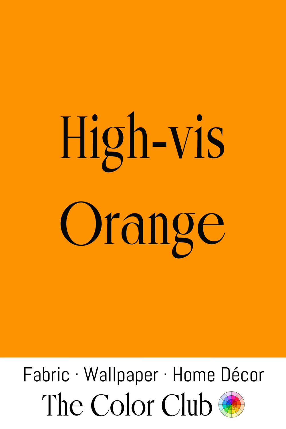
/ HIGH-VIS ORANGE / very bright and intense.
Pigments capable of this level of brightness were only developed in the mid-20th century, and international safety standards adopted this intense orange for road crews, life vests, and emergency signage because it stands out sharply against blue sky, green foliage, and gray pavement.
Beyond its working origins, High-vis Orange has been deliberately borrowed by streetwear and utility-inspired fashion designers as a bold, attention-grabbing accent color, turning a purely functional hue into a style statement.
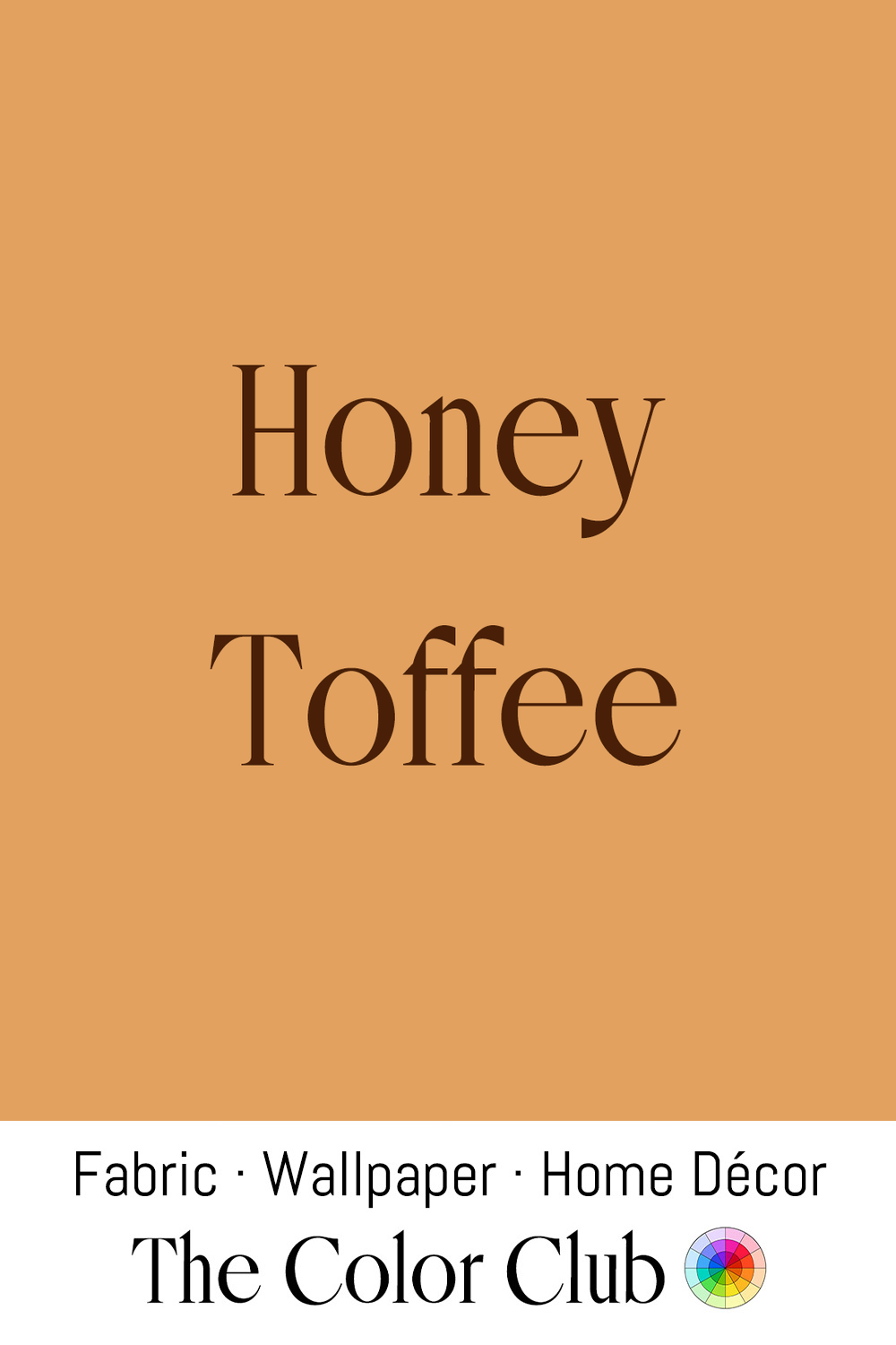
/ HONEY TOFFEE / warm, rich and sweet golden-brown.
Toffee is made by heating sugar and butter until it caramelizes, its color deepening the longer it cooks before it sets. Honey gets its hue from the flowers whose nectar the bees gather, and in the United States it is graded on a scale that runs from water white to dark amber.
In patchwork and applique projects, Honey Toffee is used as a warm grounding tone, and the same rich toffee shade is familiar in leather goods and furniture upholstery, pairing easily with both traditional and modern interiors.
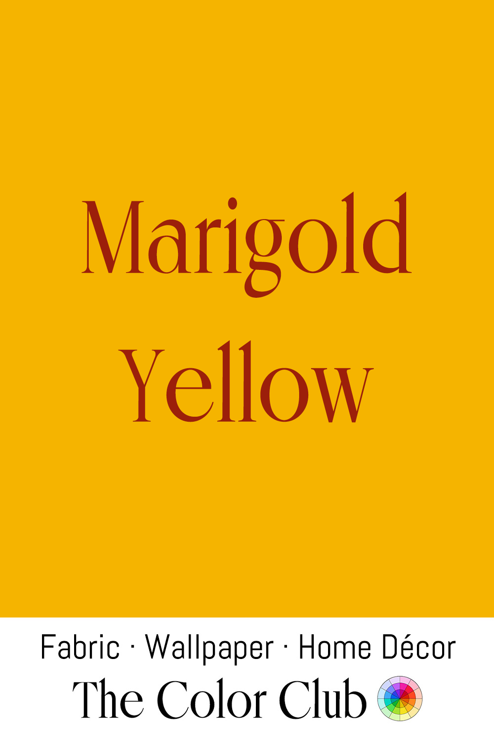
/ MARIGOLD YELLOW / festive golden-orange giving warmth and vitality.
Across cultures, this shade has long been connected with celebration, devotion, and renewal. In India, Marigold flowers have carried sacred meaning for centuries, woven into garlands and offered to deities including Lakshmi during Diwali. In Mexico, marigolds have been central to Día de los Muertos for generations, their bright blooms honoring and remembering loved ones.
Marigold Yellow also appears throughout craft traditions, including kantha quilting, the Bengali practice of hand-stitching layers of vintage sari fabric into richly colored bedspreads and throws, where yellow is a staple thread.
A color of ceremony, craftsmanship, and joy, Marigold Yellow brings warmth and celebration to any space.
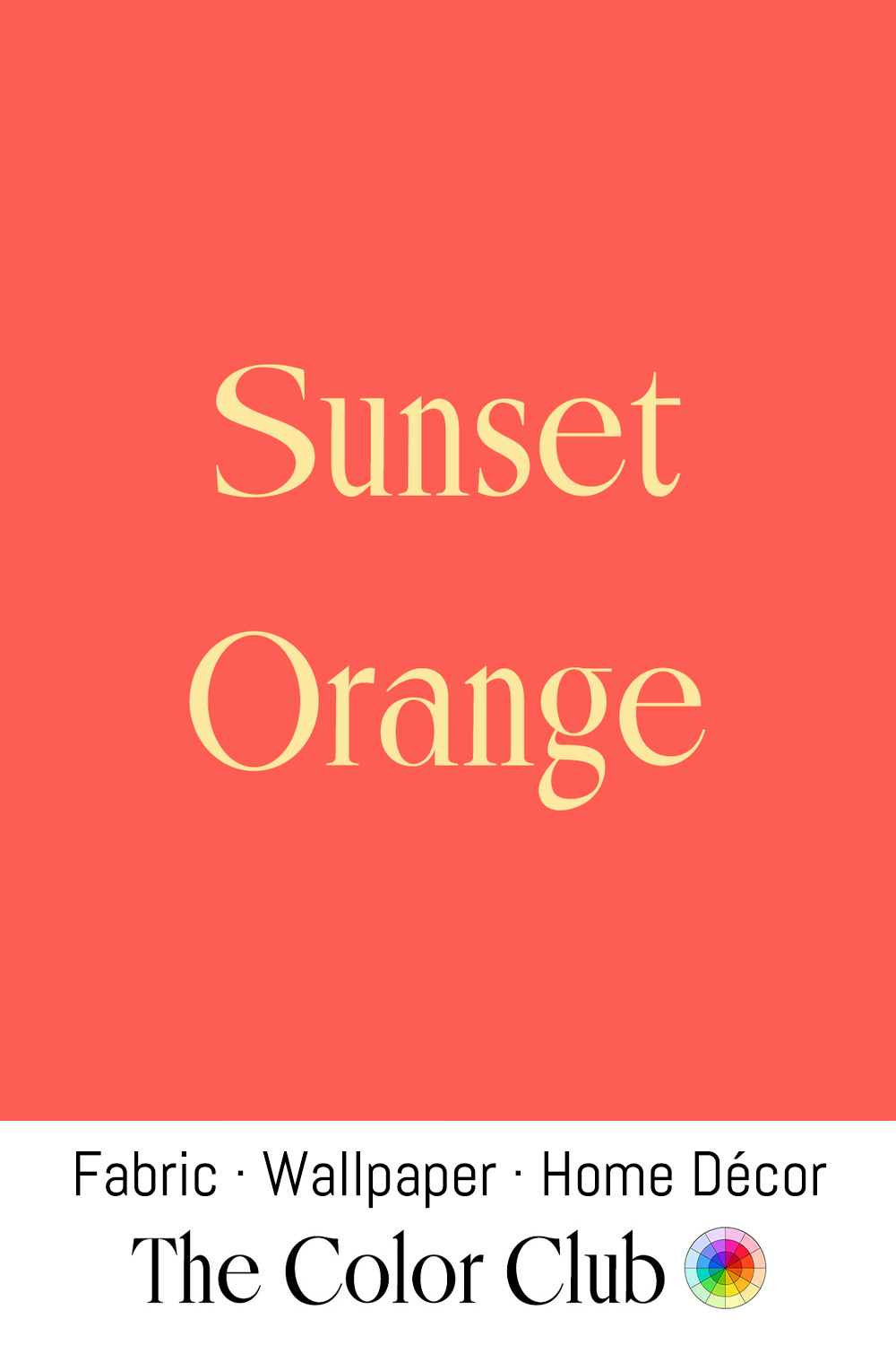
/ SUNSET ORANGE / vivid coral with the warmth of a fading sun.
In 1815, the eruption of Mount Tambora in Indonesia threw enough volcanic ash into the atmosphere to trigger the "Year Without a Summer" of 1816, producing unusually vivid, richly colored sunsets across Europe. English painter J.M.W. Turner witnessed them and became fascinated with Sunset light, returning to fiery orange and red skies throughout his career, as in The Fighting Temeraire of 1839.
The same warm orange remains a favorite in tropical and coastal design today, appearing in hand-dyed textiles, ceramics, and sun-washed interiors that draw on the mood of a fading summer evening.
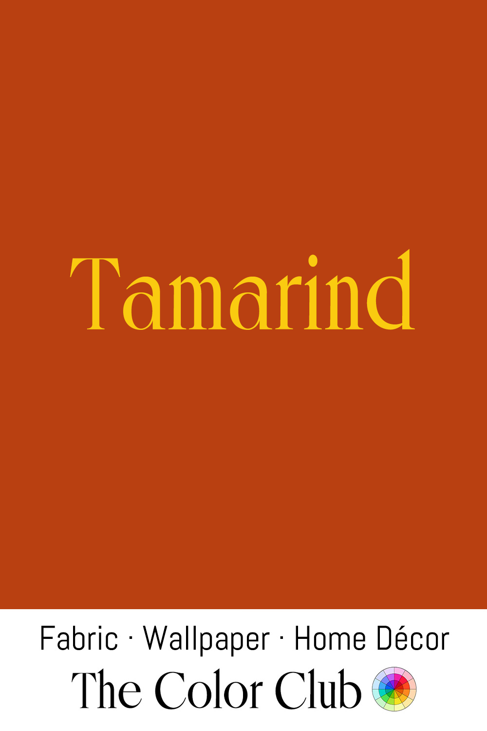
/ TAMARIND / reddish brown with a dense, tangy richness.
Native to tropical Africa, Tamarind spread across South Asia, the Middle East, and eventually the Americas along historic trade routes, its tart-sweet pulp becoming a foundational souring agent in cuisines from India and Thailand to Mexico.
This grounded shade has a strong connection to craft traditions. Tamarind seeds have tannin-rich coats that dyers use as both dye and mordant, creating golden brown tones on silk and cotton.
Today, Tamarind has found a place in contemporary interiors as a moody wall color, bringing warmth and sophistication when paired with natural wood, aged metals, and handcrafted materials.
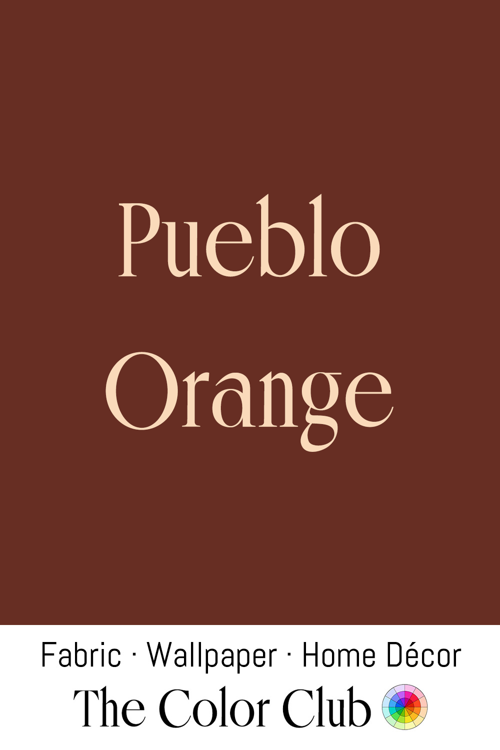
/ PUEBLO ORANGE / warm, sun-baked, earthy terracotta.
The color echoes the adobe architecture of the American Southwest. Ancestral Puebloan communities built hand-laid mud walls over a thousand years ago, and Spanish colonists later adapted the tradition into sun-dried brick for mission churches, such as San Esteban del Rey at Acoma (1629–1641), still found across New Mexico and Arizona.
Made from local earth, adobe takes its hue from the soil it is dug from, which iron oxides tint anywhere from pale tan to deep red-brown. Santa Fe-style interior design continues to lean heavily on this warm, sun-baked orange, pairing it with turquoise accents and dark wood viga beams to bring the look of adobe indoors.
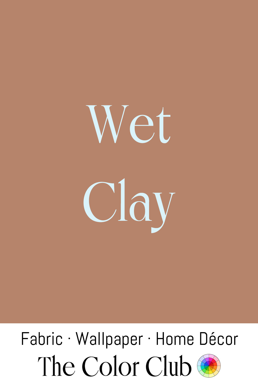
/ WET CLAY / earthy, muted orange-brown, soft and rich.
For at least 20,000 years, Clay has been shaped into pottery by human hands, and the specific orange-brown of unfired Wet Clay comes from the iron oxide it contains, a color that warms and deepens the hotter the clay is fired.
Architect Anna Heringer built the METI Handmade School in Rudrapur, Bangladesh, in 2005 with the villagers themselves, raising its thick walls from Wet Clay and straw trodden by water buffalo. In 2007 it won the Aga Khan Award for Architecture.
In interior design, this warm, matte tone is appreciated for being raw and honest.
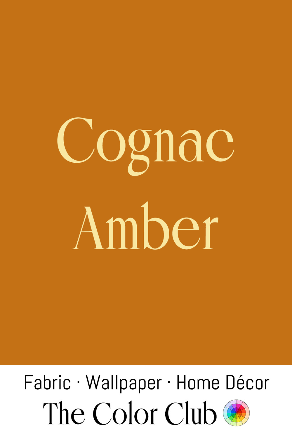
/ COGNAC AMBER / warm, rich, deep golden orange.
Named after the celebrated French brandy, Cognac Amber takes its color from the spirit's hue, which develops slowly as it ages in oak barrels. Through the 20th century, the same tone became a favorite for leather accessories.
Balanced between orange and brown, Amber carries the warmth of honey, polished wood, autumn leaves, and late afternoon light. It is grounded, cultivated, and quiet. A timeless color that only gets richer with time.
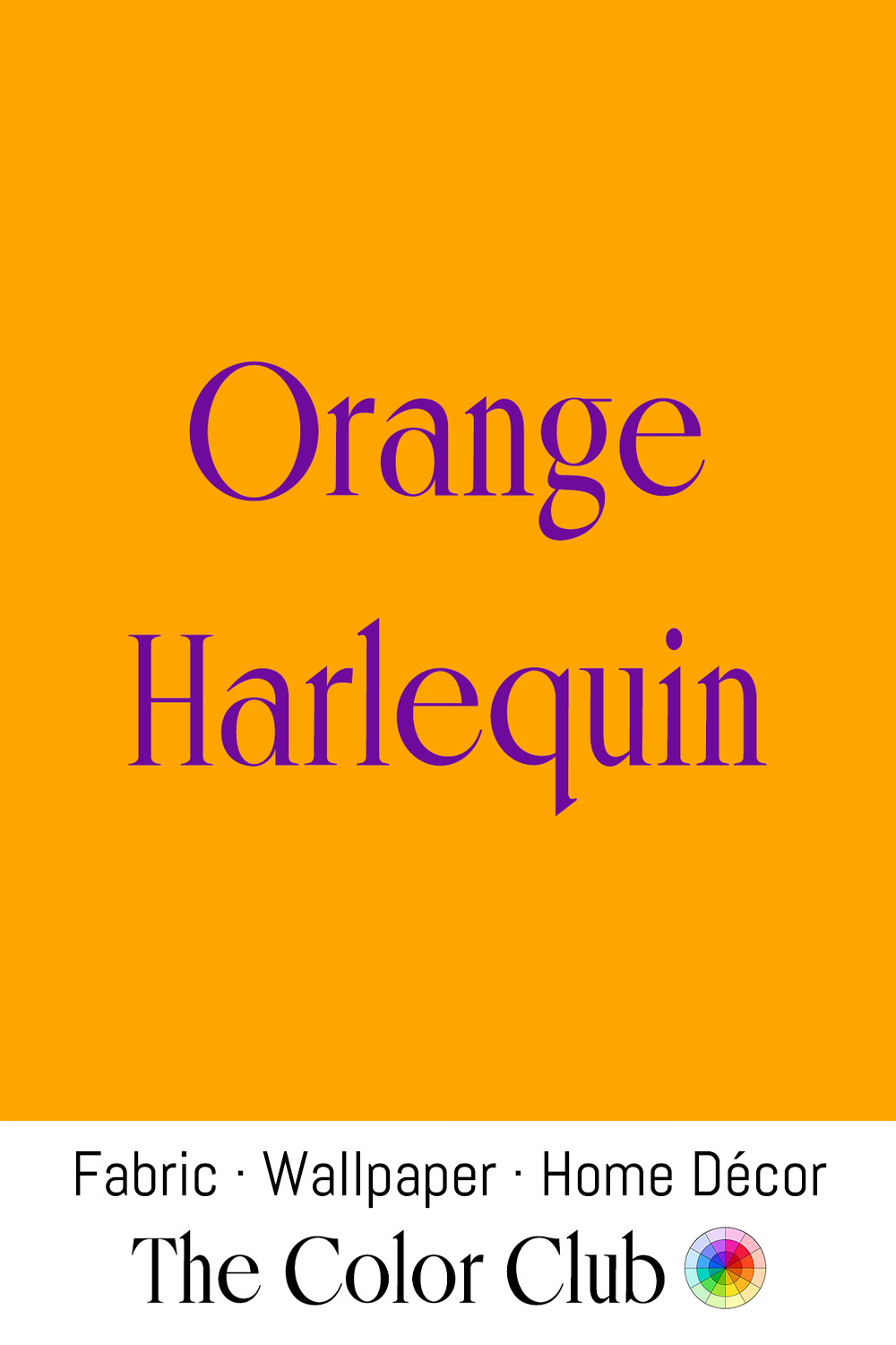
/ ORANGE HARLEQUIN / bright, bold, theatrical and playful.
The Harlequin is the iconic character of Italy's 16th-century commedia dell'arte, known for his distinctive costume made from colorful fabric pieces arranged in a diamond pattern. Over time, the name became associated with lively design and a spirit of performance.
This vivid orange carries the same sense of movement and celebration. Long connected with carnival, the stage, and creative expression, it brings confidence and energy wherever it appears.
In contemporary interiors and fashion, Orange Harlequin adds a fearless burst of personality through statement textiles, upholstery, and accents.
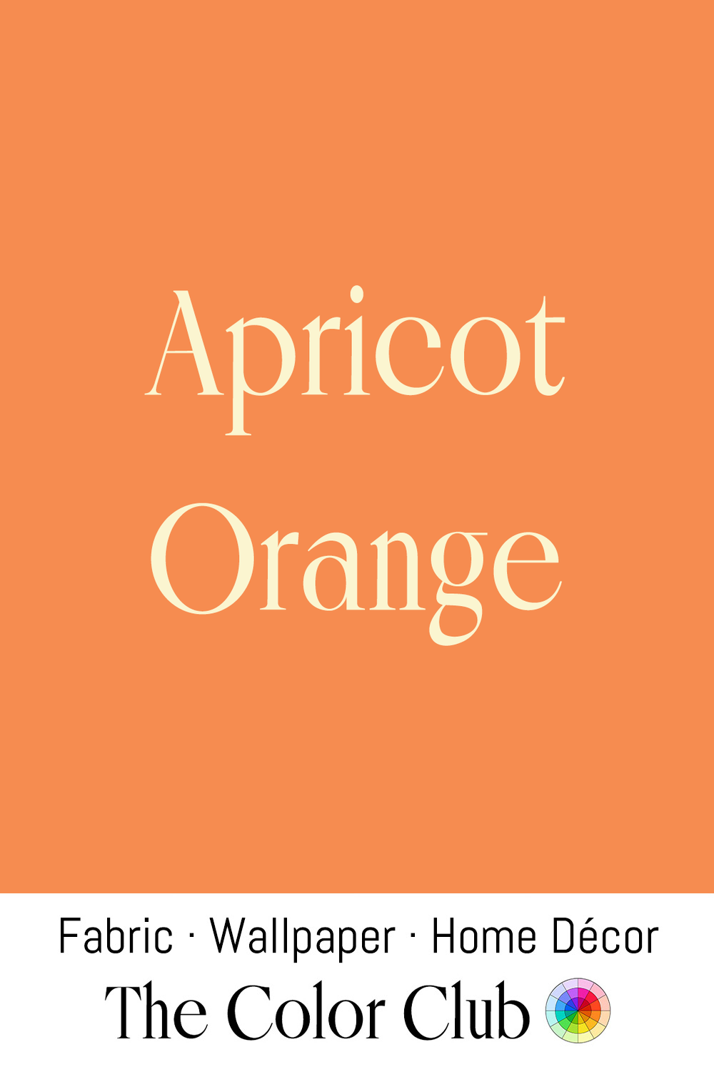
/ APRICOT ORANGE / fruity, rich and sun-ripened.
Apricots were cultivated in Central Asia and China thousands of years before spreading west along trade routes into Persia and the Mediterranean, prized both fresh and dried as one of the earliest widely exchanged stone fruits.
Jacqueline Kennedy wore an Apricot silk dress and matching coat designed by Oleg Cassini during her 1962 goodwill tour of India, first revealed on a boat ride on Lake Pichola in Udaipur. Cassini later said he wanted Jackie "to stand out" on the trip and that "the visual impact of color was important." A replica of the dress appeared in the Sears catalog and even on a Barbie doll.
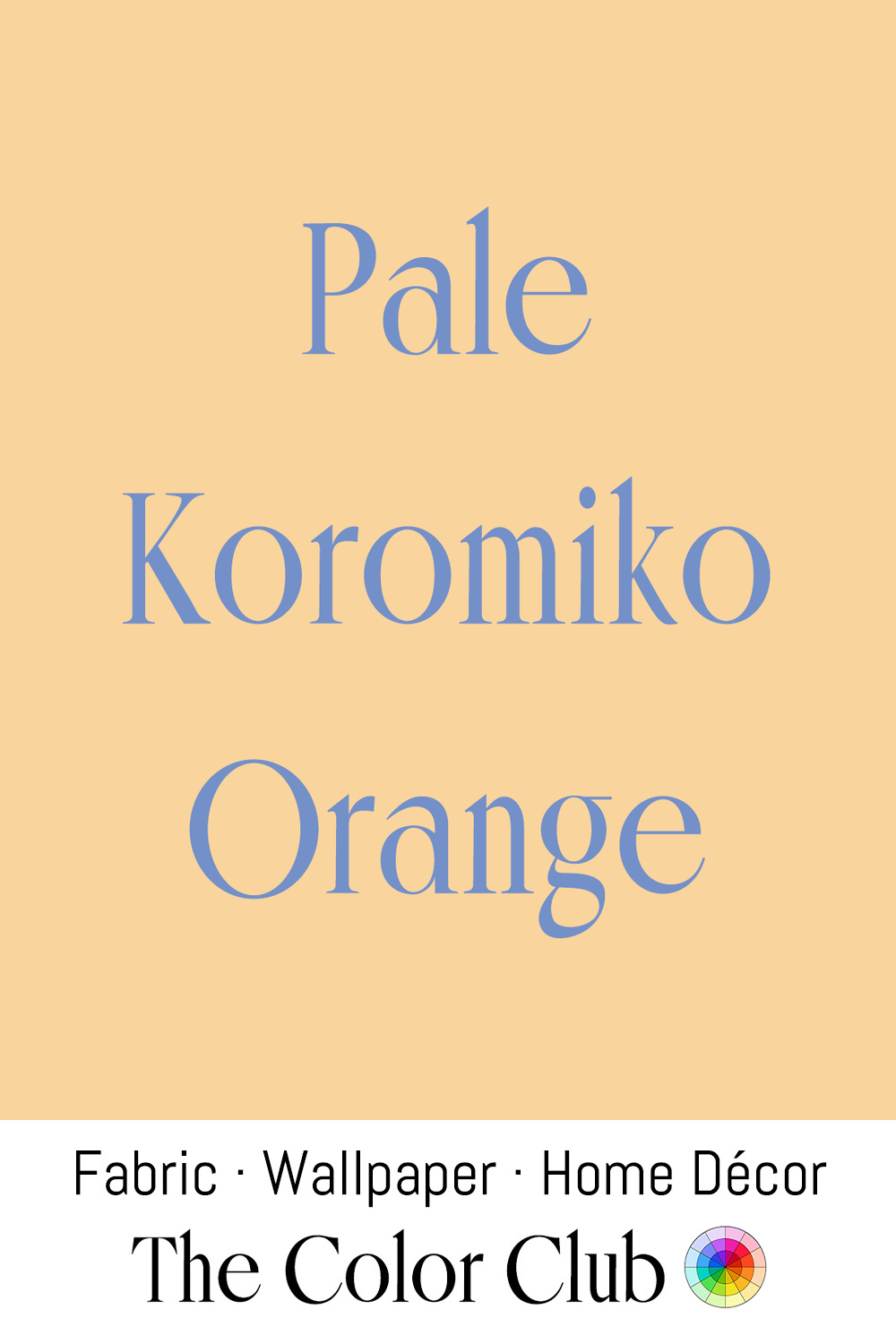
/ PALE KOROMIKO ORANGE / gentle, warm, golden cast.
Māori have long used koromiko, a group of New Zealand hebe shrubs, as a remedy for stomach complaints. In the Second World War, dried leaves were sent to the country’s troops serving in the Middle East, where army doctors tested them against dysentery.
New Zealand interior designer Clare Athfield pioneered naming paint shades after local places and native plants, influencing colors like Koromiko Orange and giving color charts a distinct national identity.
This gentle, sun-warmed variant has found favor in soft pastel interiors and gender-neutral nurseries, combining warmth, calm and playfulness.
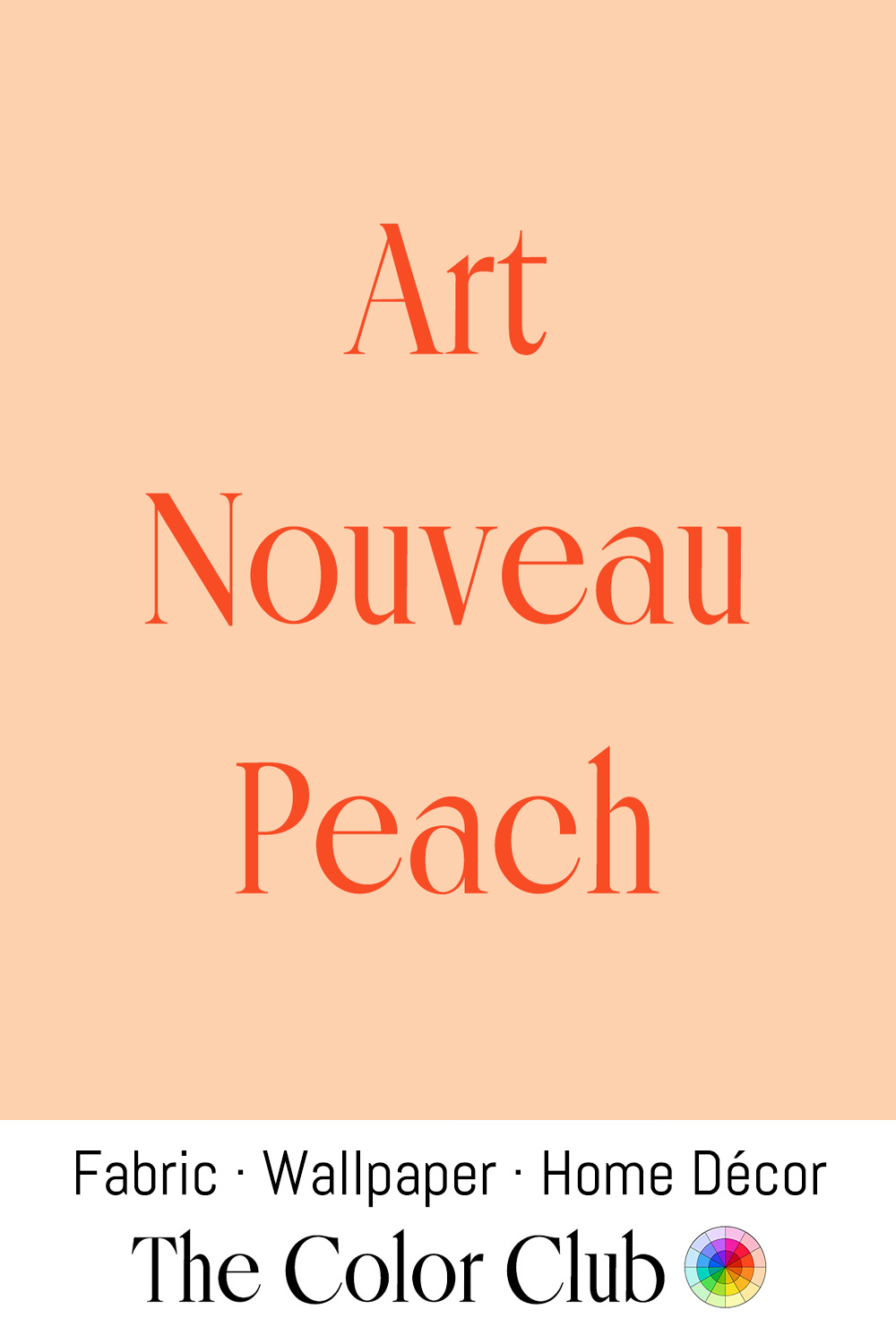
/ ART NOUVEAU PEACH / delicately warm and vivid pinkish orange.
The Art Nouveau movement flourished across Europe from the 1890s through the 1910s, with designers such as Émile Gallé drawing flowing floral motifs directly from organic plant forms and Alphonse Mucha favoring soft, naturalistic pastels, Peach among them.
The decorative Peach tone remains associated with Art Nouveau's ornamental glasswork, posters, and interior detailing, and continues to surface in revivals that borrow the era's romantic, organic sensibility.