

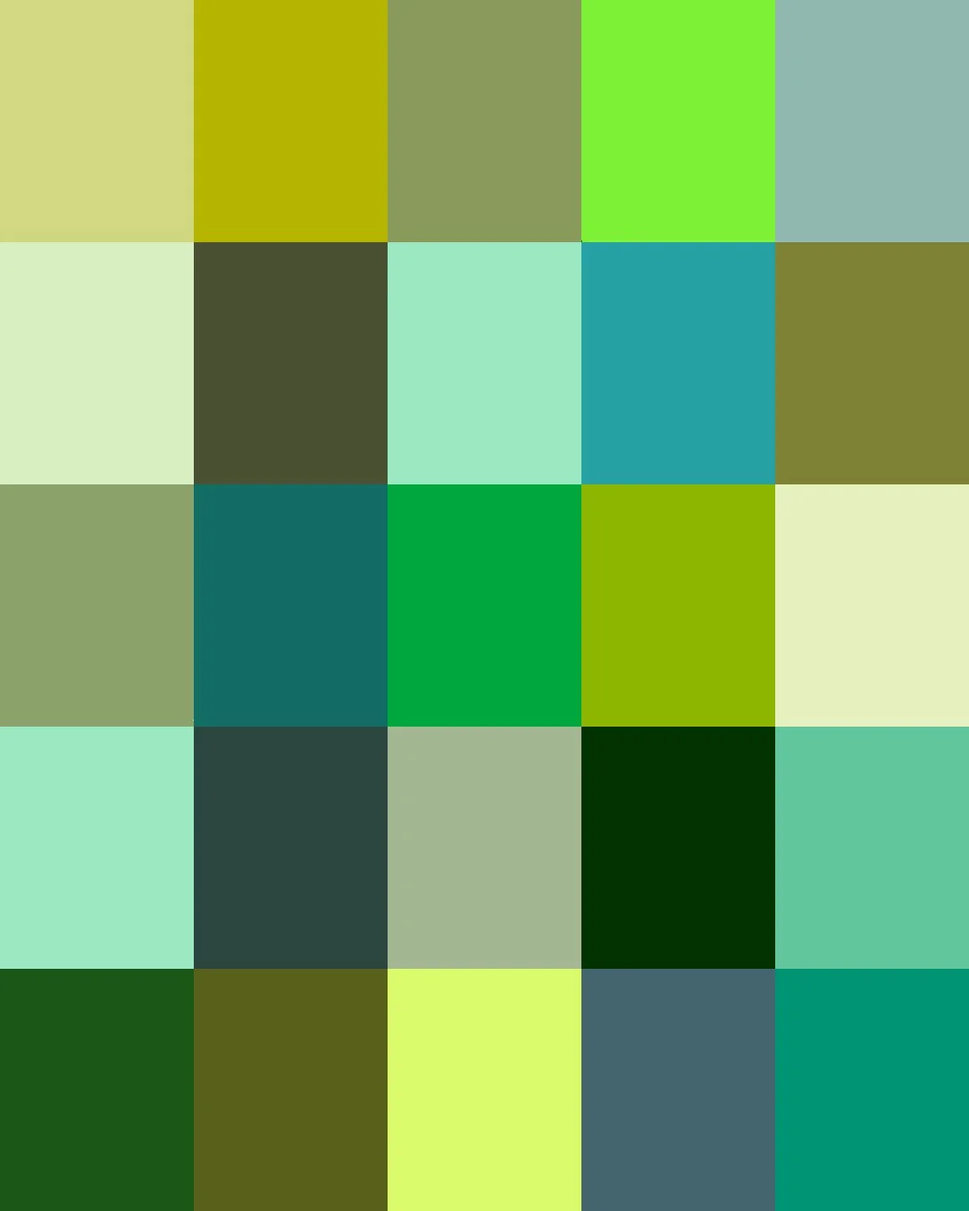
From ancient Egypt, where malachite, a ground copper ore, lined the eyes of pharaohs, to Victorian England's Scheele's green, an arsenic-laced dye that colored wallpaper and gowns despite its poison, green has long walked a line between beauty and danger.
It took modern chemistry to finally separate the color green from its poisonous past. Today's greens range from soft sage and eucalyptus, mossy forest tones, and minty pastels to the deep tones of emerald and pine.
Here are the stories about some of our Greens. Clicking on a Color will take you to our Spoonflower shop where you can order it on 60+ types of Fabric, Wallpaper, and Home Décor Products.
Or, save your favorites to your Pinterest boards for later.
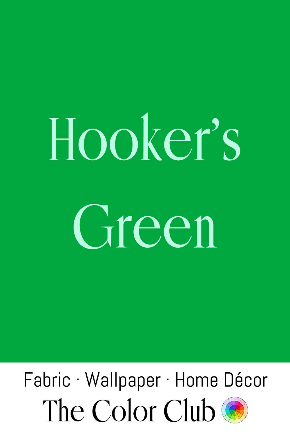
/ HOOKER'S GREEN / deep, bright, rich botanical hue.
English botanical illustrator William Hooker (1779-1832), official artist to the Horticultural Society of London, mixed the original version of this color from Prussian blue and gamboge, a yellow resin pigment, specifically to capture the tone of foliage in his detailed fruit and plant plates.
Though modern formulas are more lightfast, paint manufacturers still sell "Hooker's Green" today, and it remains a favorite among botanical illustrators and watercolorists for rendering leaves and landscapes.
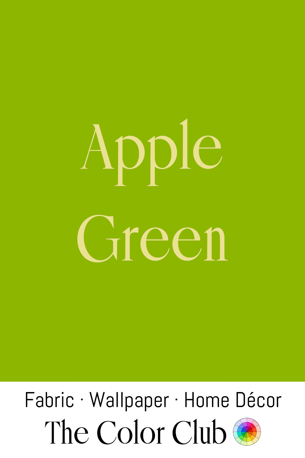
/ APPLE GREEN / crisp, fresh with a yellowish brightness.
This lively shade carries the natural freshness of one of the world's most beloved fruits. Apples have been cultivated for thousands of years, beginning with wild Apple forests of Kazakhstan that gave rise to modern varieties.
In the late 1750s, the royal porcelain manufactory at Sèvres was decorating luxury wares, many destined for the French court, with a ground color called vert pomme, or apple green. Today, the shade brings a playful sense of optimism and freshness to contemporary spaces and décor.
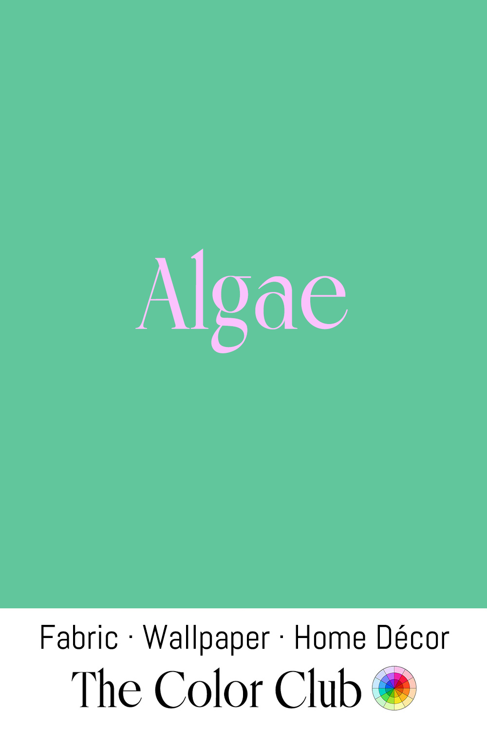
/ ALGAE / fresh organic aqua-green.
With fossil evidence of cyanobacteria dating back billions of years, Algae are among Earth’s oldest organisms. Through photosynthesis, these early Algae transformed the atmosphere and helped create the conditions for life as we know it today.
This serene green reflects a deep connection to water, nature, and renewal. In our times, Algae have become a source of inspiration in design, with researchers and makers exploring their potential in dyes, bioplastics, and other biomaterials.
A color that connects ancient origins with a more sustainable future.
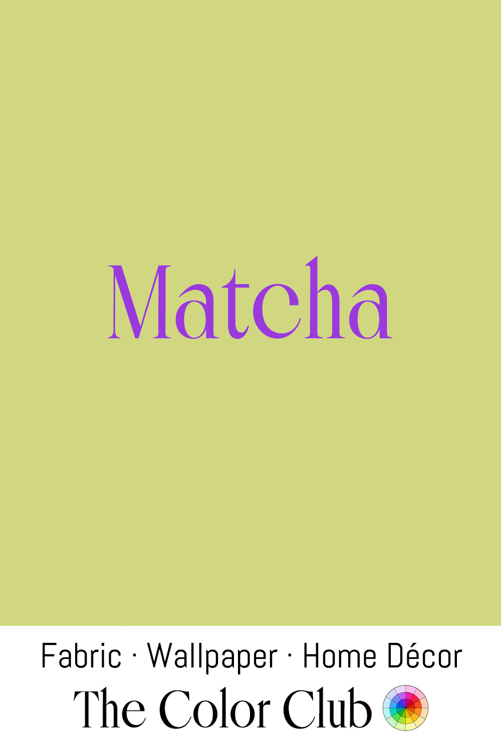
/ MATCHA / botanical soft and muted yellow-green.
The distinctive hue of Matcha comes from finely ground green tea leaves, a tradition brought from China to Japan by Zen Buddhist monks in the 12th century. Over time, Matcha became central to the Japanese tea ceremony, a practice shaped around mindfulness, precision, and quiet contemplation.
This gentle green evokes fresh leaves, natural pigments, and handmade materials. Today, Matcha brings a sense of serenity, simplicity, and harmony to design, food, and wellness spaces around the world.
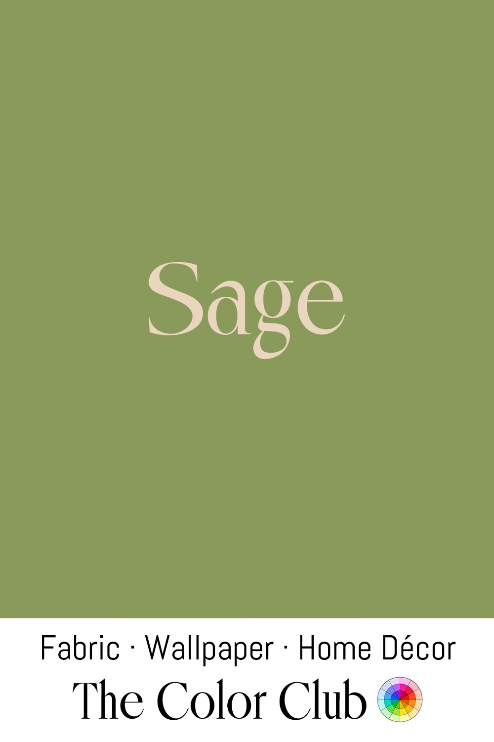
/ SAGE / muted, softly restorative gray-green.
Named after the sage plant, this calming shade takes its character from the herb’s silvery-green leaves. Sage has been valued for centuries across Mediterranean and Native American traditions, used in cooking, healing practices, and ceremonial rituals associated with cleansing and renewal.
Its gentle, grounded quality has made Sage a favorite in contemporary interiors, where it brings warmth and tranquility to walls, upholstery, and textiles. As a natural alternative to cooler neutrals, it creates spaces that feel calm, timeless, and connected to the outdoors.
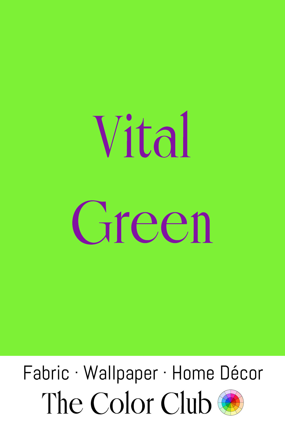
/ VITAL GREEN / vivid, yellow-leaning electric energy.
Motor racers long avoided green as an unlucky color. In the late 1960s, Kawasaki broke the superstition at Daytona, sending out its factory racers in bright green so they would stand out on color television. The machines earned the nickname “Green Monster,” and the green became the company’s signature.
Fast, youthful and full of movement, this hue captures new growth at its most vibrant. Its high saturation gives it the visual intensity associated with neon and other high-energy colors, making it particularly suited to the playful language of contemporary sportswear, technology and product design. In interiors, it can be used as a confident accent on upholstered furniture, artwork and textiles, bringing a sharp burst of life to a space.
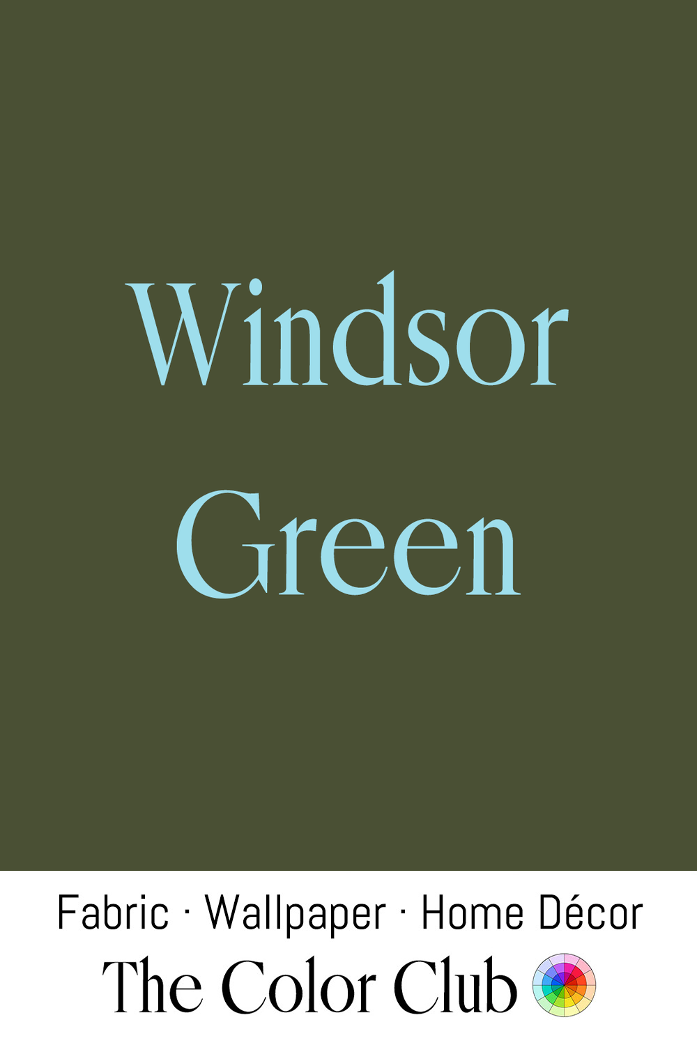
/ WINDSOR GREEN / deep, dense, blueish, rich and formal.
Deep greens like Windsor Green carry centuries of association with English country estates, royal parkland, and traditional craftsmanship. Historically, achieving these intense shades required complex processes that layered blue and yellow dyes in pursuit of lasting depth and stability.
This sense of heritage continues in contemporary interiors, where Windsor Green brings quiet drama to library walls, leather seating, and classic architectural spaces.
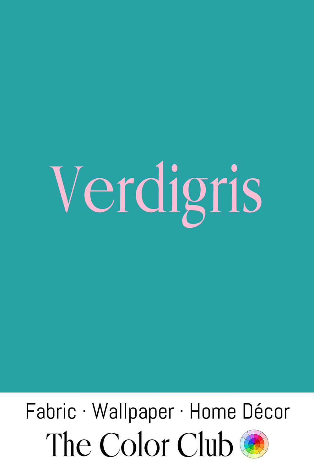
/ VERDIGRIS / saturated blue-green jewel tone.
Named after the Old French vert-de-Grèce, or "green of Greece," the pigment was long manufactured by suspending copper plates over vinegar in sealed pots. In 18th-century Montpellier, France, the work was carried out largely by women, who stacked the plates in clay jars filled with distilled wine and scraped off the blue-green crystals weekly to grind into paint.
The most famous modern example is the Statue of Liberty, which was unveiled in New York Harbor in 1886 gleaming reddish-brown and only turned its now-iconic Verdigris color in the early 1900s, as decades of oxidation from salt air, rain, and coastal pollution converted its copper skin into the protective patina that still shields it today.
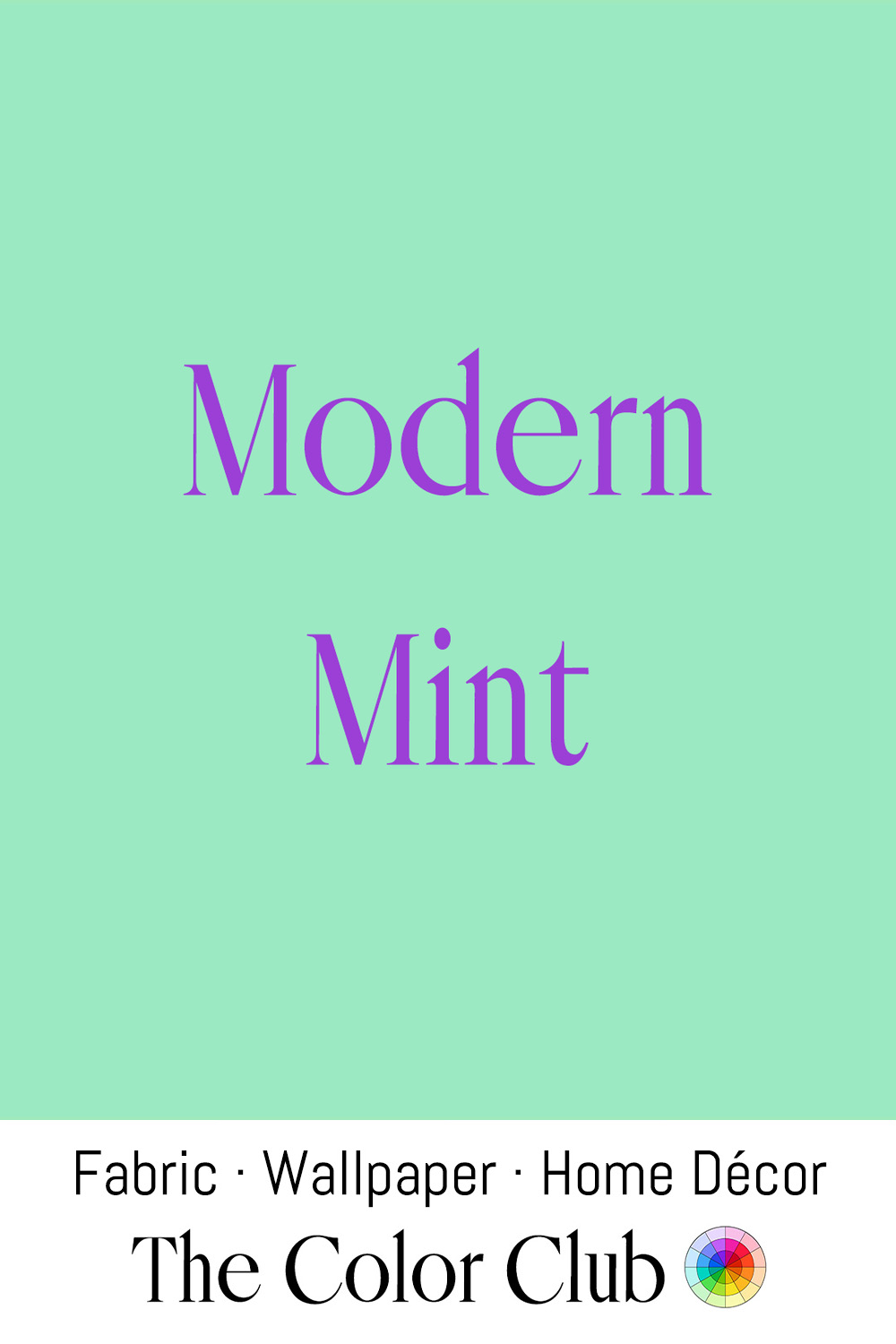
/ MODERN MINT / soft, clean and refreshing blue-green.
This gentle green is a modern interpretation of Mint: clean, optimistic, and almost weightless. Mint tones have long appeared in design, from early 20th-century interiors and Art Deco palettes to the colors of postwar homes, carrying a sense of freshness, clarity, and renewal.
In 1950s America, Mint green was a favorite pastel, seen on cars and in the kitchens and bathrooms of the era’s new suburban houses.
In the 1980s, designer Leonard Horowitz’s pastel palette for Miami Beach’s Art Deco buildings, which began with a bakery painted partly in Mint green, reached television screens as the backdrop of Miami Vice.
Today, Modern Mint continues to bring a calm, contemporary freshness to walls, textiles, and fashion.
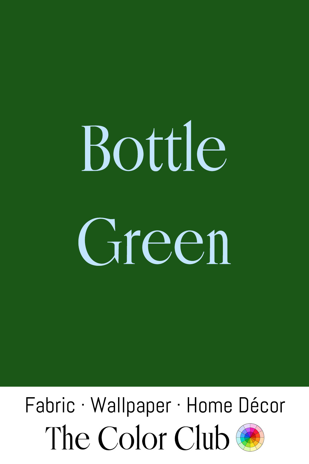
/ BOTTLE GREEN / traditional, deep and dense.
From the 18th and 19th centuries, wine and mineral water bottles across Europe were made of dark green glass. Caused by natural iron impurities, this deep green became associated with craftsmanship and durability.
In the 19th century, such greens helped set the scholarly atmosphere of libraries, gentlemen’s clubs, and country houses, in rooms layered with dark woods, leather, brass, and rich textiles.
Today, Bottle Green returns with the revival of heritage interiors. On textiles, it is especially striking in Celosia Velvet®, where the changing direction of the pile gives subtle shifts in tone, and in Belgian Linen™, where the natural weave adds depth.
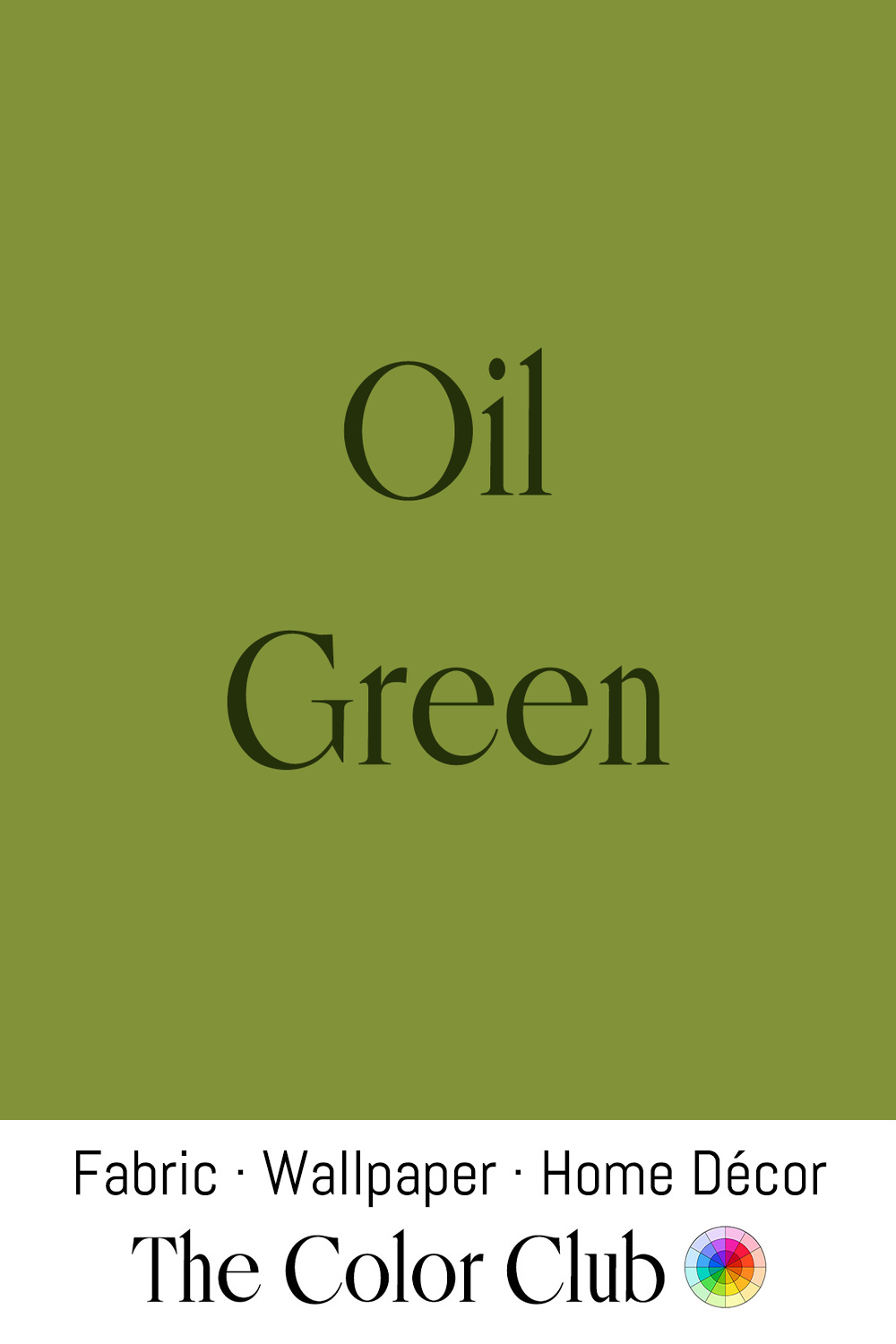
/ OIL GREEN / rich, fruity 1970s classic.
Olive greens became popular in late 19th-century Aesthetic Movement interiors, where designers moved toward quieter, nature-inspired palettes and away from the heavier colors of Victorian decoration. The shade also appeared in utilitarian textiles and military fabrics, valued for its practicality and ability to blend with its surroundings.
Olive green found its defining decade in the 1970s, becoming a signature of the era's earth-tone palette alongside avocado, mustard, burnt orange, and deep brown. Homes of the period were filled with these warm, natural shades, often layered together for a cocooning, lived-in feel, marking a deliberate shift away from the brighter, synthetic colors of the 1960s.
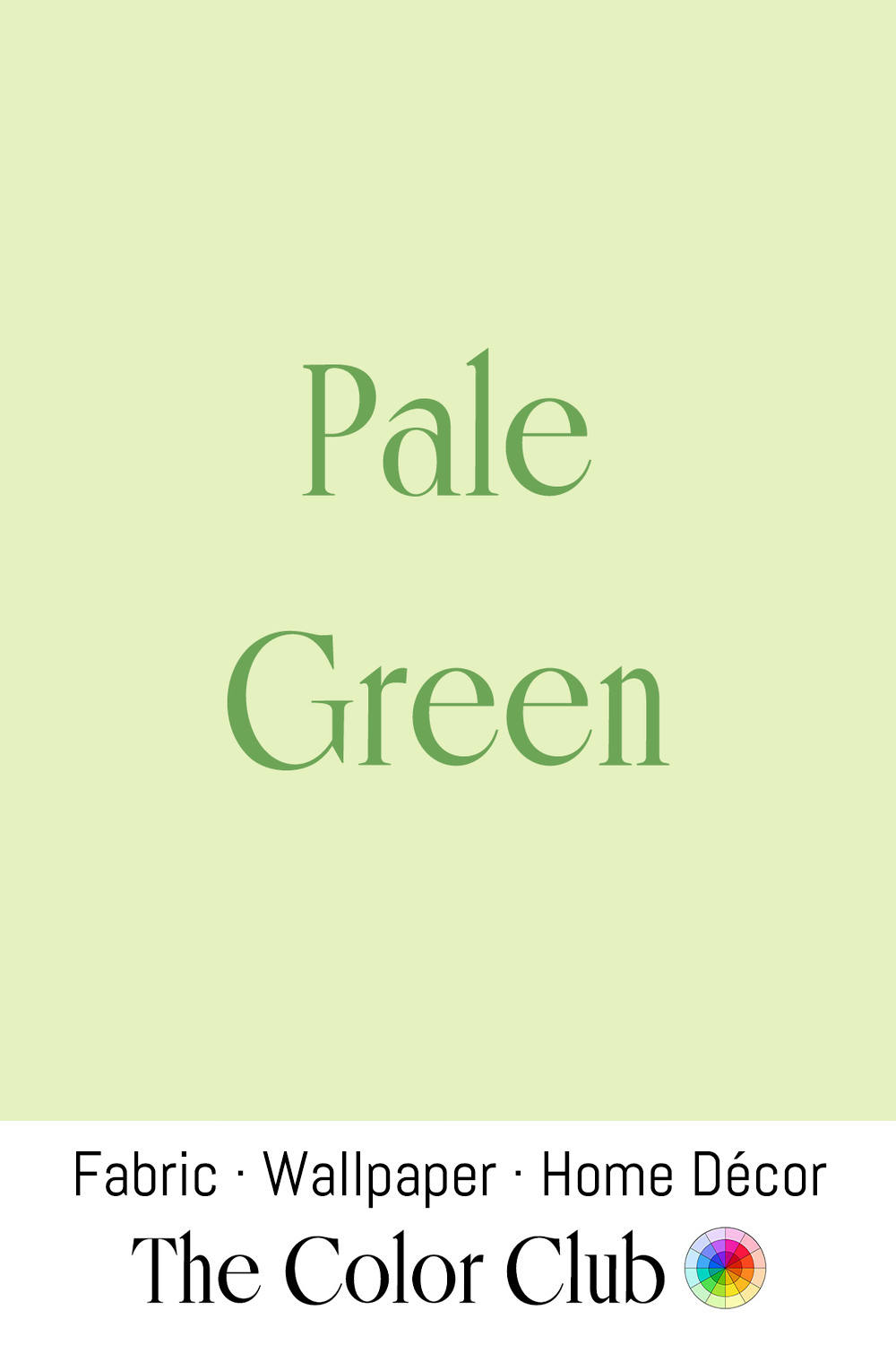
/ PALE GREEN / freshly sprouting garden spirit.
Pale, diluted greens have long carried associations with renewal and spring growth, echoing the tender color of new leaves and unripe fruit before either matures into deeper, more saturated tones. These gentle greens have appeared throughout decorative arts as delicate wall tints and subtle textile shades that bring lightness and calm to homes.
In contemporary design, Pale Green has become a favorite in the Scandinavian-influenced interiors of the 2020s, used as a softer alternative to stark white in bedrooms, bathrooms, and minimalist living spaces.
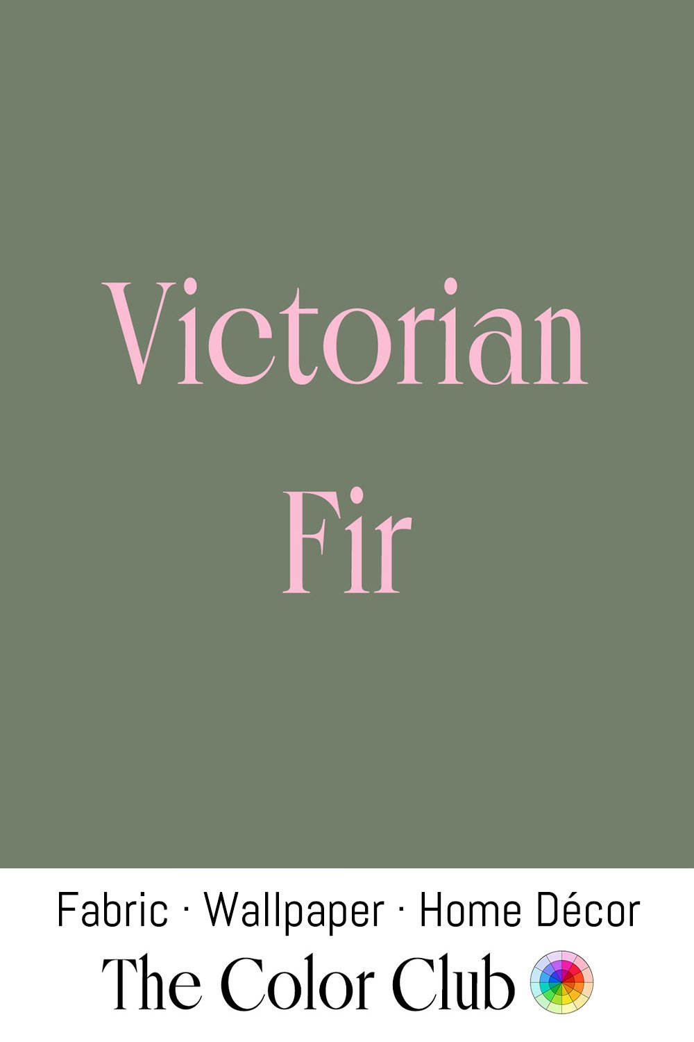
/ VICTORIAN FIR / medium-dark, muted green.
In 1848, an engraving of Queen Victoria and Prince Albert's decorated fir at Windsor Castle popularized the German tradition of the Christmas tree across Britain, cementing needle-green tones as a fixture of the festive season ever since.
In winter the deep green of the foliage takes on a quieter, more contemplative character. Victorian Fir reflects the return of heritage-inspired interiors and nature-based palettes, its restrained depth bringing a calm, enveloping atmosphere to contemporary spaces.
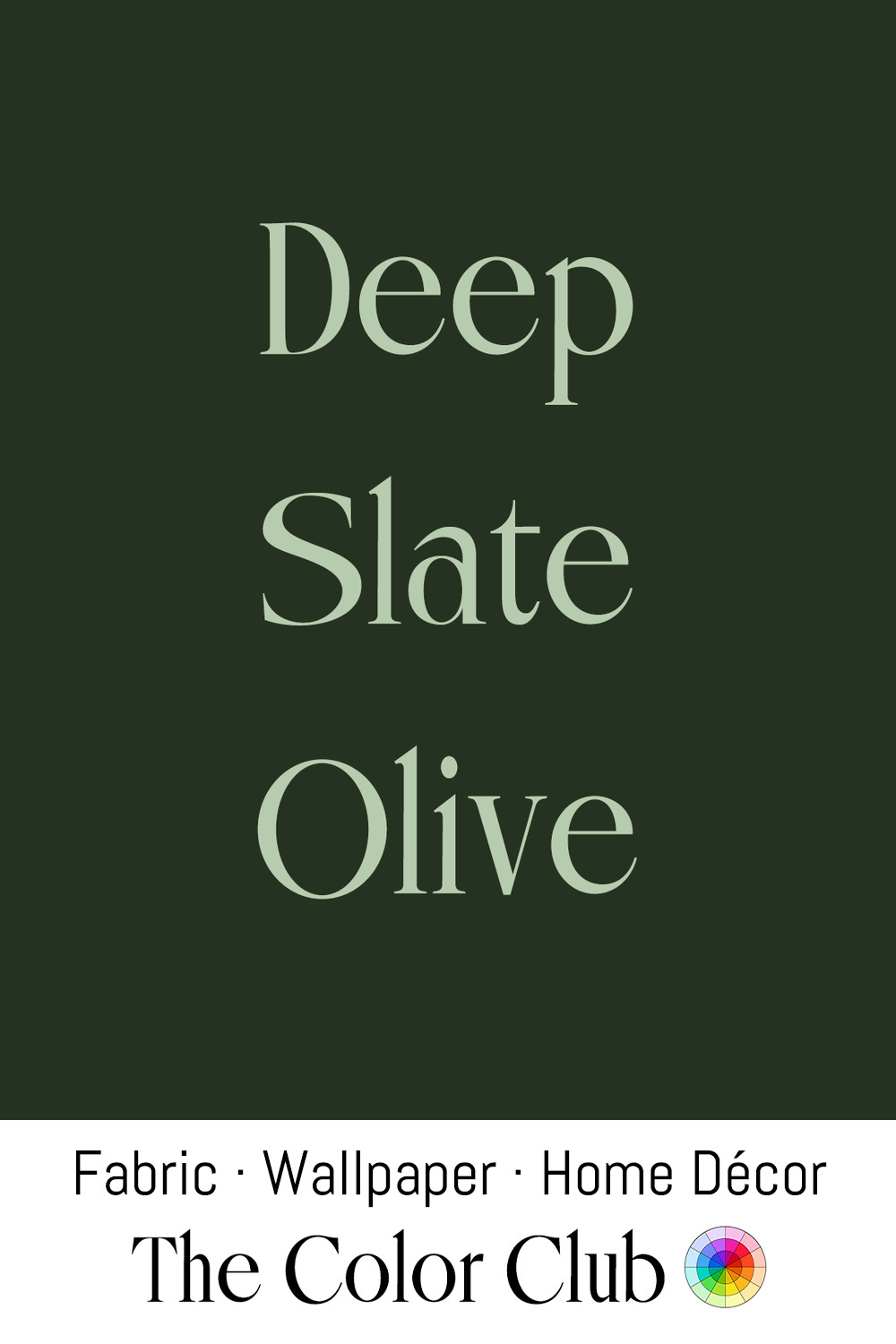
/ DEEP SLATE OLIVE / shadowed forest green.
The color sits between green, brown, and gray. This subdued, architectural shade carries the character of aged Olive foliage, moss-covered stone, and time-softened mineral pigments.
Dark Olive tones have long appeared in military textiles, traditional paints, and utilitarian goods, valued for their durability and connection to the landscape. Similar shades became central to Arts and Crafts interiors of the late 19th and early 20th centuries, where nature-inspired colors created harmonious spaces built around wood, stone, and handcrafted materials.
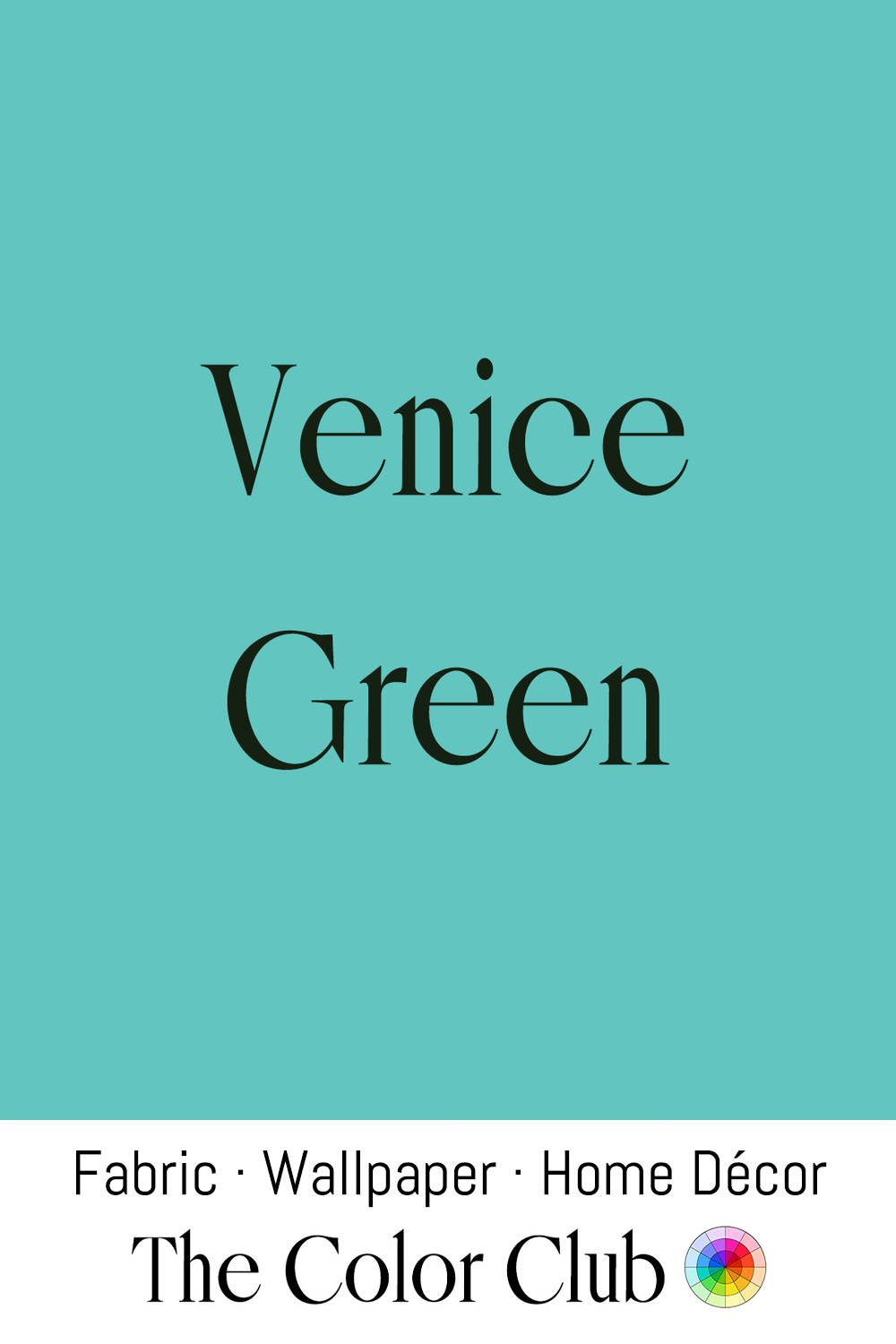
/ VENICE GREEN / Veronese green, rich saturated teal.
Blue-greens have long appeared in decorative arts, from European painted interiors to Mediterranean ceramics and glasswork. In Venice, similar shades became especially associated with Murano glass, where artisans used metal oxides to create translucent objects prized for their depth and luminosity.
Recalling the green-blue tones of Venetian glass, canal reflections, and the colorful houses of Burano across the lagoon, this cool hue lingers between aqua and turquoise, the architectural and aquatic.
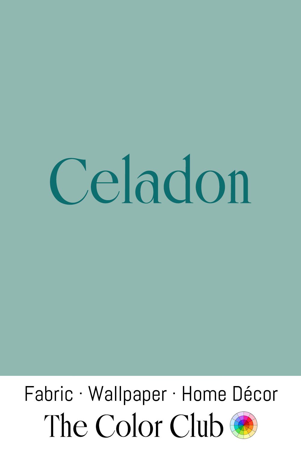
/ CELADON / quietly soft and muted grayish blue-green.
In 17th-century France, the name of Céladon, the hero of Honoré d’Urfé’s pastoral romance L’Astrée, came to describe the jade-toned ceramics that Chinese and Korean potters had perfected long before. Korea’s Goryeo dynasty (918–1392) produced Celadon of such refinement that a Chinese writer of the period ranked it “first under heaven.”
Among studio potters and ceramic houses worldwide, Celadon glazes remain in active use, while the color has become a staple of quiet, minimalist interiors. Its softened blue-green character brings a sense of calm and restraint, especially when paired with natural materials such as wood, stone, linen, and handcrafted tableware.