

Black & Gray Color Stories
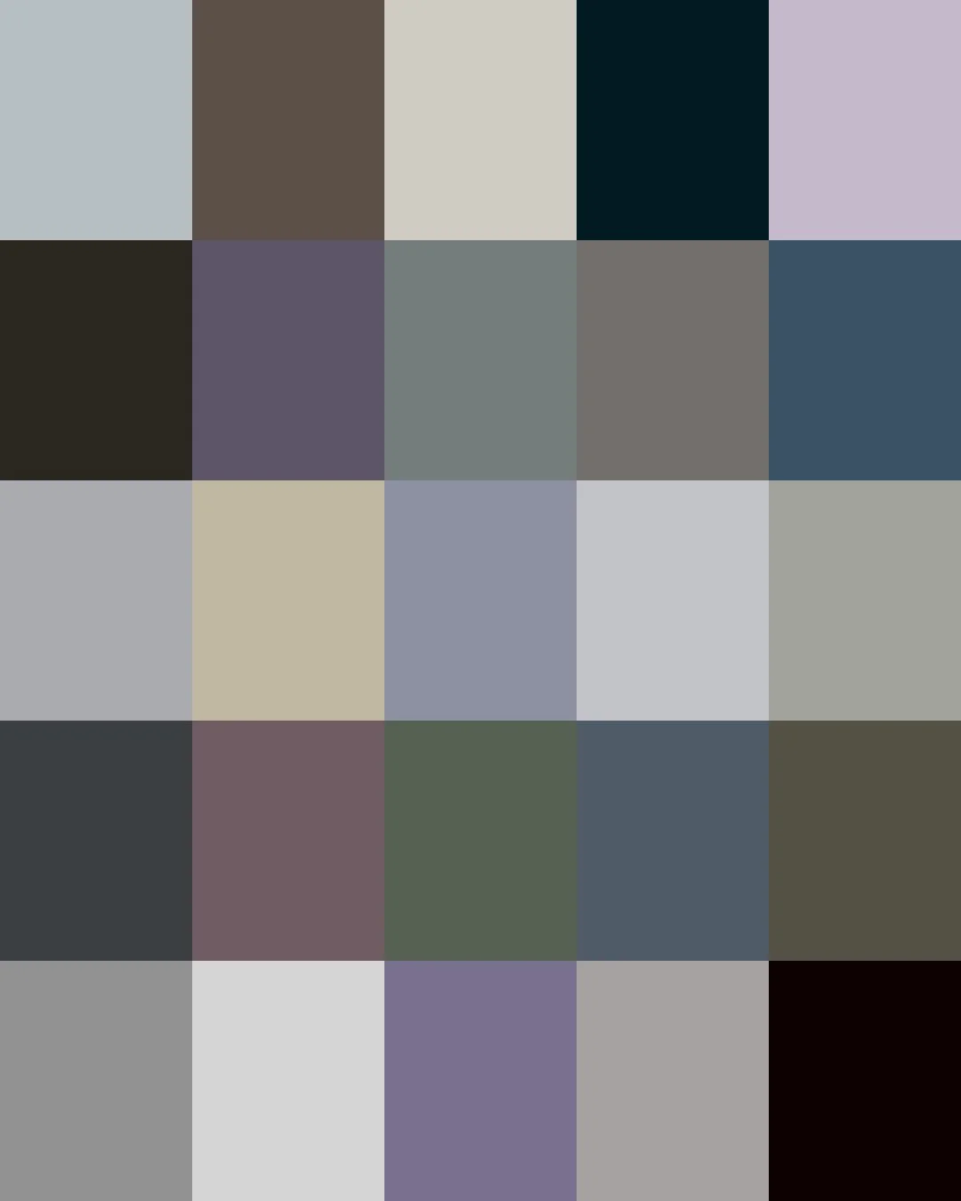
From the Neanderthals who over 60,000 years ago ground manganese dioxide into black pigment, to Queen Victoria's forty years of mourning that turned the color into the uniform of an entire era's fashion, black and gray have always ritualized human expression. By the twentieth century, black had shed its association with grief and become a wardrobe staple. Today's blacks and grays range from soft dove and fog, warm charcoals, and cool slates to the deep tones of ink and onyx.
Here are the stories about some of those Blacks and Grays in our Collections.
We print all of them on demand for you.
Clicking on a Color will take you to our Spoonflower shop where you can order it on 60+ types of Fabric, Wallpaper, and Home Décor Products.
Or, save your favorites to your Pinterest boards for later.
/ WARM BLACK / extremely deep dark and velvety.
Soot collected from burning oil or resin, and charred animal bone ground into a fine powder, were among the most common sources of this warm, brown-toned black for centuries. Both materials carried a natural warmth from their organic origins, giving prints, paintings, and inks the soft, enveloping depth long prized in engraving, etching, and fine printmaking.
The shade has a long connection to craft traditions, including Japanese lacquerware and European furniture finishing, where black surfaces were built through layers of hand-applied material. In fashion, this warmer black became closely associated with Savile Row tailoring, where bespoke tailors have long chosen it for suits worn under warm indoor lighting, its brown undertone giving formal wool a rich, soft depth.

/ ALTOSTRATUS / soft, violet-tinged blue-gray, cool and pale.
Named after the high, layered clouds that often cover the sky before rain or snow, Altostratus describes the muted gray-blue produced when sunlight diffuses through dense cloud layers. The name comes from Latin altus ("high") and stratus ("layered").
Similar blue-grays have long appeared in landscape painting, where artists used softened tones to capture distance, mist, and changing weather. This same cool gray-blue became a signature of Danish modernism through Arne Jacobsen's SAS Royal Hotel in Copenhagen (1960), where muted blue-grays were carried across walls, furniture, and fittings to create a cohesive, light-filled interior.
/ COLD SILVER / pale gray with the coolness of polished metal.
Embedded for thousands of years in coins, vessels, jewellery, and ceremonial objects, this distinctive cool gray comes from the appearance of polished metal, refined over centuries of silversmithing technique.
The color became strongly associated with Art Deco, when chrome, nickel, and polished metals defined the machine-age aesthetic of the 1920s and 1930s. William Van Alen's Chrysler Building (1930) in New York used a then-new rustproof stainless steel, Nirosta, for its spire and eagle gargoyles, admired for its bright, polished silver surface.

/ DOLPHIN / cool, muted blue-gray.
The name refers to the natural coloring of dolphins, whose skin ranges from pale silver-gray to deeper blue-gray depending on species and light.
In fashion, this muted blue-gray sits within the same family of grays, charcoals, and navies documented in Giorgio Armani's tailoring from the late 1970s onward, part of the softer, more muted palette credited with easing the rigid formality of traditional menswear.
Porsche has used the name Dolphin Grey for one of its own paint colors since 1964, introduced on the 356C as a cool, pale gray noticeably lighter than the brand's other grays of that era. It later reappeared on select 911 models, including a modern 997.2 GT3 RS, and it was the original color of the 1964 356C that Janis Joplin bought in 1968, before famously repainting it in psychedelic murals.
/ INK BLACK / deep, cool at with a carbon core.
Traditional East Asian ink makers have long distinguished between two sources of black: soot from burning pine, and soot from burning oil. Pine soot ink, known in Japan as seiboku, carries a naturally cooler, blue-black cast, prized for centuries in painting and calligraphy. Oil soot ink produces a warmer, browner black, used just as widely for fine painting and formal writing.
The color is closely linked to East Asian calligraphy and sumi-e painting, where artists created entire landscapes through variations of black ink and water, diluting a single pigment into a full tonal range.
In fashion, Rei Kawakubo of Comme des Garçons became known for treating black itself as an entire spectrum, reportedly working in as many as a dozen distinct shades within one collection since her Paris debut in 1981, a practice that helped establish black as a serious, deliberate design material with its own range of character.
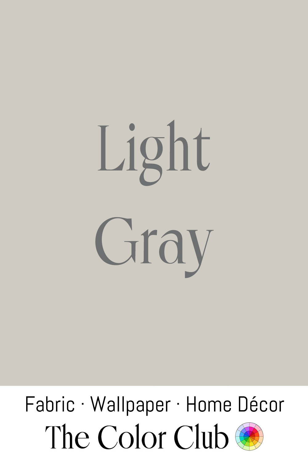
/ LIGHT GRAY / pale neutral, soft and quiet.
Existing as a color category for centuries, named from the Old English grǣg, this family of tones has long been associated with ash, stone, and natural wool. Its lighter variants were historically created by mixing black pigments with white materials such as chalk or lead white.
In fashion, this pale, balanced gray became closely associated with fine wool tailoring, most notably gray flannel trousers, a staple of mid-century American menswear popularized well beyond its origins by Sloan Wilson's 1955 novel The Man in the Gray Flannel Suit, whose title turned the fabric and its color into shorthand for corporate conformity.
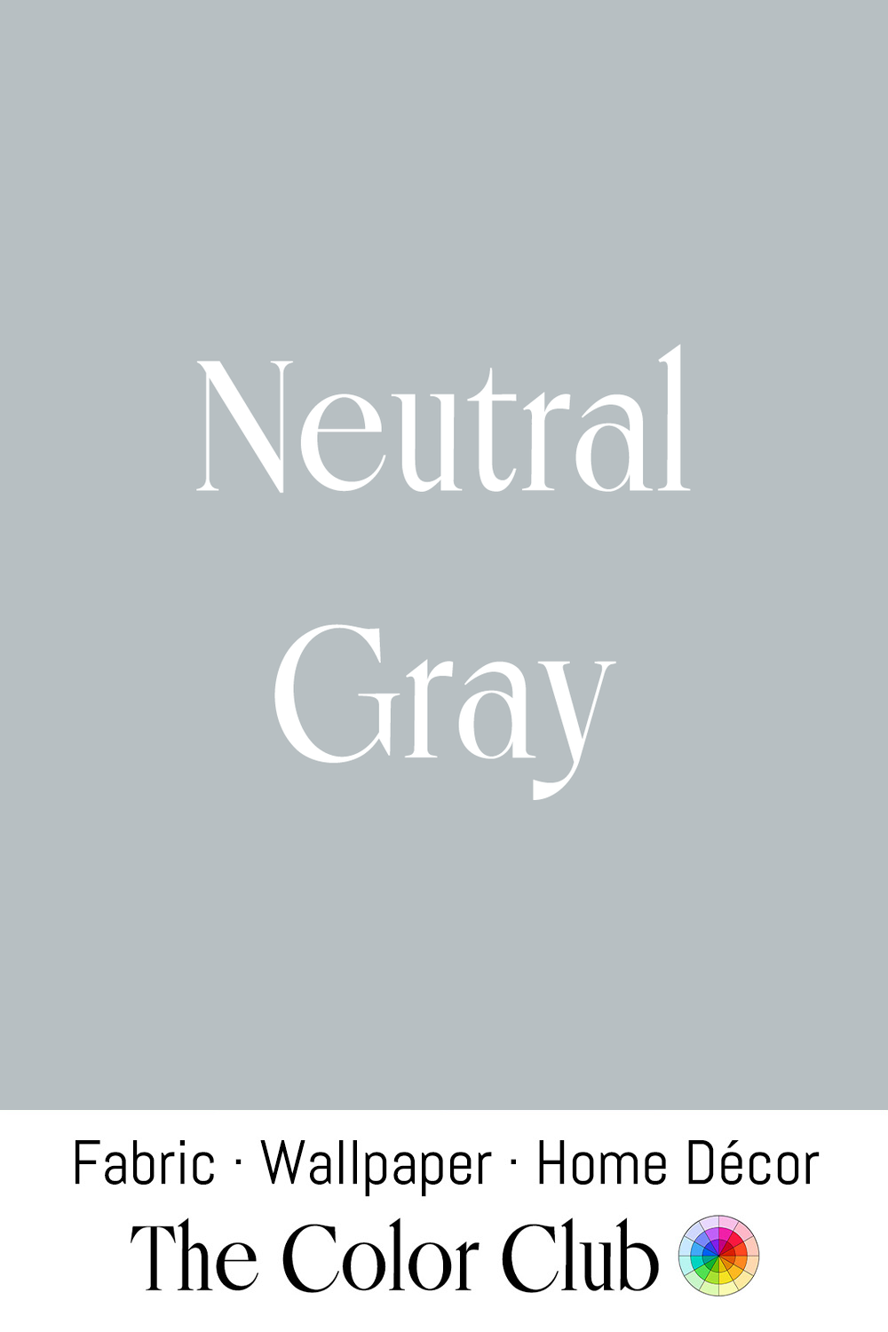
/ NEUTRAL GRAY / true middle tone, balanced between dark and light.
Combining black and white in equal visual balance produces a color with no noticeable warm or cool bias.
This midpoint is formally defined in the Munsell Color System, developed by the American painter and educator Albert Munsell in the early 1900s, where a neutral gray of zero chroma sits between black and white on his numbered value scale — a reference still used today in art, design, and manufacturing to specify color without any hue bias. In photography, standardized gray cards built on this same principle became essential tools for achieving accurate exposure and color balance.
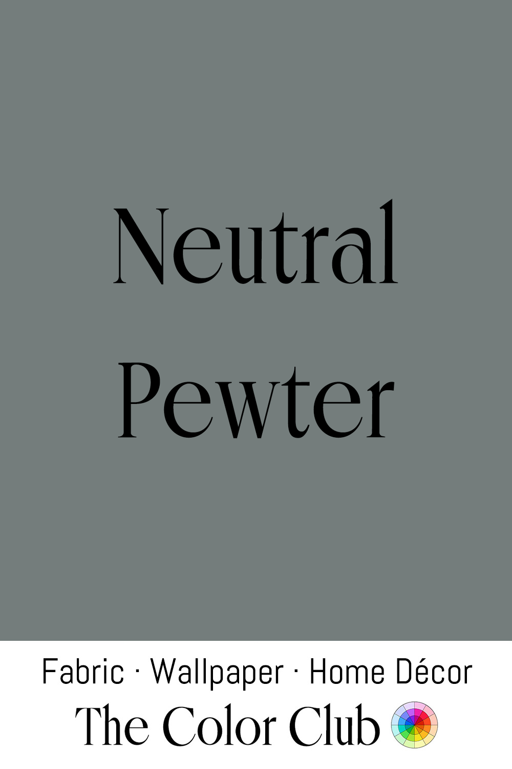
/ NEUTRAL PEWTER / soft gray with a whisper of green.
An alloy of tin combined with small amounts of other metals, this material has been used for centuries in plates, tankards, candlesticks, and household objects, developing a softer gray surface with age as oxidation and wear gradually mute its finish.
The color is closely associated with early American decorative arts. The Danforth family of Connecticut, among colonial America's foremost pewterers across three generations starting in the 1730s, produced tankards, plates, and candlesticks in this soft, oxidized gray, valued for its practical durability as much as its appearance.
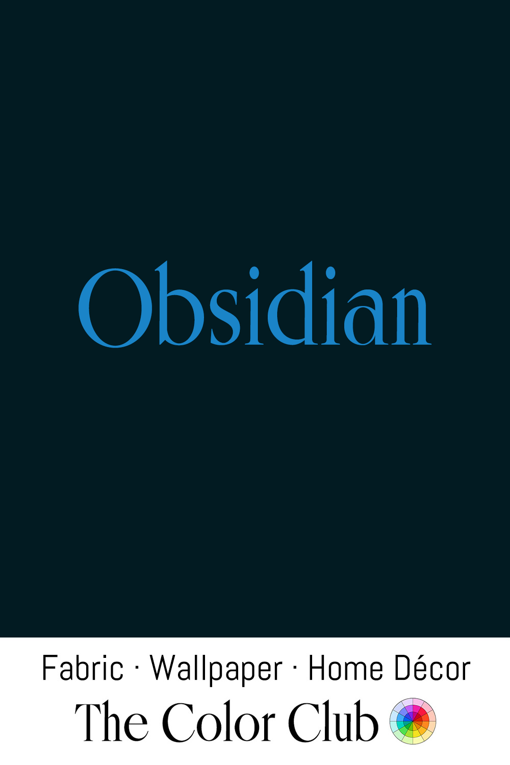
/ OBSIDIAN / near-black with a deeply saturated blue-green undertone.
Formed when lava cools too rapidly for crystals to develop, this natural volcanic glass has a deep black surface, often with subtle green or blue reflections, that has made it a valued material for tools, mirrors, and ceremonial objects for thousands of years.
In Mesoamerica, obsidian's near-black surface was polished into ceremonial mirrors as well as tools and blades, valued for its reflective depth as much as its edge. One such mirror, brought to Europe after the Spanish conquest of the Aztec empire, later belonged to the Elizabethan astrologer John Dee, who used it for scrying; it remains on display today in the British Museum, one of the best-known objects made from this deep, glassy near-black stone.
Mercedes-Benz has used the name Obsidian Black for one of its own paint colors since the late 1970s (color code 197), a deep black carrying a faint metallic depth across its surface. It has remained in the brand's color range ever since, appearing across decades of models into the present day.
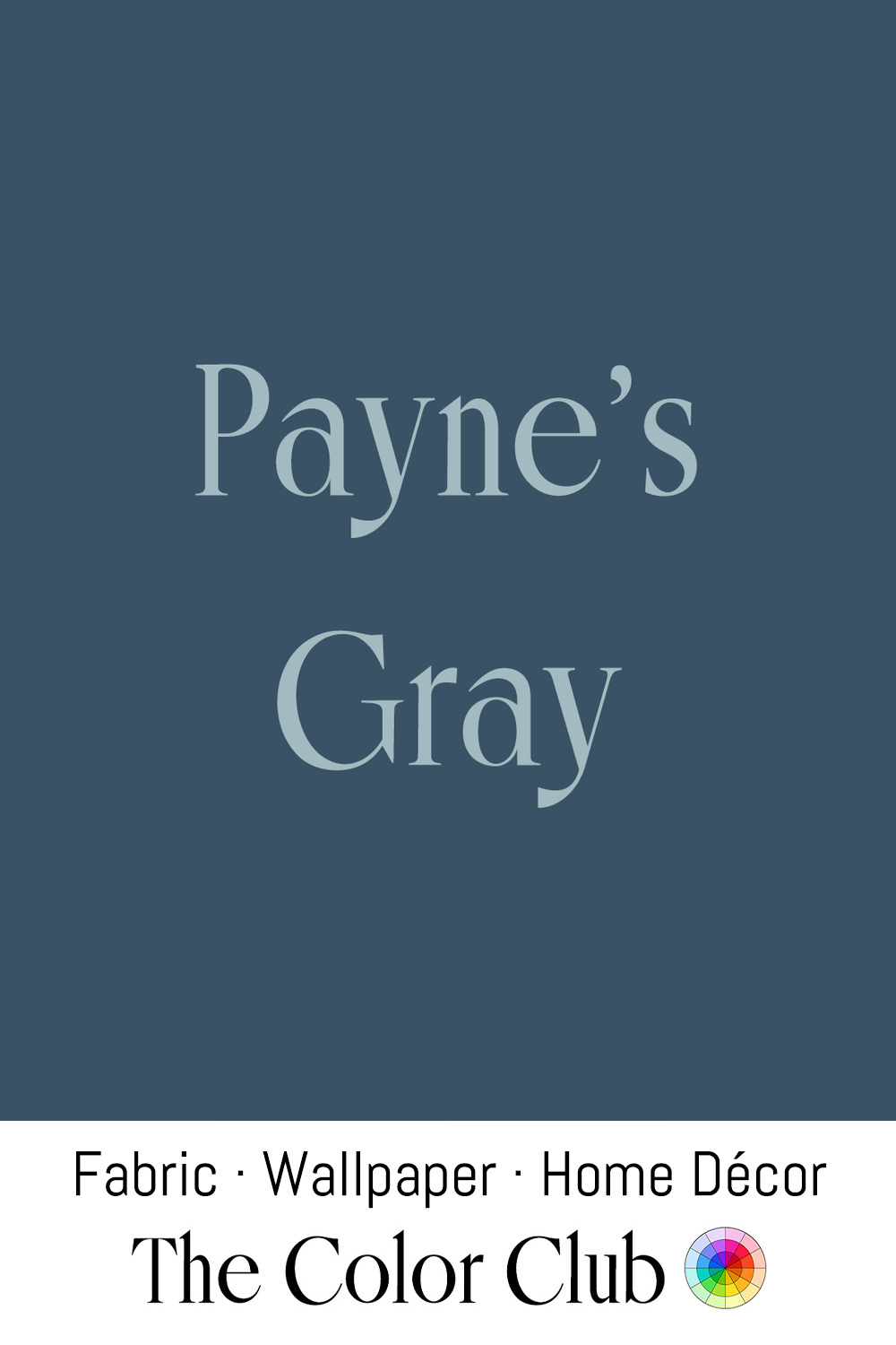
/ PAYNE'S GRAY / deep, cool, smoky blue.
British artist William Payne developed this mixture in the late 18th century as a practical alternative for watercolor painting. Traditionally made from Prussian blue, yellow ochre, and crimson lake, the pigment offered painters a controlled, atmospheric option for rendering shadows, skies, and distant landscapes.
Payne used the color himself in works such as Upon the Yealm, Devon (1791), applying it in varying dilutions to suggest distance across the landscape. Two centuries later, British painter George Shaw built an entire 2011 series of monochrome watercolors titled Payne's Grey around the color, describing it as "the color of English rain."
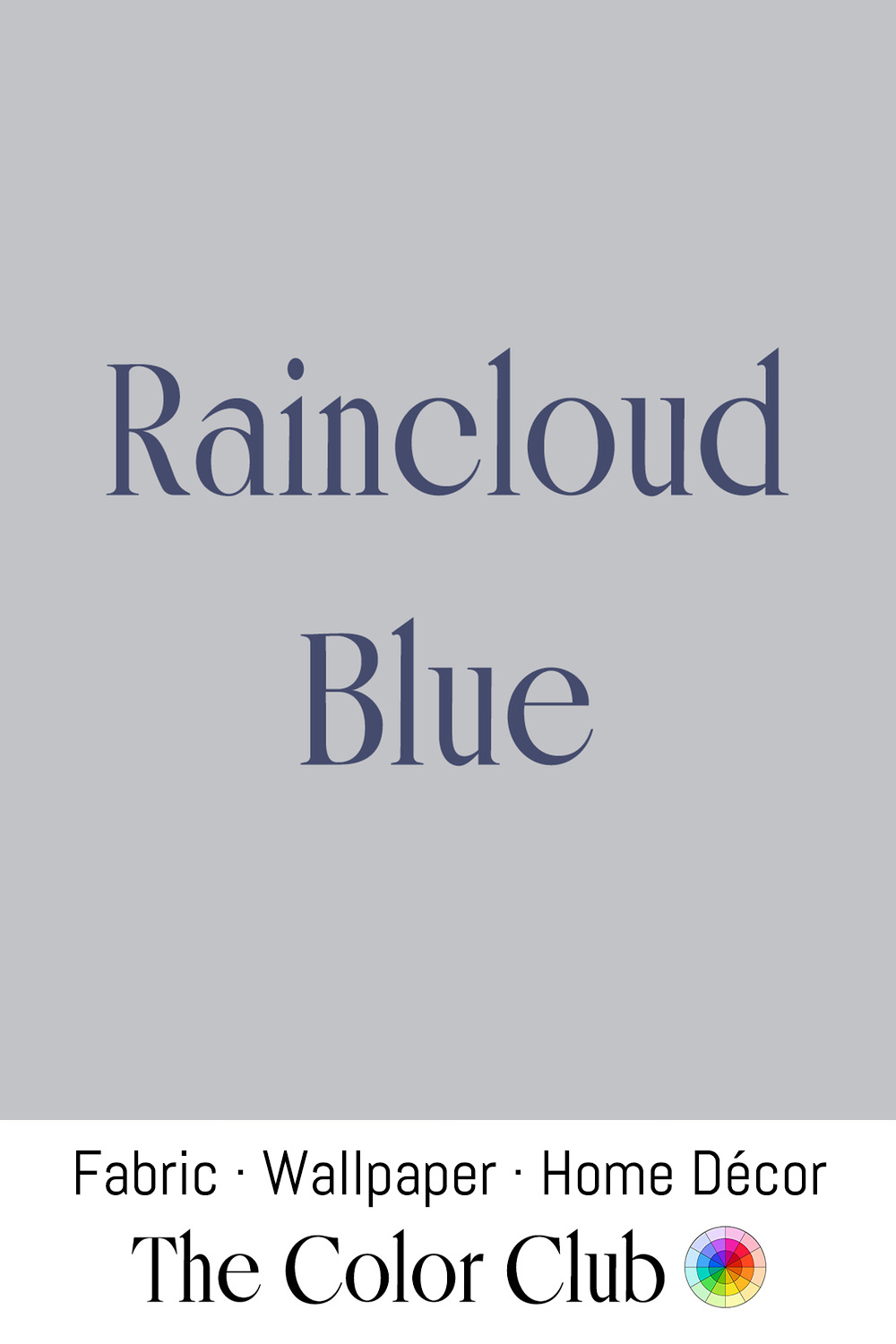
/ RAINCLOUD BLUE / pale gray, soft and overcast.
When sunlight passes through layers of cloud, it softens the sky's blue into a muted gray in this same range. Similar tones have long appeared in landscape painting, where artists used diluted pigments to represent mist, distance, and changing weather.
James McNeill Whistler used a closely related blue-gray throughout his Nocturnes, a series of paintings begun in the 1870s that rendered London's Thames at dusk in hazy blues and grays. The critic John Ruskin accused Whistler of "flinging a pot of paint in the public's face," prompting Whistler to sue him for libel in a trial that became a landmark argument for treating mood and atmosphere as serious subjects for art.
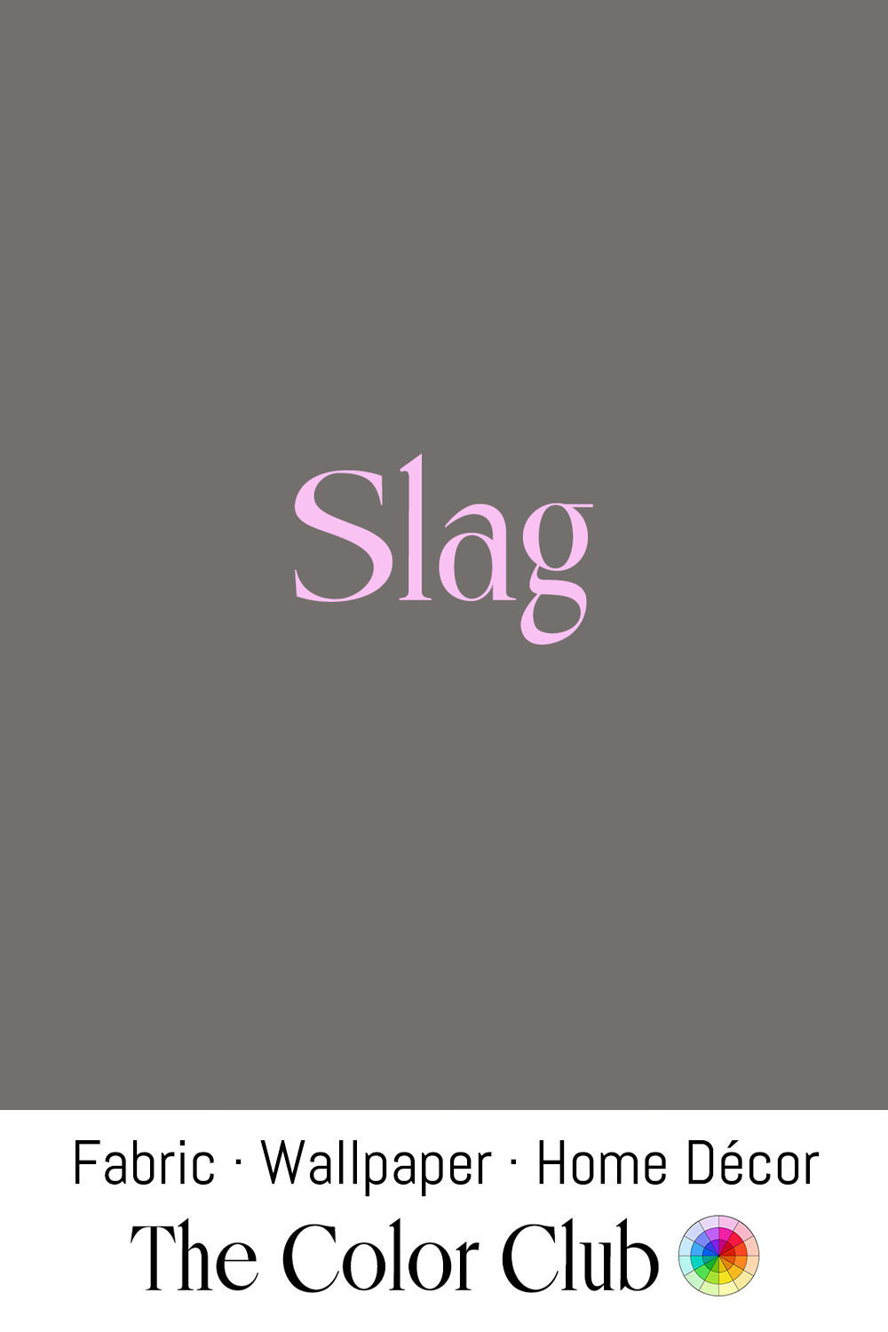
/ SLAG / dark gray, industrial and mineral.
Left behind after metals are separated from ore during smelting, this glass-like material has been produced for thousands of years as part of metalworking; its dark gray tones reflect the minerals, heat, and transformation involved in extracting iron and other metals.
The color became closely associated with industrial architecture during the 19th century, when iron, steel, and factory materials shaped the appearance of growing cities. Similar dark mineral grays appear in the exposed cast-iron and steel framework of structures such as the Eiffel Tower, completed in 1889.
In decorative craft, English glassmakers of the late 19th century began adding slag from iron-smelting works directly into molten glass, producing an opaque, marbled effect in this same range of grays that came to be known as slag glass. Manufacturers such as Sowerby used it widely for lampshades, bowls, and other pressed-glass objects through the Art Nouveau and Arts and Crafts periods, valued as an affordable alternative to hand-cut art glass.

/ WARM CONCRETE / pale gray with a soft, beige cast.
Depending on the minerals, sand, and aggregate used in its composition, concrete naturally varies in color; traditional surfaces often carried warmer gray tones from local stone materials, closer to limestone and weathered plaster than modern uniform cement.
This warmer interpretation became important in contemporary architecture influenced by natural materials and Japanese minimalism. Architect Tadao Ando used carefully finished concrete surfaces where subtle changes in tone and texture became central to the design, as seen in works such as the Church of the Light, in Ibaraki, Osaka Prefecture, Japan that he completed in 1989.
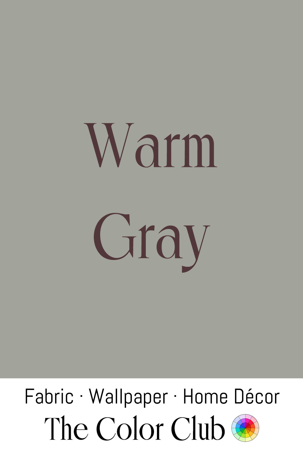
/ WARM GRAY / medium tone, soft, quiet greige.
Sitting between true gray and beige, this family of tones is created by adding small amounts of earth pigments to a neutral gray base. Similar shades appear naturally in limestone, wool, weathered stone, and unbleached fibers, materials that have shaped architectural palettes for centuries.
The shade became influential in mid-century modern interiors, where designers paired warmer neutrals with teak, leather, and natural stone. Scandinavian designers such as Alvar Aalto used related palettes to create interiors where soft grays complemented wood, textiles, and organic materials.
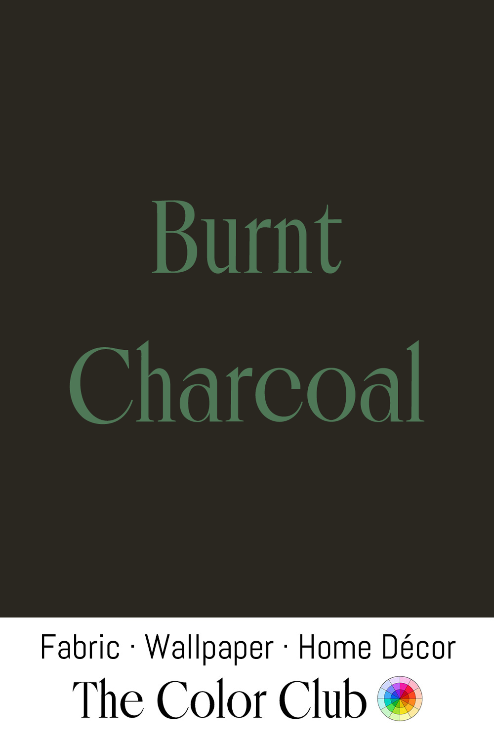
/ BURNT CHARCOAL / brown-black with the warmth of smoked ash.
One of humanity's oldest drawing materials, this brown-black comes from slowly burning wood until it becomes a carbon-rich pigment. Its warmer notes develop from hardwood sources, which retain traces of the original wood after burning.
This deep brown-black connects to traditional crafts including Japanese sumi ink and shou sugi ban, the traditional method of preserving timber through controlled charring. Contemporary architect Terunobu Fujimori has used this technique directly, building houses and teahouses finished in charred cedar that expose the burnt surface itself as the material's color.
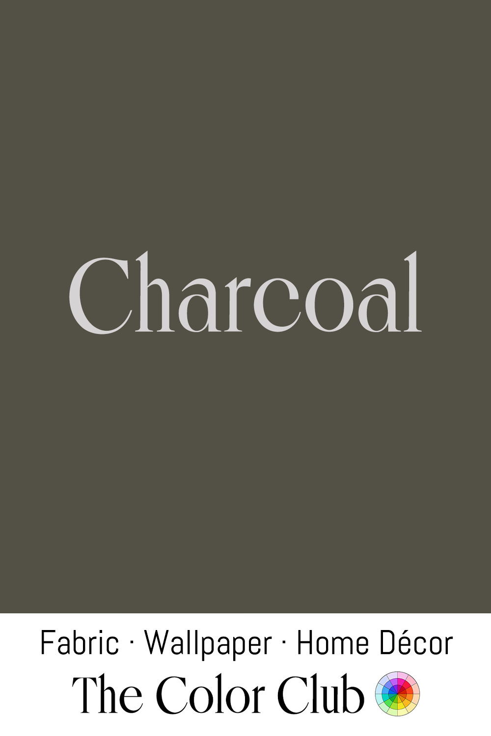
/ CHARCOAL / dark gray with the quiet warmth of spent embers.
Willow and vine charcoal, made from thin sticks of lightly charred wood, produce softer, grayer marks favored by figure and life-drawing artists, distinct from the deeper, cooler blacks of dense compressed charcoal. Artists have long chosen between the two depending on whether a drawing calls for delicate tonal buildup or hard, opaque line.
Georges Seurat built his charcoal drawings almost entirely from this kind of soft, granular tone, dispensing with contour lines so that figures seemed to emerge directly from an atmospheric gray, built up in soft tonal layers instead of hard outlines. Leonardo da Vinci and Michelangelo used the same soft charcoal during the Renaissance, prized for its gentle transitions between light and shadow in detailed preparatory studies.